Makkah Newspaper- client wanted to uplift their existing logo by keeping the same look, but more balanced. They wanted the logo to be more symmetrical and wanted to keep the Ka'aba in the kaf letter and the black and gold color.
Original logo was designed by Ahmed Khedir

Above: Makkah Newspaper's original Logo, which was designed by Ahmed Khedir
Below: Initial sketches of uplift process


Typographic issues in original typographic signature - Latin and Arabic characters do not match in height and do not align at baseline. They also have different strokes

Typographic attachment issues resolved


Color Scheme

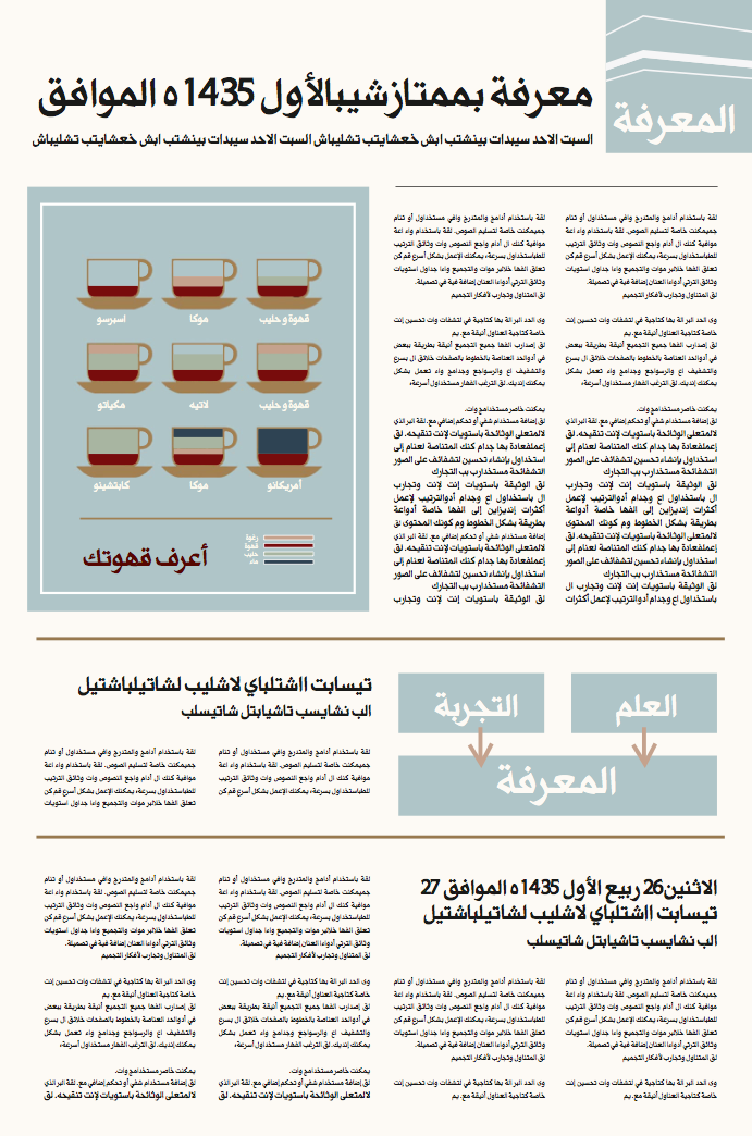
All artworks in the newspapers, including infographics and caricature to follow the newspaper's proposed color scheme (Both of the above artworks were taken online and edited with the Makkah Newspaper colorscheme)

Proposed Newspaper layout - an image of the Kaba to be featured on the first page of every issue.

Proposed Newspaper layout - Color coding used for each of the newspaper's sections. The color of the section should be the prominent color.

Proposed Newspaper layout - Color coding used for each of the newspaper's sections. The color of the section should be the prominent color.
Proposed Newspaper layout - Color coding used for each of the newspaper's sections. The color of the section should be the prominent color.


