JOYCO
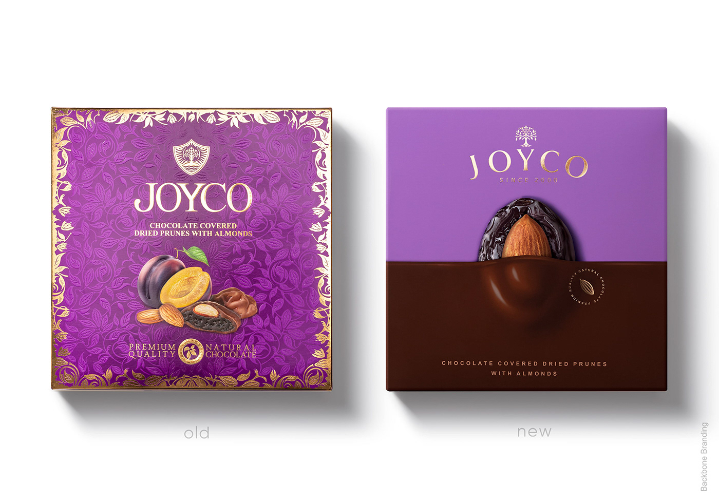
The largest and one of the best-loved chocolate brand in Armenia, Joyco, lacked the deserved attention of customers to its exclusively delicious treat in the super-competitive and oversaturated market.
Sales had been on a steady decline, despite this product’s high quality, and despite how much it is loved. It has needed much work in order to be re-entered into competition standards. So, the purpose of the redesign was to present an updated, competitive design to reach a more specific audience.
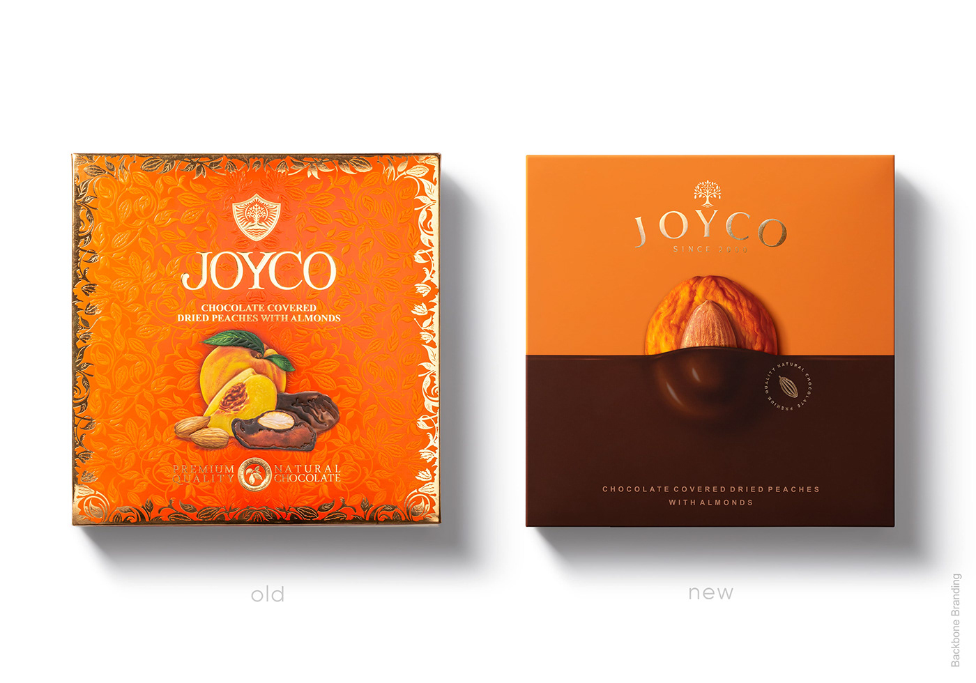
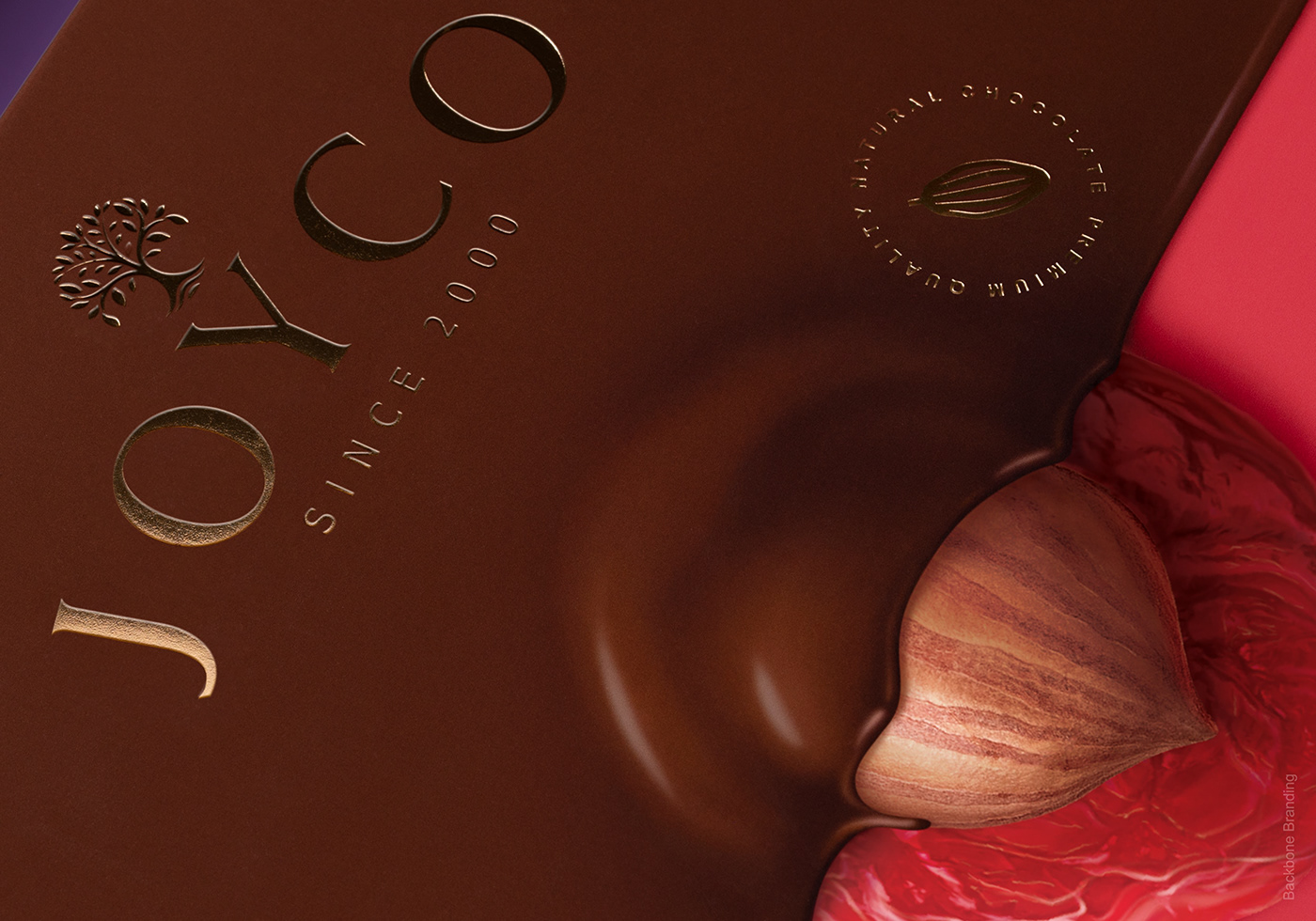
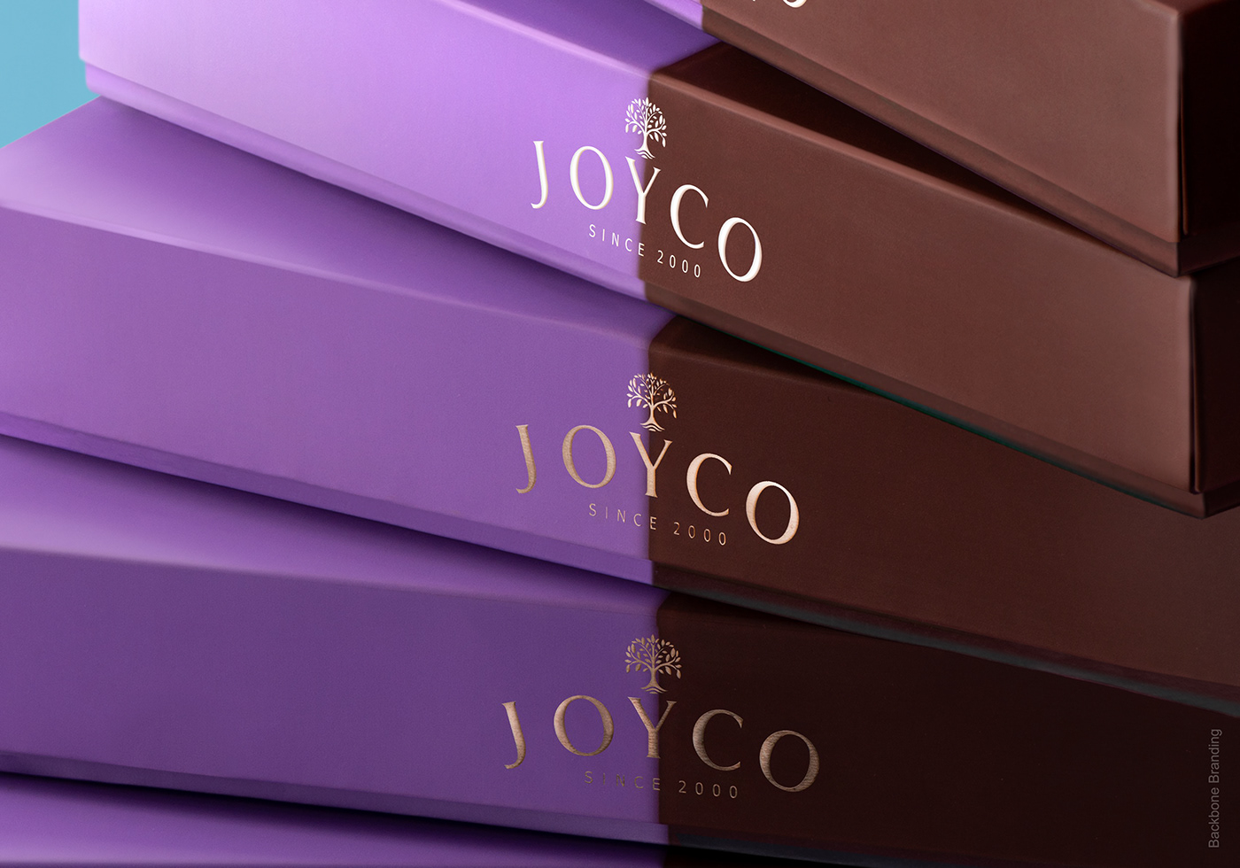
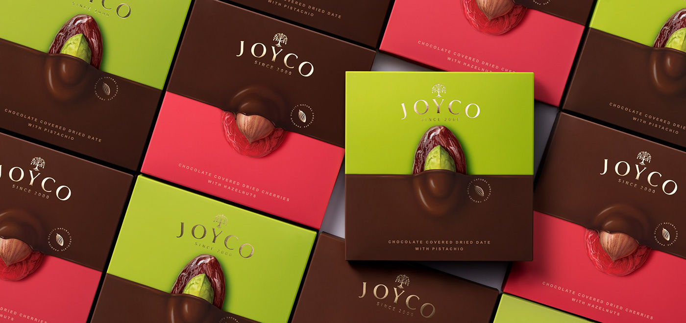
We have changed selected fundamental parts of the old design. The logo, a noisy background, and an unappetizing food zone, each flawed and uncooperative with the heart of the product.
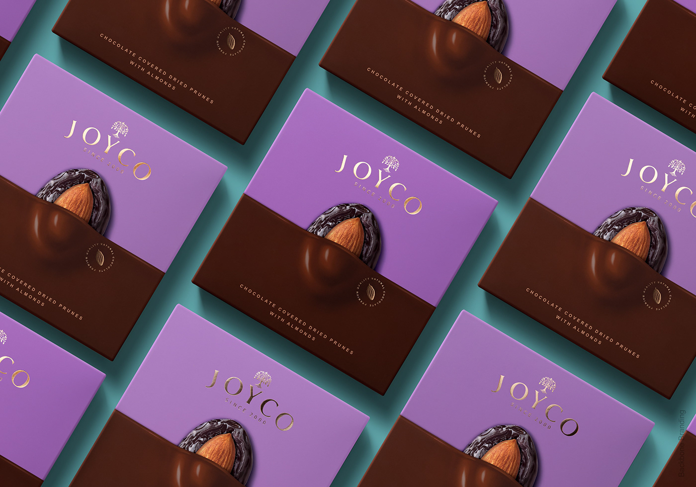
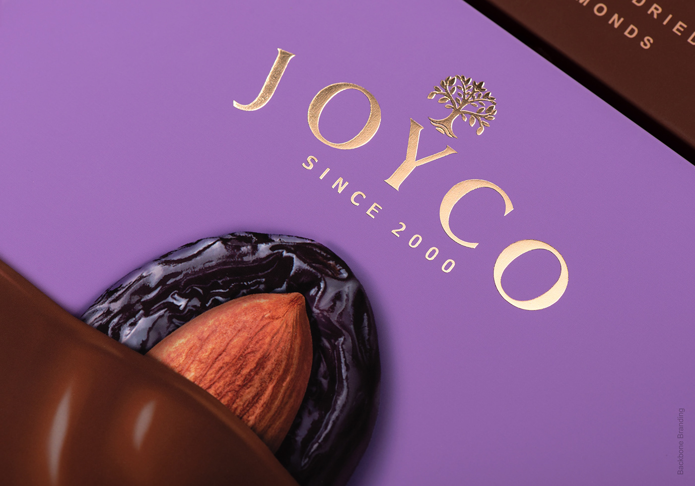
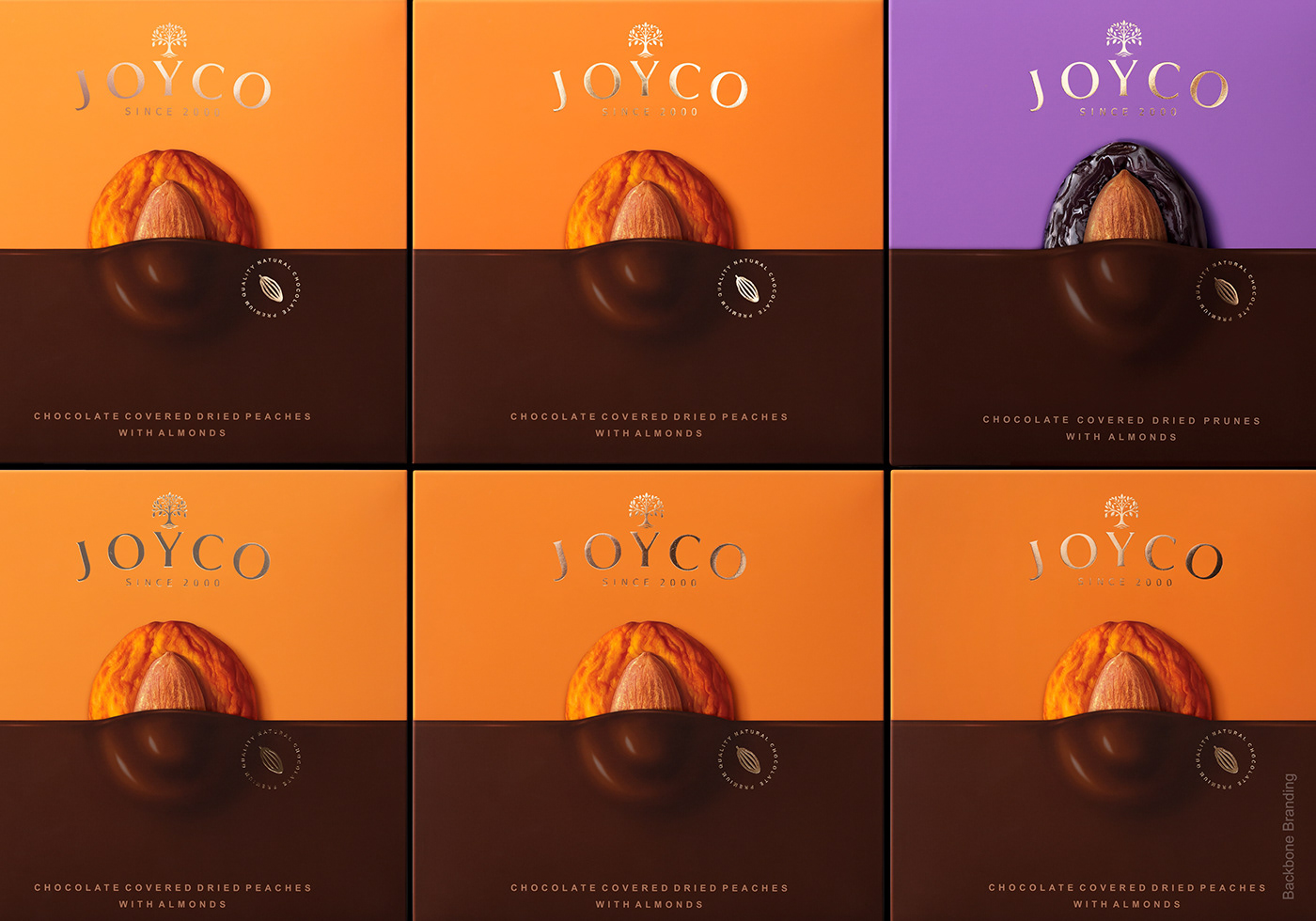
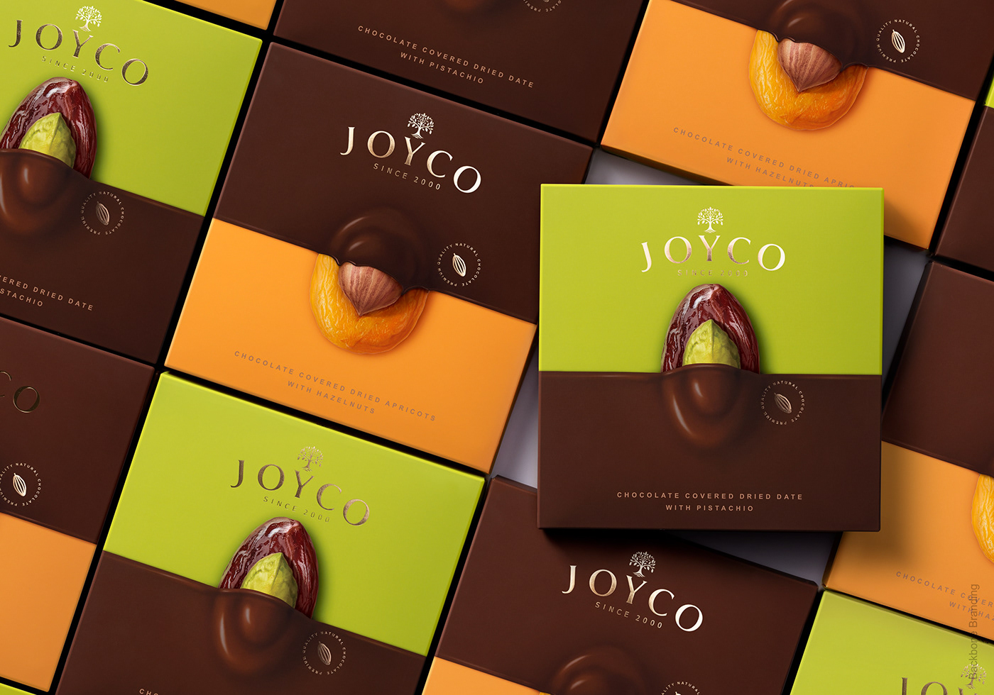
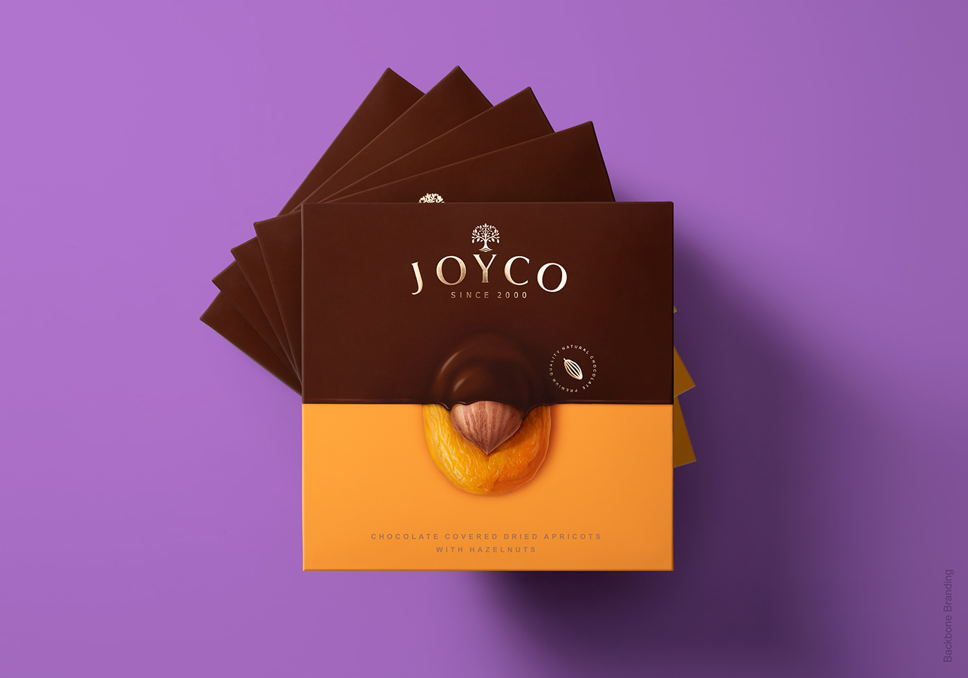
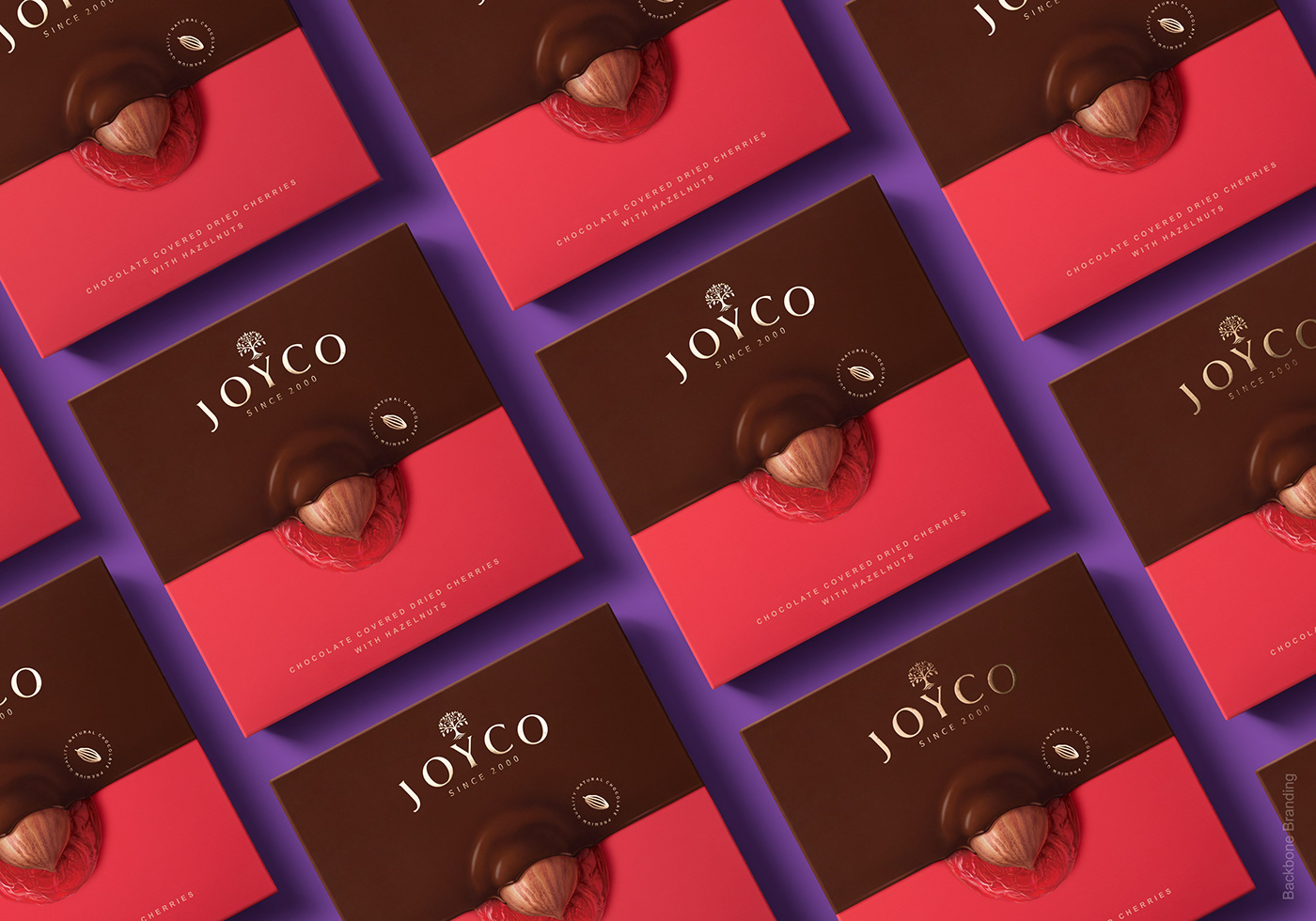
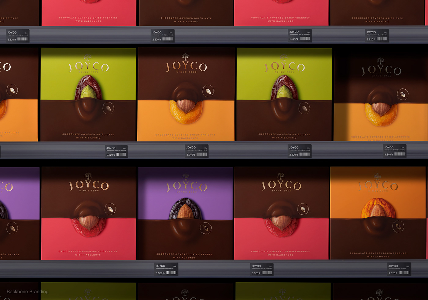
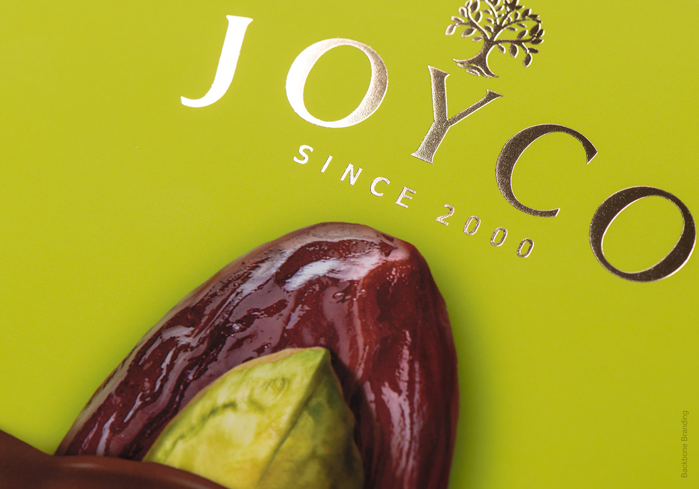
In redesigning the face of the packaging, attention has been given to the three main ingredients: chocolate, whole nuts, and dried fruits.
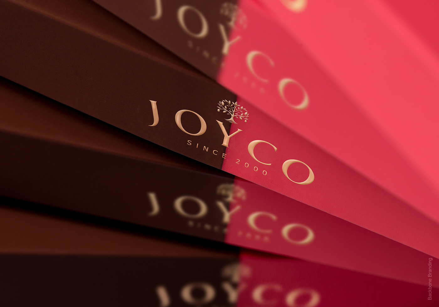
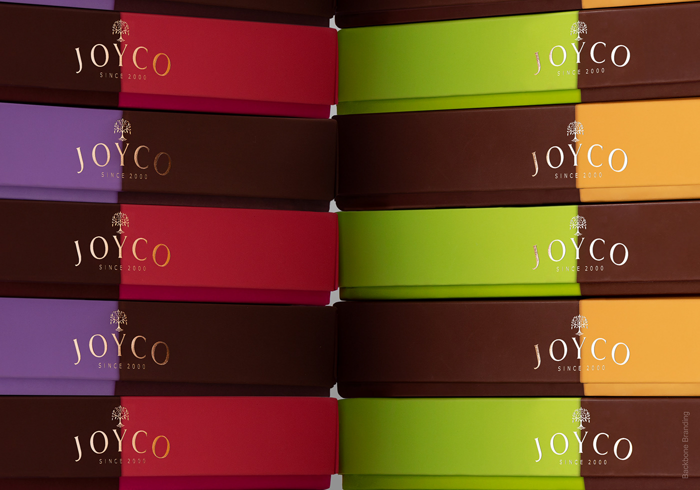
The first step was to dip the box in melted chocolate. The surprise treats peek out of the melted chocolate, exposing their bare layers of nuts and fruit. The busy background has been replaced by colors that are striking, yet graceful enough to return the attention, complimenting their flavourful counterparts.
The logo has also been simplified, casting the packaging straight to competition level with its new premium appearance.
By untangling the focal areas, we are presenting an effortless yet eye-catching design that will attract the customers, even from the top shelves.
Credits:
Creative Director: Stepan Azaryan
Illustrator: Marieta Arzumanyan
Graphic Designer: Ashot Hayrapetyan
Junior Designer: Lilit Hovhannisyan, Liana Mazmanyan