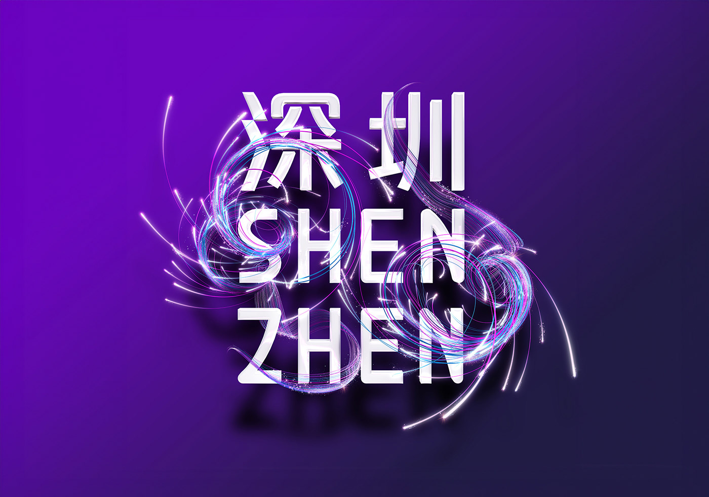
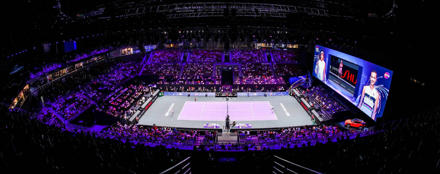
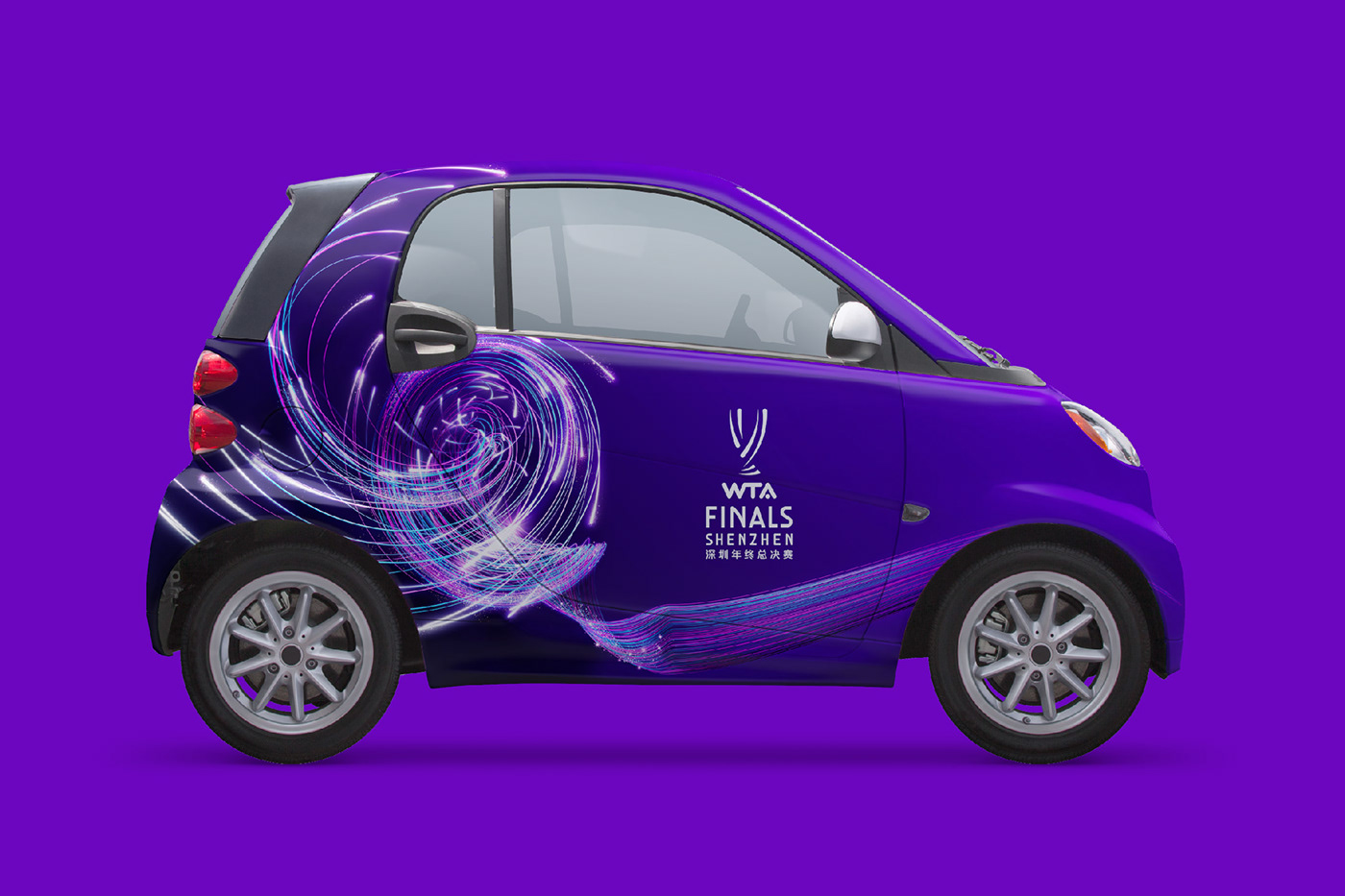
When the WTA finals moved to the dynamic city of Shenzhen in 2019, we were akse duo create the even identity. Built around the idea of ‘Sparks will fly’ - alluding to the competitiveness in tennis and the electric vibrancy of the city - we crafted an a vibrant identity that engaged with both players and fans at level touchpoint. The iconic colour system and trophy icon is now synonymous with the WTA’s most prized competition.