

Role
Branding & Packaging
Country
Spain
—
Grippadel is a new and innovative paddel racket grip company, which has patented a new system that will help players play a better game on the field. A young company that aims to enter a market quickly, thanks to its efficiency.
The Challenge
The main objective and challenge was to highlight Gripppadel as a new product and very different from its competition, and all this in a relatively saturated market. We needed to find a way to catch the attention of padel players at a first glance and give brand credibility beyond what competitors had already explored, offering a bold new proposition to the consumer.
The Solution
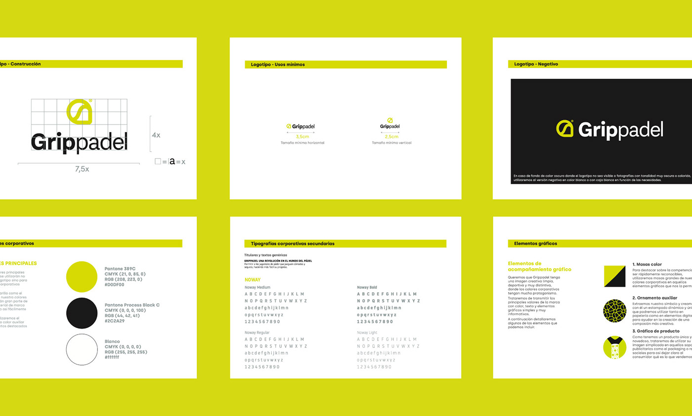
For our logotype, we created an element that identifies the type of product, using the paddle tennis racket as an identifying element, as well as the tennis ball, appealing to its curved lines on the interior. At the same time, we played with the brand's initial, the letter G. With all this we created a minimalist, memorable and very easy to identify element. For the brand color, we choose a Pantone inspired by the color of tennis balls, which will also allow all our corporate elements to attract attention.
Finally, we use a sans serif font that gives us that sporty character to the brand and is easily legible on all media.
Finally, we use a sans serif font that gives us that sporty character to the brand and is easily legible on all media.


Packaging design
As in the rest of the corporate elements, our Pantone, accompanied by black and white, will be the only main colors in our packaging. We want to make it clear at a glance what the product is about, since we need consumers to identify us on the shelf, and we are looking for a sporty, linear design with a very direct message.


