

来るべきデザイナー
現代グラフィックデザインの方法と態度
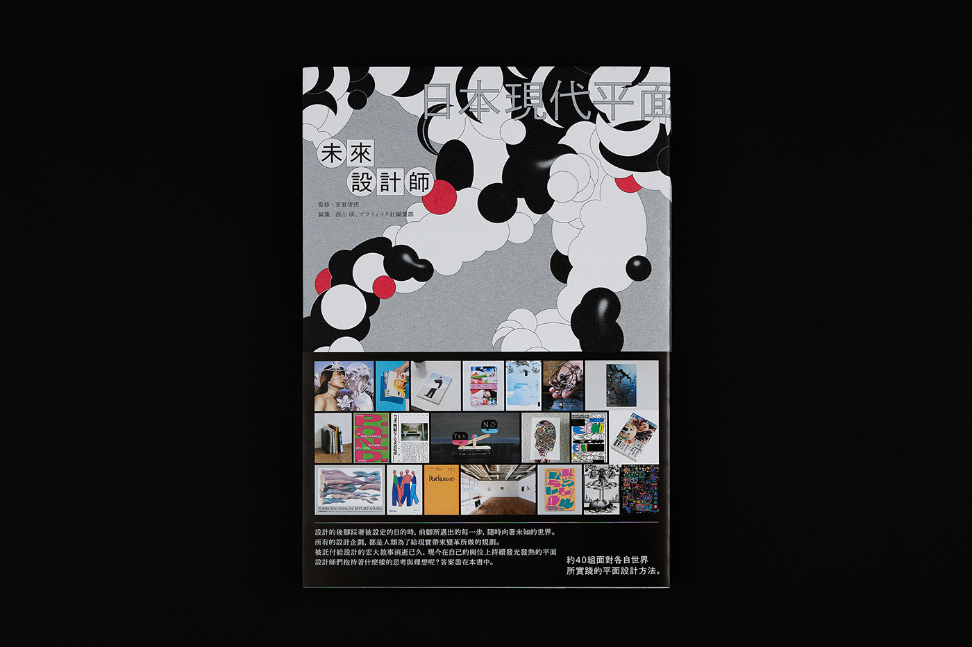
未來設計師:日本現代平面設計方法和態度
_______________________________________________________________
監修 / 室賀 清徳 , 編者 / 西山萌、グラフィック社編集部
出版 / 桑格設計書店 , 譯者 / 劉京偉 , 封面設計 / 朱俊達 Chun-Ta Chu , 攝影 / 58KG
〈第I 章〉 平野正子、八木幣二郎、岡﨑真理子、石塚俊、小池アイ子、村松佳樹、米山菜津子、大田拓未、
脇田あすか、小酒井祥悟(Siun)、福岡南央子、「power/point」展〈 第 II 章〉 ボールデザイン、相島大地、山本浩貴+h、
櫻井雄一郎、コバヤシタケシ、森敬太、中山望、宮﨑希沙、今垣知沙子、三上悠里、宮越里子、阿部航太、木原共、真崎嶺、
座談會:平山みな美 × 惣田紗希 × 岡あゆみ
〈 第 III 章〉 大澤悠大、藤田裕美、高良真剣、浦川彰太、牧寿次郎、美山有、鈴木哲生、加納大輔、牧野正幸、へきち、村尾雄太、
對談:佐々木俊× 加瀬透


To capture the diverse design approaches and attitudes explored in this book, we have transformed the 40 designers featured into various geometric circles. These circles, resembling clouds, pile up and collide, symbolizing the designers' thoughts and ideas. A red circle serves as a visual cue, intuitively linking the impression of "Japan" to Japanese designers. Collectively, these elements represent the myriad thoughts and actions of countless Japanese designers, interacting, colliding, merging, and revealing themselves throughout the book.
為了體現本書不同的設計方法和態度的主題,將書中40位設計師轉化為數個不同的幾何圓圈,如同雲一般堆疊和碰撞,代表了設計師的思維和想法。以紅色圓圈作為視覺符號,直觀地聯結日本設計師「日本」的印象。總體而言,它代表了無數日本設計師的思想和行為,在本書中互動、碰撞、融合、展現。


In the design process of translating abstract concepts, we sought to create intuitive connections and imaginings without sacrificing aesthetic appeal. At the same time, we aim to pique readers' curiosity and attention. Therefore, the metaphor "Descending Tiger" is employed as a hidden symbol, representing the ever-changing and challenging jungle that the design community must navigate. We encourage everyone to learn from this book, drawing nourishment from the works and experiences it contains, so that you may become a "Descending Tiger"—a skilled or mature designer. Through this book, you'll gain insights that better prepare you for the field.The book's title references the concepts of "now" and "future," symbolized by the changing phases of the crescent moon to represent the passage and transformation of time. This is also visually manifested in the tiger's stripes.
For the book cover, we chose IORI bamboo-weave paper from Takeo Paper Industries. Its texture is inspired by the "earthen walls" found in traditional Japanese architecture, made by interweaving straw and clay fibers. This subtly complements the book's theme of Japanese design. Printing is done in monochrome black, special red, and ultra-bright silver. Additional layering on 3D reflective surfaces in black and silver enhances the effect of the super white coated paper. This combination results in evenly saturated ink that, along with the paper's unique texture, lends modern vitality to the visuals while also adding a layer of humanistic depth.
在設計過程轉譯抽象概念時,我們想要具有直觀的聯繫和想像,但又不想過於直白的失去美感。同時,我們希望引起讀者的關注和好奇心。因此,「猛虎下山」被用作隱藏的符號意象,將需要設計的社會比喻為且充滿變數和困難的叢林。我們鼓勵大家向本書學習,以書中的作品和經驗為養分,讓大家成為下山的老虎,成為一名有能力的設計工作者或成熟的設計師,通過本書將學到更多,讓我們更加準備好了。
本書標題提到了「現在」和「未來」的時間概念,在此用新月變化代表著時間的變遷和推移,同時在整體視覺上也表現出老虎身上的條紋。
此次書封紙材選用來自竹尾紙業的蒝織紙IORI,其紋理來自於傳統日式建築中的「土壁」是由稻草與泥土纖維交織而成的樣子,對應本書日本設計的主題,能夠很細微的相以呼應。印製方面以單色黑、特色紅、超亮銀做三色印刷,並另在3D物件上的反光處,讓黑銀做部分的疊印處理,透過蒝織超白輕塗紙的效果,墨色勻稱飽滿且搭紙張獨有的紋理,能讓畫面展現出現代的張力,同時又具有人文的深度。


〈用紙〉
書衣 / 恆成 蒝織紙 超白 151 g/m , 書腰 / 峻揚 美階晶彩 140 g/m , 書封 / 峻揚 原儷卡 250 g/m , 內頁 / 恆成 日標HUWA HUWA 105 g/m
書衣 / 恆成 蒝織紙 超白 151 g/m , 書腰 / 峻揚 美階晶彩 140 g/m , 書封 / 峻揚 原儷卡 250 g/m , 內頁 / 恆成 日標HUWA HUWA 105 g/m


