


EN
ABOUT THE PROJECT
CodeRus offers business solutions, automation and accounting, reporting, technological know-how that speeds up business processes and replaces monotonous manual labor for organizations and individual entrepreneurs, users of 1C software products from all over the world.
TASK: rebranding.
The company has been on the market since 2012, during this time it has grown, received the status of 1C Real Automation Center, ERP-Center. CodeRus works with large manufacturing, trading, construction companies, among the employees there are specialists and experts. In the brand identit it is important to reflect the company's manufacturability, business approach, relevance of IT solutions, as well as courage, willingness to cooperate and openness.
DESIGN SOLUTION
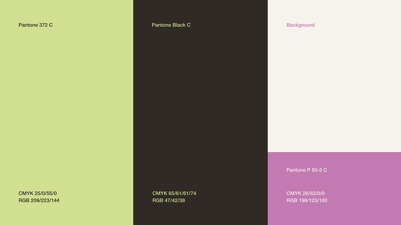
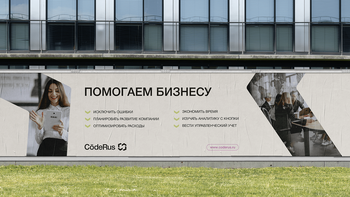
I chose green as a primary life-affirming color to represent the growth and development that comes with the business cycle. Dark brown is grounding and harmoniously complements the main color of the brand. The letter O is emphasized so that customers can easily determine how the company name is read correctly. The brand is about cooperation, so the font is grotesque, and the sign is the personification of the system that CodeRus creates through automation. The badge is used in fragments as a graphic technique to link all the elements of the identity and help the brand to increase recognition. The green checkmarks have a direct reference to the 1C program, because when the operation is completed successfully, a green confirmation checkmark appears.
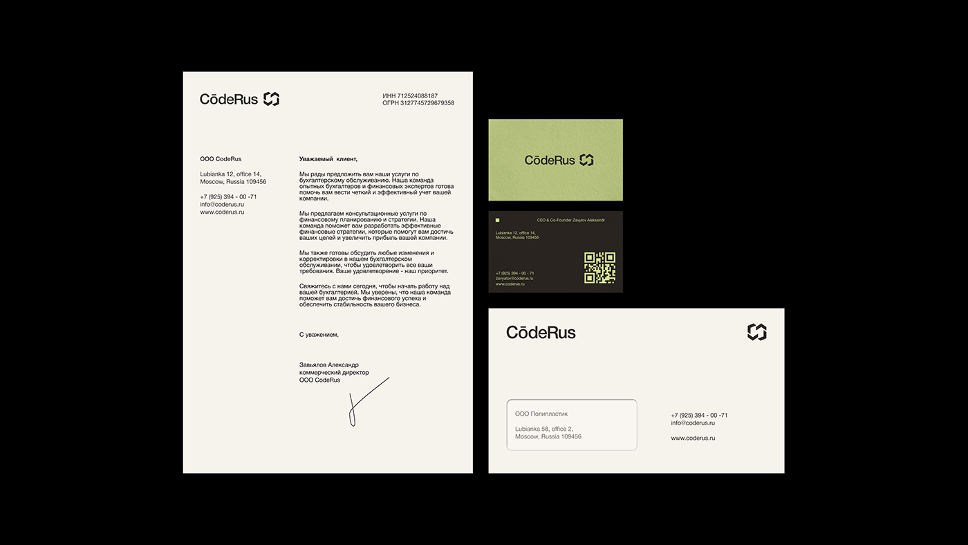
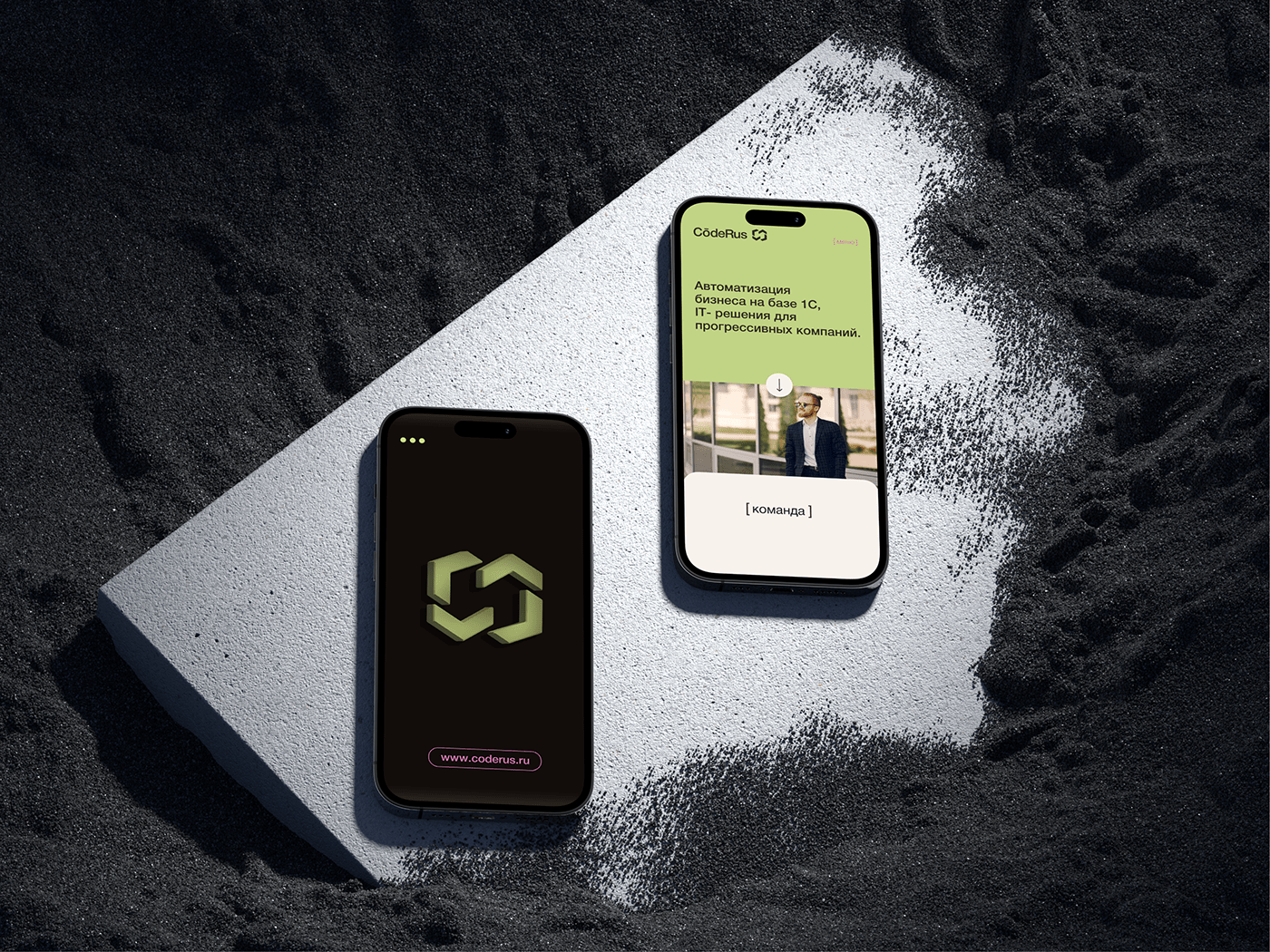
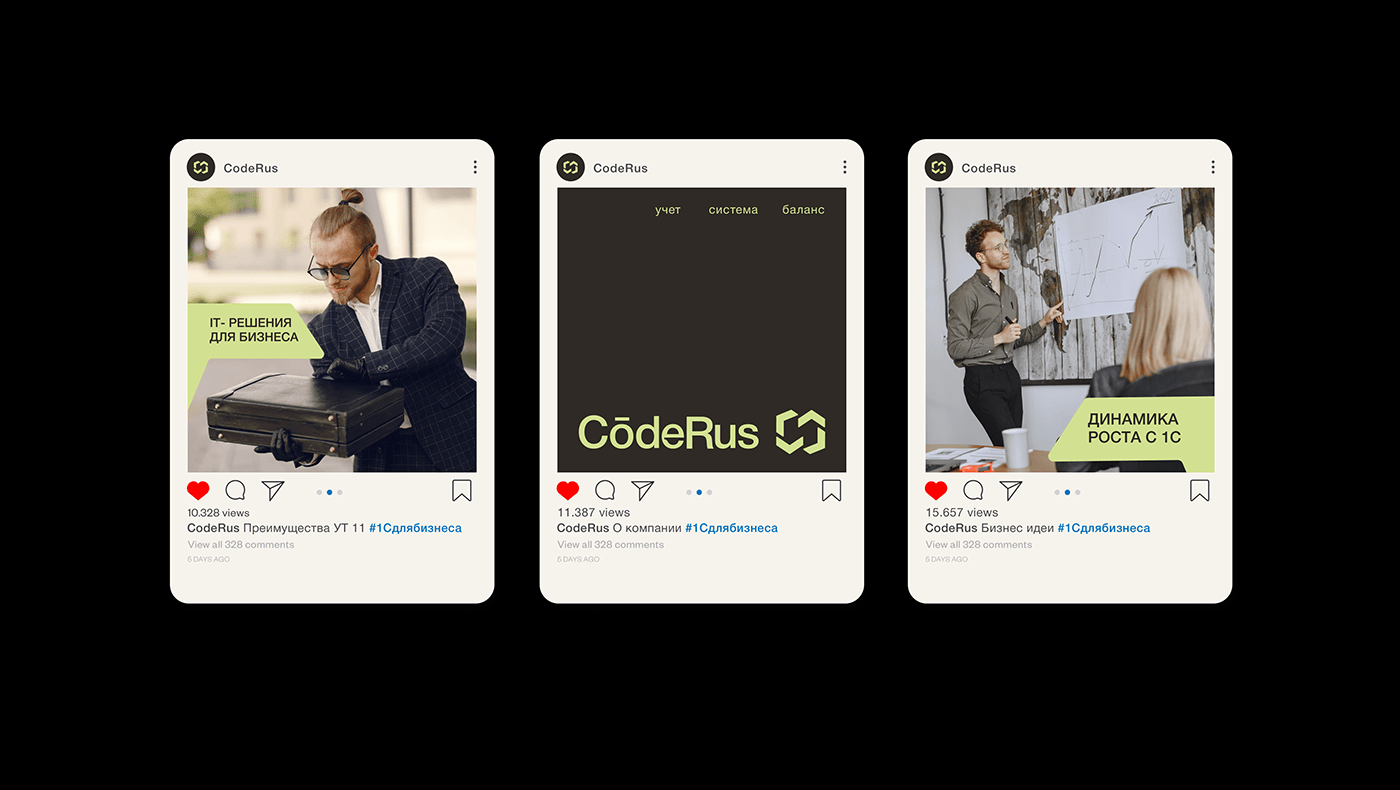
Company documentation templates have been developed: business letters, commercial offers, postcards, business cards. Created social media and website.


RU
О ПРОЕКТЕ
CodeRus предлагает решения для бизнеса, автоматизацию и учет, сдачу отчетности, технологические ноу-хау, ускоряющие бизнес-процессы и заменяющие монотонный ручной труд для организаций и индивидуальных предпринимателей, пользователей программных продуктов 1С со всего мира.
ЗАДАЧА: ребрендинг
Компания на рынке с 2012 года, за это время она выросла, получила статусы 1С Центр реальной автоматизации, Центр ERP. CodeRus работает с крупными производственными, торговыми, строительными компаниями, среди сотрудников - специалисты и эксперты. В айдентике важно отразить технологичность компании, деловой подход, актуальность IT- решений, а также смелость, готовность к сотрудничеству и открытость.
ДИЗАЙН РЕШЕНИЕ
Я выбрала основной жизнеутверждающий зеленый цвет, чтобы предать идею роста и развития, которые сопровождают бизнес-цикл. Темно-коричневый цвет заземляет и гармонично дополняет основной цвет бренда. На букве O поставлено ударение, чтобы клиентам легко было определить, как правильно читается название компании. Бренд про сотрудничество, поэтому шрифт гротескный, а знак - олицетворение системы, которую создает CodeRus посредством автоматизации. Знак фрагментарно используется в качестве графического приема, чтобы связать все элементы айдентики и помочь бренду повысить узнаваемость. Галочки зеленого цвета имеют прямую отсылку к программе 1С, ведь когда операция выполнена успешно, появляется зеленая подтверждающая галочка.
Разработаны шаблоны документации компании: деловые письма, коммерческие предложения, открытки, визитки. Оформлены социальные сети и сайт.


