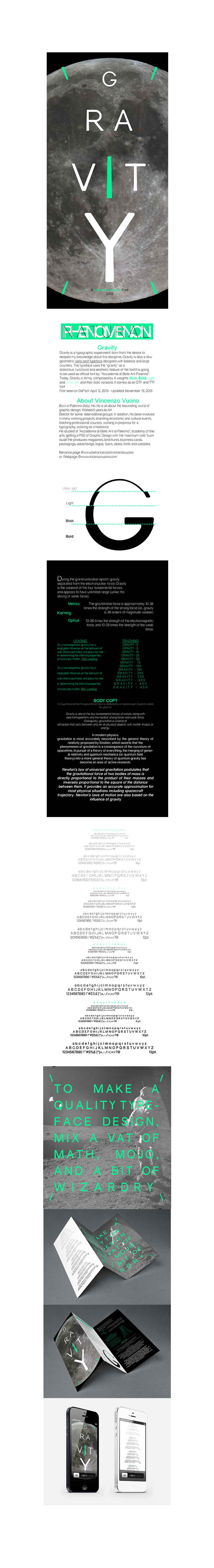
GRAVITY FONT FLAG
The reason for my choice of font was based on the interesting design and because of the family of typefaces it comes with. It can be used as a display font and as body copy text which allows you to use this font for any project where suitable. It is a very clean font and is easy on the eye.
Another reason was for the font flag, the name Gravity allowed me to stick to a theme being “Space and Gravity”
When I searched gravity in google it came up with latest movie called gravity which is about being in space so this was also played influence to my design although the movie does not use the Gravity font for the movie posters.
When I searched gravity in google it came up with latest movie called gravity which is about being in space so this was also played influence to my design although the movie does not use the Gravity font for the movie posters.
Gravity is a ttf. True type font
I will be using inDesign to create the broacher and production report and will be doing the mock-ups in Photoshop.
For the layout I will be using the space theme to support the font. My font specimen will be arranged from small to big to give the effect that gravity is pulling the text down. The front will have my font flag on with the font
specimen sheet at the back. The inside of the front of the broacher will have the font info, designer info and type variations whilst the inside of the back will have the pan-gram on it.
specimen sheet at the back. The inside of the front of the broacher will have the font info, designer info and type variations whilst the inside of the back will have the pan-gram on it.
I will cover
• The different font weight
• Display font
• Kerning and Leading
• Tracking
• Justification of text
• Font size
• The different font weight
• Display font
• Kerning and Leading
• Tracking
• Justification of text
• Font size
The two images on the left will be the images I will be using for this project and have been downloaded of the NASA website
My spotcolor for print
C - 100
M - 0
Y - 65.62
K - 0
My spotcolor for display
C - 100
M - 0
Y - 65.62
K - 0
My spotcolor for display
R - 0
G - 238
B - 148
G - 238
B - 148