


It takes a certain wild attitude and energy to throw your body into freefall with nothing
but a parachute. That audacious courage is what we hoped to capture with JYRO,
a full strategic rebrand for NZ Aerosports.
but a parachute. That audacious courage is what we hoped to capture with JYRO,
a full strategic rebrand for NZ Aerosports.
The founder’s daughter wanted to bring the brand into a new era, with a clearly
defined brand essence with impact, longevity and a sense of meaning which
honoured her late father.
defined brand essence with impact, longevity and a sense of meaning which
honoured her late father.
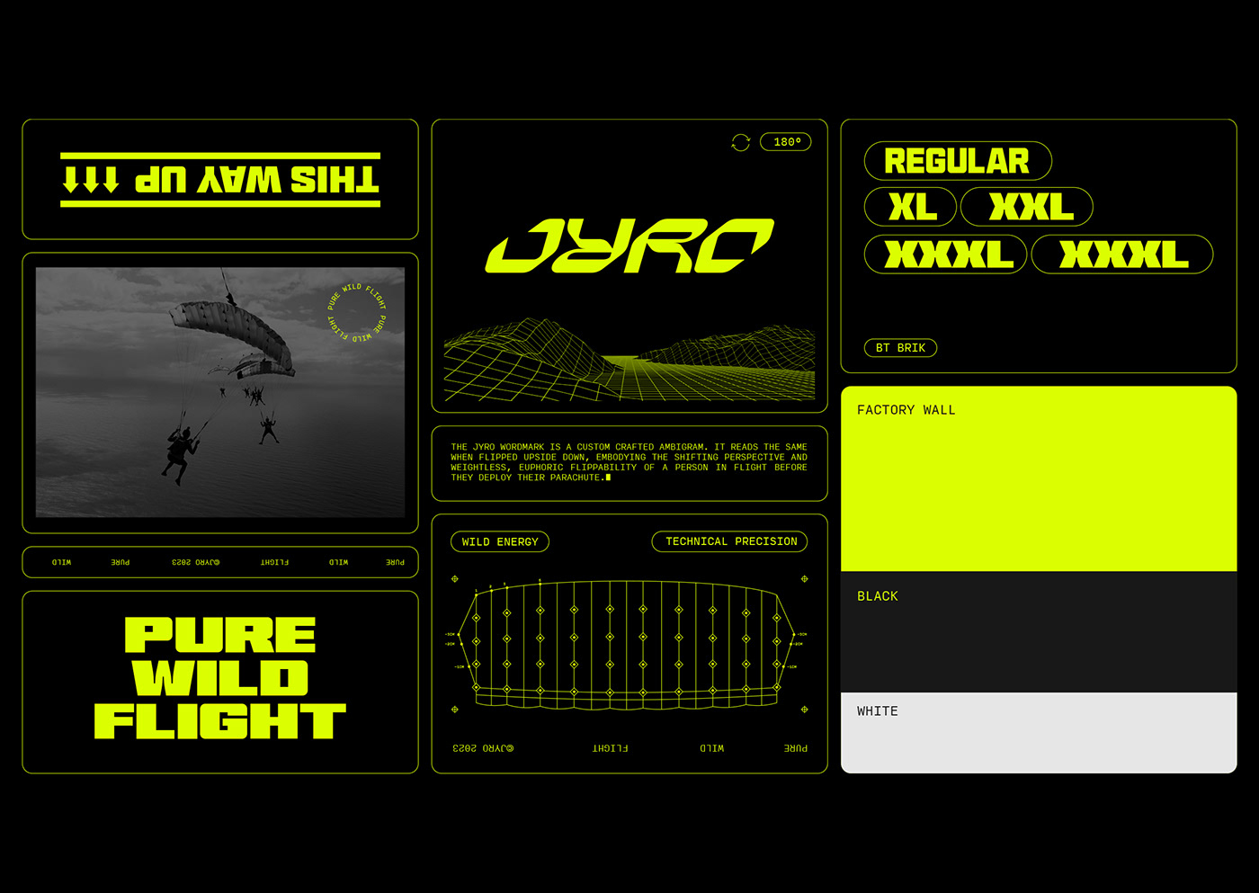
The JYRO wordmark is a bright, bold and dynamic custom crafted ambigram, embodying the shifting perspective and weightless, euphoric flippability of a person in flight before they deploy their parachute. Jyro was the founder’s nickname and, by giving his name
to the brand, we sought to evoke the experience of pure wild flight he loved so much.
to the brand, we sought to evoke the experience of pure wild flight he loved so much.
The supporting design system is flexible and adaptable, capturing the versatility
of an aerosport athlete and inspired by high performance leisure and sport tech brands.
of an aerosport athlete and inspired by high performance leisure and sport tech brands.
With JYRO, we created a distinctive, brave and bold brand with a playful and dynamic personality that’s unmistakeable — even flipped upside down.


