Client:
A Little Creative Co.
Project Summary:
A Little Creative Co. is a consultant studio specializing in guiding client's marketing and social media strategies in the interior design space.
Challenge:
Similar to many boutique creative studios, ALC Co. focused foremost on their client's needs while putting their own on the back burner. Although the marketing language and voice were on the mark, the visuals did not support the quality of the content. This was reflected in the inconsistent use of typography, imagery, icon styles, and colors.
A cohesive, flexible, and intentional visual identity reflecting the values of the studio but also resonating with their clients was required.
Approach:
A Little Creative Co. used an inconsistent visual brand strategy that did not effectively convey their business expertise. To address this issue, a custom logo, a complementary color palette, and an icon set were created to lend the ALC Co. brand a strong and consistent presence across all channels. Through many client discussions and research, a clear understanding of ALC Co.'s business objectives and target audience was developed.
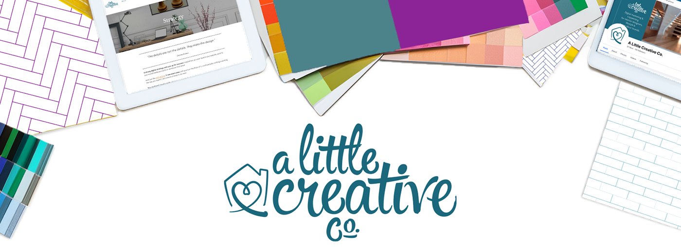
Firstly, a custom word mark that more closely reflects the client's brand personality and core values was created. A hand script-style type treatment was chosen to convey approachability, the personal touch clients should expect to receive, and modified in a unique way to be ownable. The logo serves as the foundation for ALC Co.'s visual identity, informing the other elements of the brand identity.
The "bug" logo icon was created to accompany the word mark or stand in for the primary logo where space is limited such as social channels. The icon echoes the handmade aesthetic of the script logotype, incorporating a house and heart. These symbols were brought together to reflect the intention ALC Co. puts forth in making their services feel personal.
A hierarchy has been added to ALC Co.'s existing color scheme. The system provides a cohesive visual experience across all touch points.
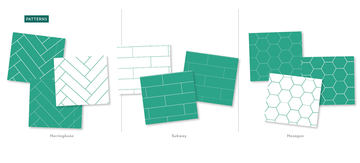
The brand textures represent common patterns familiar in interior design. These elements can be used as wall paper patterns or for framing content.
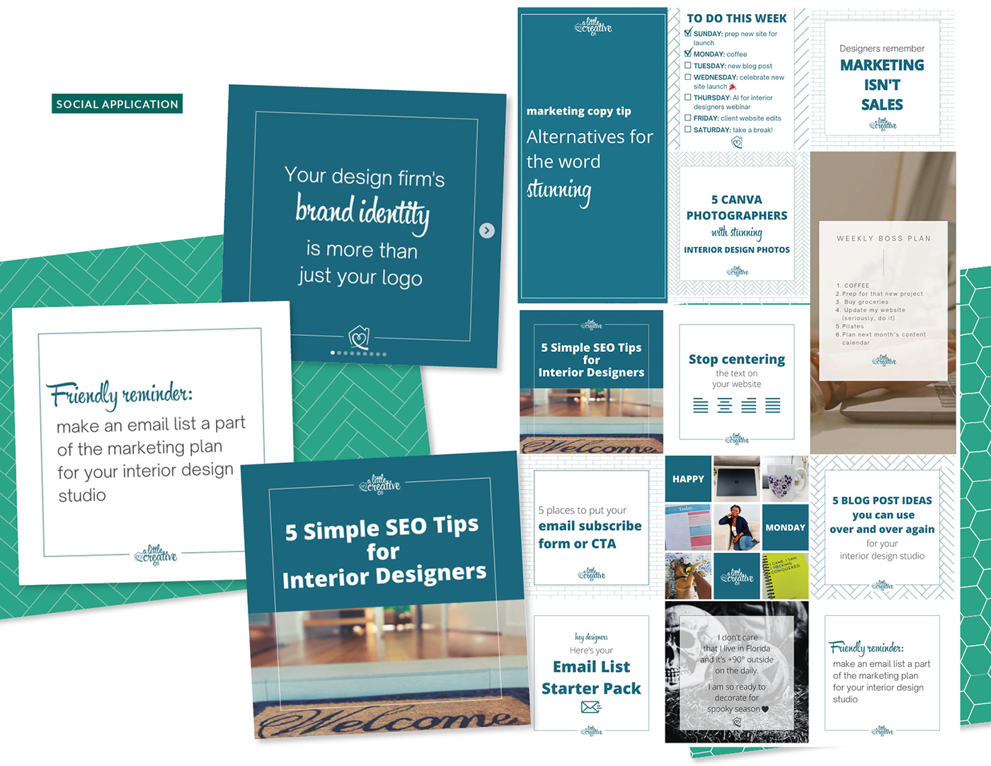
Finally, a set of custom icons were created that align with the word mark featuring similar line thicknesses and follow the brand color scheme. These icons were designed to be versatile and engaging, serving as visual representations of key features and services offered by the client.
Project Details:
• Logo design
• Brand kit
• Digital channel profile icons, promotional templates for social and web applications