This exercise was indicated on a school setting, particularly in the subject of Desenho para Ecrã, where the goal was to promote one font and their respective foundry.
For this exercise was required the development of a print object in a free format, using only one font. And then the elaboration of a website, promoting the foundry, using three fonts.
In my case, after I have chosen the foundry and the font, I started to research about editorial design and techniques, being able, after this, to choose a concept for my print object, which were several postcards of the movie Kino-Eye, achieving the following results:


The next part of the exercise, was the website. I tried to keep the same design as the postcards, but in a more contained way.
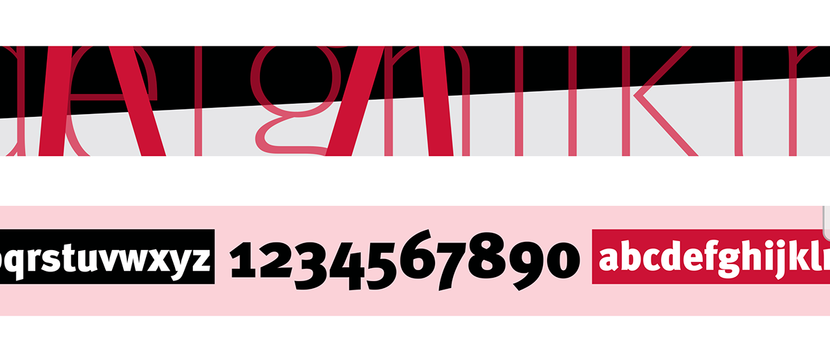
I made a web page for each font, assigning to each a different color.
In that same page, I produced an approach that positively promotes and demonstrates the complete font, introducing their respective features and how those fonts behave in different color backgrounds.
In that same page, I produced an approach that positively promotes and demonstrates the complete font, introducing their respective features and how those fonts behave in different color backgrounds.