-About
Persado is a platform that helps different types of businesses increase their income. The company uses generative artificial intelligence which covers all digital channels. AI creates personalized experiences for customers, and that leads to increased sales for businesses. Analysis of more than 1.5 billion customer interactions from 150 million customers allows users to create messages that drive business results throughout the customer's digital
journey.


-Hypothese
Having decomposed the essence of artificial intelligence into primitives, it became clear the entire pattern of technologies and their weaknesses, such as electricity, conductivity, and so on. without energy and power, the operation of the device is impossible in real time.
And gives nutrition and energy a mechanism (schemes, ways) through which we can enjoy all the necessary benefits of our daily life. I wanted to reflect such an archetype in the site and the structure of the case (the microcircuits were responsible for the supply and function of business and artificial intelligence), when as rounded forms were a
metaphor for the development of fashion for the use of ia (weak and loyal to interference).

-Space organization
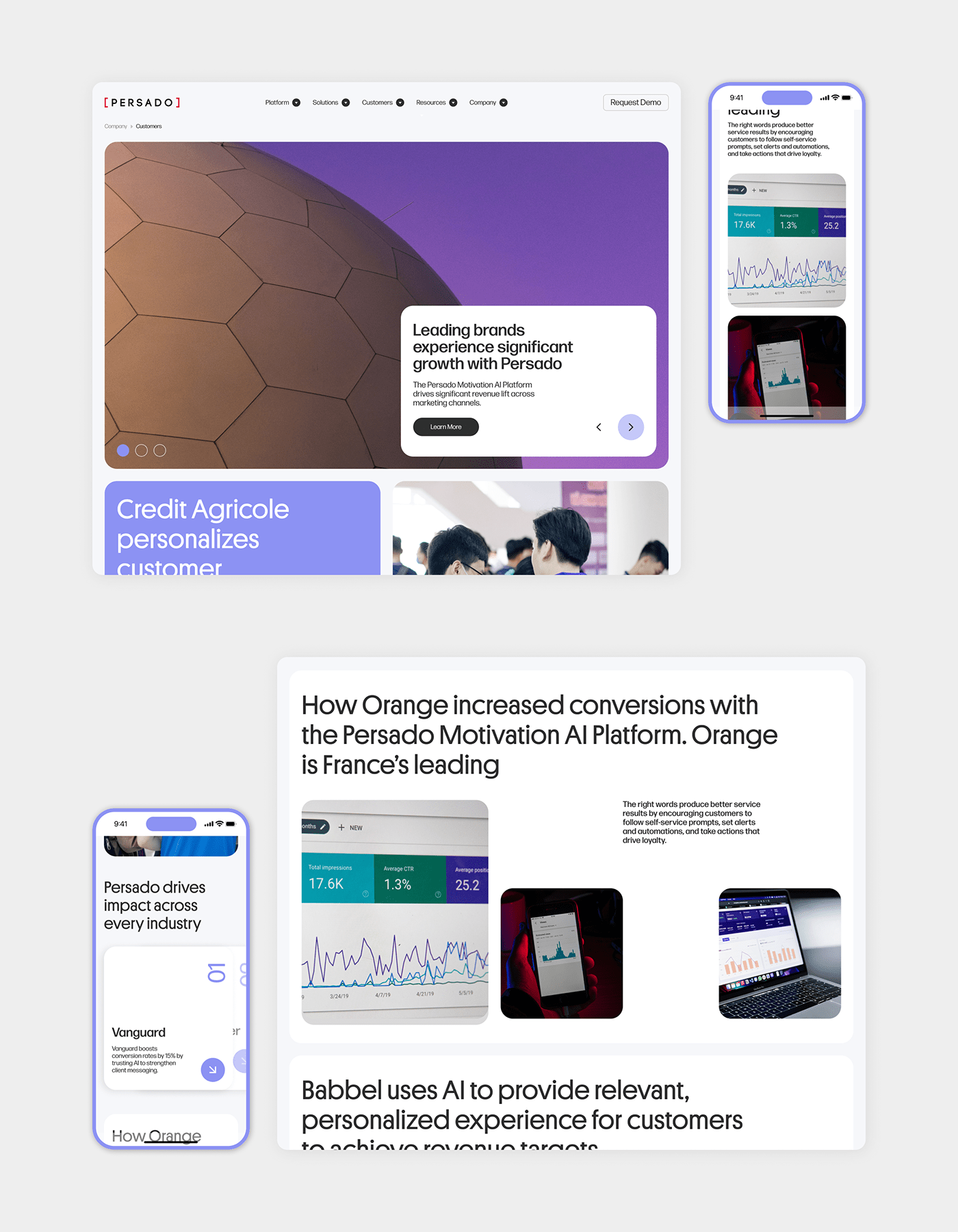
In the project one of the tasks we faced was to organize the space competently. Since the company has a large amount of text and the compositional component is of the same type, users get bored reading and studying the site. As a result, the company loses potential users and money.
The main idea was to resort to such a technique as block and modal structure, so we were able to delimit the space. With the help of a modular structure, we tried to present the text and media content in an interesting way, assuming that with the help of interesting composition and dynamics we would be able to keep the user's attention much longer.
We improved the text highlighting the headings, so we wouldn’t encumber the site visitors or subject them to a solid text.


-Infographics and fonts
The “platform” accent font pairs well with the readable “forma djr” typeface. In addition to arranging uniform blocks and organizing content there, we also drew a line of force for headings and typesetting. As a result, the layout looks much more cohesive and the user does not get confused. Now it’s easy to read the information in each section and, if necessary, read more in detail in the block.


-Colors
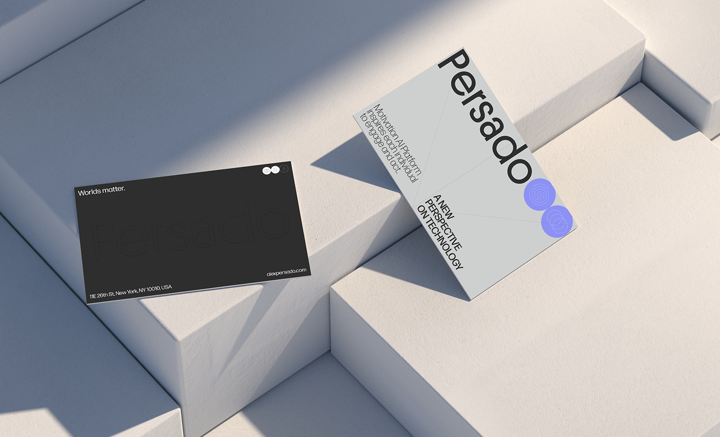
Since the theme of the company is “corporate-technological” and it specializes in new technologies and their re-application, we selected colors in a bright style in order to emphasize the modern approach of the company. Due to the amount of text on the website it was of the utmost importance for us to make the site more loyal and friendly so we opted for purple and other colors.


Studio: “Sum-O”
Year: 2023
Telegram channel: @summomm
Telegram: @danilaarakelov
— open for works —


