The Brief: To re-brand a well-known brand of your choice.
I chose always a leading brand of sanitary towels I wanted to make the packaging more discreet and nicer to engage with. My solution is for the whole range of pads to be made into colourful discreet boxes.
The boxes open by pulling a ribbon tab that pushes the front of the box open. I thought of a logical way to differentiate the ranges but keeping the packaging consistent at the same time. Each range has its own colour and the intensity of colour tone indicates the pads absorbency. Dots on the front of the box also indicate this more clearly.

New logo - I hand drew the logo based on the ideas of a piece of silk ribbon something delicate and feminine it also kept all the letters joined in the current logo only some of the letters are joined making the logo look disjointed. The colour of the logo changes to match the colour used for each of the always ranges.

Front of box

Back of box

Box shown open

Base of box - All the required information can be found on the base of each box a image of the product and its features along with the number of pads the box contains and the pads absorbency indicated by a water drop scale.
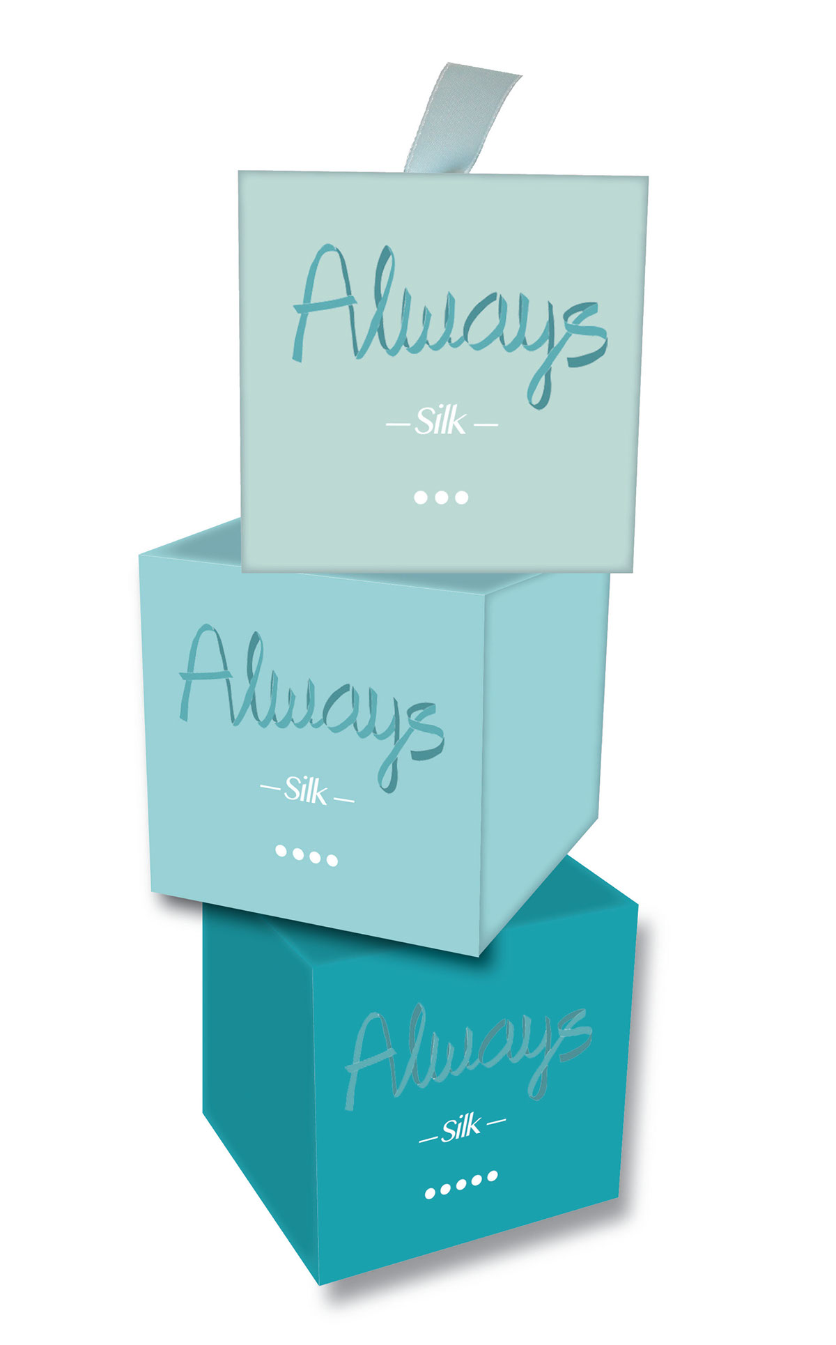
Silk range boxes stacked up
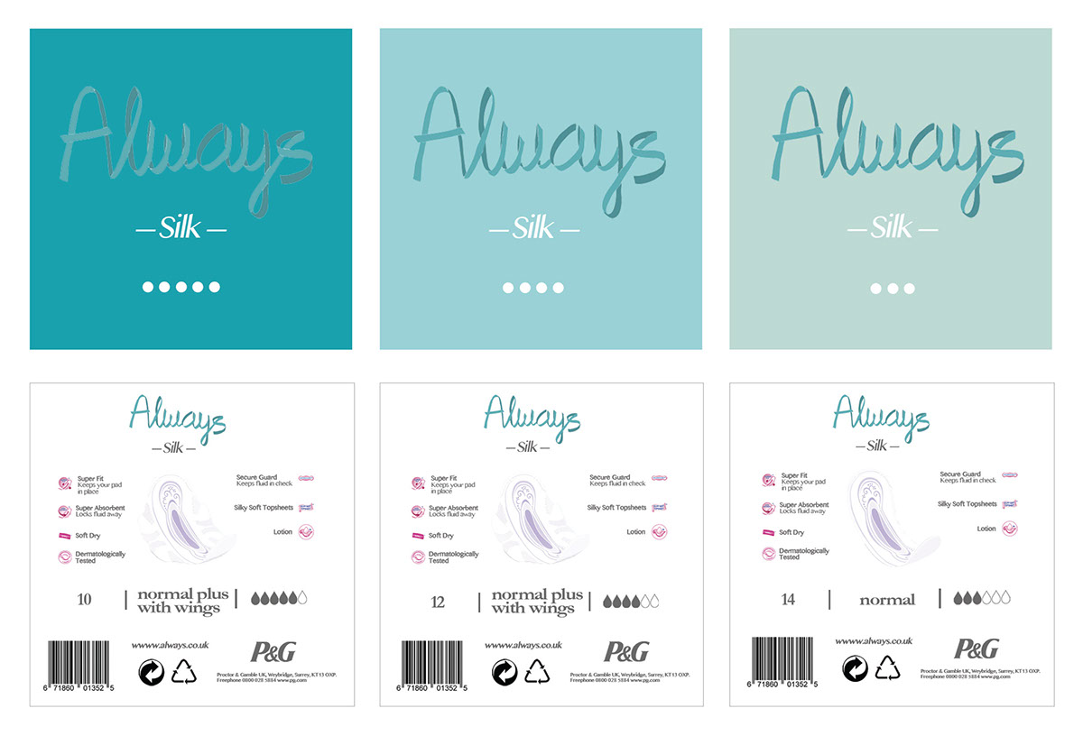
Fronts & bases of the Silk range boxes
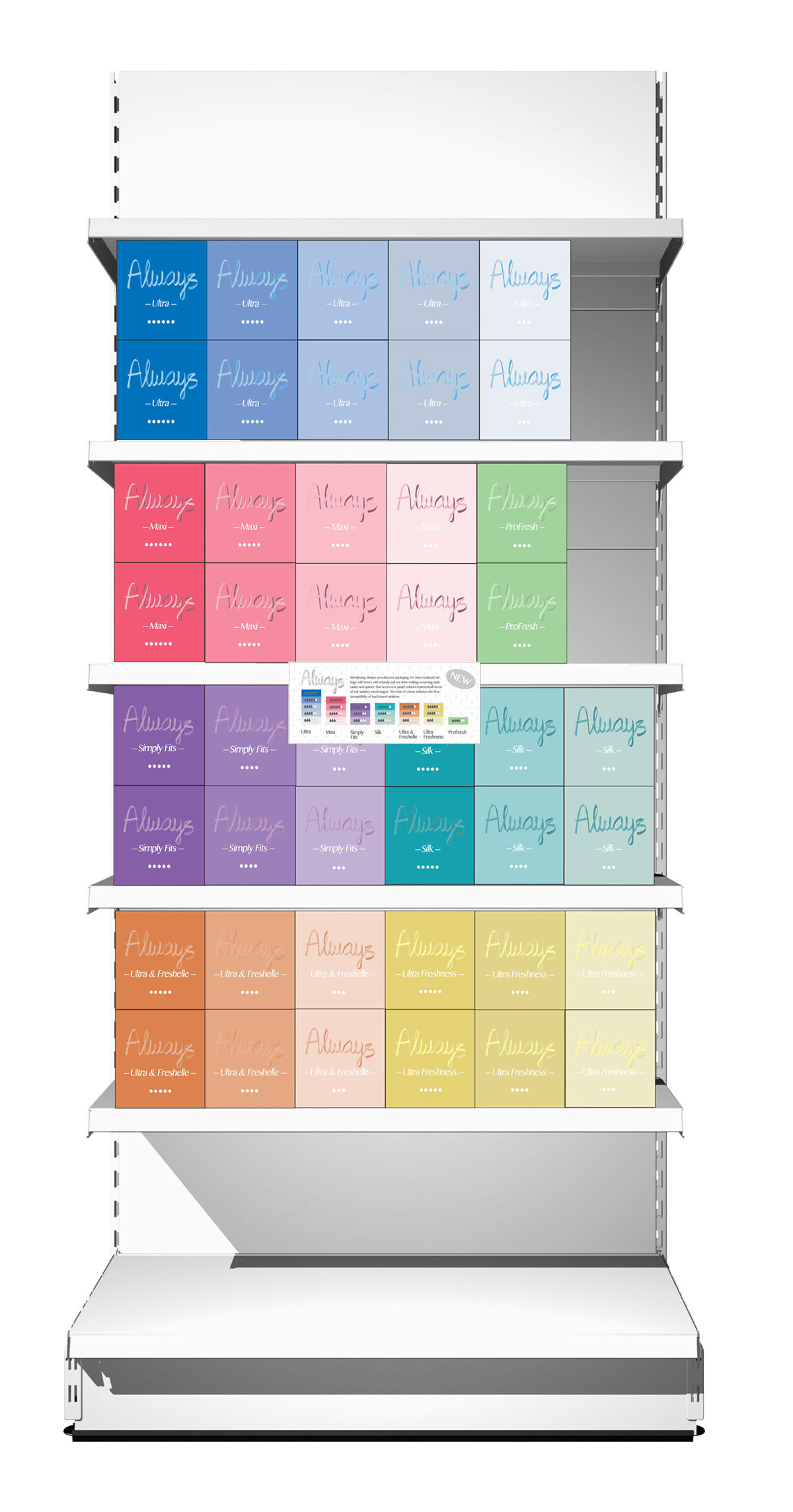
All the always ranges together as they would be seen on shop shelfs

New discreet packaging information card that would be seen in store


