Carretão Auto Peças
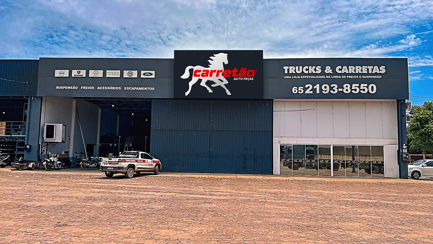
Uma empresa consolidada no mercado, com 25 anos de tradição e mais de 20 mil itens disponíveis para clientes em todo o Brasil. A matriz da empresa está localizada em Maringá - PR e há lojas em Curitiba - PR, Itajaí - SC, Sinop - MT e Várzea Grande - MT.
O projeto de Rebranding modernizou a marca, mantendo sua tradição e essência, mas reformulando sua estética. A construção de toda a estratégia foi feita para evoluir a identidade, deixando-a mais moderna e atrativa, com características e essência mantidas com o máximo de minimalismo possível, proporcionando melhores aplicações em diferentes formatos sem perder a essência.
O logotipo criado em 1998 trazia o desenho gráfico de um cavalo, reconhecido no mercado com quase 25 anos e acabou se tornando um símbolo forte, uma forma da empresa ser chamada “cavalo”, uma gíria que os brasileiros usam para se referir a “carretas”. A tipografia usada era comum na época em que foi criada: compacta e pesada, também havia um desenho de uma estrada ao lado do descritivo que disputava a atenção do leitor.
Com tantos detalhes juntos, havia um desequilíbrio estético e um certo desconforto de leitura. Agora, a empresa possui duas versões de assinatura: uma totalmente tipográfica, o logotipo principal, que traz o detalhe da “estrada” em sua letra inicial “C”, e outra assinatura, o isologo, com o desenho do cavalo moderno e a tipografia em outra versão sem o detalhe da estrada na inicial “C”.
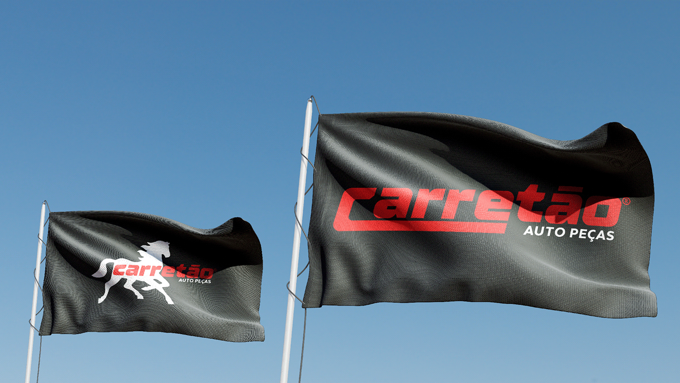
O símbolo do cavalo agora está mais imponente e atrativo, com traços modernos e maior flexibilidade para aplicações em diversos formatos. O novo posicionamento do Carretão destaca a força e grandeza da marca espalhada pelo Brasil, com modernidade, sofisticação e muita credibilidade. Seus produtos são de alta qualidade e total confiança. O cavalo preto transmite credibilidade aos clientes que sempre confiaram na marca, por sua agilidade, resistência e força de vontade em ajudar o próximo.
Carretão - Cavalo Forte
_______________
Carretão Auto Peças
A consolidated company in the market, with 25 years of tradition and more than 20,000 items available to customers throughout Brazil.
The Rebranding project modernized the brand, maintaining its tradition and essence, but reformulating its aesthetics. The construction of the entire strategy was made to evolve the identity, making it more modern and attractive, with characteristics and essence maintained with the maximum possible minimalism, providing better applications in different formats without losing the essence.
The logo created in 1998 featured the graphic design of a horse, recognized in the market for almost 25 years and ended up becoming a strong symbol, a way for the company to be called “cavalo”, a slang that Brazilians use to refer to “carretas”. ”. The typography used was common at the time it was created: compact and heavy, there was also a drawing of a road next to the description that disputed the reader's attention.
With so many details together, there was an aesthetic imbalance and a certain reading discomfort. Now, the company has two signature versions: a fully typographical one, the main logo, which brings the detail of the “road” in its initial letter “C”, and another signature, the isologo, with the design of the modern horse and the typography in another version without the detail of the road in the initial “C”.
The horse symbol is now more imposing and attractive, with modern features and greater flexibility for applications in different formats. The new positioning of Carretão highlights the strength and greatness of the brand spread throughout Brazil, with modernity, sophistication and a lot of credibility. Its products are of high quality and completely reliable. The black horse conveys credibility to customers who have always trusted the brand, for its agility, resistance and willingness to help others.
_______________
Scope ─ Logo Design, Brand Identity, Art Direction, Copywriting
Date ─ Abril 2023
Planner ─ Deividi Oliveira
Creative Director ─ Deividi Oliveira
Graphic Designer ─ Deividi Oliveira
Art Director ─ Deividi Oliveira
Copy ─ Deividi Oliveira
Motion ─ Deividi Oliveira
Studio ─ PresetBrand®
_______________