Café 220° - Shopping experience
The problem:
Buying coffee online creates distrust among buyers, as they are used to buying coffee in physical stores and are guided by the recommendations of other buyers. We need to create a shopping experience that invites regular coffee consumers to make their purchases online.
The goal:
Design a shopping experience for a coffee shop in Mexico City with an emphasis on buyer reviews and ratings to assist in the purchase decision of new buyers
UNDERSTANDING THE USER
User research
To begin the research, I conducted some interviews and empathy maps to understand the needs of the users, with which it became evident that what they were most interested in when making a decision to buy coffee, they preferred to do so based on recommendations from regular buyers.
With this information, a shopping experience is planned so that users can read the recommendations, opinions and ratings of previous buyers and make the decision to buy coffee in our online store, easily and quickly.
User pain points

User persona
After a series of interviews with several volunteers, who stated that they drink brewed coffee at home on a regular basis, I did some empathy mapping to understand the needs of the users. I identified that they all work, and that several mentioned that in order to buy coffee in a store, they would like to have previous recommendations and opinions and that the purchase process is simple and efficient.
With this information it was decided to make a responsive website with an emphasis on user recommendations and an efficient and pleasant shopping process for users.

User Story
“As a person who works in a government office and with little time to search, I would like to be able to buy coffee from an online store but have recommendations from other consumers to be sure that it is delicious and of excellent quality.”
User Journey Map
The User journey map for Mariana revealed revealed that users like to buy coffee with previous references since they cannot physically taste and smell it. In addition, they would like a recurring purchase option.

Site map

User flow
This is the main user flow for buying a fresh bag of coffee, efficiency is prioritized and the strictly necessary steps are taken. This helps us in understanding ways users can interact with the product, as well as allowing us to see navigation through user goals.

Wireframes
Here are the wireframes where I prioritized the recommendations and opinions from the previous customers. I ensured that the elements that made it to digital wireframes would be well - suited to address user pain points.

Refined wireframes

Usability test
After creating the prototype from low fidelity wireframes, I design a usability test with four tasks. I asked five different participants to complete the tasks in the prototype in hopes of garnering enough feedback to use for my next set of design iterations.

Affinity Mapping
I divided the observations from the usability testing sessions into these categories:

Test results

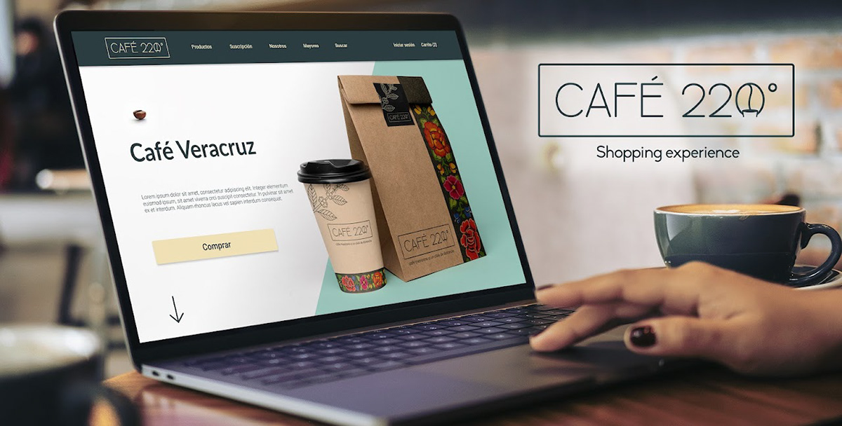
Brand identity
For the image and name of the company, I took the temperature at which coffee acquires its best qualities when roasted, with the oval formed by the zero, I played with the negative space, forming a cup of steaming coffee, which gives it the shape of a coffee bean at the same time.


The color palette refers to the colors found in coffee shops and coffee related establishments, the typefaces are thin and elegant to make a clean image

Mockups


Mobile mockups


PROTOTYPE
In the next section you can try the final prototype for the Café 220° website experience.
Thank you!
