


台積電慈善基金會 Rebranding
Client:台積電慈善基金會
AD/D:海流設計
隨著基金會服務的廣度與深度成長,識別形象應用的範圍也更多元,原有LOGO因色彩繽紛、元素眾多稍嫌零散,在複雜背景底色/縮小至一定程度時都會有辨識困難的問題。
原有LOGO圖案過於細碎、繽紛但不明顯;中文與英文字體搭配及比例不協調;中文標準字有些筆畫特別突出。
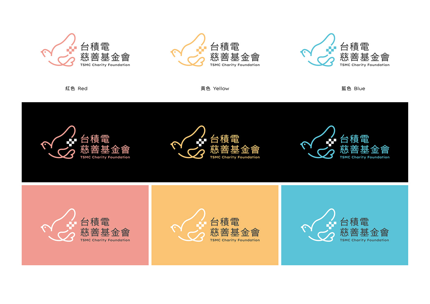
因此在設計上保留原本偏暖色調的方向,並將眾多色彩精簡為三色;除此之外,也將規範「在單色的使用情況」以及「不同背景的使用情況」,以供未來基金會實際運用。原先LOGO包含了「愛心、晶圓、鴿子、四大精神」等元素,但太多重複及零散的分佈;因此我們將保留主要元素,融入新的LOGO設計之中。
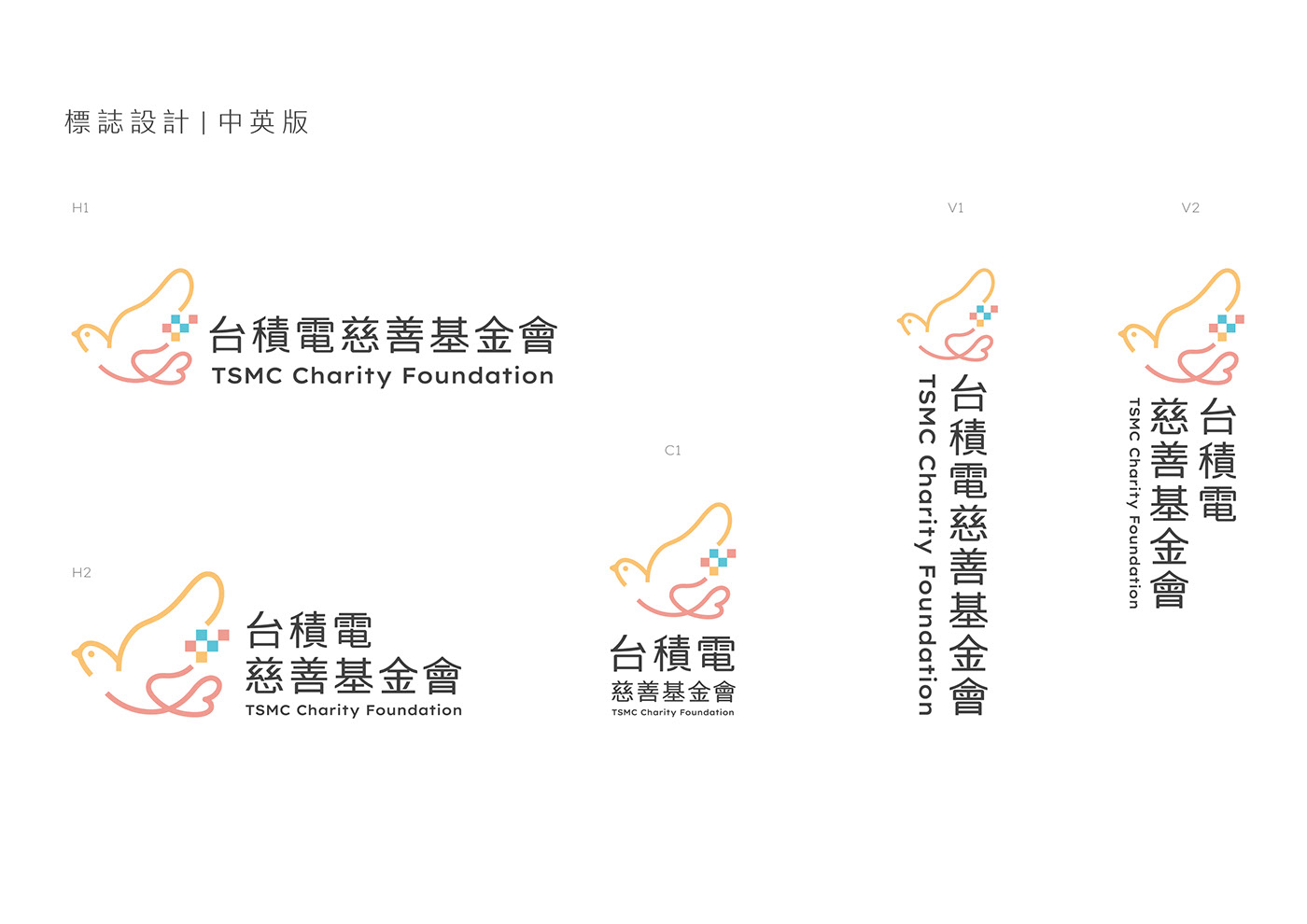
結合溫潤感重新設計的黑體,在筆畫尾端加入圓角的溫和性格呼應基金會性質,保有黑體的通用性,並融入慈善溫暖的結構造型。英文字體選用與中文標準字個性相符的Lexend Exa,造型圓潤俐落兼顧,同時該英文字體也是一個致力於解決文字閱讀更加容易的開源字體,可供未來基金會任何使用場合。
標誌以鴿子為主體,尾端結合愛心造型,傳達「公益行善」的直觀印象, 以三色線段交接標誌,像是讓愛不斷循環接棒下去, 而鴿子的翅膀中融入晶圓的造型,象徵台積電慈善基金會的獨特代表。
As the breadth and depth of foundation services grew, the scope of identity applications also became more diverse. The original logo, with its colorful and complex elements, was somewhat scattered and difficult to identify when placed on a complex background or scaled down to a certain degree.
The original logo design was too intricate and colorful without being distinctive enough. The combination and proportions of Chinese and English fonts were not harmonious, and some of the strokes of the Chinese standard characters were particularly prominent.
Therefore, in the design, we kept the original warm color direction and reduced the numerous colors to three. In addition, we also standardized the use of the logo in "monochrome" and "different background" scenarios for the future application of the foundation. The original logo included elements such as "heart, wafer, pigeon, and four major spirits," but there were too many repetitions and scattered distribution. Therefore, we retained the main elements and incorporated them into the new logo design.
The redesigned black body font, combined with a gentle rounded edge at the end of the stroke to echo the foundation's nature, retains the versatility of black body while incorporating a warm and charitable structural design. The English font selected is Lexend Exa, which is compatible with the personality of the Chinese standard font, with a round and neat appearance, and it is also an open-source font dedicated to making text reading easier, available for use in any future foundation scenarios.
The logo is centered around a pigeon, with a heart shape at the end to convey the intuitive impression of "public welfare and doing good." The logo is made up of three-color lines, which seem to allow love to circulate continuously, and the wafer shape is integrated into the wings of the pigeon, symbolizing the unique representation of the TSMC Charity Foundation.


