Port Comfort hotel branding
Development of a name, corporate identity and brand book for an international network of multifunctional apart-hotels.
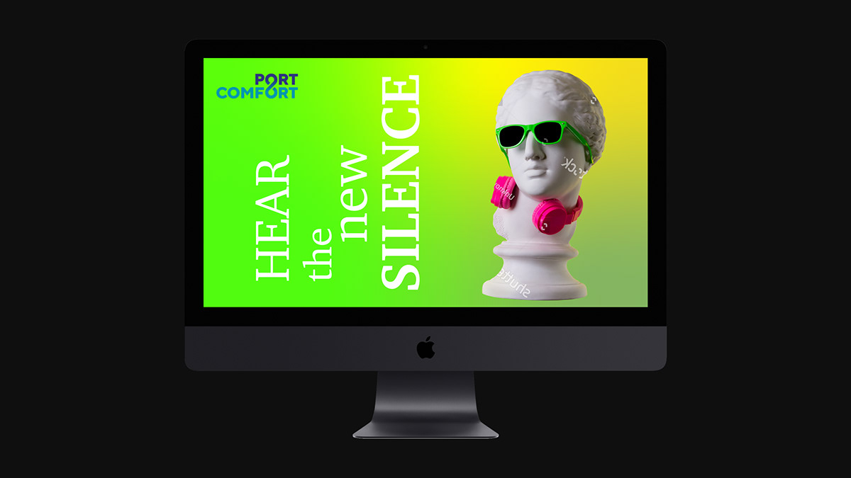
The key message of the name Port Comfort is a catchy combination of words meaning a cozy and peaceful place where everyone can do their business in comfortable conditions. This is a secluded corner in quiet areas of the city for short or long stays.
This is a personal space for work and leisure of purposeful and successful people who value their time. The corporate colors of the company are laconic blue and soft turquoise. The first color promotes concentration on the important and serious, quick decision-making, composure, that is, what is so necessary during work. Turquoise color symbolizes harmony and tranquility.