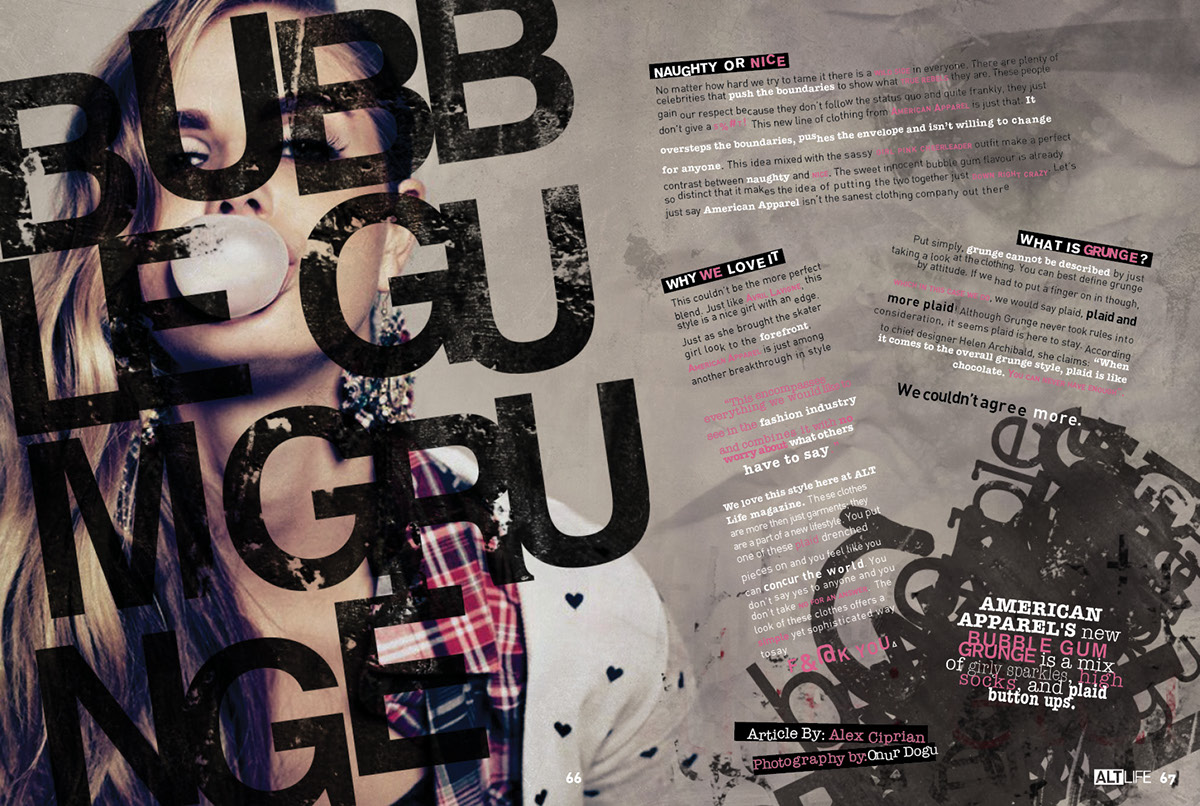


I took the challenge of having to create something using the grunge style and with the subject matter referring to fashion. My concept involved many stages through things such as sunglasses, hats, hair, makeup and eventually ended up with clothes. My article is about a fictitious new line coming out called Bubble Gum Grunge by American Apparel. The idea behind this line is that it mixes a girly girl preppy cheerleader fashion with a hard edge, punk hipster look. This also gives the article a little more flavour because it isn’t just simply about grunge style.
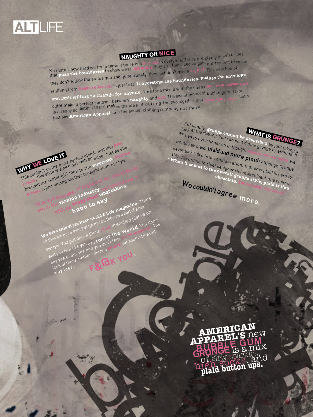
For this style I decided to use a approach similar to the style of David Carson. His grunge design was really popular in the late 90’s and has since made a mark that can be very inspirational in terms of his grunge design style. This influence can be seen in the way the type is treated all as separate parts with a disregard towards the rules of body copy setting. I also decided to go a little crazy with the character styles by bolding and highlighting many key phrases and words. The one thing that keeps all the body together and unites the design is the colour palette. This keeps the design uniform and doesn’t create too many distinct differences that distract your eye. I chose to use pink as a accent colour to make a connection between the bubble gum and grunge look.
The image chosen was a standard image that had that look of rebellion and the “I don’t give a shit” attitude that encompasses what grunge is. She is also dressed in the clothes the line would sell and blowing bubble gum, so those connections are obvious. The image is meant to look a little dated and off register. This sort of pays homage to the grunge style of the 90’s almost as if this picture was taken then. The colours in the image are also cross processed (red highlights, blue shadows). This also gives that throwback feel that is trendy nowadays. The main display type was chosen to further describe the big in your face grunge style. The words are also split up, moved and rearranged to look messy. This supports the connection between the rebellious style of grunge. It also gives more visual weight when looking at the other “messy” type in the bottom right hand corner. This type was created in a David Carson style. Initially this graphic is supposed to be ornate and not to be read but the words/letters used all include the name of the article.


