About
This project involved a rebranding effort for the Coritiba Foot Ball Club. The client sought to update their visual identity to modern times while preserving their longstanding traditions and recognition. Our team of professionals collaborated closely with the client to develop a complete redesign of the club's visual identity, including the logo, typography, color scheme, and other visual elements, to create a fresh and modern look that resonates with both current and new generations of fans. This project required a delicate balance between modern design principles and a respect for the club's heritage. The end result was a successful rebranding that showcases the football team's rich history while positioning them for future growth and success.
Agency: Candyshop
Client: Coritiba Foot Ball Club
Creative Director: Ricardo Mercer
Creative Head: Vinicius Grein
Art Direction: Gabriel Akihiro | Vinicius Grein
Graphic Designer: Gabriel Akihiro
Strategic Planning: Beto Matta
Copywriting: Andrey Soares | Ricardo Mercer


Tradition and Evolution
Tradition in constant evolution. This is what drives football not only nationally, but also internationally. In recent years, major clubs have been investing in more modern, minimalist visual identities. A renewal that brings new air to the club and more belonging to the fans. Especially the younger ones, who are the future of our great "alviverde" nation.
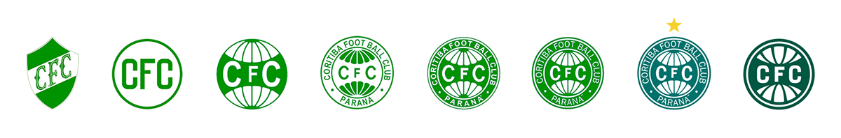
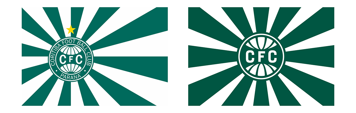
Current Shield
According to Art. 9 of Coritiba's Statute, the club's emblem consists of:
- Circle, symbolizing the globe;
- Rays, referring to the polar ice caps;
- Coritiba Foot Ball Club written in the upper part;
- Paraná at the bottom;
- Initials CFC in the center.
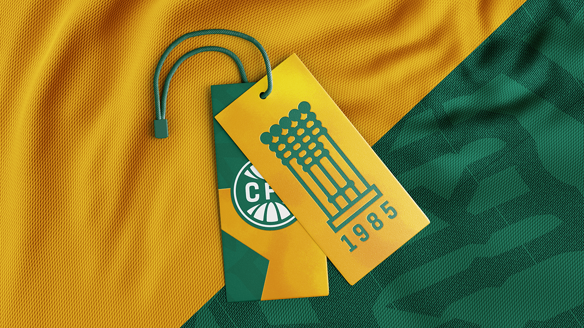
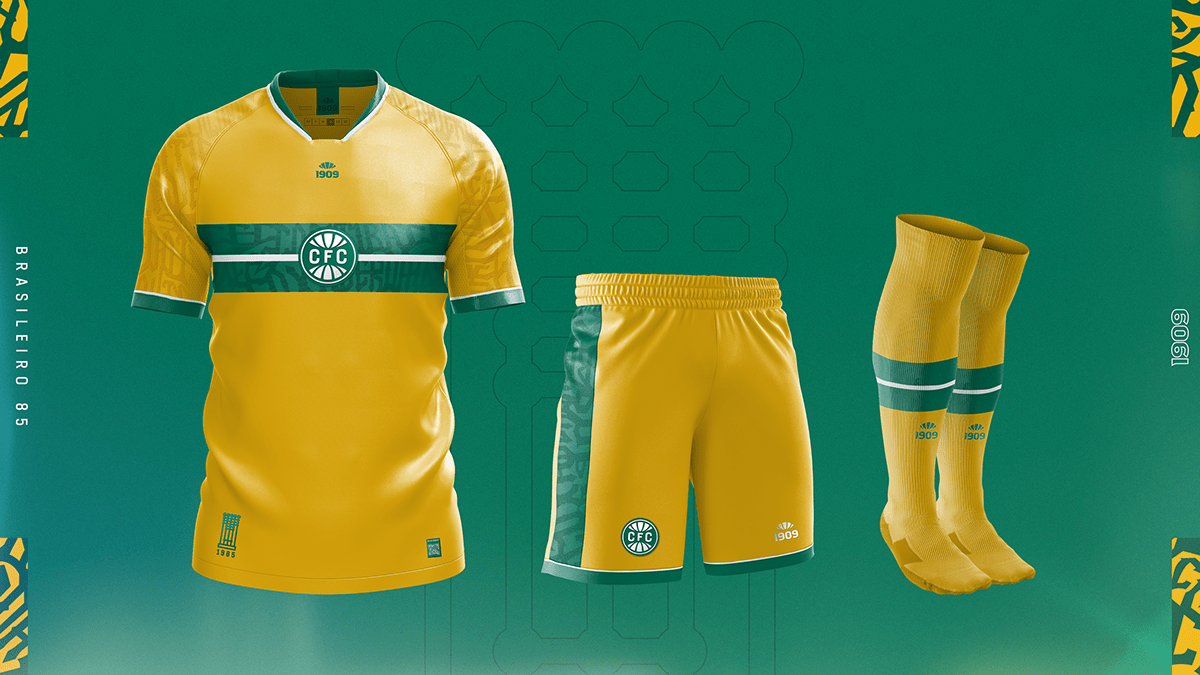
The colors refer to the flag of the state of Paraná and the star symbolizes the 1985 Brazilian Championship.
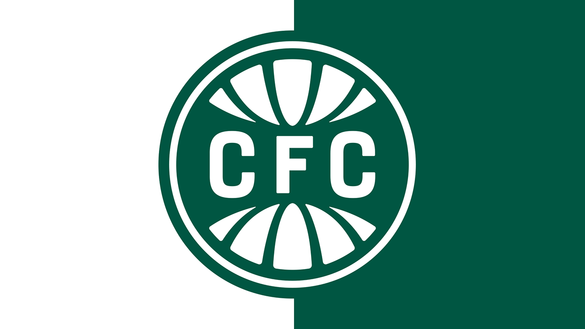
Centennial identity
To keep our essence. Our great mission. Coxa's new shield is inspired on the textual construction of the club's 1st flag, besides the meridians of the 1st version with the globe. Seeking to value our roots, but still evolving and putting Coritiba in its rightful place. On top of the world.
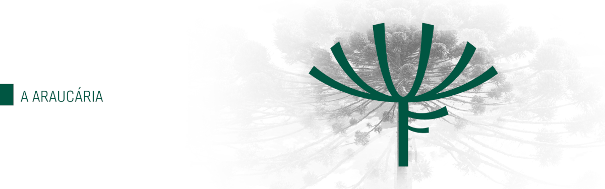
Symbology
Araucária: The Araucária is an icon of Paraná. Majestic and imposing, with its branches arranged in a striped manner, this tree is situated at the top of the new shield.
Pine Nut: The pine nuts symbolize the seeds of love for Coritiba planted by our ancestors in our hearts for generations. The 10 pine nuts represent the month of our Club's foundation.
World: Once the polar ice caps, now the top of the globe. After all, Coritiba's name around the world will shine. Its design is formed by our roots, which developed in the sacred soil of football.

Kur yt yba
From Tupi-Guarani, Kurytyba means "great quantity of pine trees", "a lot of pine nuts",
a meaning that was valued in the new shield.
a meaning that was valued in the new shield.
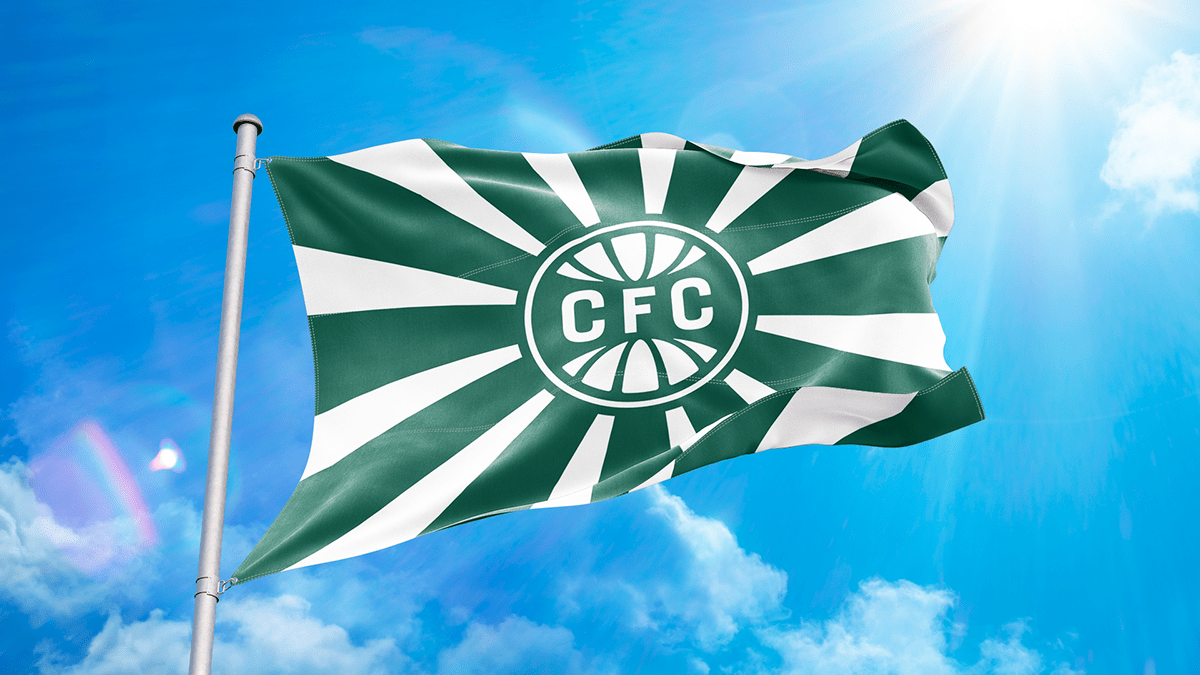
Flag
Our flag will feature 12 rays to represent the club's anniversary day. 12 rays on the flag and 10 pine nuts on the shield together form the full date of our founding. The new shield is also centered to highlight that Coritiba is the center of everything.
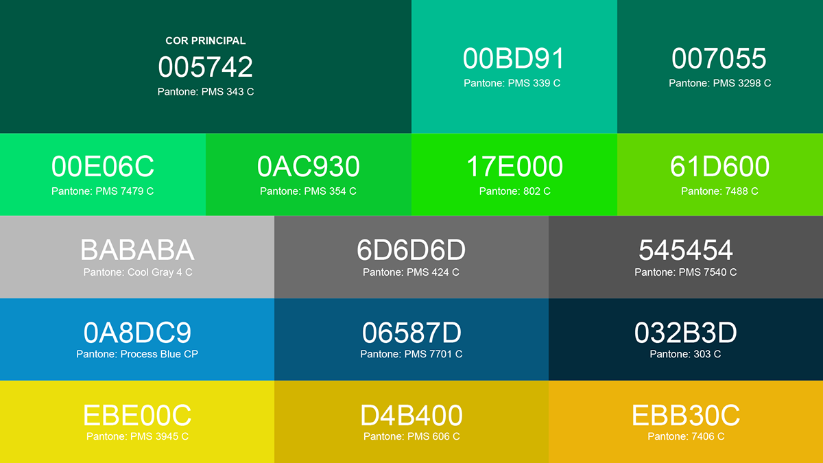
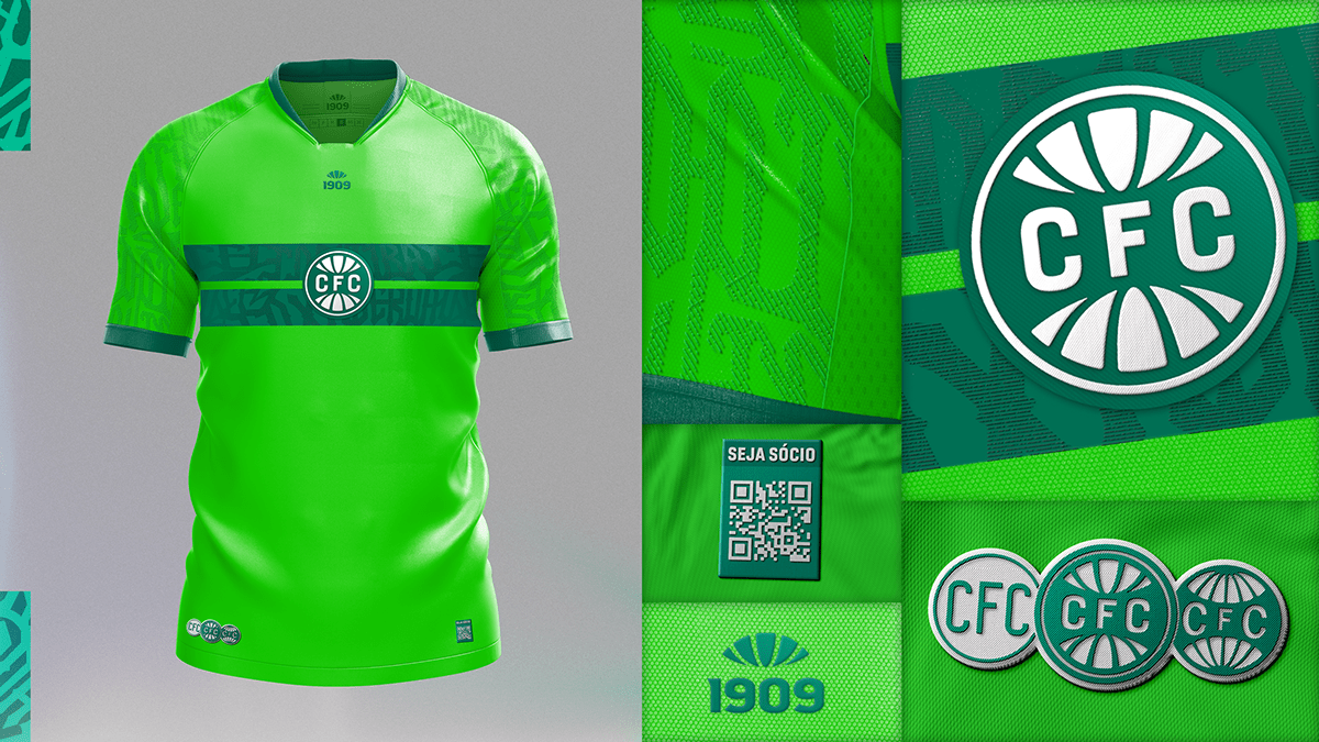
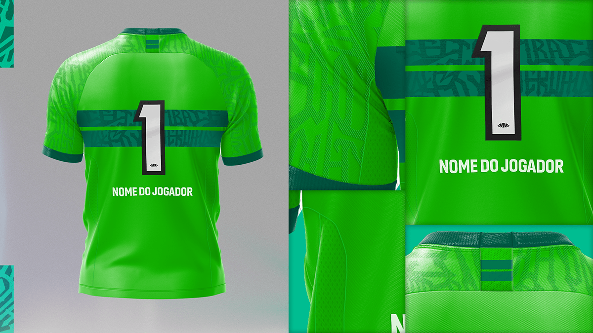
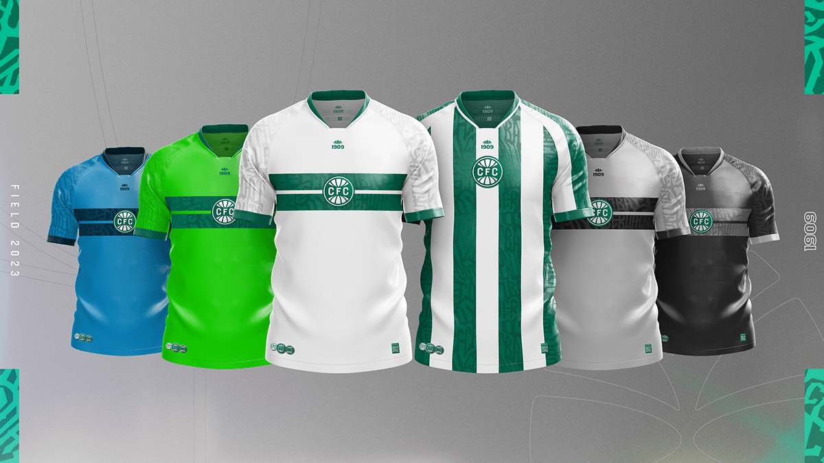
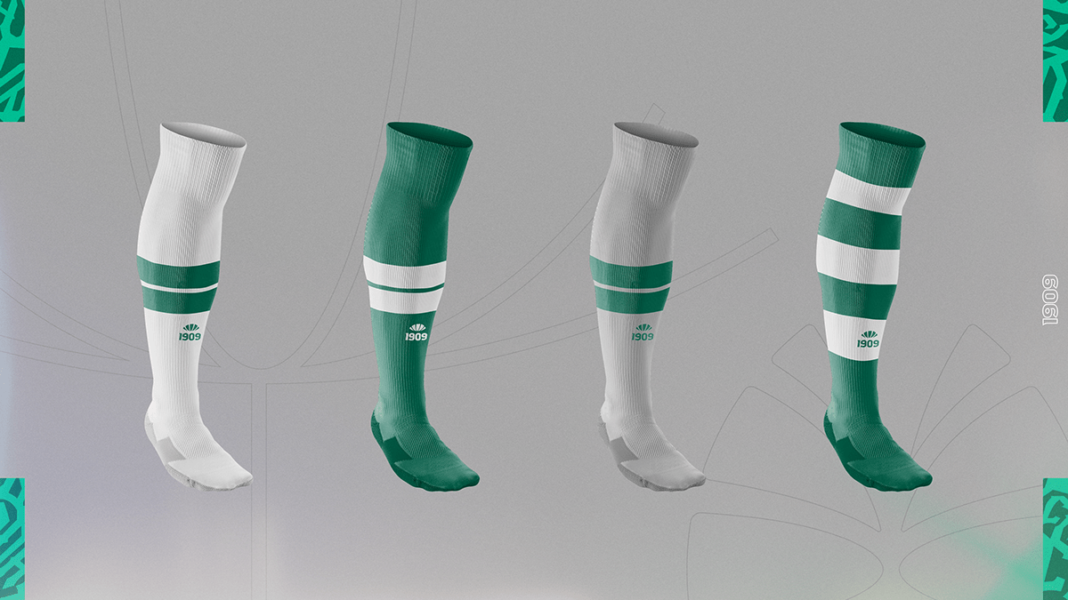
Colors
This new concept seeks to unite tradition and evolution. The color of a club is something very important, so we came up with the ideal color for Coritiba to use in its materials. A green that becomes even greener again. After all, are we or are we not the Verdão do Alto da Glória?

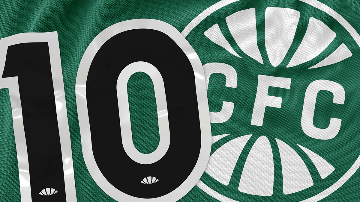
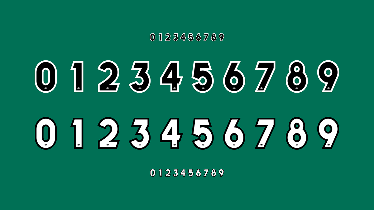
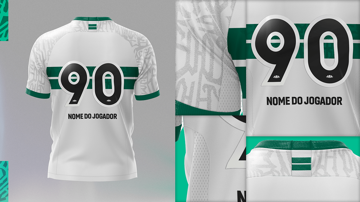
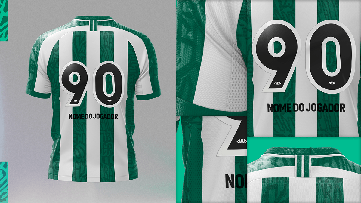
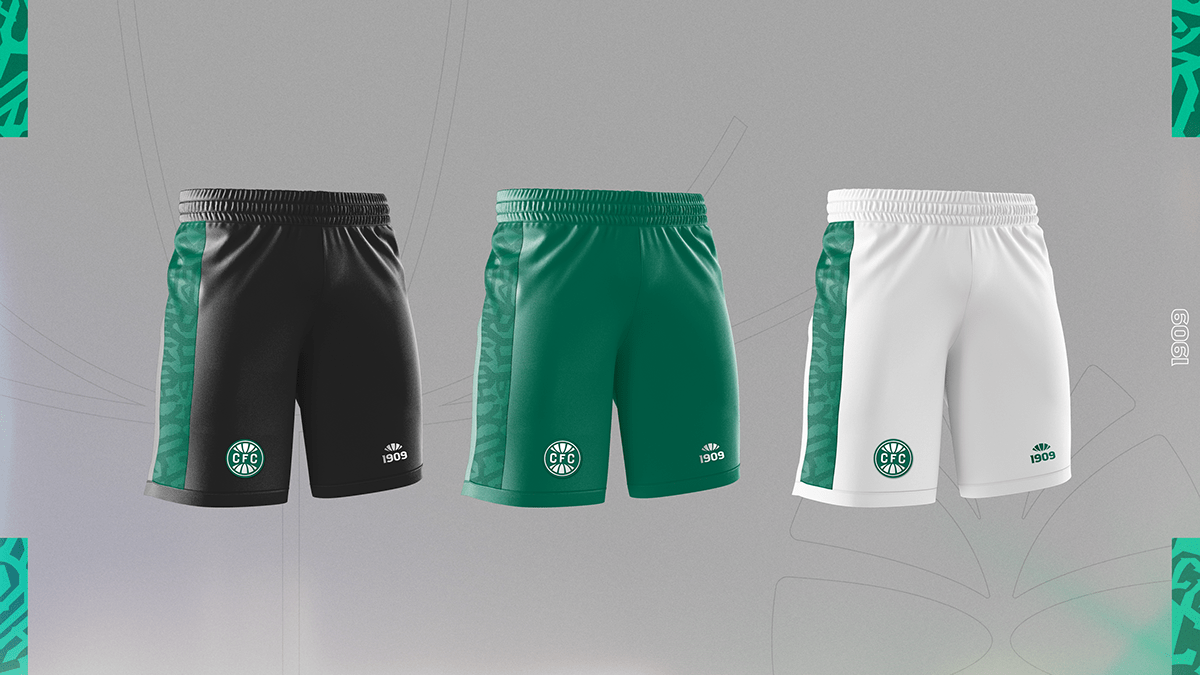
Exclusive and inclusive numbering
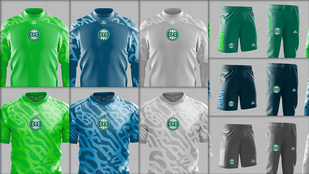
A football game should be accessible for everyone. Considering several typographic characteristics that make it difficult to differentiate the numbers on the shirts, an exclusive font for Coritiba, inspired by fonts from the rebranding of the Braille Institute, was developed with the goal of being as legible as possible for all fans. Even for those who have some type of visual impairment.


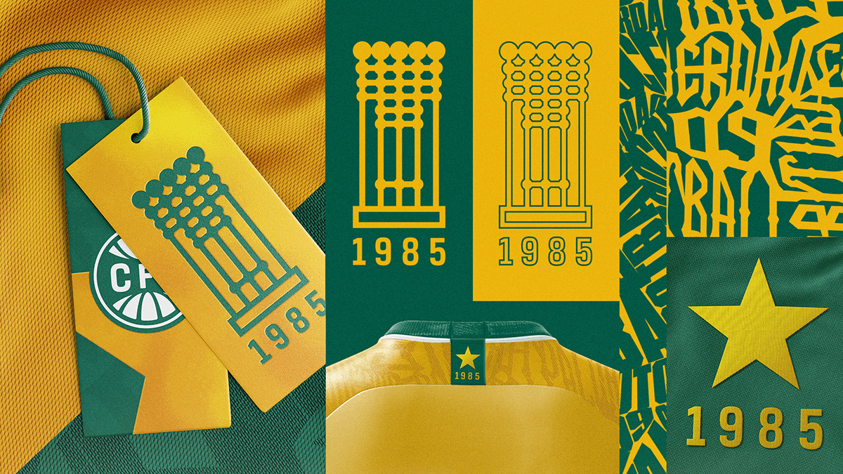
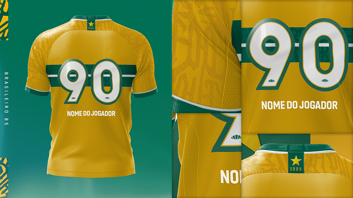
The Star
The 1985 Brazilian Championship was always honored with a star above the shield. We want to look towards a new horizon, therefore, the star will no longer be part of the new shield. However, the gold that represents it will be kept in the club's new color palette in an attempt to illuminate the bright future to come.


Reductions
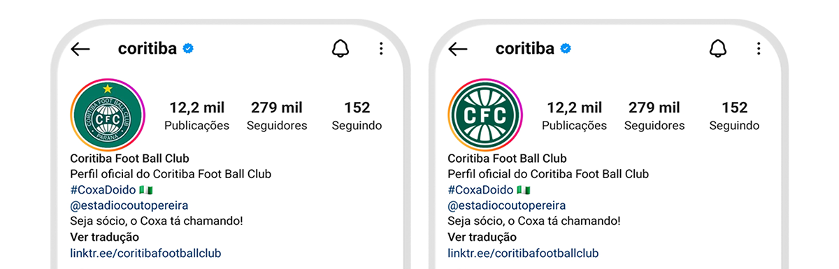
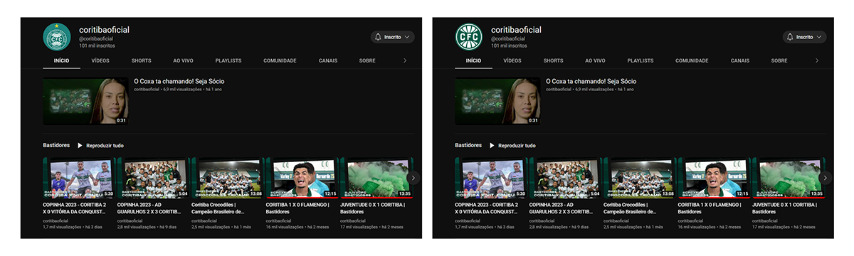
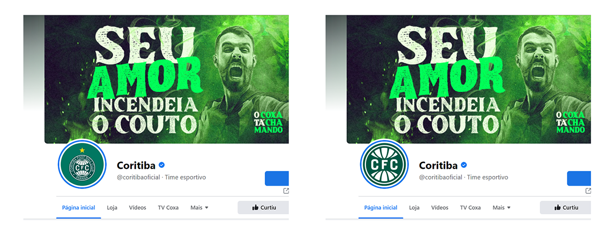
The last version of our shield, created in 1990 in the pre-internet era, did not foresee its application in social networks, the spellings Coritiba Foot Ball Club and Paraná made it difficult to read avatars such as Instagram and Facebook because of its reduction. The star and the writings around the logo make the current shield not gain the necessary presence in the digital environment. The new shield shows not only its effectiveness, but also Coritiba's greatness. The difference is impressive. The new shield also allows for excellent applicability on small materials such as labels, key chains, and stickers.


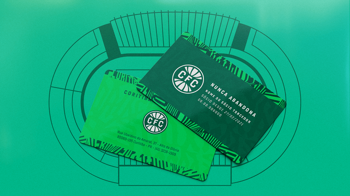
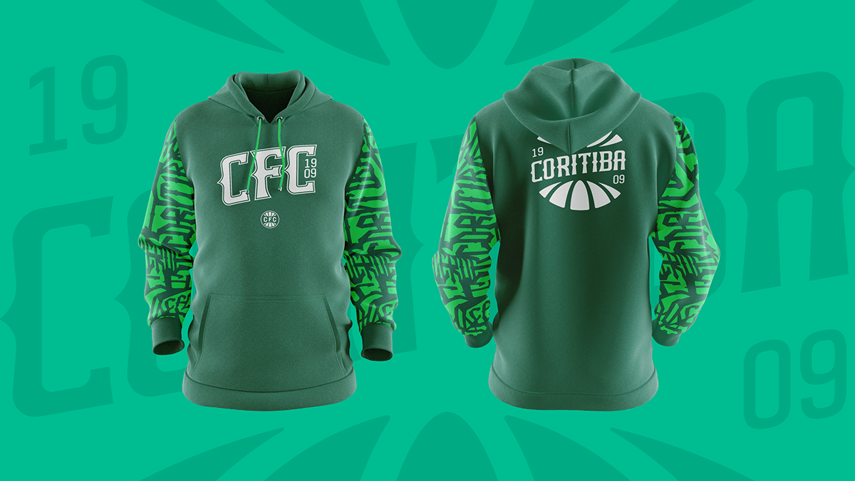
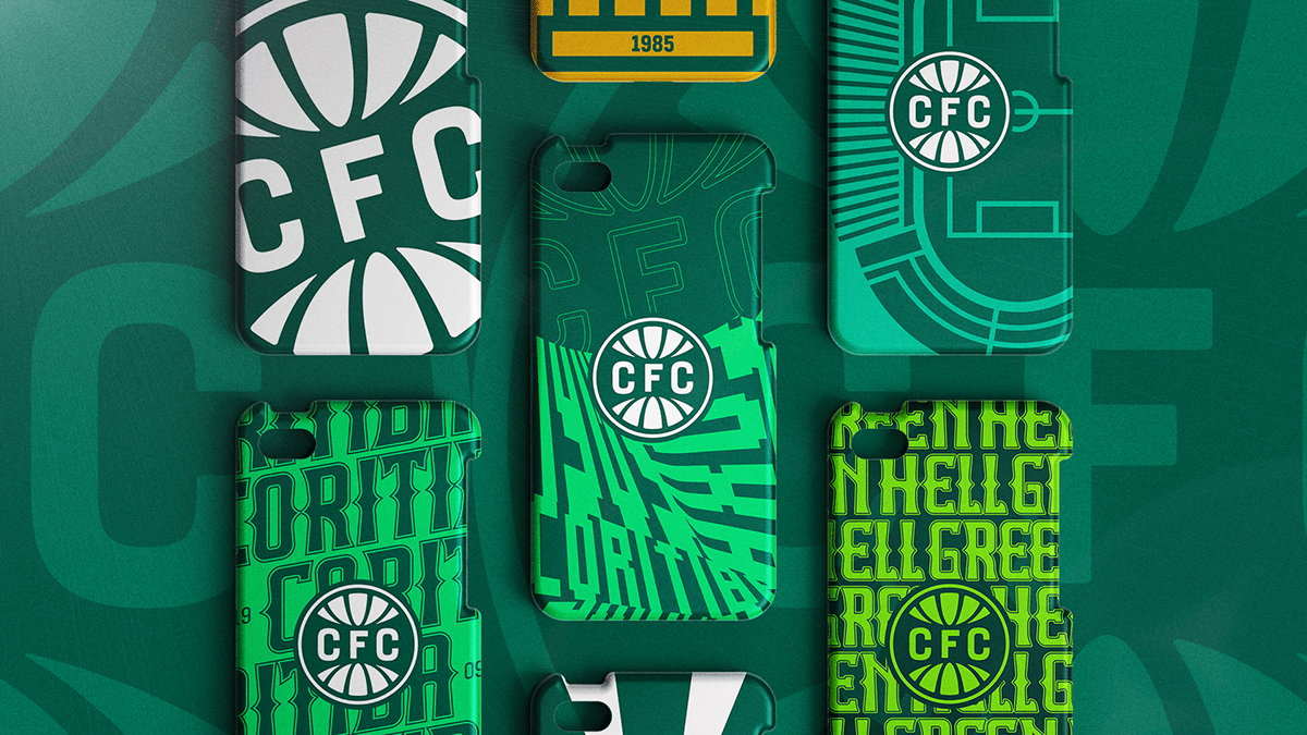
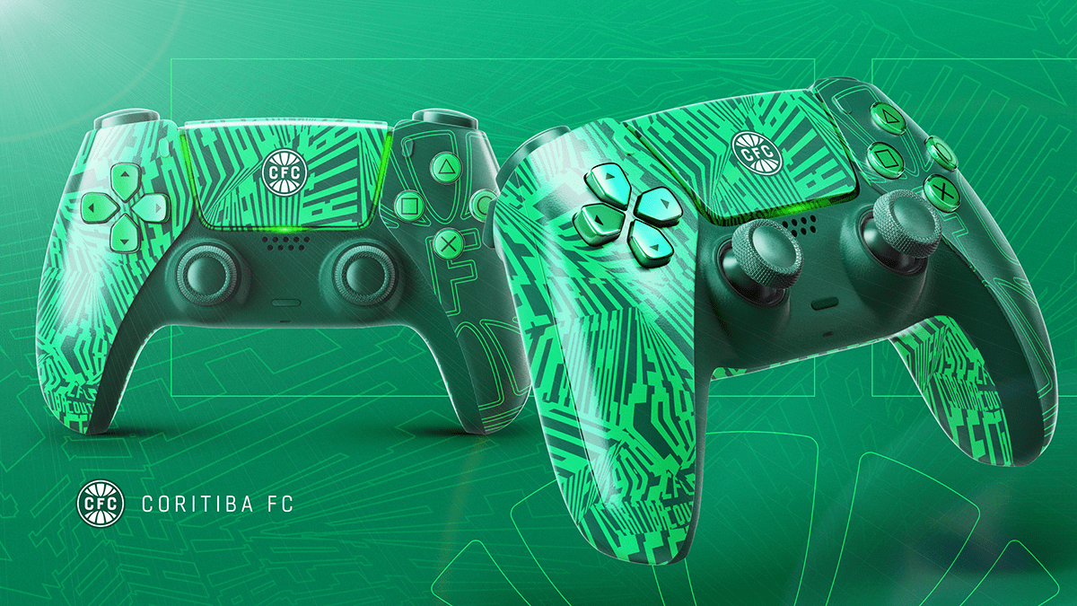
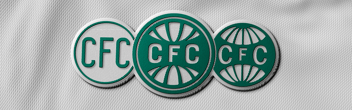
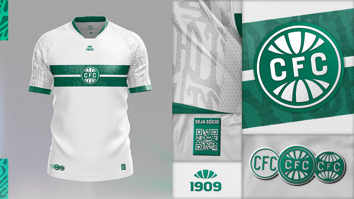
Brand elements
More than just a shield, communication support elements such as fonts, textures, icons, and graphics were also developed.