Personal Branding Identity
Self-Promotion
Self-Promotion
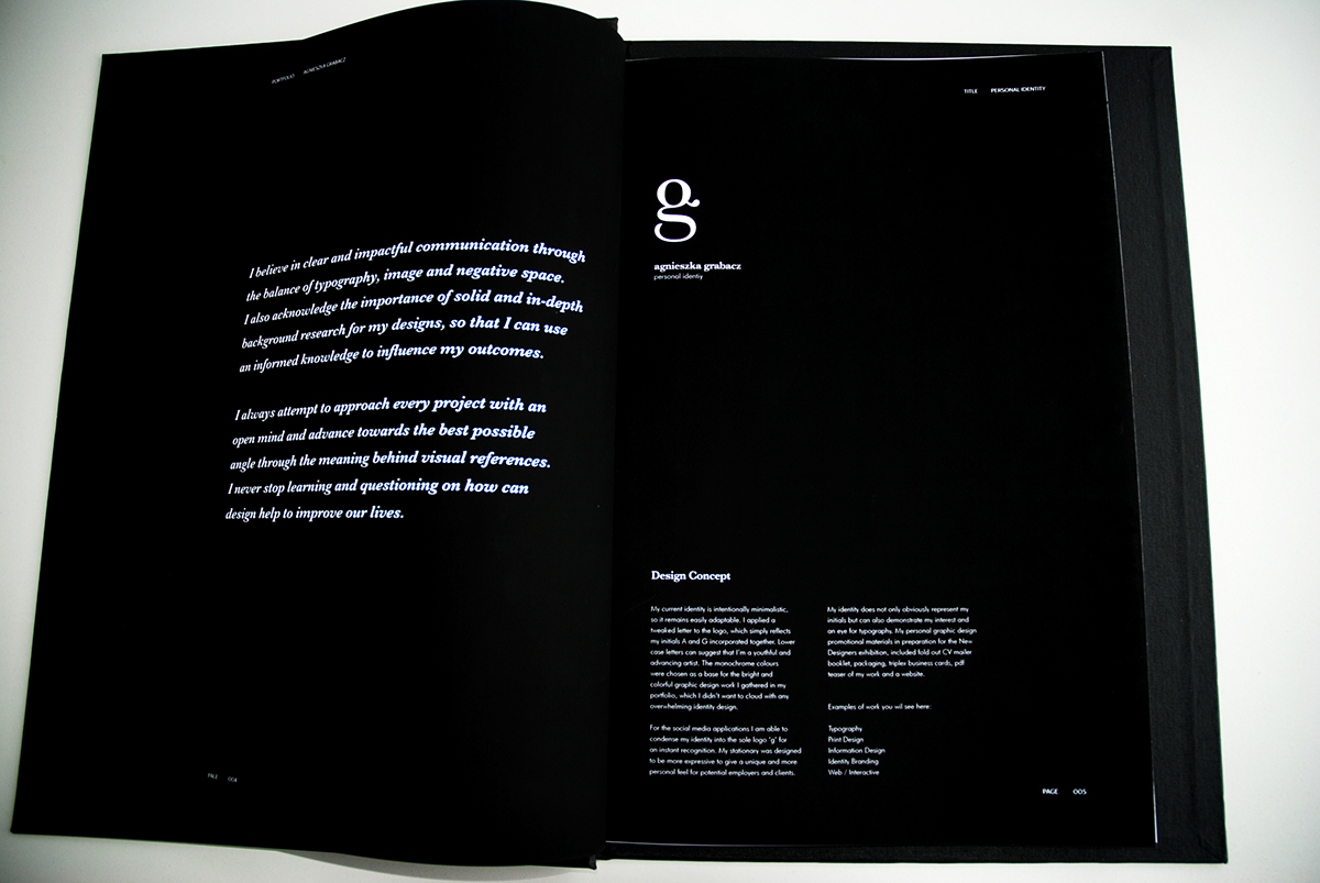
Design Concept
My current identity is intentionally minimalistic, so it remains easily adaptable. I applied a tweaked letter to the logo, which simply reflects my initials A and G incorporated together. Lower case letters can suggest that I'm a youthful and advancing artist. The monochrome colours were chosen as a base for
My current identity is intentionally minimalistic, so it remains easily adaptable. I applied a tweaked letter to the logo, which simply reflects my initials A and G incorporated together. Lower case letters can suggest that I'm a youthful and advancing artist. The monochrome colours were chosen as a base for
the bright and colorful graphic design work I gathered in my portfolio, which I didn't want to cloud with any overwhelming identity design. Furthermore, for the social media applications I am able to condense my identity into the sole logo 'g' for an instant recognition. Whereas, my stationary was designed to be more expressive to give a unique and more personal feel for potential employers and clients. My identity does not only obviously represent my initials but can also demonstrate my interest and an eye for typography. My personal graphic design promotional materials in preparation for the New Designers exhibition, included fold out CV mailer booklet, packaging, triplex business cards, pdf teaser of my work and a website.