Rebranding Adidas?
Man, who do you think you are and what the hell are you talking about!?
This is not a rebranding project. This is just the analysis of the current Adidas brand design, re-thinking the brand marketing, giving a different perspective and a minimal brand design strategy to the brand through visuals, comparisons, designs and mock-ups.
First of all I should tell that I'm a big fan of Adidas. I play soccer and I personally prefer to wear/use Adidas products on the field. I also love Nike, Puma and some of the other sports brands which is normal for a sports fan like me. I think that the design team in Adidas gives a huge effort and makes beautiful products. The graphic design team in Adidas Design Studios also makes beautiful and amazing things and of course gives a big effort during the war against Nike and the other sports brands.
I don't mean to be sniffy or rude but as an Adidas consumer and as a brand designer, with all respect to all designers in Adidas, I think that the Adidas brand is giving too much information to the target groups by using too many visual communication elements (incl. logos and additional graphic elements) in too many different ways. This is a problem which makes the brand not confident and not comfortable at all. The positioning of the brand is in my opinion a bit confusing and it is not as straight as it should be. With this conceptual project I wanted to share my analysis and thoughts and tried to approach the consumer in a minimalistic, straight and more confident way.
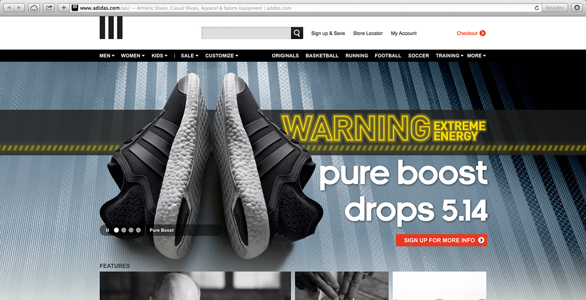
What's the logo of Adidas? Just ask this question to your friend.
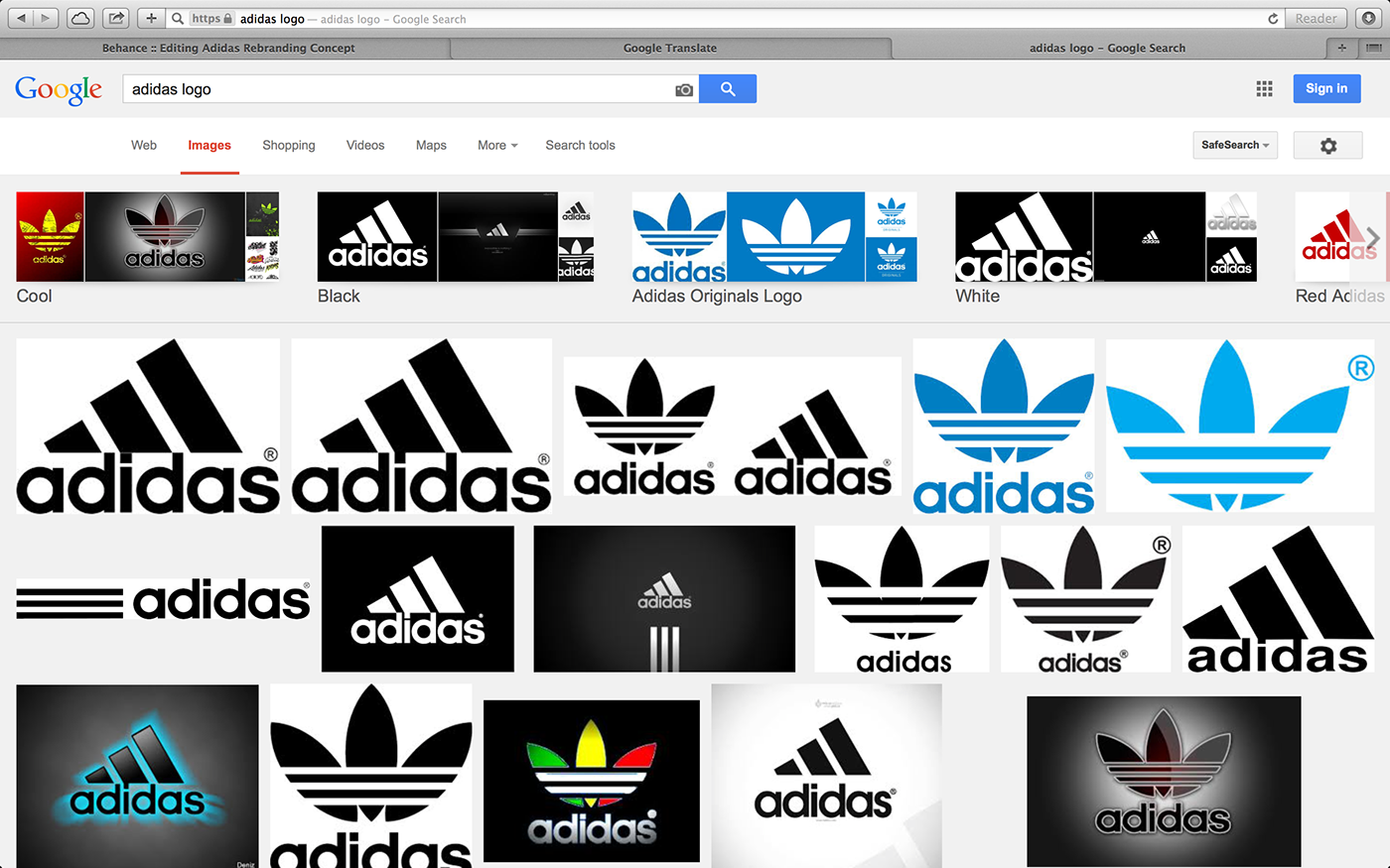
Results of the search query 'adidas logo' in Google. Only one of the image results is the main logo of Adidas.
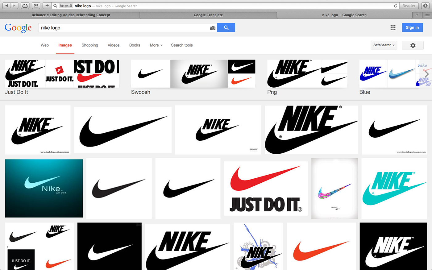
Results of the search query 'nike logo' in Google. Only one image result is not the logo of Nike. The brand symbol is correct though.
Brand Analysis
Brand Name: Adidas AG
Foundation: 1924 as Gebrüder Dassler Schuhfabrik
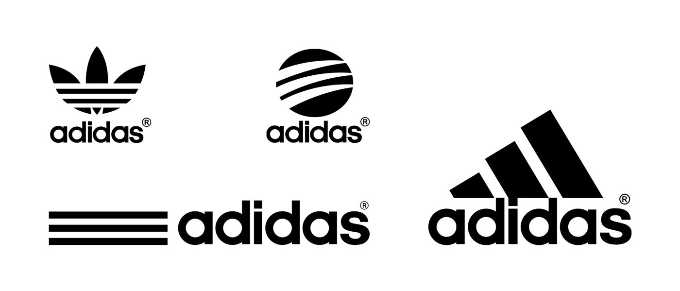
Main Logos:
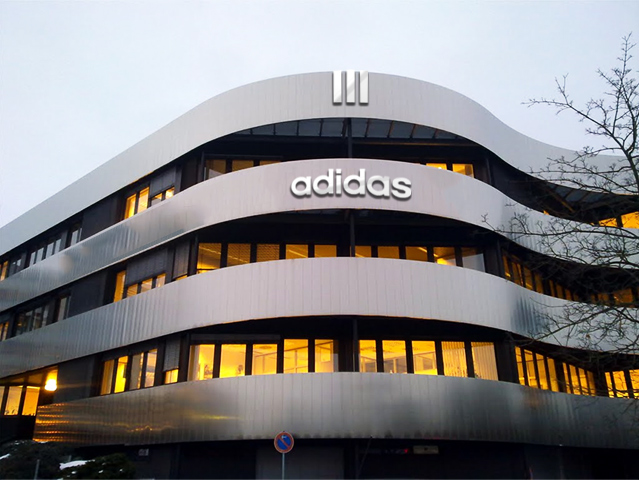
Visual Implementations in Headquarters
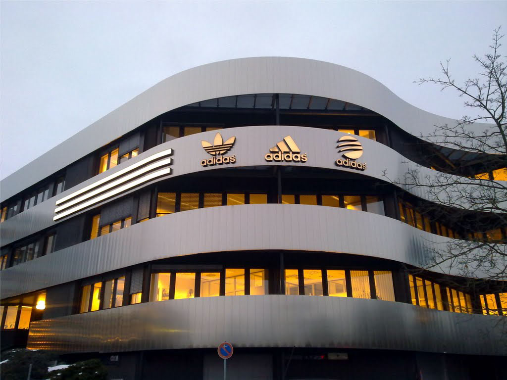
Adidas HQ Herzogenaurach, Germany. Image © SammySambo76 - Panoramio.
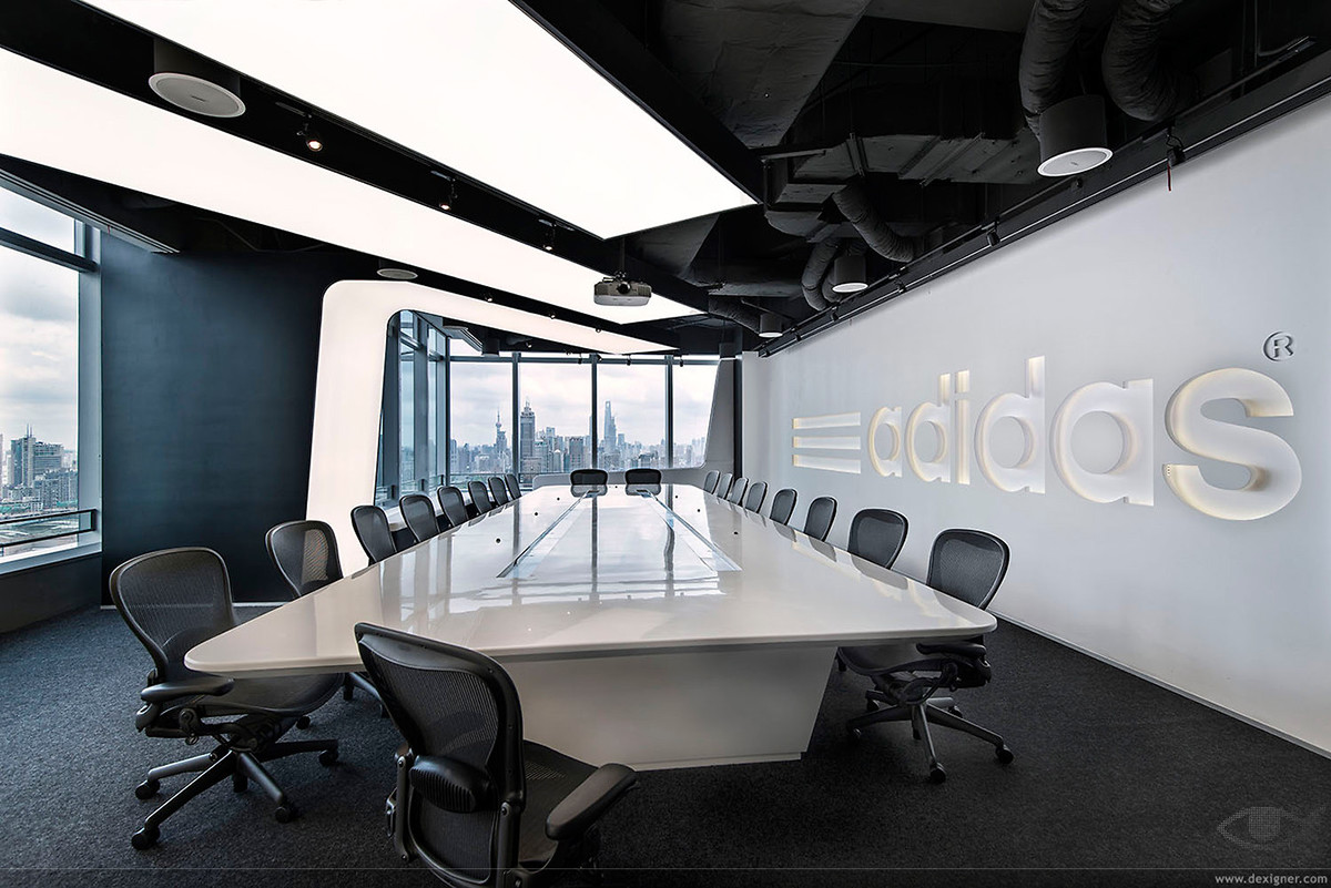
Adidas HQ China. Image © Dexigner.
Adidas Brand Architecture and Global Brands Strategy
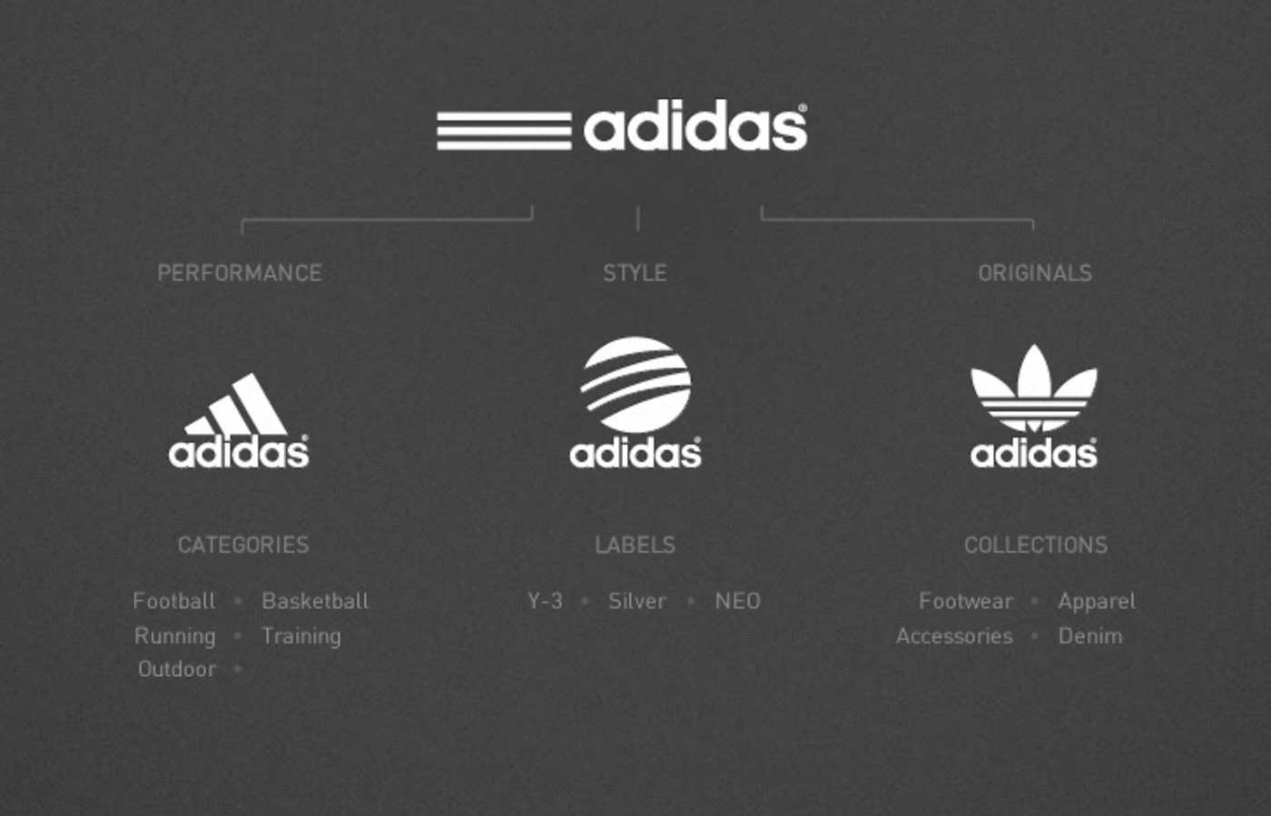
I first analysed the Adidas Group website to understand the strategy behind this complex brand marketing strategy. Here, under the 'Adidas Strategic Positioning' section it says:
"adidas is mainly targeting competitive sports based on innovation and technology with adidas Sport Performance. This sub-brand is the multisport specialist.
...
The sub-brands adidas Originals and adidas Sport Style strive to take the brand’s unique heritage and design leadership to capture further potential in the sports lifestyle and fashion market.
...
As part of our market segmentation strategy and to increase our addressable market to the lifestyle and fashion consumer, several sub-labels under the banner of adidas Sport Style were established To increase our appeal to a younger, more price-conscious generation of lifestyle consumers, the adidas NEO label was established to cater specifically to their needs."

A screenshot from Adidas Group website.
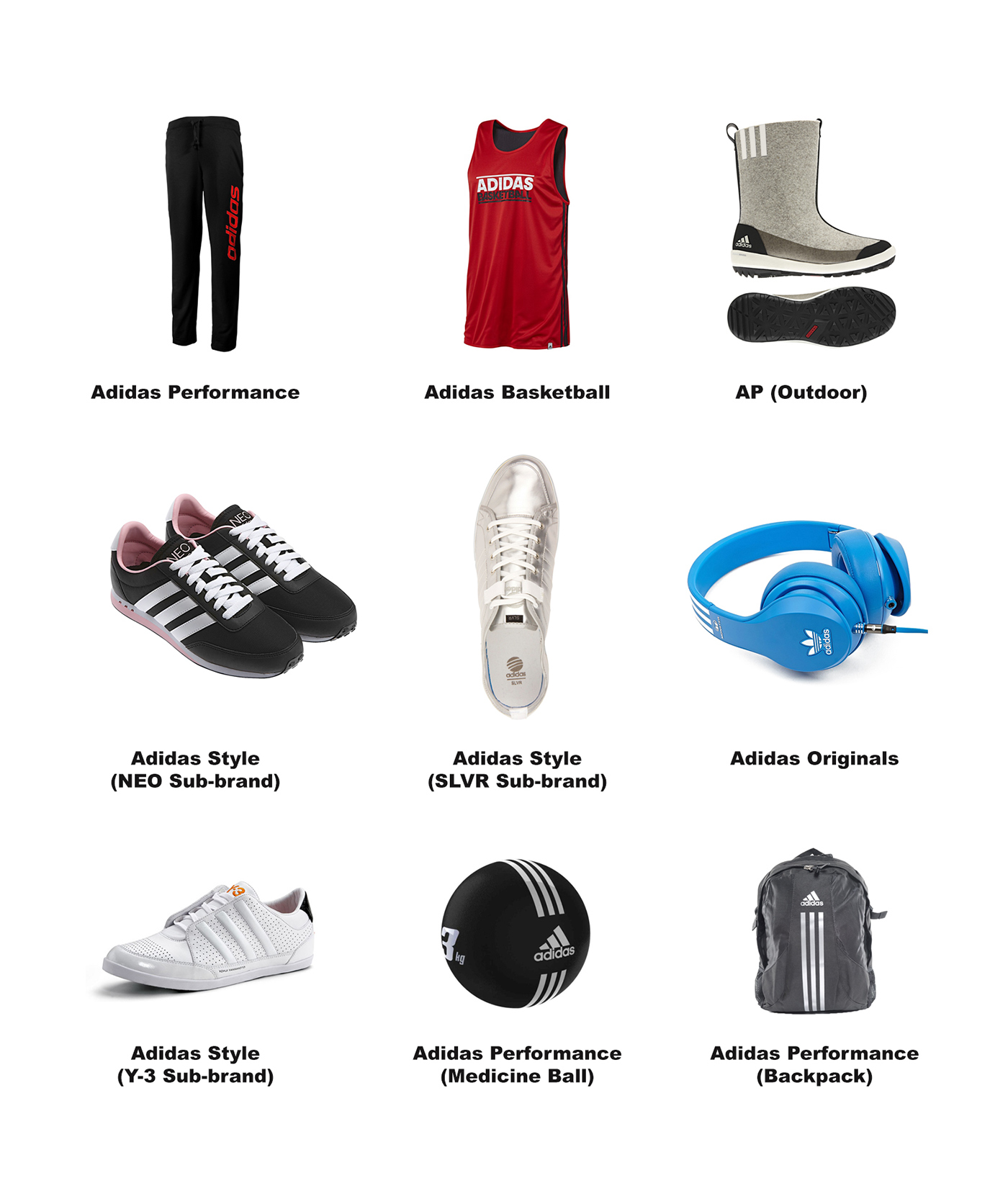
Adidas Brand Achitecture
And let's see how the whole brand architecture excluding the 'superhero-like' collection logos (which is a cool marketing idea btw.) such as Tracy McGrady, Messi, Derrick Rose, Dwight Howard etc.:
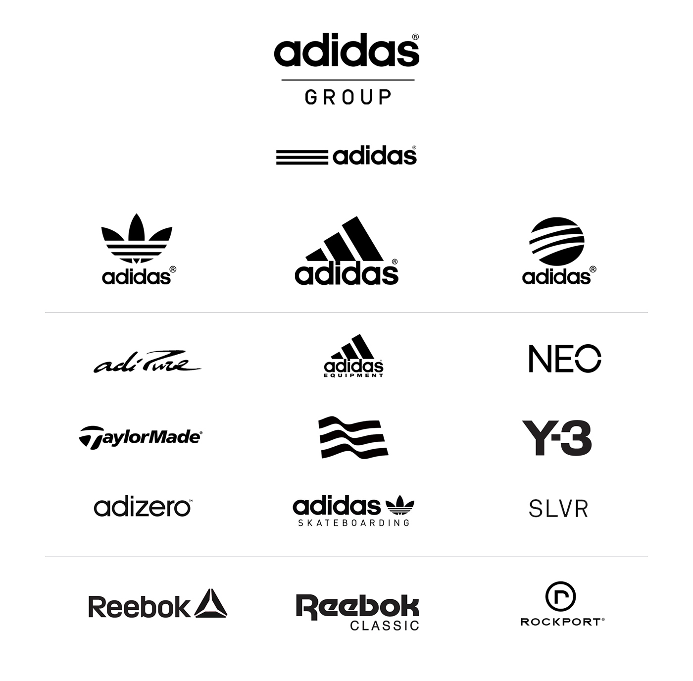
The logos are placed in an irregular manner.
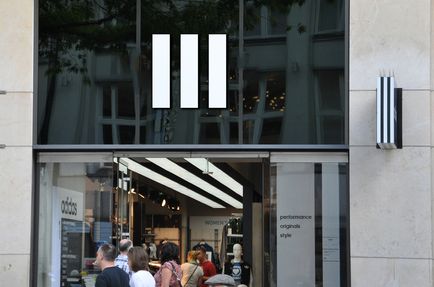
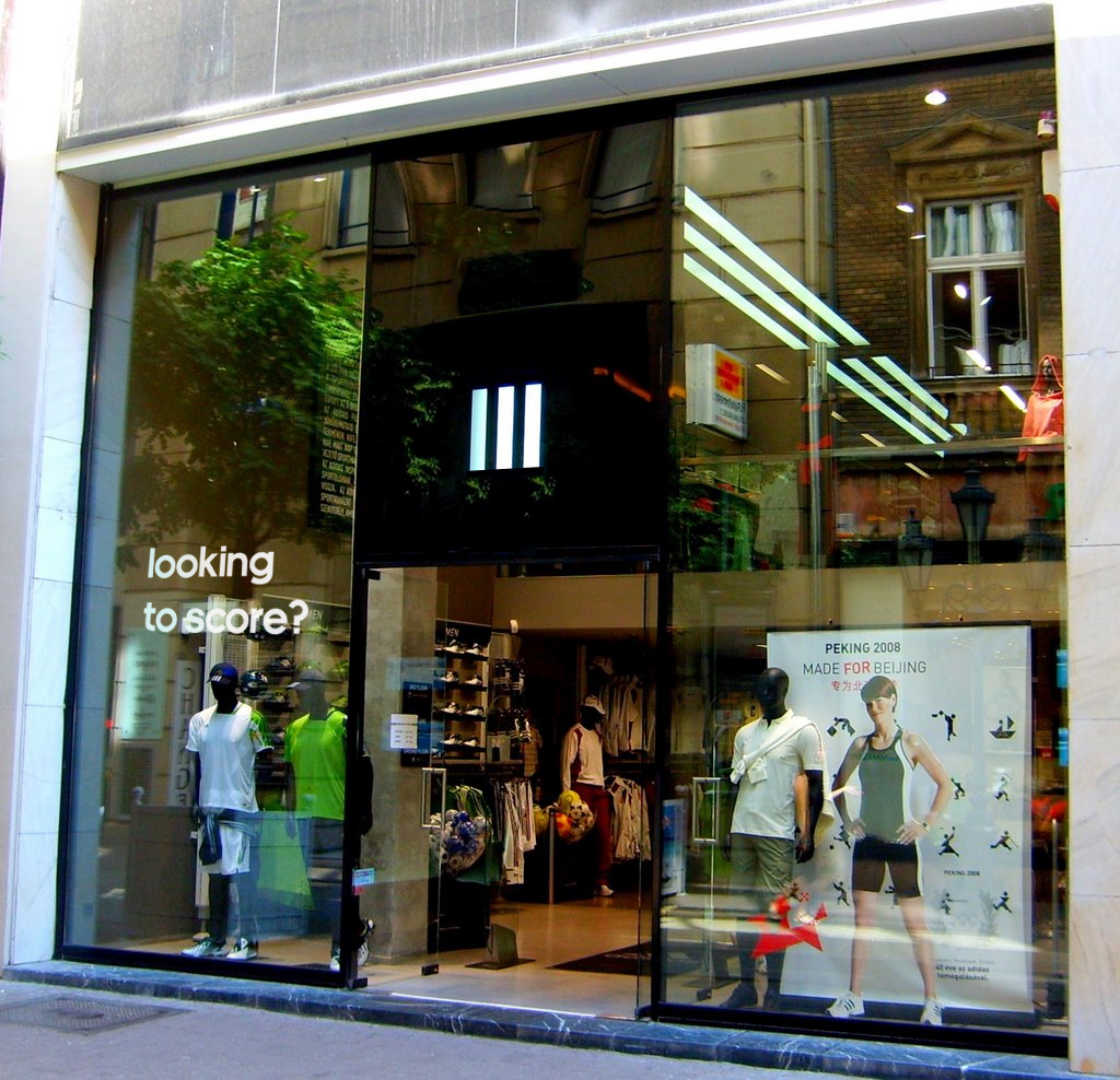
Pictures from the Adidas Stores all around the world:
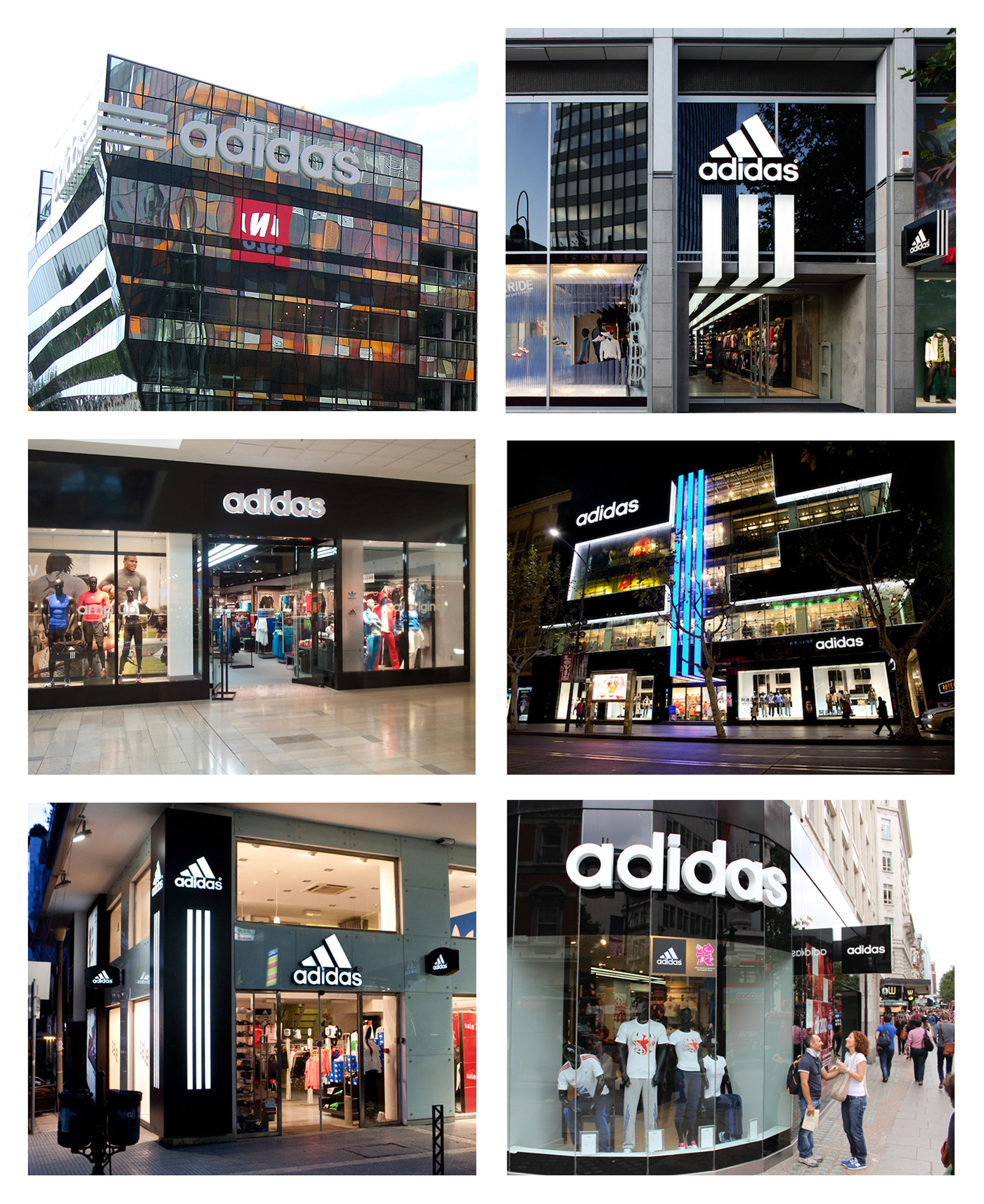
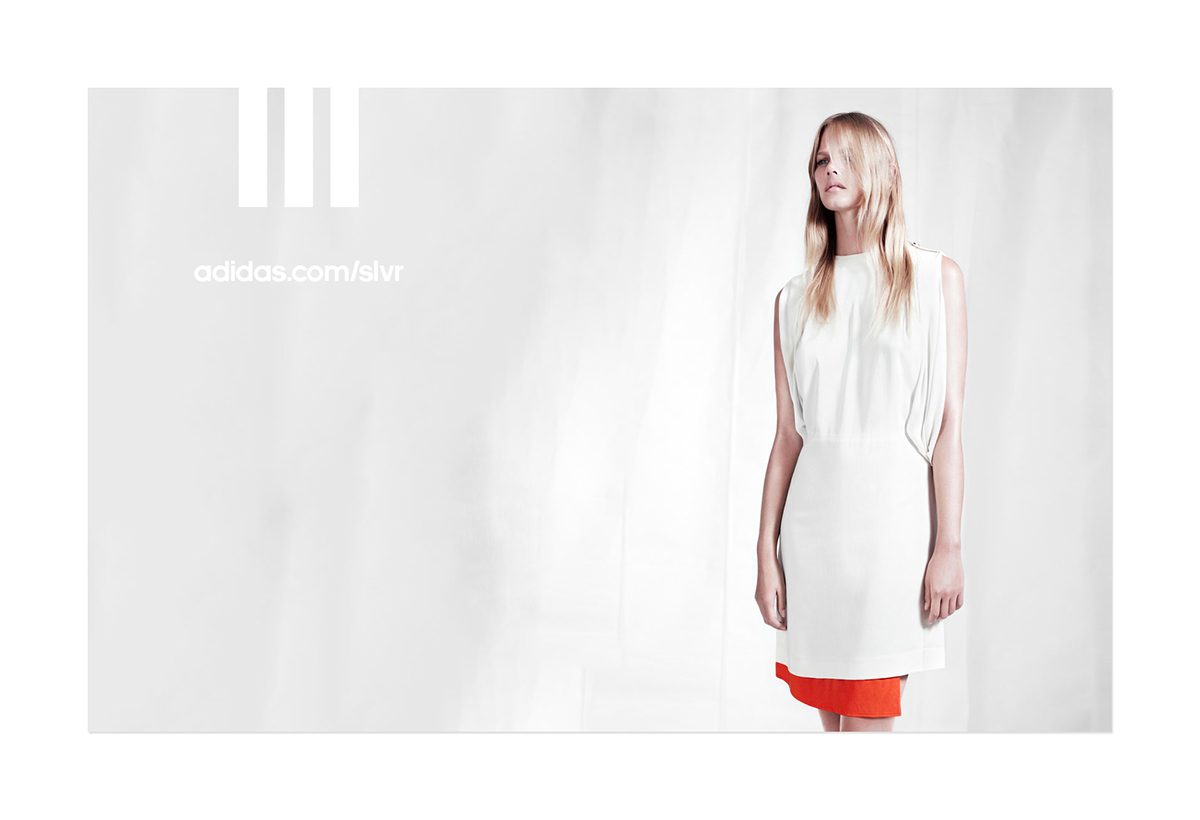
There are also SLVR and Originals stores:

SLVR Store in NY. Image © alphacityguides.com.
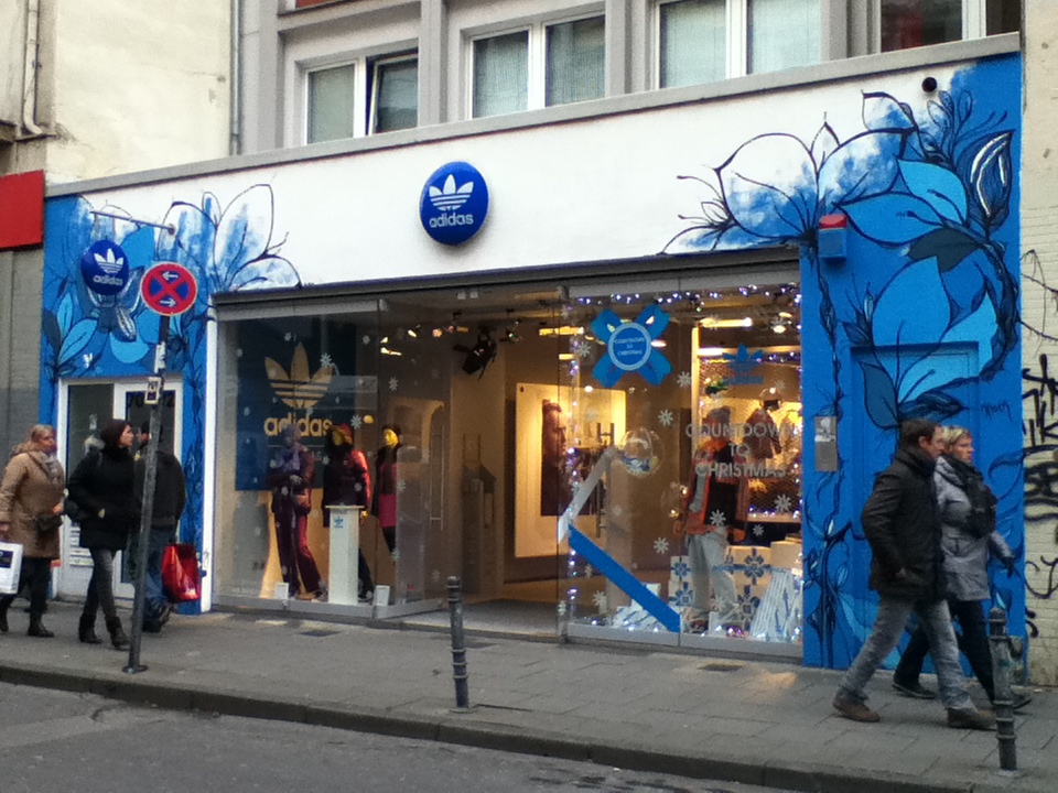
Adidas originals Store in Cologne, Germany. Photo © Lara Möllring.
And there are also store signages which are targeting specific audiences. Like this one:
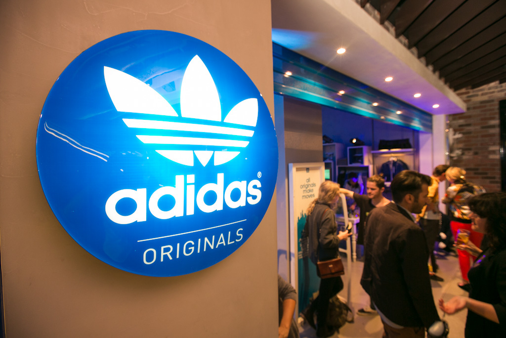
Photo © primomag.com.au.
And there are also Adidas Originals stores which are using only the legendary trefoil logo:
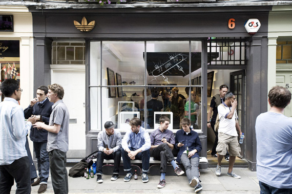
London, Photo © freshnessmag.com.
OK. Let's summarize the visual communication of Adidas stores and HQs.
1. There are three sub-brands and each have their own stores.
2. There are stores which use the Adidas Performance sub-brand logo as their storefront signage and and also sell Adidas Originals products inside the store which actually has another logo.
3. There are stores which sell all of the product lines. Performance, originals, style etc.
4. There are also seperate stores of the sub-brand stores like SLVR and NEO which work under the Adidas STYLE sub-brand.
5. There are three Adidas logos in Germany HQ building as the building signage.
6. There are some stores which use the three horizontal stripes as their stores signage next to the Adidas wordmark —which is the main logo.
7. There are also stores which use the Adidas Performance logo as the main logo of their stores although they sell different products of Adidas sub-brands like Originals, Style etc.
8. There are also stores which use only the Adidas wordmark as their signage.
Isn't it too much for the consumer to understand a brand or to feel something about it? OK. Adidas wants to reach everyone. I understand. And they want to do that as differentiated as they can. But is this the right way to create a brand strategy and reach the consumer? What about the common target audience?
A potential customer should think at least of a powerful 'something' when thinking about a brand, right? Adidas is breaking this important brand voice strategy into 10 different pieces and this complex brand strategy makes a mixed soup of branding strategies.
Result
Complexity makes the brand difficult to understand. And one can't be sure of how they should feel when they think about the 'Adidas Outdoor', 'Adidas Football' or other product labels, after all of those complex information bombardments.
OK this is the store implementation side. And how about the Adidas products? Do they also have too much visual information?
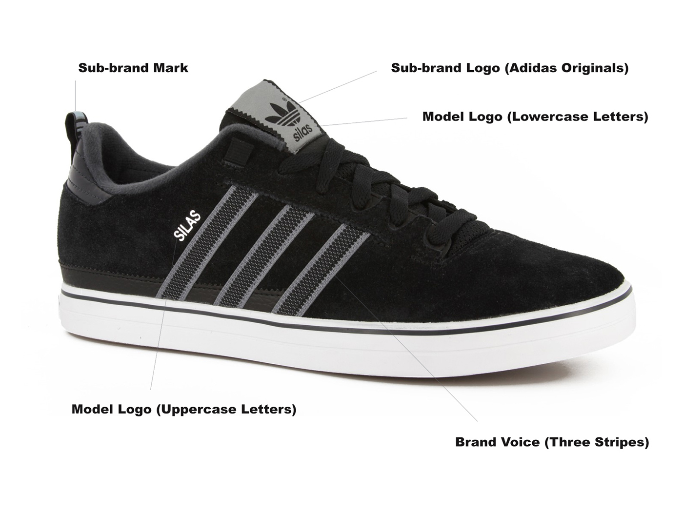
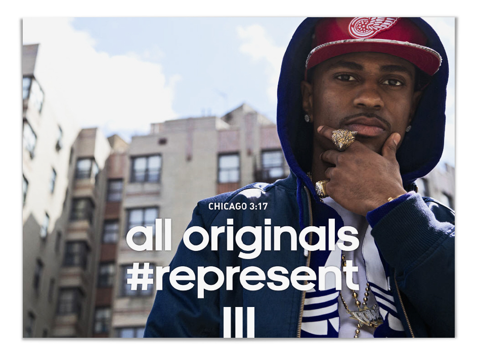
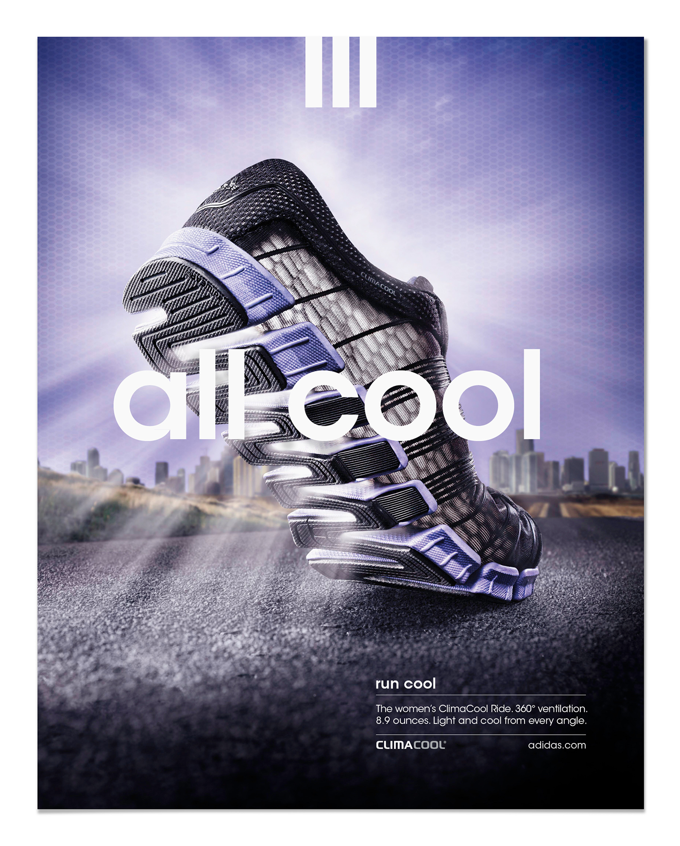
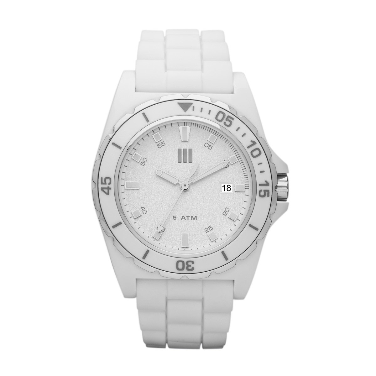
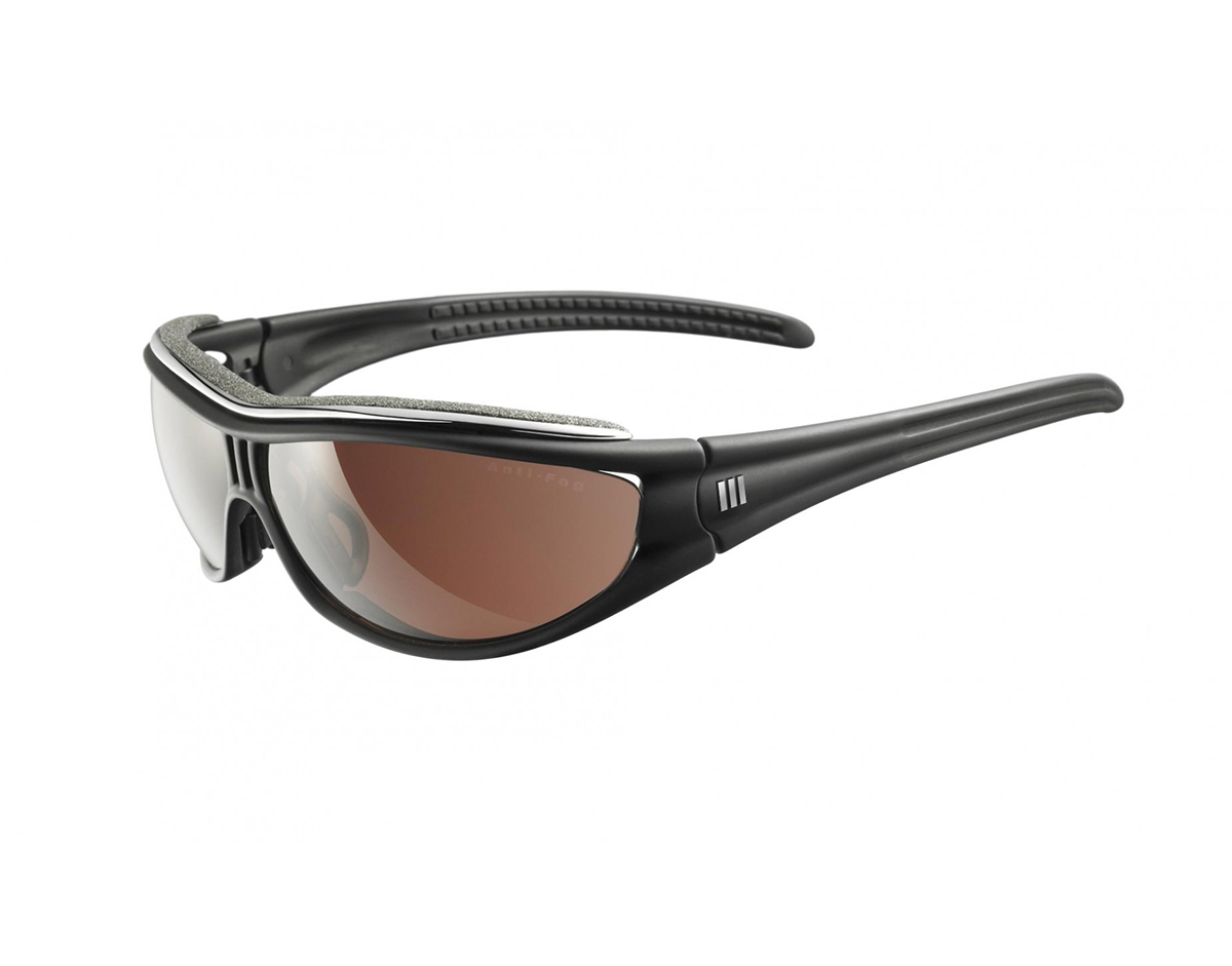
Unfortunately yes. This is a common problem in most of the brands on the market. Some use their logos really big like Polo Ralph Lauren does or some of them use a lot of logos, trademarks, names etc. And I think the main 'giving the consumer a feeling' problem starts right here. There really are lots of overused Adidas logos, collection logos, model names/logos and additional graphic elements on the product implementations. It makes the brand boring and old-fashioned despite some products have really amazing product designs and advertisements, in my opinion. Here are some information bombardment examples from the different product lines.
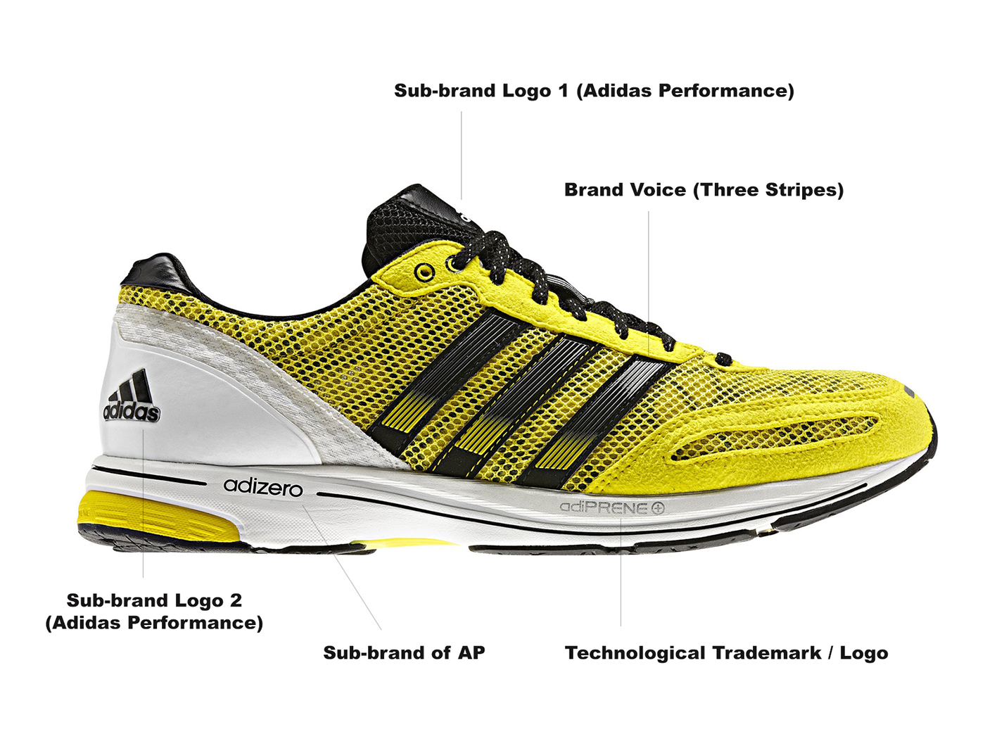
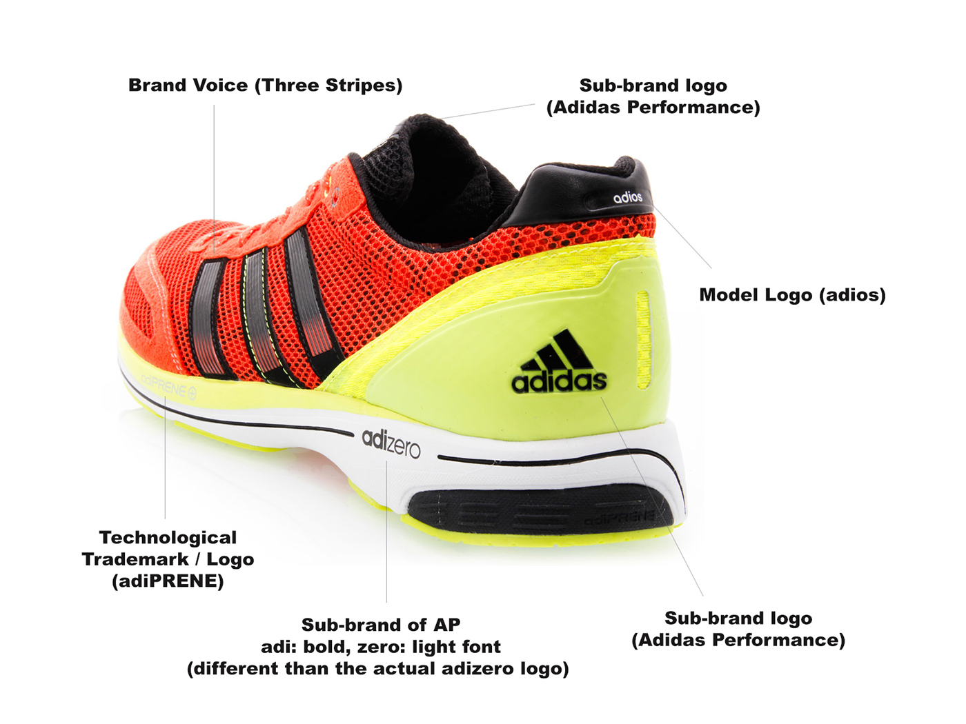
There is a good example on how the target groups are differentiated through the products: the beautiful Copa Mundial soccer shoes. If I want to buy the world cup series of Copa Mundial soccer shoes for example, do I have to visit the Adidas Style store? Because it's branded with the Adidas Style logo!? Turf shoes with Adidas Performance and most of them are branded just with the Adidas wordmark. Where do I get those?

You can find some of the Copa Mundial shoes under Adidas Performance and some of them under Adidas Style sub-brands which is absolutely unnecessary. Because the target audiences are the same.
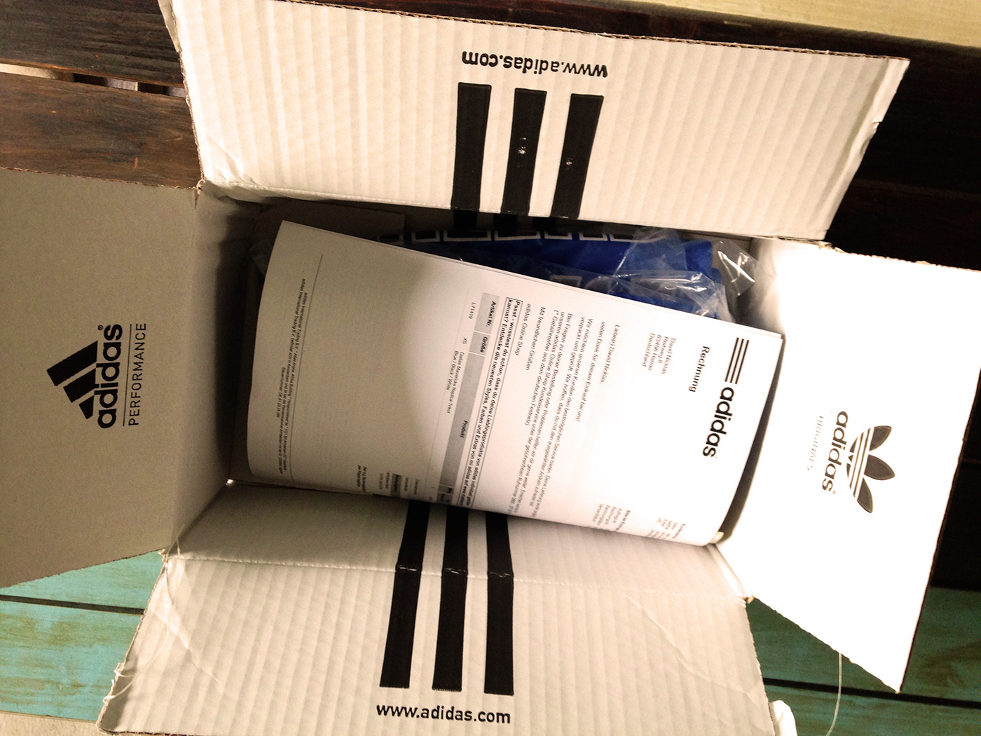
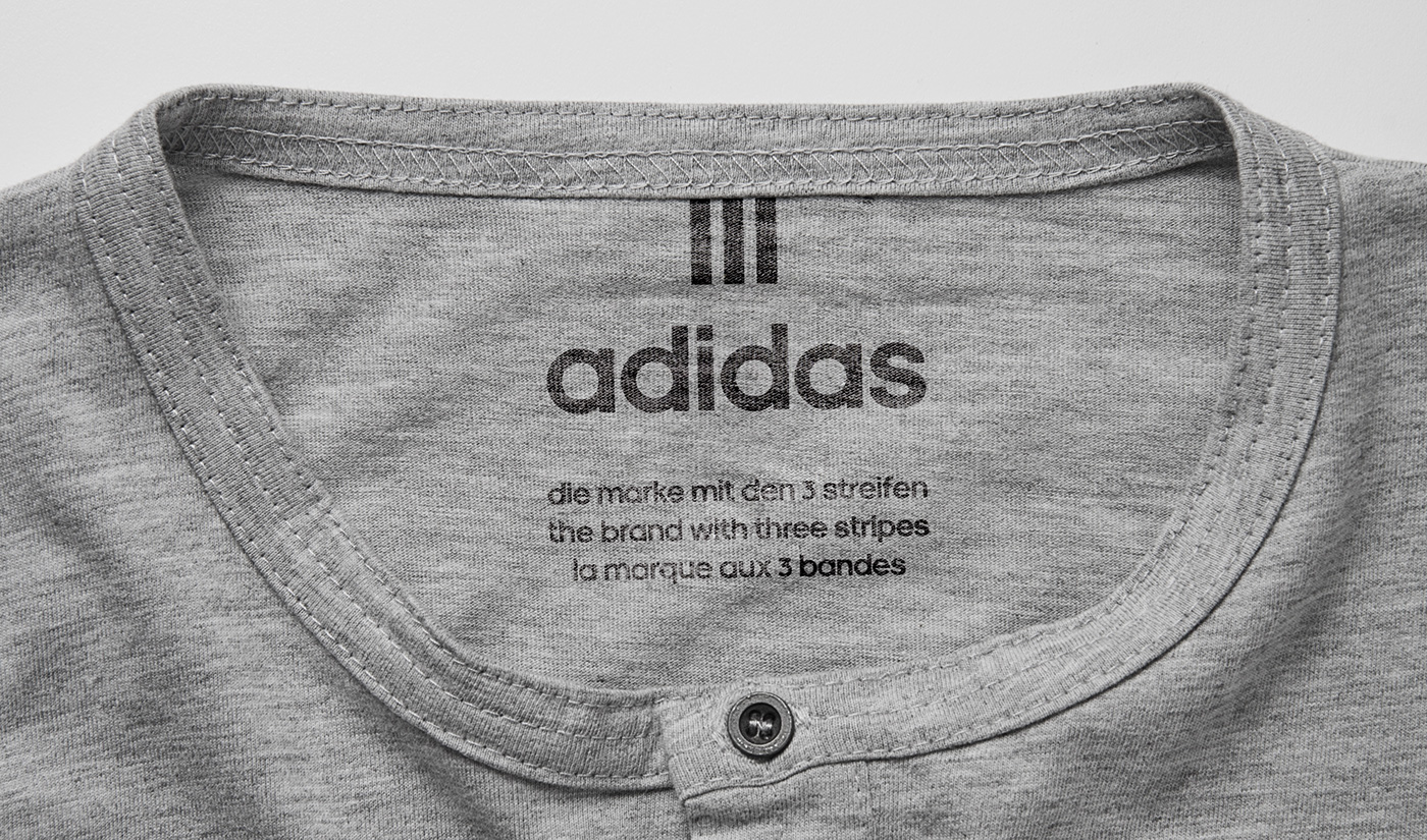
Current Adidas product packaging with an invoice in Germany .
When I ask the simple "what's the logo of Adidas?" question to people, most of them answer this question by saying that the Adidas Performance logo is "the logo of Adidas". Some of them say that the trefoil logo is the main logo of Adidas.
This is a huge gap for a brand. They decided to change the branding some time between 2005-2006, I guess. But there wasn't any main logo back then. Correct me if I'm wrong but they decided to use the three horizontal stripes next to the Adidas wordmark years later. Which shows us that somehow they weren't on the right track back then.
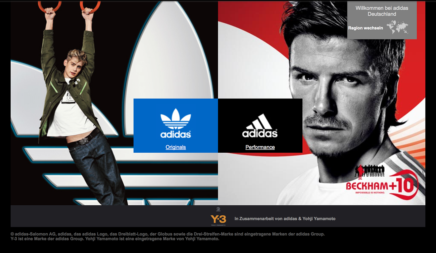
A screenshot from the Adidas website back in 2005.
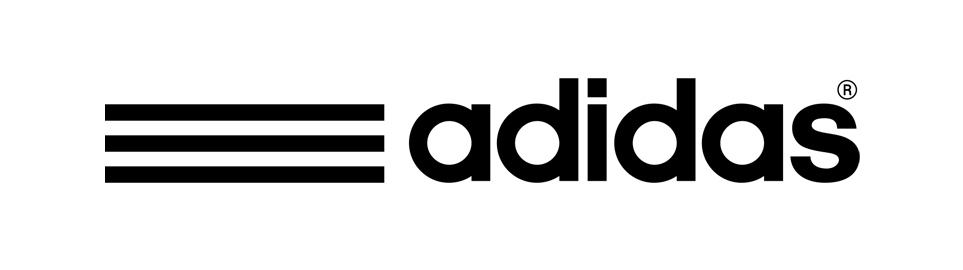
Here is the -current- main logo of Adidas (with the unnecessary registered trademark symbol of course).
The problem is that there aren't any products with the current main logo. I mean the logo above. At least I have never seen one. They only use different forms of three stripes as their brand voice in labeling, product implementations (as an additional graphic element) and some of the advertisements (nowadays you can see the main logo on the advertising signboards on soccer fields).
How do the consumer have an idea about everything above? Trefoil, three horizontal stripes, rising stripes, a circle with stripes, including registered trademark symbols... Should they make a research before they interact with the brand product? Should they also consider to use the first initial of the brand name in lowercase like "adidas", always?! Do the product designers of Adidas have to spend more time thinking about all the logos and their implementations rather than the design of the product itself? Questions. A lot of questions.
I assume that understanding the current brand strategy of Adidas must be time-consuming for both sides. For Adidas employees and for the consumer.
OK. Enough with the analysis. Here's my idea for Adidas to make it easy to understand, to reach the consumer in a more non-confusing way.
Solution: 'all in' three stripes
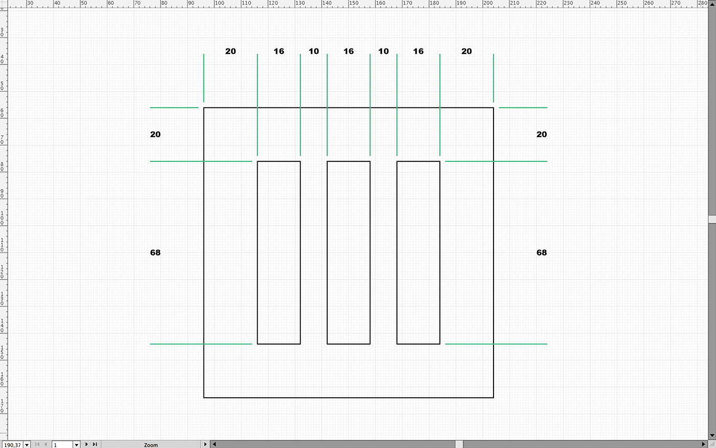
Mathematics of the symbol. Grid is 10mm x 10px by the way.
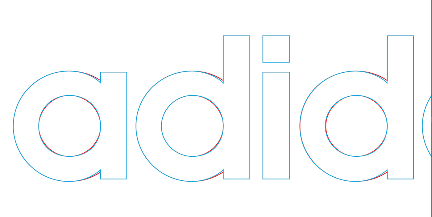
Original logotype is red, blue is the treatment.
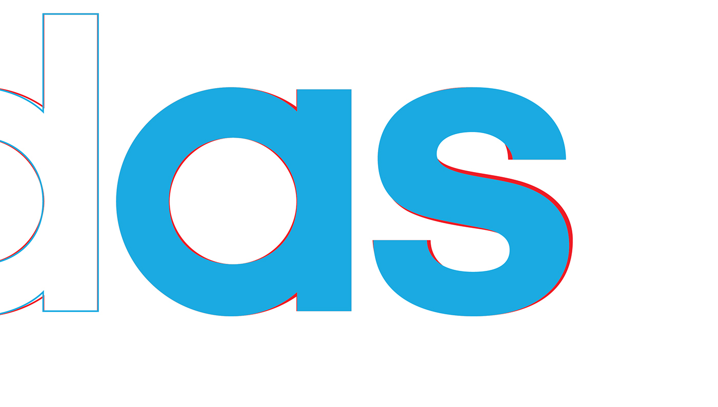
Original 'a' and 's' are in red, blues are the new ones.
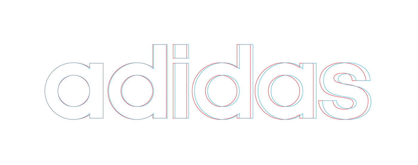
Blue one is the new kerning of the logotype.
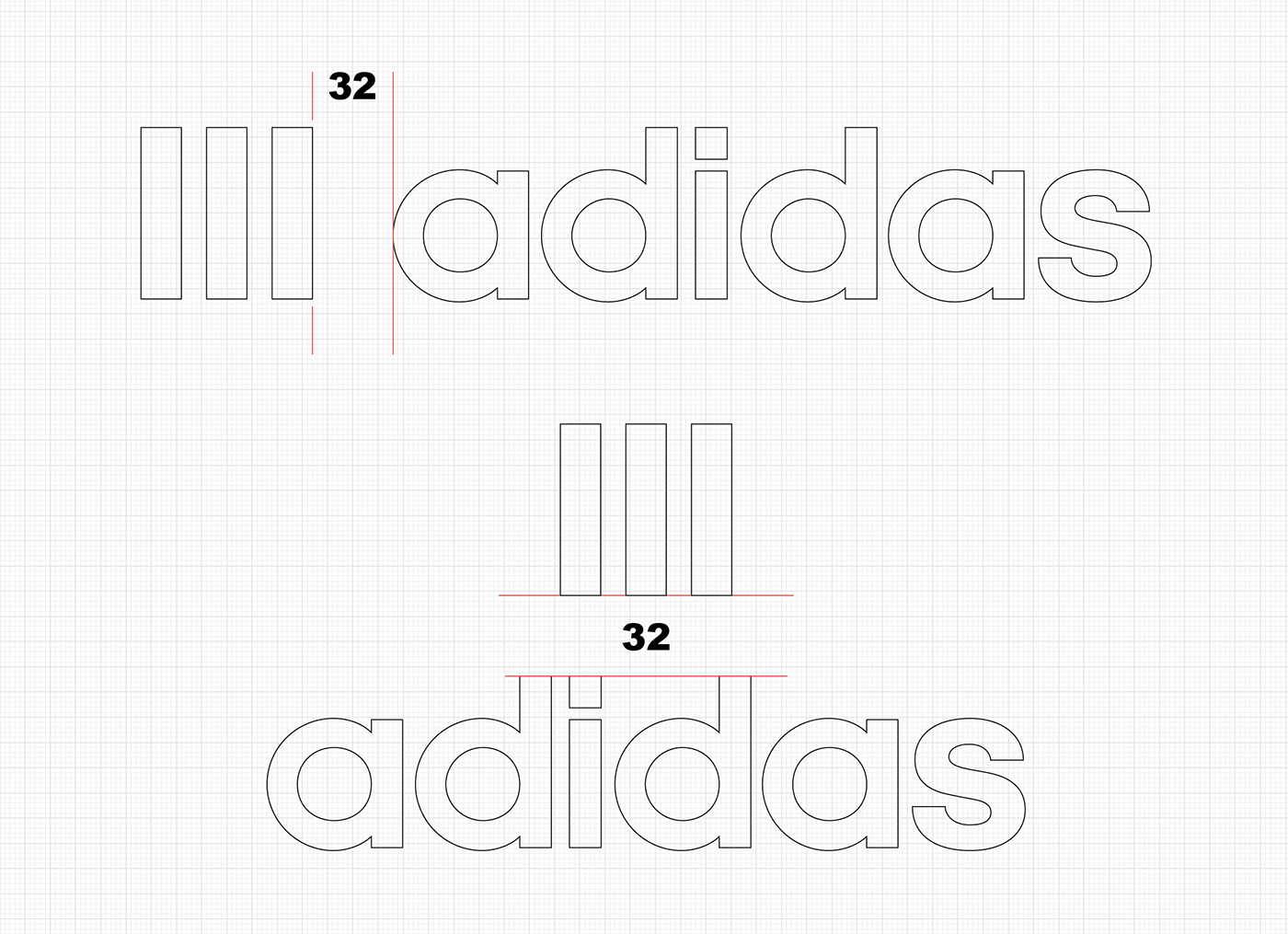
Vertical and horizontal positioning of the new logo.
The Three Stripes = Adidas

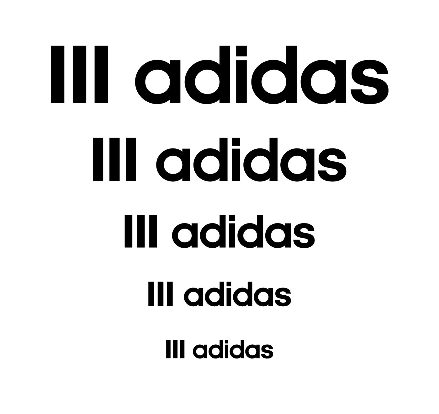
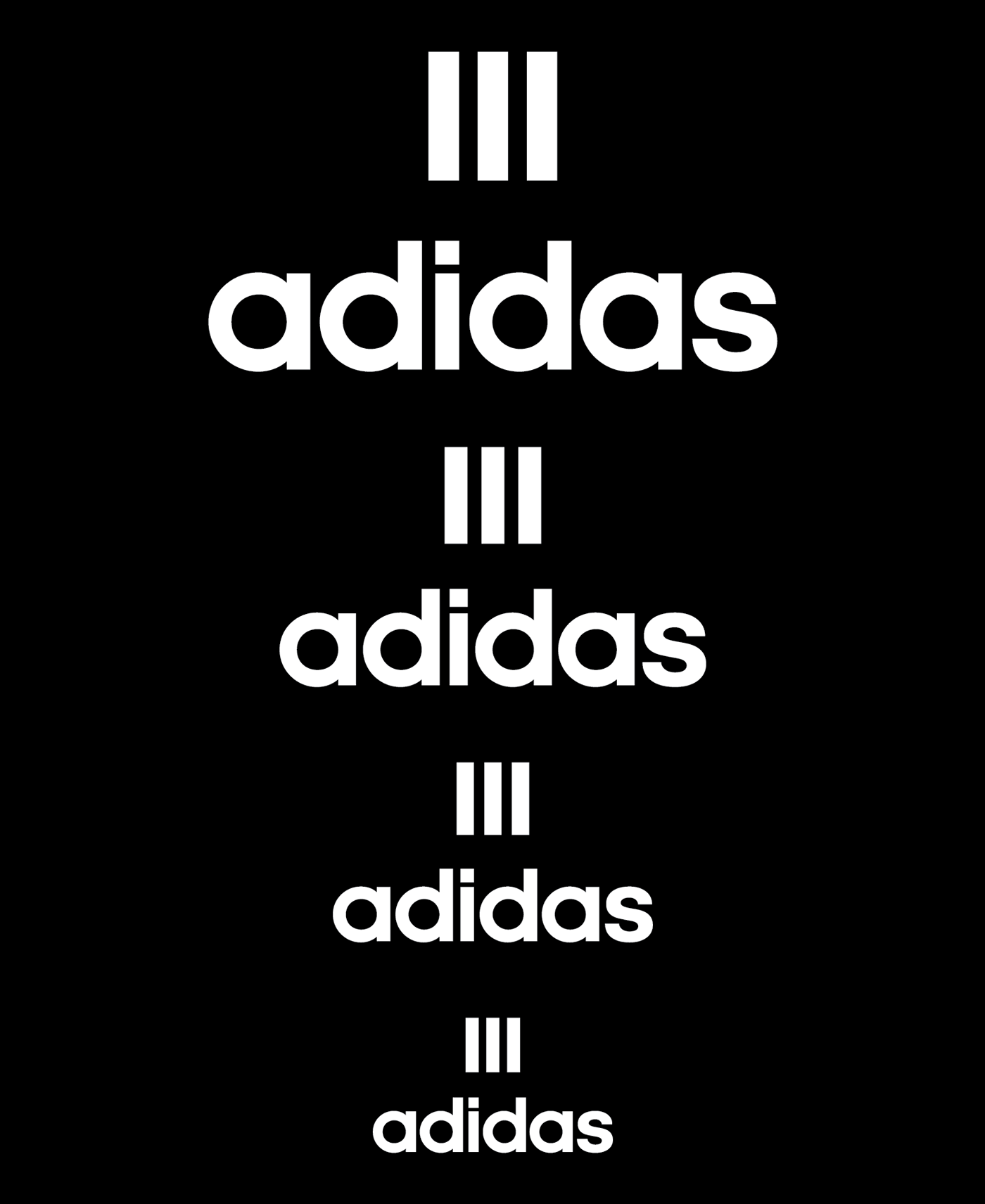
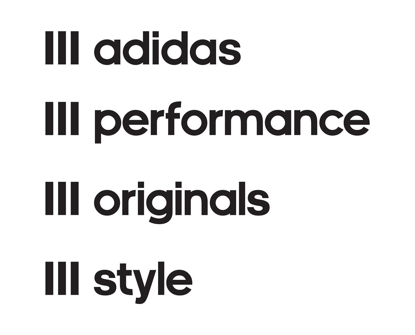
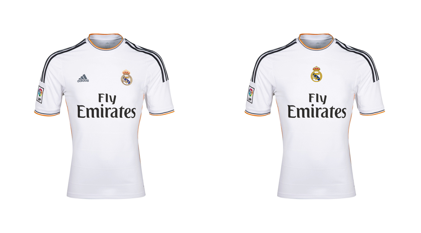
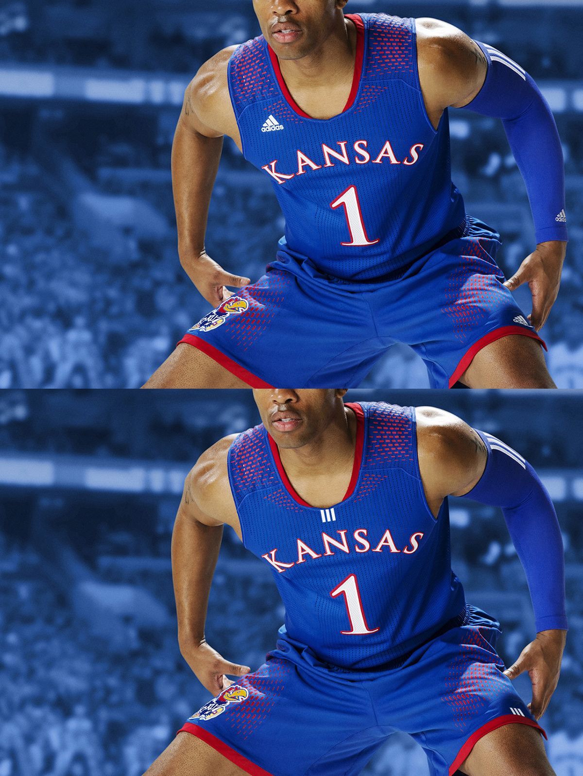
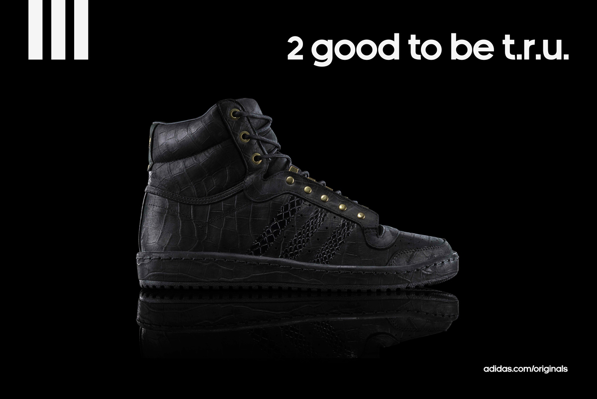
New look of the brand architecture. I thought that this would give more strength to the "three stripes" brand mark and easy to give the Adidas brand connection to the consumer through implementing the adiNeue font which is created by Base Lab.
This brand architecture can be implemented to all of the brands of Adidas Group. The "Three Stripes" brand mark can be used on all products and the logotype would change according to the collection or sub-brand name.
And I think this implementation style (dynamic positioning) of the brand symbol works for all of the sub-brands, products and collections.

I have removed the 'Americana' model logo from the product because the product already has the three stripes (main brand voice) and the model is branding itself with its' design style. If you do enough marketing (like Adidas does) then you don't have to give an additional effort to brand the model (which is Americana) again through implementing the model logo on the product.
Product Implementations

Here is the Gazelle model. You can implement model name in AdiNeue font backside of the tongue or maybe over the lining inside of the shoes.
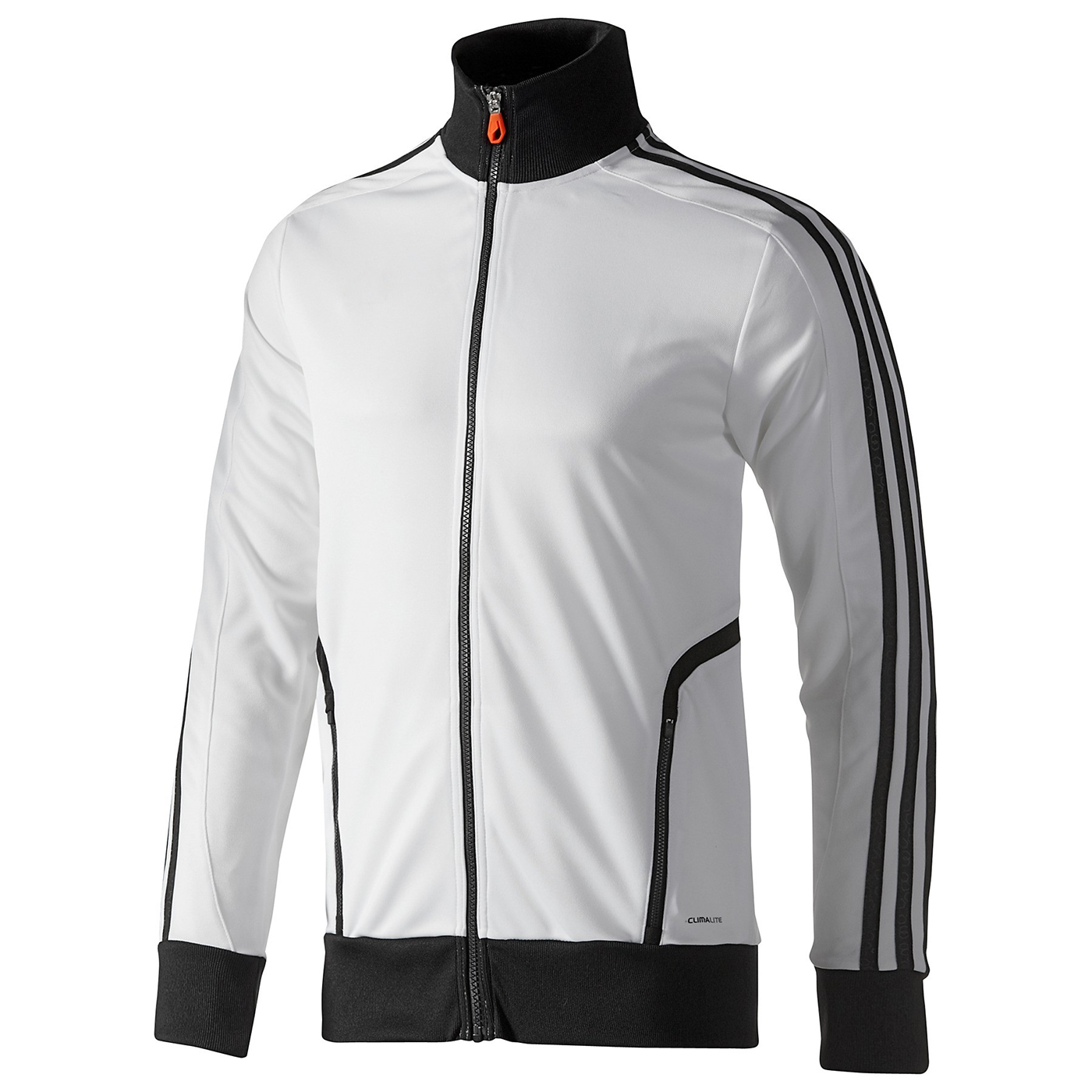
This training jacket had an Adidas Performance logo on it. I think it doesn´t have to. Because you already give the Adidas brand voice to your consumer with your famous three stripes on the product itself. Most of the people recognize this Adidas product from meters away.
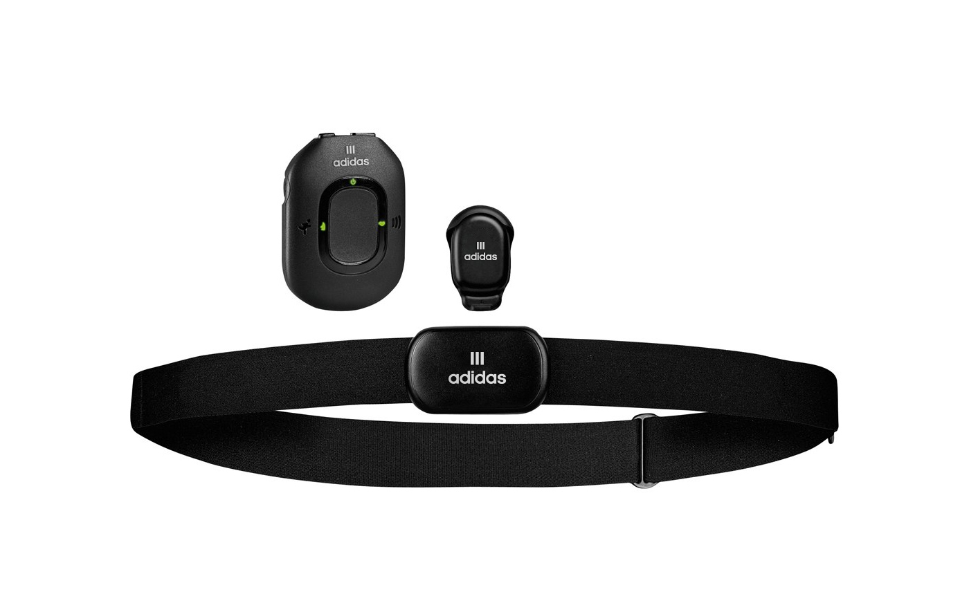
Adidas miCoach Pacer Bundle.
Close-up to the logo and favicon mock-up.
Signage System
Apart from all that, I know that there are many other brand assets in a branding system. But I hope that this project study gives an idea of what I'm personally expecting from a brand like Adidas as a consumer and brand designer.
With all my respect to sports brands employees and those who love brand design.
Thanks for watching.
—Oz
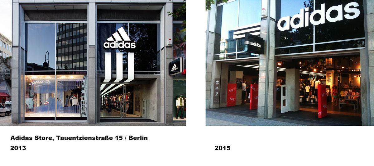
Update (May, 2015): The new storefront signage has the main logo of Adidas in Berlin.
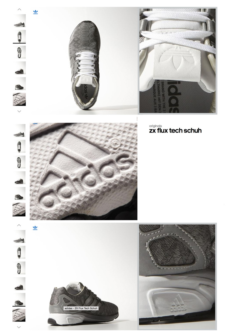
Update 2 (Sep, 2015): ZX Flux Tech Shoes has both the adidas Performance and Originals logos.
© Gravitart — Brand Design, Published in May 2014. Last edited in October, 2016.
Legal Notice: All trademarks, service marks and trade names of Adidas used herein (including but not limited to: the word mark "adidas", "the adidas logo", "the trefoil", "the 3-Stripes") are trademarks or registered trademarks of Adidas or its affiliates. All images are copyright to their respective owners.

