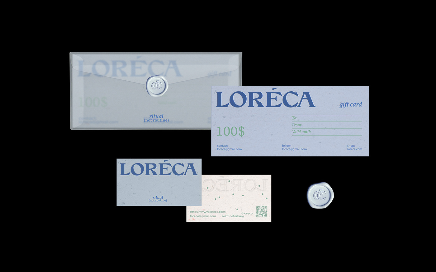
Loreca is a brand of natural skin care and bath products designed to make everyone feel relaxed in the process. The brand's slogan is a ritual, not a routine. The design aims to depict the silence, calmness and relaxation of skincare.
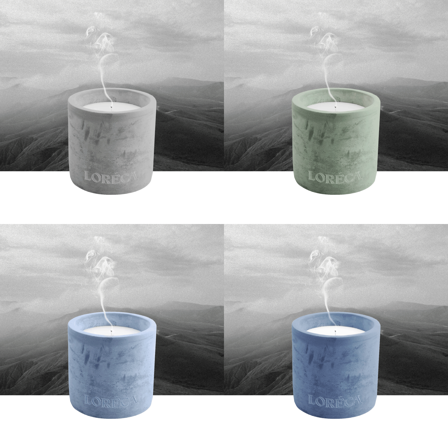
Steam became the basis of the graphics, so all care products are applied after taking a bath or shower. It was important to convey the feeling of foggy, so the packaging of care products is made of frosted glass, and the envelope for branded printing is made of tracing paper. This idea is reflected in the photographs, which intentionally have different levels of blur. Circular elements became another graphic element - this is what steam looks like at the molecular level.


DESIGNER: PINSKAYA ELIZAVETA
Thanks for watching!


