Client: Kiki Huang
Project: Brand Identity
Year: 2014
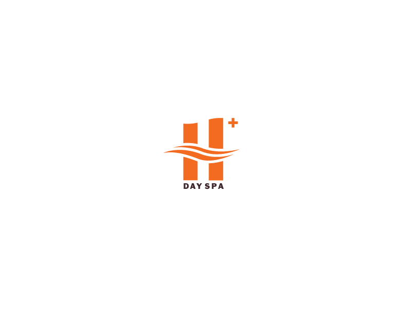
H+ Day Spa wish to provide high quality, heavenly, healthy, harmonious experiences to its customers. Plus symbolizes extra, plus, on top of, more.
Project: Brand Identity
Year: 2014
H+ Day Spa wish to provide high quality, heavenly, healthy, harmonious experiences to its customers. Plus symbolizes extra, plus, on top of, more.
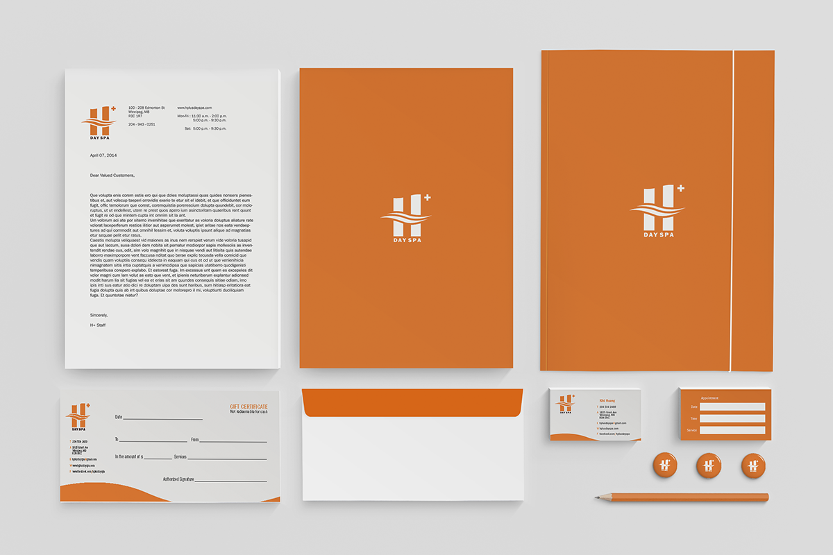
The design concept began with the word "hydrogen". I wanted the identity to bring out flowing, flexible and soft emotion. I also gave the top H a wavy shape to give an extra characteristic.
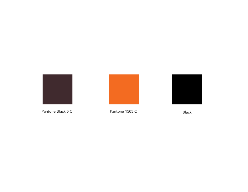
The client designed her interior space in orange color. Orange represents warmth, positively and life. To complement with her interior design, I also chose orange as the color for the identity. Not only it is a bright and appealing color, more so to differentiate itself from the other competitors. Most spas tend to have blue, aquamarine or earth tone colors, orange is an attractive color which also complement the personality of this particular client.