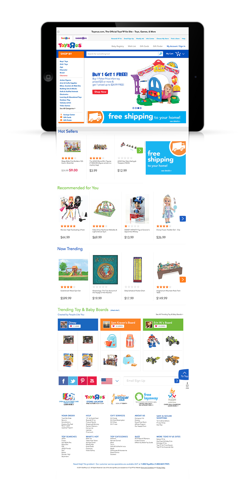
While working at DL Hastings, we were tapped to design the tablet and mobile experience for Toys R Us. This would be a huge undertaking, and would teach me many lessons in UI design, UX, and what it takes to build a successful product (spoiler, it takes a freaking lot of work). Toys R Us wanted to increase mobile usage and buying. I was the lead designer on this project, and here are a few adventures, challenges and screens I am sharing.
Screens, Coffee, Screens, Lunch
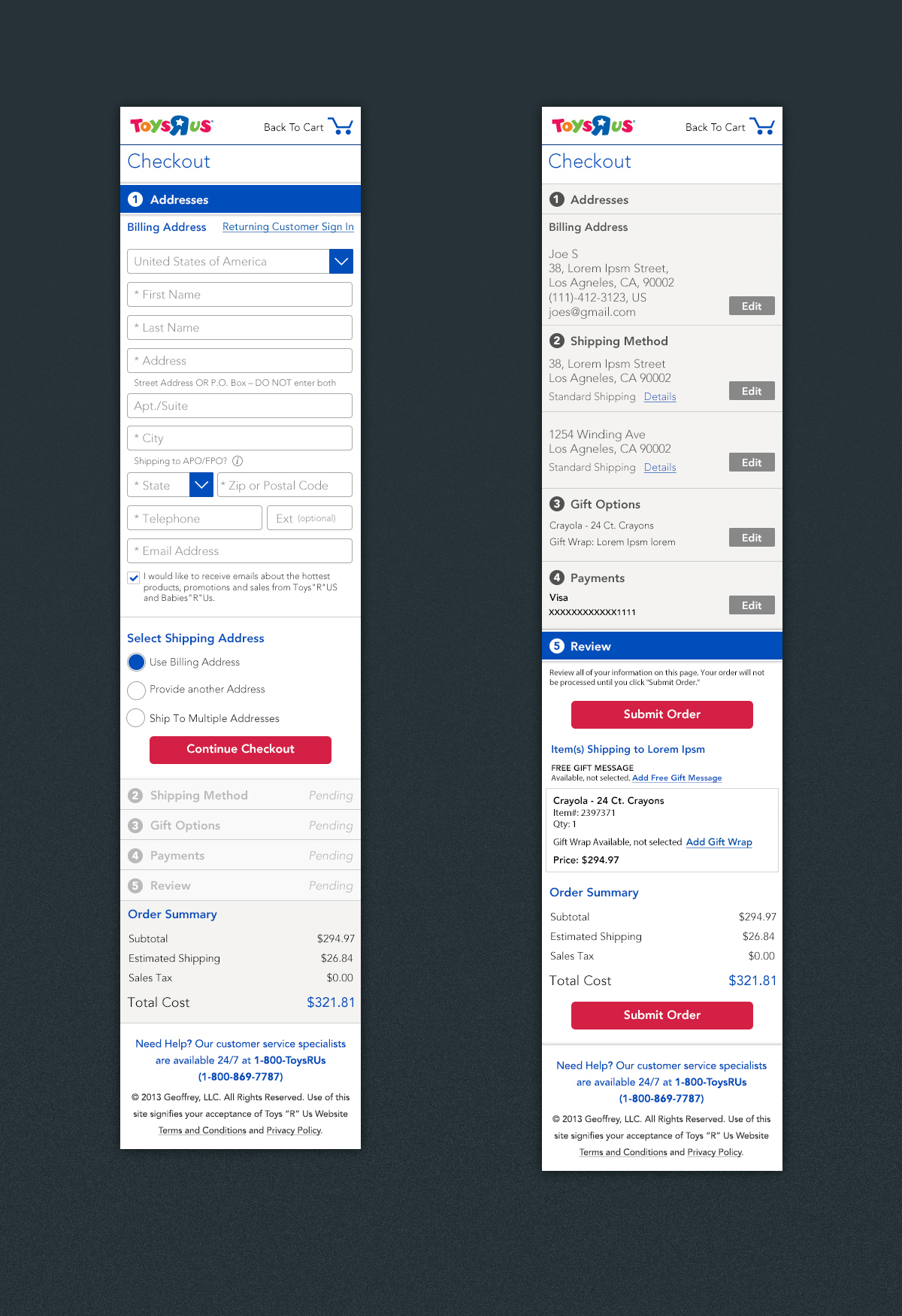
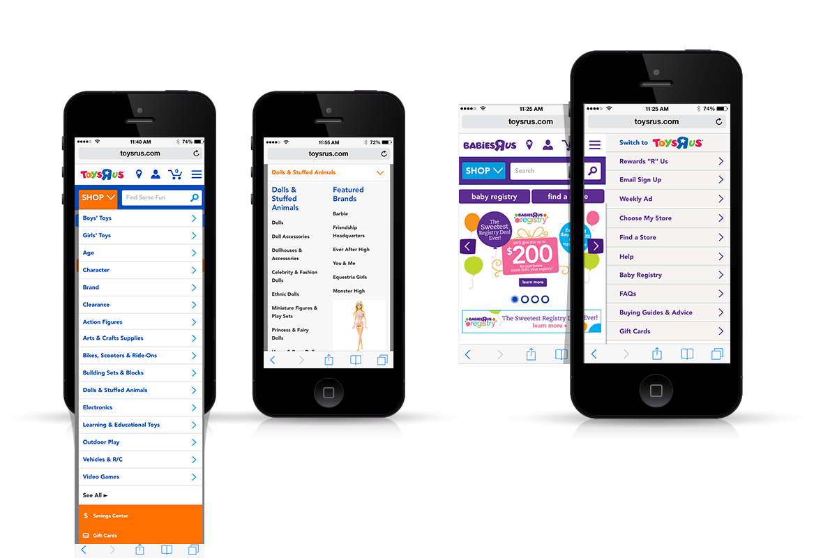
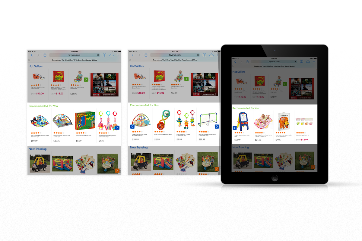
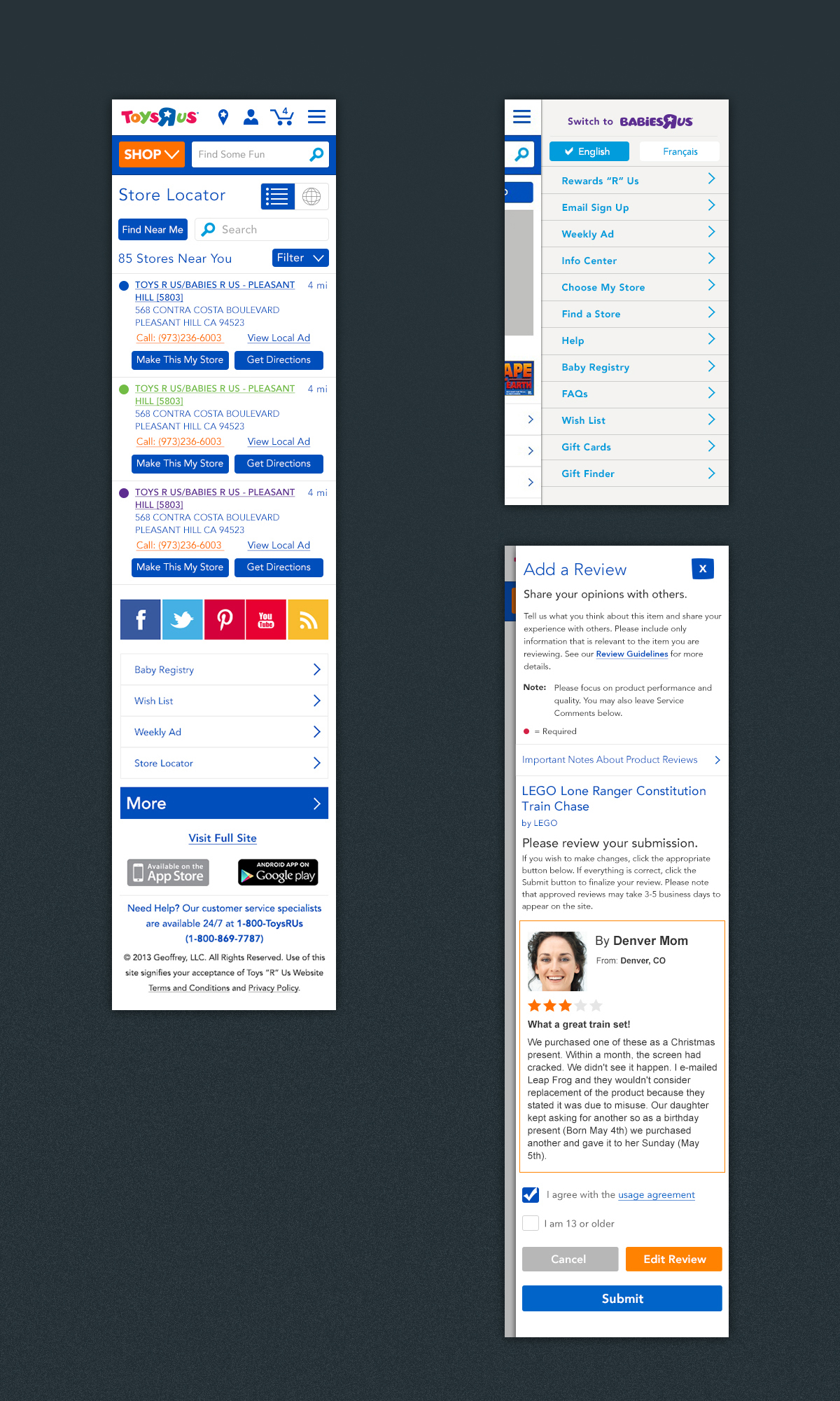
Daily meetings, wireframes, screens, pencils being worn down, and massive amounts of coffee being consumed. All of that goes without saying, and is pretty standard, except the daily meetings, that was a little tiring. What was interesting is that we needed to explore every possible scenario that we could think of, and mock that up, on mobile, tablet, and if we had the time, all the orientations. Oh yea, we did all the orientations.
We designed all error messages, all dropdown states, heck we even designed scenarios that may happen if a user just throws the keyboard out of the window. There were a lot of late nights, and broken keyboards.
We designed all error messages, all dropdown states, heck we even designed scenarios that may happen if a user just throws the keyboard out of the window. There were a lot of late nights, and broken keyboards.
Challenges, Solutions, and Sammiches
Looking back now, one thing that struck me as a challenge, was that screens were being reviewed and implemented statickly (not a word), with no prototyping, no user testing before deployment. That didn't come until the we were in the QA stage. Yikes! Maybe it was because we just didn't know what was fully possible with prototyping, and also the good team at TRU, while awesome to work with, wanted everything done yesterday. User testing, pff we got toys to sell!
Speaking of QA, boy oh boy did we QA. We took video of the screens we were working on, and trying to show odd behavior. We had spread sheets of spreadsheets of tickets to input. We Jira'd the shit outta our design. I really was blown away to hold my design in my hand and be interacting with it. It humbled me beyond belief.
"OMG, you mean this modal is too big because of live text content! AHHH my design is melting!"

Parting ways, and more coffee
This project was a bootcamp. I learned so much by doing, failing, and sometimes winning. As a note, when I won, I won hard.
Here are a few fun facts:
Over 1000 screens designed
Every scenario ever
3 Teams, 3 Countries, Lotsa GoToMeeting
When all was said and done, we got a huge thank you, and never heard from the team again. Toys R Us increased there mobile usage, and people bought hella stuff on their devices. We accomplished what they needed and wanted. We were happy, tired, and empowered. Toys R Us kept the design for 1.5 years, and has just recently (like a month ago) started a refresh while still keeping a lot of our UX in place. Yay!


