Chapa Hamburgueria
Visual identity and naming
Chapa Hamburgueria is a small Brazilian fast food chain that aims to bring the best possible experience to each customer, from the preparation of snacks with selected ingredients, extremely fast delivery and proximity to the customer.
The objective of this project is to define the positioning, verbal and visual identity of the network, stand out from competitors and win over customers, making them loyal.
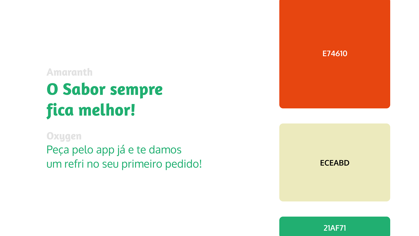
For this, light colors were chosen, a typography that makes the customer feel the flavor of each sentence, colorful and dynamic packaging, facades that stand out in the streets and shopping centers attracting the customer, everything about this project makes your mouth water!

The logo's main idea is the combination of a wide variety of typography, symbolizing the variety of flavors and moments in a bite. To give a touch of lightness, a typography drawn in the “H” was added, thus bringing complete harmony to the logo, which speaks to the entire identity of the project.


The objective of visual communication is to translate the entire branding, the part that people feel, to the part that they see, thus attracting the attention of the right people, communicating the right message, the visual identity was designed so that both physical contact points as digital ones communicate the same message, the same feelings, and of course, mouth-watering!