

Premessa
Il termine sanscrito “Sangat” indica l’insieme di persone, discipline e culture, che condividono gli stessi nobili ideali: la libertà di essere e di esprimersi, l’amore incondizionato verso se stessi ed il mondo.
Introduction
The Sanskrit term “Sangat” indicates the people, the disciplines and the cultures who share the same noble ideals: freedom to be and express themselves, unconditional love for themselves and the world.

Symbol design
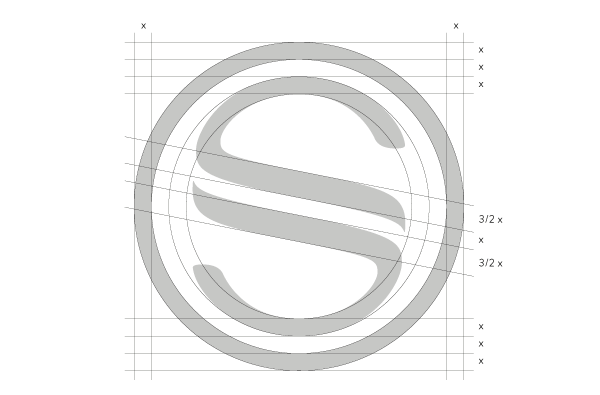
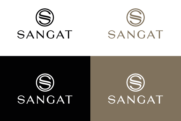
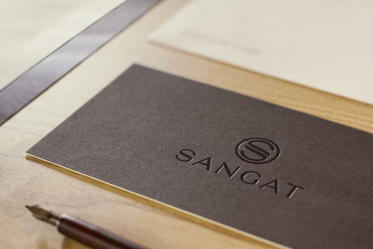
Il simbolo che abbiamo progettato per il Centro Benessere Sangat è l’iniziale del nome composta da due forme che si fondono all’interno di un cerchio, metafora di equilibrio tra mente e corpo, che è di fatto il mezzo, ma anche il fine per il raggiungimento del Sangat, ossia l’unione universale, l’equilibrio con il tutto.
The symbol we projected for the Wellness Centre Sangat is the initial letter of the name, composed of two shapes which blend together into a circle, metaphor of balance between body and mind, which is the means and the purpose at the same time to reach the Sangat, i.e. the universal harmony and balance with the whole.
Typeface design
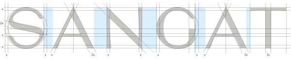
Abbiamo disegnato un carattere tipografico maiuscolo, leggero, con dei minimi contrasti, la cui linearità viene interrotta dall’allargamento dei terminali di alcune aste, per esprimere concetti quali armonia, sinergia, natura, ma anche eleganza, eccellenza, qualità.
Questi concetti sono stati rinforzati dalla scelta di un colore caldo, di una carta dall’aspetto molto naturale e dalle nobilitazioni degli stampati.
Questi concetti sono stati rinforzati dalla scelta di un colore caldo, di una carta dall’aspetto molto naturale e dalle nobilitazioni degli stampati.
We designed an uppercase typeface, light and with minimal contrasts, whose linearity is interrupted by the enlargment of some stems' terminals in order to express concepts like harmony, synergy, nature, but also elegance, excellence and quality.
These concepts have been reinforced by choosing a warm colour, a very natural-looking paper and a special finishing of the print.
These concepts have been reinforced by choosing a warm colour, a very natural-looking paper and a special finishing of the print.
Logo design
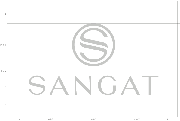
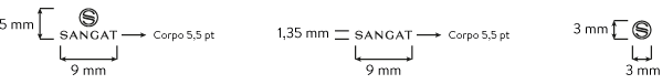
x = distanza minima da mantenere da altri elementi grafici.
x= minimal distance to be kept from other graphic elements.
Main colour

Secondary colours
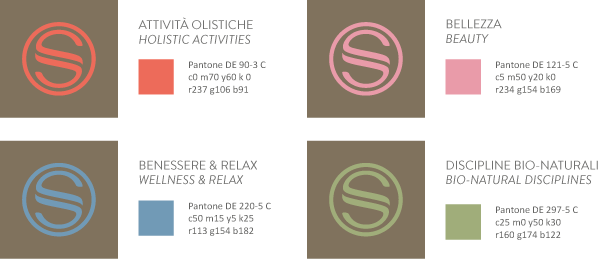
Colour combinations
Minimal dimension
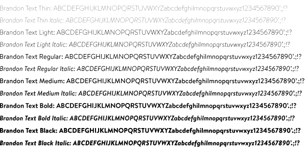
Font to be used
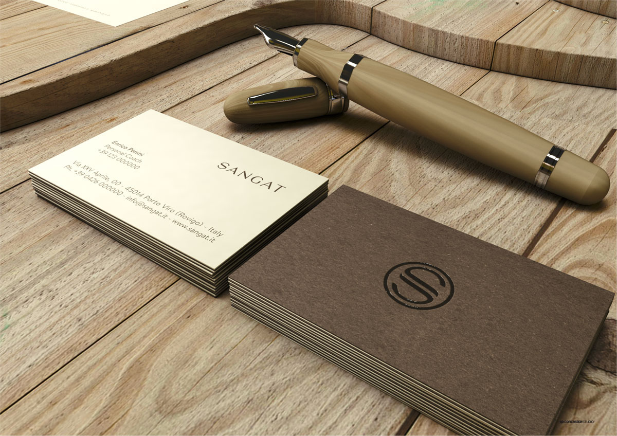
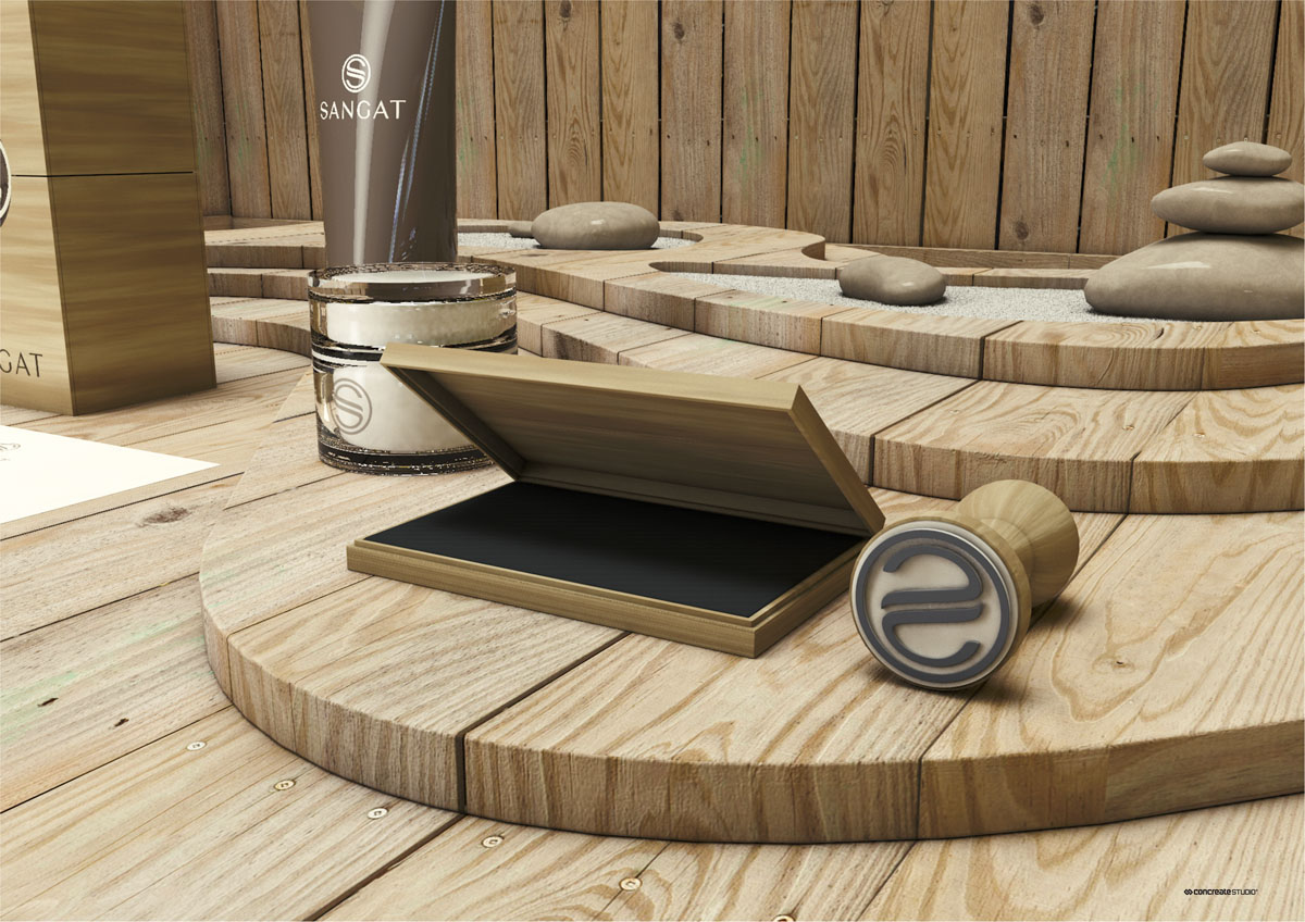
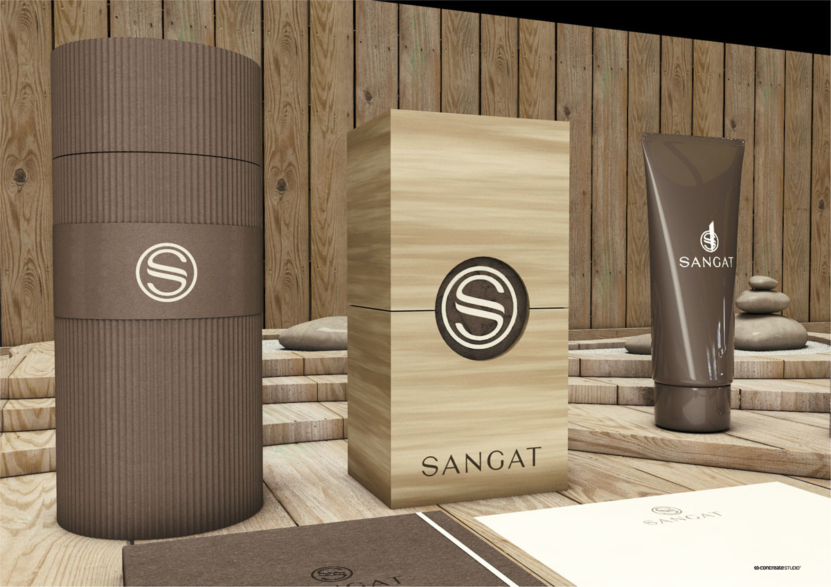
Branding (3D Render)

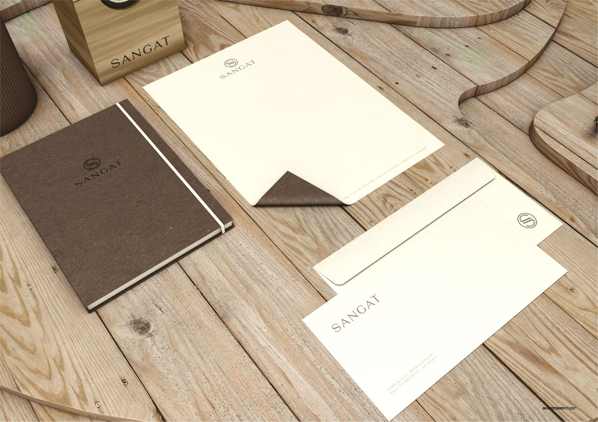

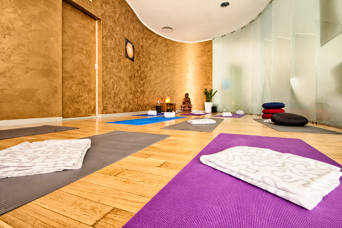
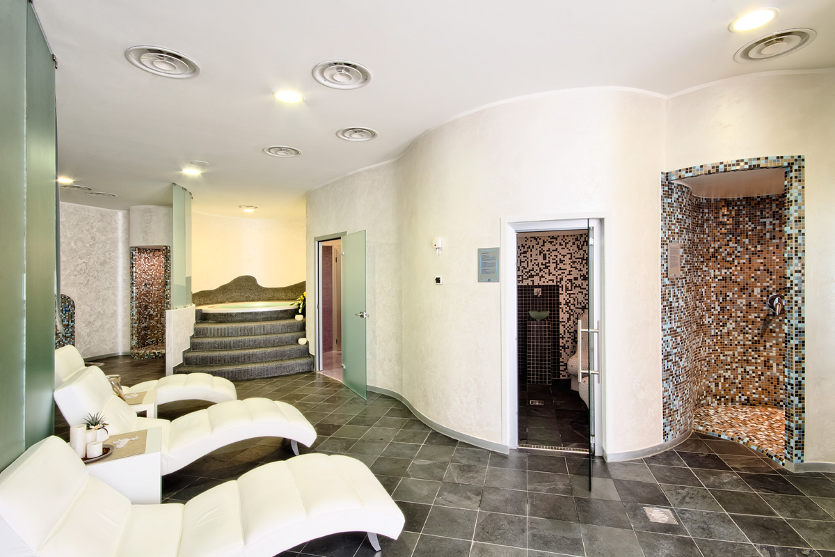
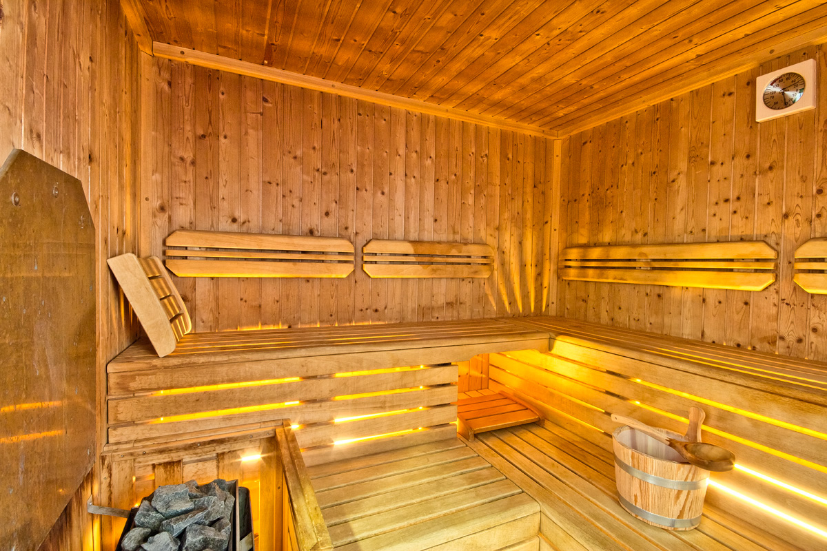
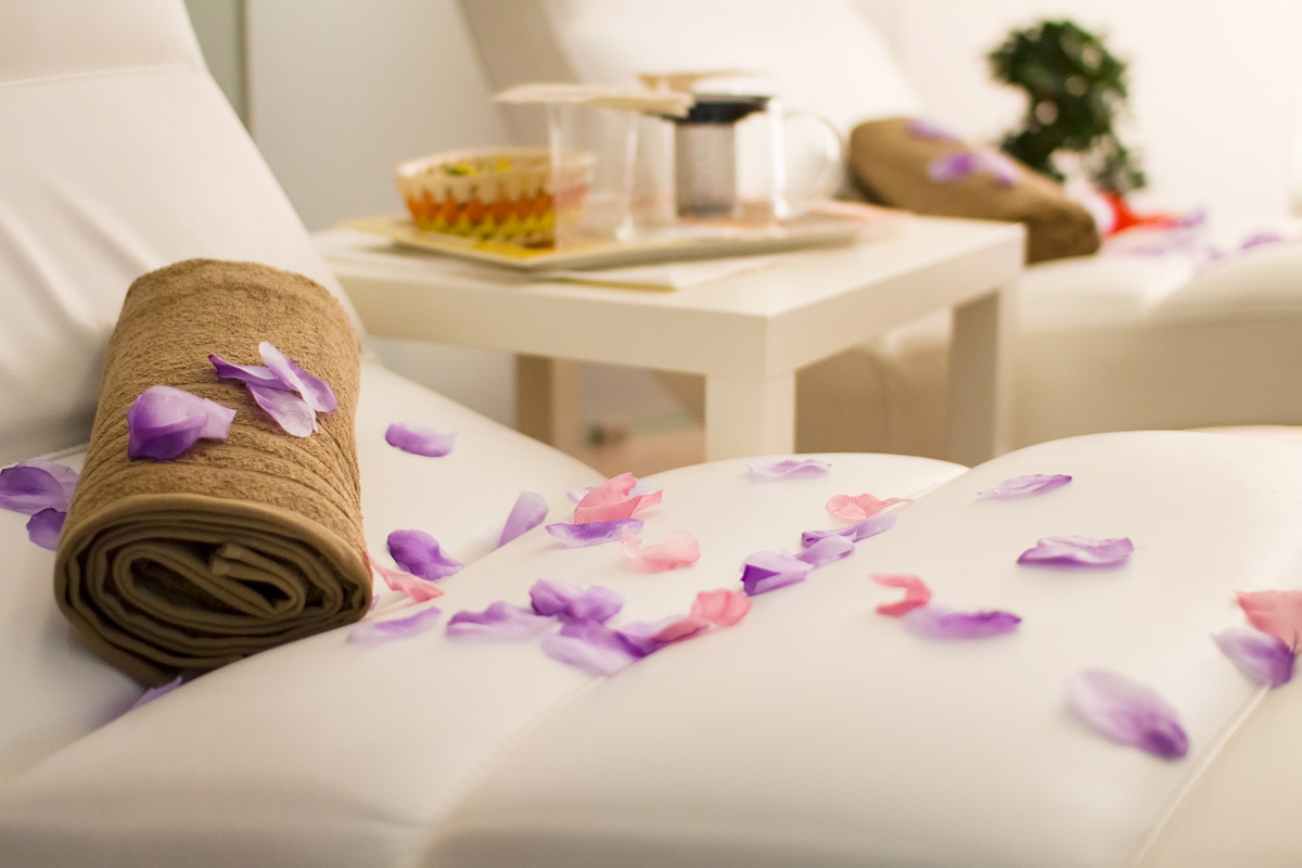
Print Design (Photos)


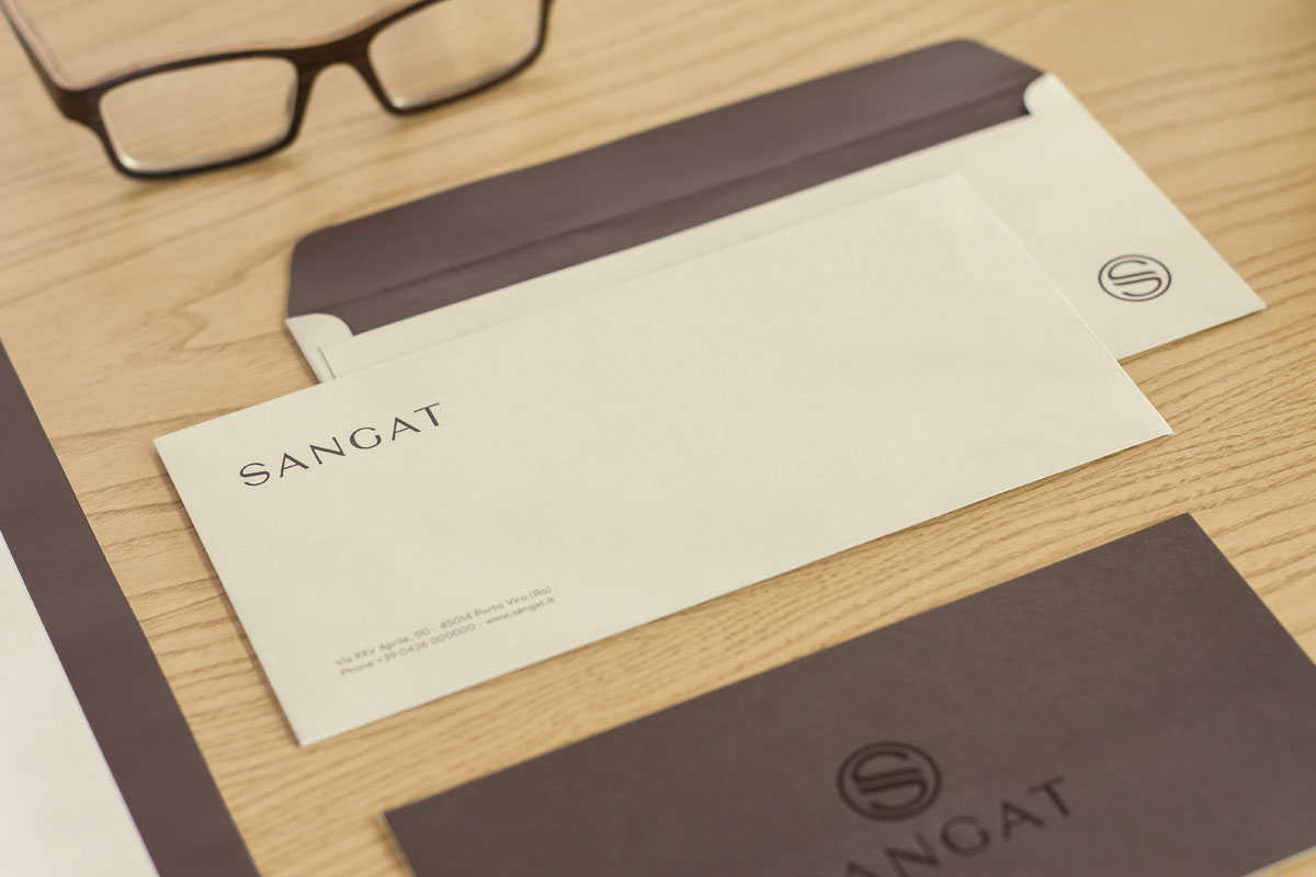

Photos of the Wellness Center.
Winner of Branding Category. Behance Portfolio Reviews Verona 2014.

Thank you for watching our work.


