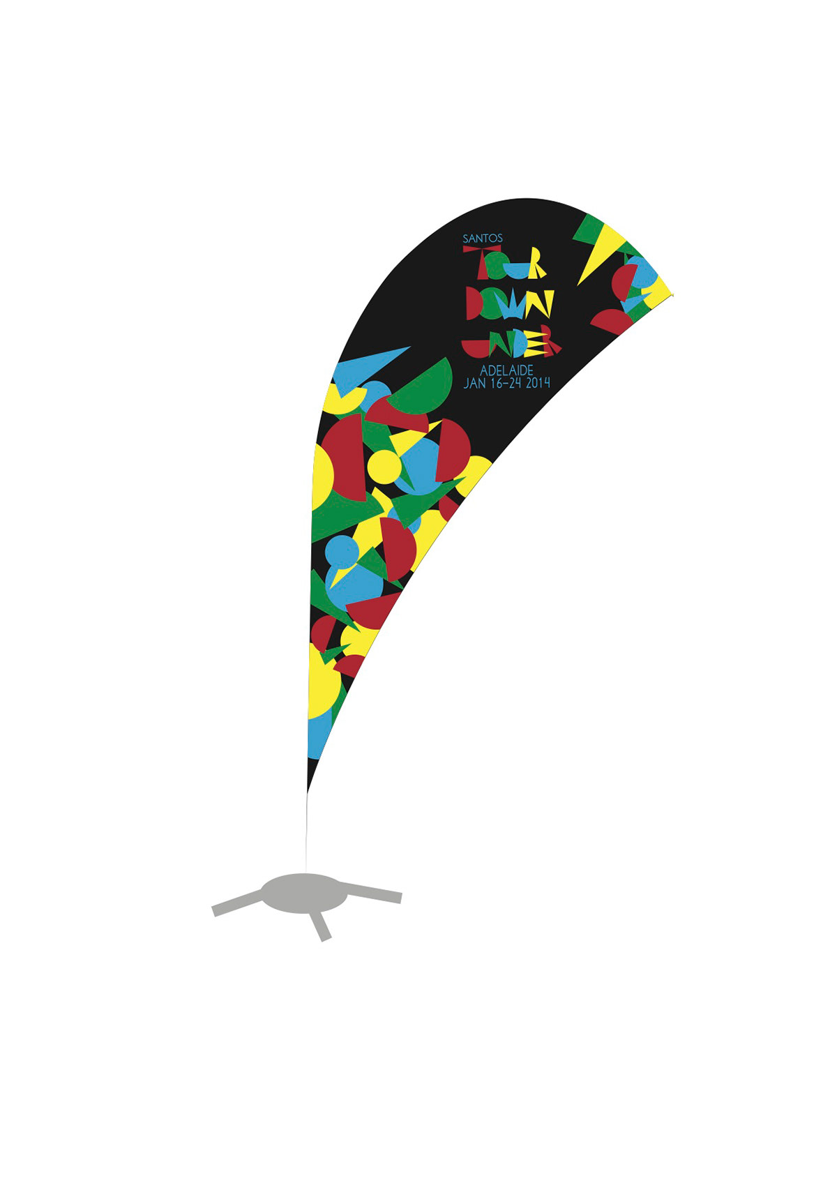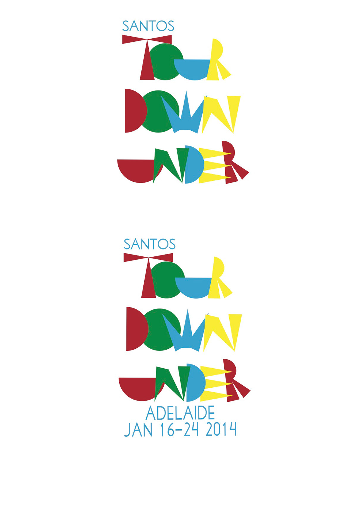
This is the outcome of a university assignment based around the Santos Tour Down Under, for which we were rebranding.
I chose to base my design around the idea that the Santos Tour Down Under is more than just a bike race, it’s a party for the whole of Adelaide as in conjunction to the race a free concert and special events are also held. This is reflected in the logo as it is made from graphic shapes, especially triangles (and their connection to party hats), with large blocks of colour evoking the colour and atmosphere of a party. The colours chosen all relate to various aspects of the tour – Blue is the official colour of Santos, Yellow is the colour associated with the winners jersey in cycling, and red and green represent the extremes that occur in the Australian landscape, from red deserts to lush greens around the coastline. The logotype has been created out of shapes to make a distinctive and memorable logo. The shapes are – triangles showing the party aspect as they connote things like ‘party hats’, semi-circles are the basic shape of the riders helmet and circles are wheel shaped. These strong graphics are continued through the poster, banner, cyclist clothes and truck. The elements that create the type have been deconstructed to make the abstract patterns seen. Black has been used as the background colour in all the elements as the colours are bright and the black makes them stand out even more.