

The Project:
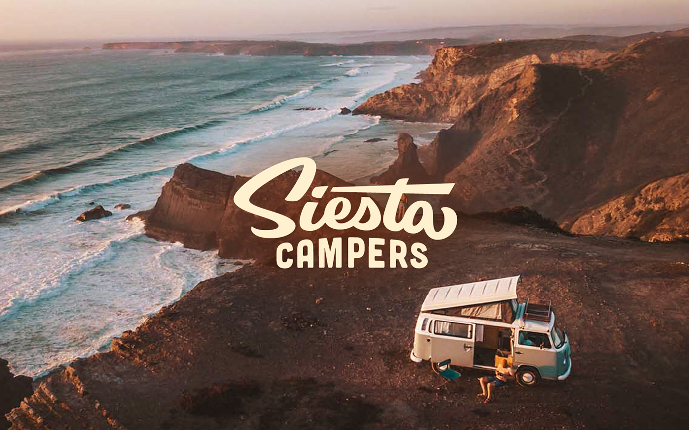
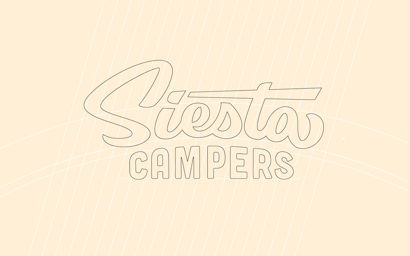
Logo refresh for Siesta Campers, Portugal's #1 van rental company. Siesta Campers has built VW vans and explored life on the road for over 20 years. I worked closely with the team to update their logo system to be more flexible, legible, and timeless. We kept a very surfy script style for "Siesta" while adding a good deal of movement. We also removed the bloat from the "Campers" sub-text by sitting the type on a flat baseline. The overall look of the stacked logotype still has the badge-like feel of the original mark to retain the brand's hard earned visual equity.
Services: Creative Direction, Wordmark Logo, Responsive Logo Suite, Apparel


“We knew Wells was the right choice for our logo refresh. His typography skills are amazing. He worked through a comprehensive set of ideas that felt like a fluid transitional journey until we reached the final choice. The logo refresh sits perfectly with our company, and we all wear that logo daily with pride. Thanks for the journey Wells.”
Loyd Rozzo | CEO Founder


