Challenge:
To renew Vetta brand design, to create a system of differentiation for 4 different group of goods (products for bath, kitchen, cleaning and storage) while keeping the brand recognisable for target audiences.
Idea/Solution:
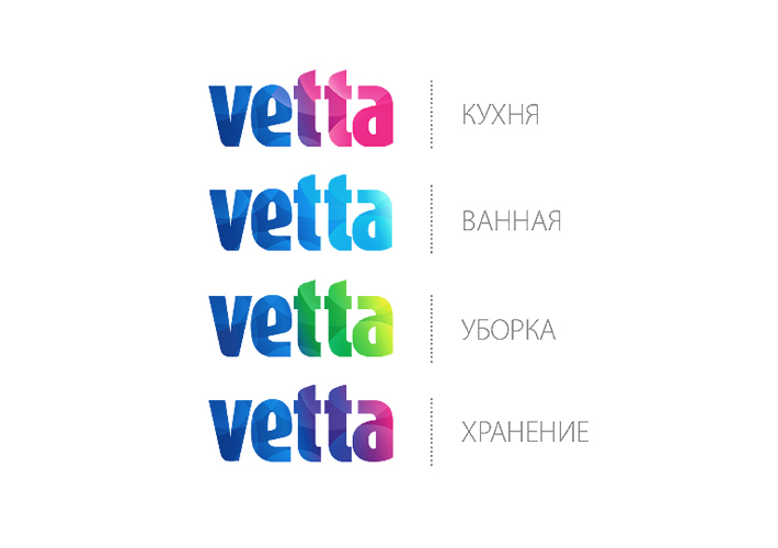
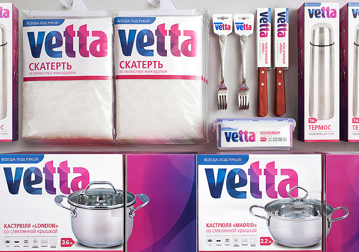
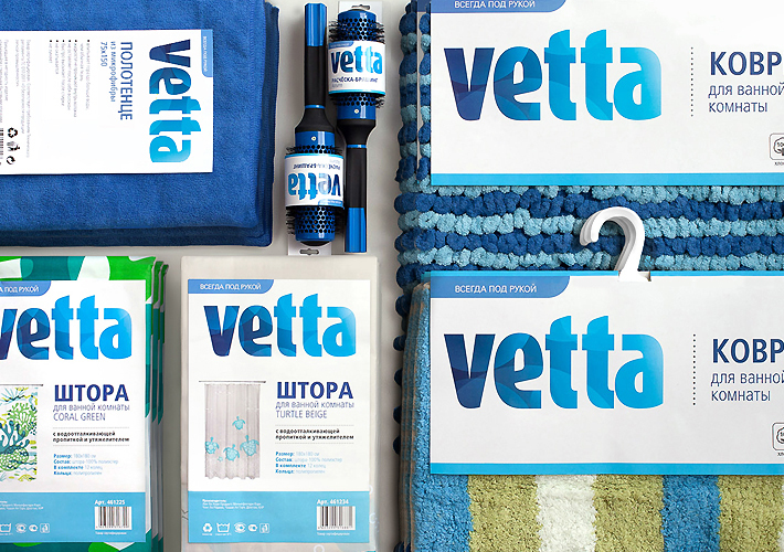
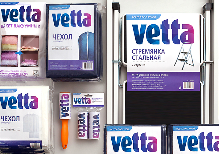
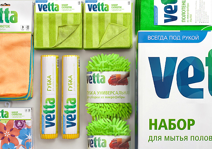
Brand’s recognition before restyling was achieved through a number of key elements: font, shape of a house in logo, color scheme of the package (use of color blue). In order to maximize the logo space we decided not to use she shape of the house anymore, keeping the fonts and key color, which was integrated into the logo itself. White became the new backgrounв color, making the brand lighter and brighter, which is crucial for the household-helper goods.The differentiation system is built through keeping blue as the main color in the left part of the logo and changing the color in the right part according to the group of goods. Kitchen products utilize the colors orange and pink (fire is quintessential to cooking), bath products – light blue (water), cleaning – green (ecology, purity and freshness of nature), storage – purple (rationality).Through the use of overlay technique the logo became more up-to-date. The design gained additional depth and mobility that support the large amount and assortment of goods produced under Vetta brand.Brandiziac also carried out the adaptation of the renewed house style to more than 1000 goods in different product categories.
Result:
Vetta products with renewed house style can be found in network retail points since may 2013. Due to the use of the color white the package attracts attention and catches the eye of the customer.

