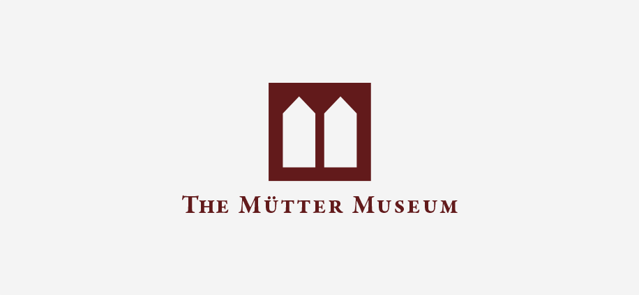
The Mütter Museum Identity
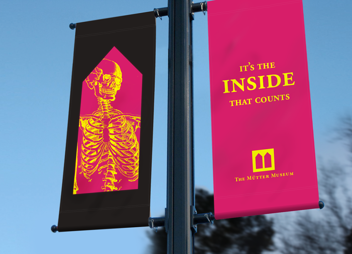
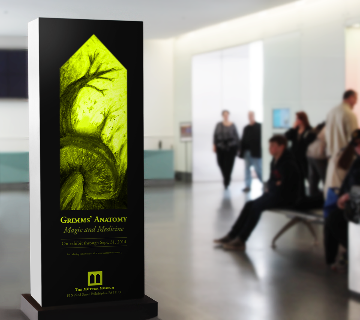
This rebranding of the museum’s identity brings its historical aspect into a contemporary mark, which takes the form of a case—a nod to the Mütter’s 19th century Victorian cabinet presentation style and its goal to inform the public. This opens opportunities for visual play, invoking the museum’s sense of fun, curiosity and eccentricity.
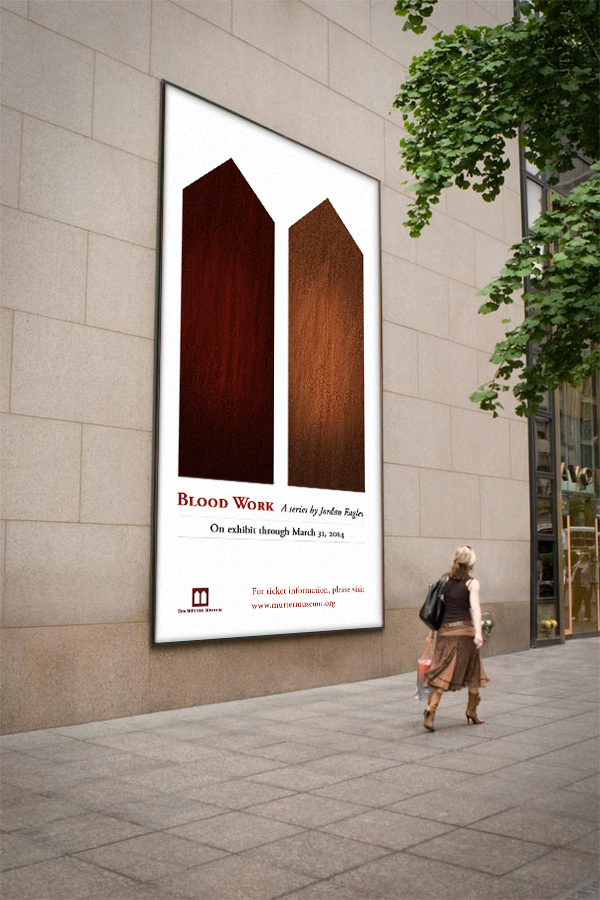
Speculative Work: The Mütter Museum
Credits: The College of Physicians Digital Library | The Mütter Museum website | The Mütter Museum youtube channel
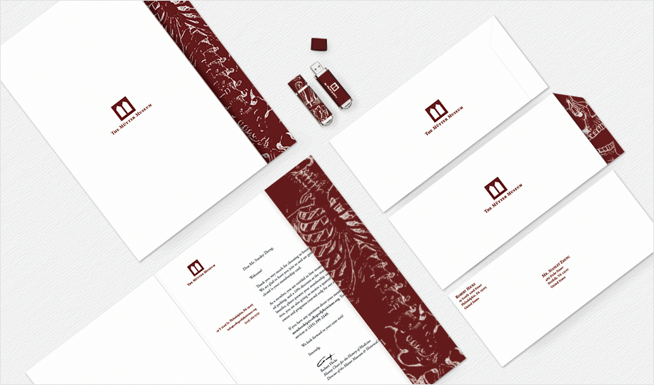

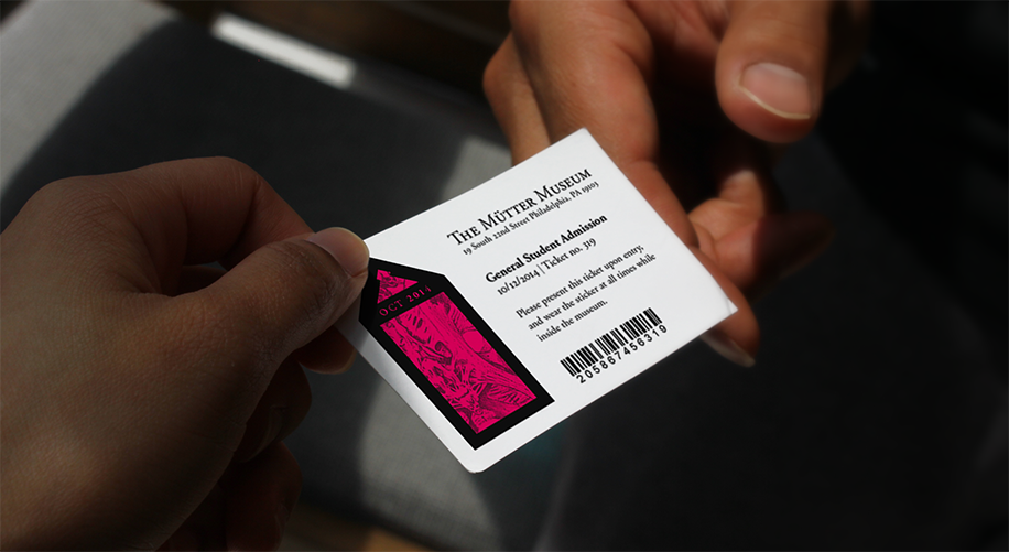
The stationery system aims for the clean, corporate look. Images evoking visual wordplay are introduced as a textural element to balance out the structured forms. The same idea is carried over to the membership cards. Function-wise, members need to be able to have this at all times, thus, a small die-cut taking an element of the logo is used to serve as a tag for keychains.
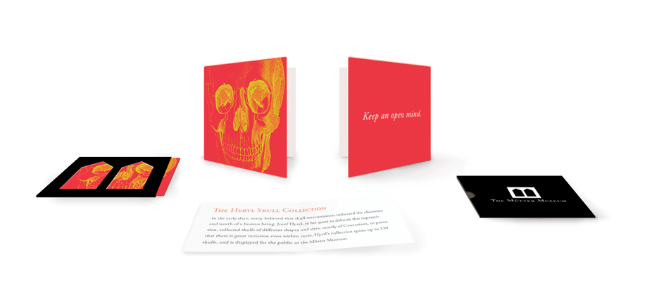
Promotional cards play on the concept of little curiosities. Each card contains trivia, reflecting the museum’s aim to educate people and to showcase their collection.
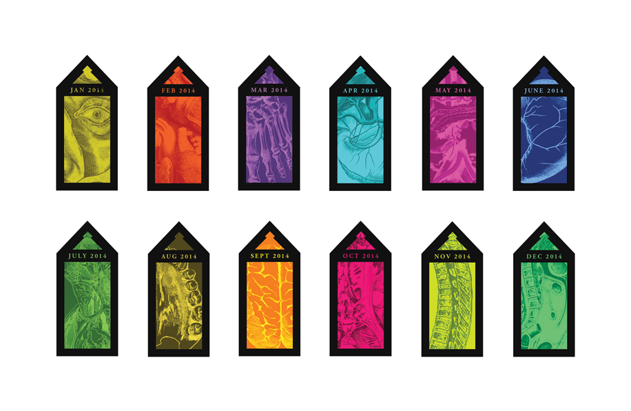
Visitor tags will be stickers, with the logo reinterpreted into specimen jars. Returning visitors could have their own collection as the stickers change every month.