In one class, we were assigned a list of names of famous people from which to choose subjects for logos.
Louis Pasteur, Sir Joseph Paxton, and Marco Polo are long gone, so in most cases, I had to update their "brands" into modern companies with descendants working for the companies.
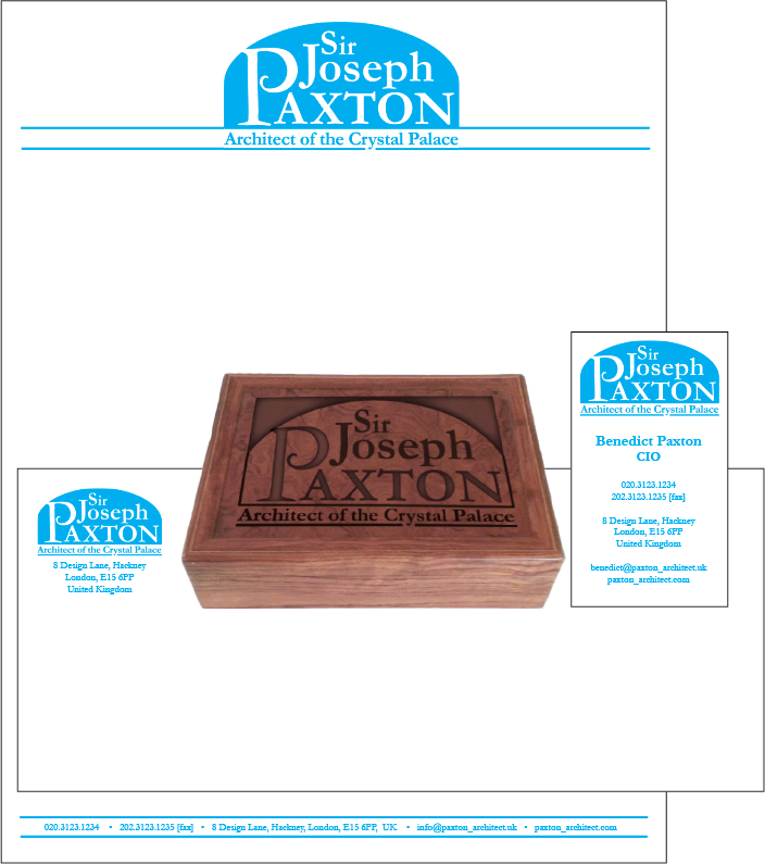
The original files had letterhead, business card front (and sometimes back), envelope, and a promotional item. These were intended to be printed, cut, and mounted on black boards and overlapped as needed as part of my physical portfolio.
Then I had to overlap the parts into a single rectangle to print in the pages of the mini-portfolio. Most of these identity displays are from the single rectangle.
I'm not sure this single rectangle is the best way to represent the individual pieces in an online portfolio. I need to look at the work of other graphic designers to see what will work best.