



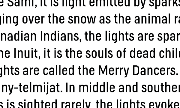

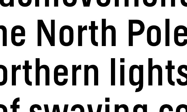
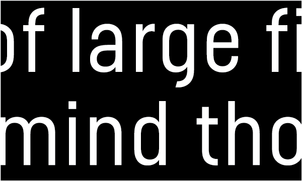
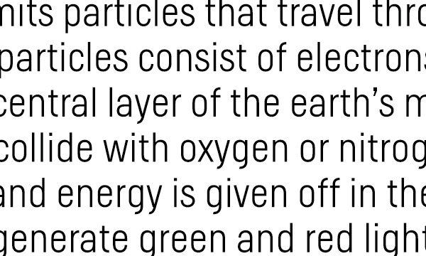
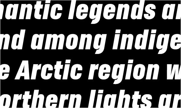
Helsinki is inspired by the Finnish traffic sign typeface. Like other classic wayfinding typefaces the Finnish signs featured rather crude, constructed letterforms. Compared with the original design Helsinki is optically more balanced, without losing the specific character of the typeface. I designed the first style of the typeface during my stay in the north of Finland in 1998. Later I completely updated the typeface, expanded the character set, revised the weight range and added italics. Helsinki fonts are optimized for on-screen reading and available for the web. I designed this little webpage to show the Helsinki webfonts in action and tell a little story about the magic of the Finnish winter nights.
Visit the Helsinki microsite.
Thanks for visiting!
Want to see more? Keep in touch by clicking the Follow button.

