


UI/UX work; 3 pages, 3 very different cases.
1. Redesign webb; Chorus
My currentcompany Chorus, has been busy developing digital health record systems, health care apps and health informatics. So busy they haven't had time to look at their own webpage. It was a pretty straight forward webflow page but it wasn't very responsive anymore. I stayed in webflow and started off from a theme in order to condense the pages, get some CTAs in and make the page more easily navigated.
Tools: Figma, Webflow, Miro
Tools: Figma, Webflow, Miro
Old version:

New version;

2.Redesign webb; Zengio (plus extra material)
Zengio is a product company developing and selling small scale health care solutions they needed to have refresh of their logo, graphic profile and their site. We also took a look at templates for presentation, icons, photo/illustration style, sales material, social media images and animated short movies to help describe complex flows.
Tools: Figma, Webflow, Miro, Adobe illustrator & Photoshop, Adobe express.
Tools: Figma, Webflow, Miro, Adobe illustrator & Photoshop, Adobe express.
Old version:

New version:

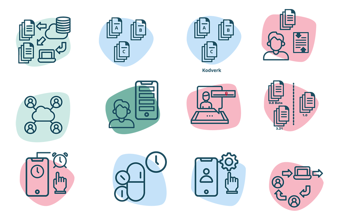
Product icons:
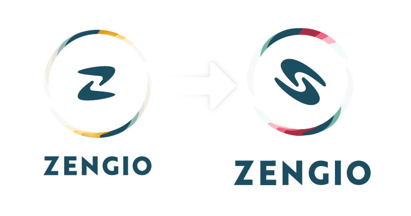
Redesign of logo:
We wanted to keep the feeling of our caring hands, without it looking like a "Z". The logo colors also have to work together with another red logo profile color.
We wanted to keep the feeling of our caring hands, without it looking like a "Z". The logo colors also have to work together with another red logo profile color.
Explainer videos:
3. Västtrafik
I worked as the digital design lead at Västtrafik for the better part of two years, during the covid lockdowns. Västtrafik is the public transportation company in Swedens second largest city, Gothenburg. Working with public transportation during a time in flux was definitely a challenge, though the biggest challenge was getting vetted for compliance with the wcag directive on accessibility. Originally hired to be responsible for the build and documenting of a design system, a lot of the day to day work came to be about finding and communicating with stakeholders for everything from map material to digital signs.
We did however get to redesign the webpage, Im including the web as it is now (one year later) as it has most of the design implemented.
Tools: Figma, Miro, Adobe illustrator & Photoshop, XD.
We did however get to redesign the webpage, Im including the web as it is now (one year later) as it has most of the design implemented.
Tools: Figma, Miro, Adobe illustrator & Photoshop, XD.
Old site:
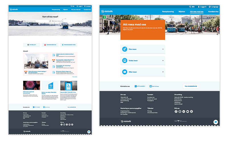
Current site:

There you have it, 3 redesigns, 3 very different takes.
Cheers!
Cheers!


