Marathon Social is a start up social media public relations firm.
The client wanted a bold, clean and corporate mark that had an active tone to it.
Below is a look at how the identity developed over two rounds. Following the ACCD dictate, I do 50 sketches (no matter how bad) before I move into the computer. Below is a selection from my sketchbook pages...

The client was very specific about wanting a logo in addition to a wordmark. Shades of the final mark can be seen in the bottom right above.
I pursued two primary graphic directions: monogram and triangles.
Abstracting the "marathon" part of the name, I made overlapping triangles that formed a sort of foot/shoe. Rotating the points forward could make them into multiple shapes that come together to form an M.
I pursued two primary graphic directions: monogram and triangles.
Abstracting the "marathon" part of the name, I made overlapping triangles that formed a sort of foot/shoe. Rotating the points forward could make them into multiple shapes that come together to form an M.

I've been big on triangles this year. And particularly three pointed shapes with circular cutaways. Some soft longing for Herman Miller? It dogs me but doesn't stop me. I used it for a great project last Fall that is buried under a NDA. It didn't stop me from taking that toolbox out for this project.
Whether monogram or abstract, the logo had to have an active "sporty" vibe to it.

The monogram approach also took a pointy, flag approach.
What you'll also see here at the far right is a late idea for a pet M, an m with four legs. Social and Friendly but probably too family for the client.
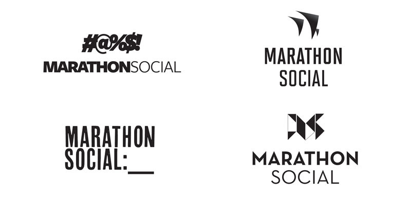
I presented four drafts in the first round.
The exclamation mark on the top left i still feel is brilliant for a scrappy social media pr company. But it was the two on the right that the client wanted to see more development on.
The monogram changed to become symmetrical. The color fade within the mark is to emphasize the S within the M. Pretty and liked but the client voted it down as too Transformers. Maybe. But hey, the 80s are back.
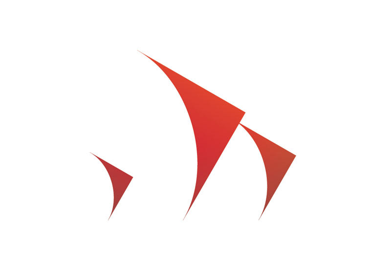
The three triangle M got adjusted so that the feet were all on the same horizontal, and the scale was changed to fit a Fibonacci meter. The client found the color too orange and we changed it to a bluer-red with a slight top to bottom fade which gave the top-heavy mark a greater right thrust.

The three triangles sit within a Fibanacci meter. The smaller two create the third. The spacing between the feet of the M are the distance of a middle triangle. Outside border and typography are each a small triangle in scale.
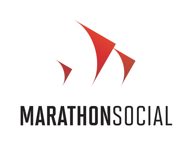
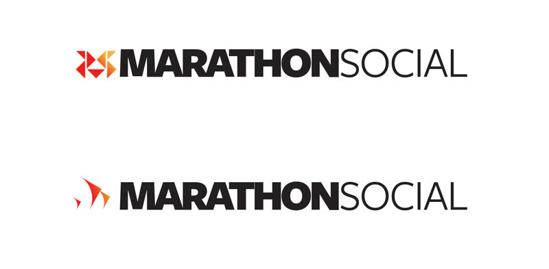
The finished mark and type say Active and Clean. Three triangles are rotated 30° with a right lean and given a top to bottom fade creating a subtle weight and movement. Each shape is identicle in form but not in scale. The many shapes coming together, working together suggests the "social" part of what the company does. The positive form suggests an M to reinforce the monogram element; the negative space looks like billowing sails in the wind which underlines the active part of the message and helps to reduce the Running implications from marathon.
Total time, about four weeks from start to finish on the identity. Everyone is very happy.
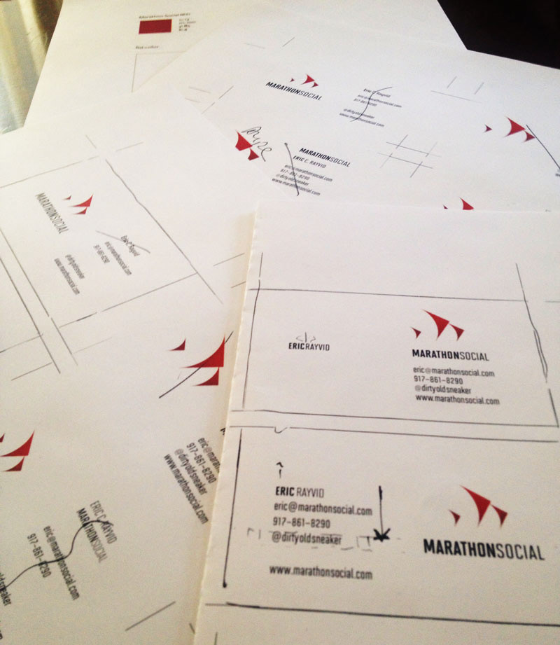
We also worked on business cards for the client. The final card had to be single sided and unvarnished. Below are some iterations as well as an illustration of how these things are a battle of millimeters (or points, if you're old school).