


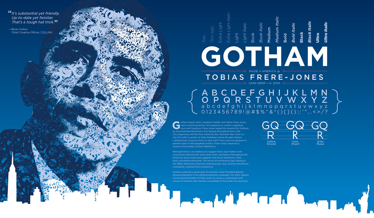
Gotham Typography Poster
Printed with a matte finish and mounted to Gatorboard.
14" × 24"
This poster was for Design 258: Typography (spring quarter 2011) at The Ohio State University as part of a series of typographical posters. Students were each assigned a different typeface and were given a starting point in terms of a grid. The name of the typeface was required to be 3" from the top and 3" from the right, 1.25" in height. Typefaces that required two lines for the name use a .25" gutter and use a second 1.25" row beneath. The remainder of the grid and layout was left to the student. The finished posters were displayed in such a way as to form a typographical timeline. My poster was the last in the series (as Gotham is very new in the type world).


