Rebranding of a family business
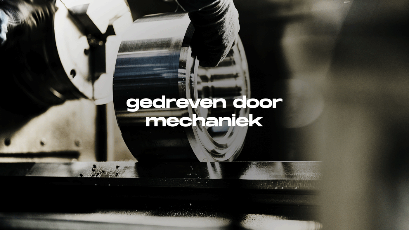
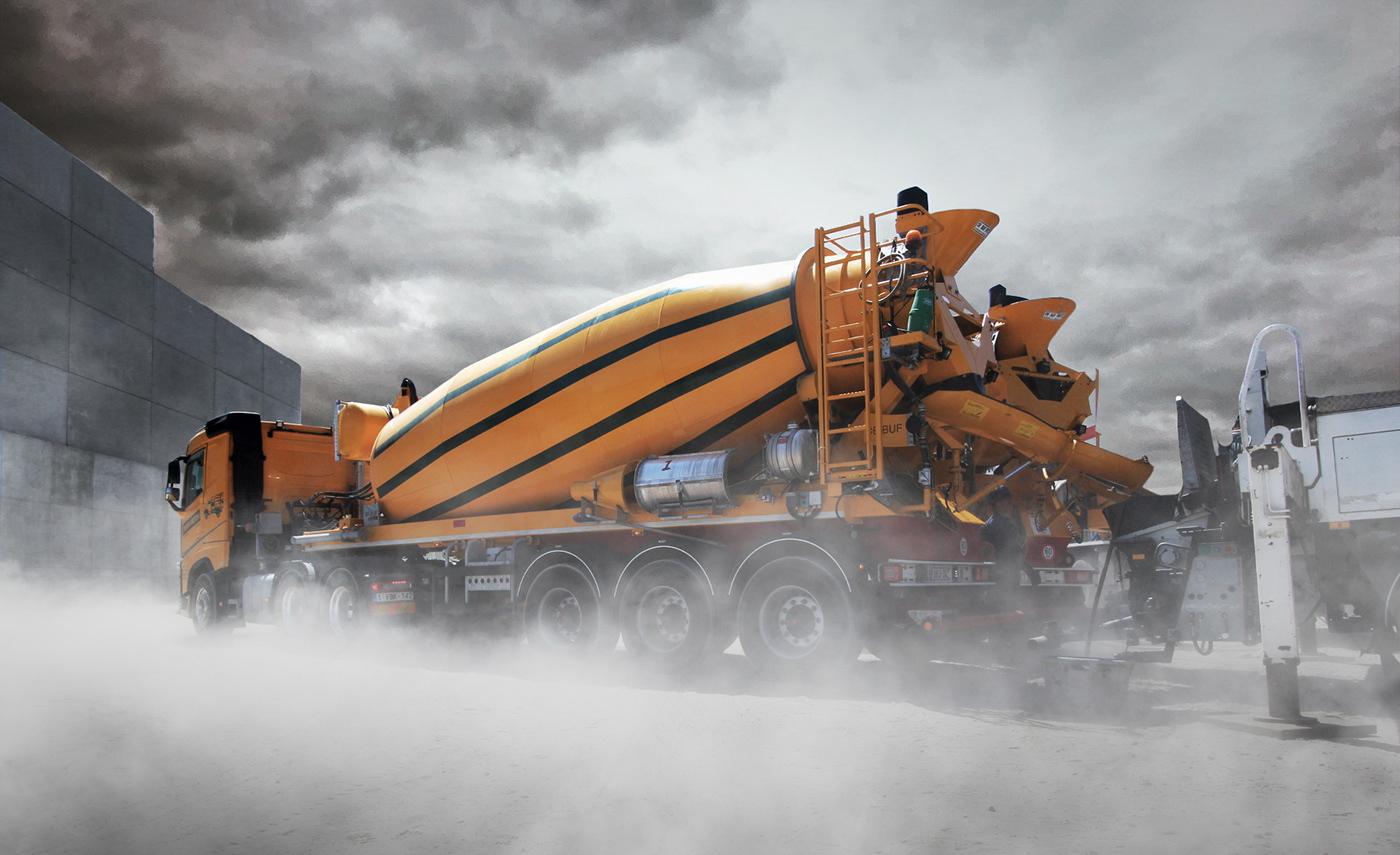
De Buf started in 1988 with the construction of trucks, and later expanded with the development of its own concrete mixer. The second generation are now ready and waiting to continue Frits De Buf's life’s work. In order to prepare the company to pursue its international ambitions, it was time for a clear brand positioning and rebranding.
The brand's positioning and story
Preliminary investigation revealed that this was a sector of few words. Our brand strategy workshop confirmed this, and it was primarily pride in their concrete mixer that came to the fore. To get the national and international clientèle excited about De Buf, we decided to position the family business as a dependable, experienced player with a direct approach.
A bold visual identity concept
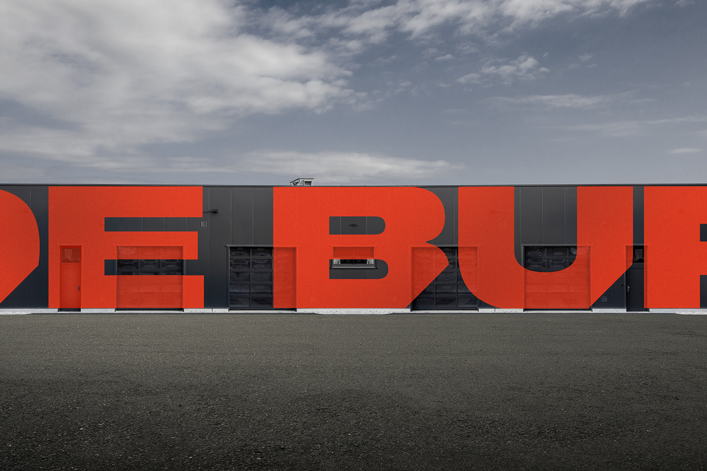
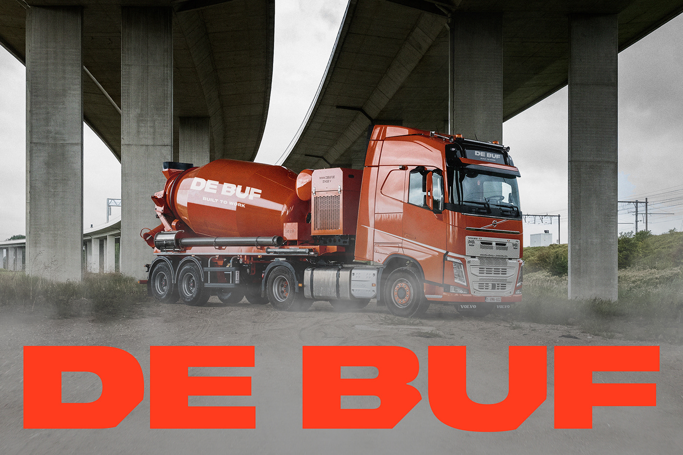
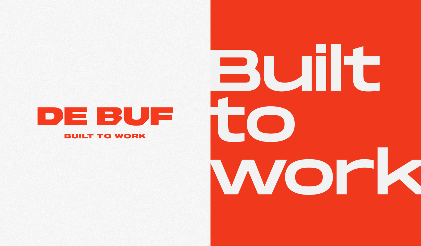
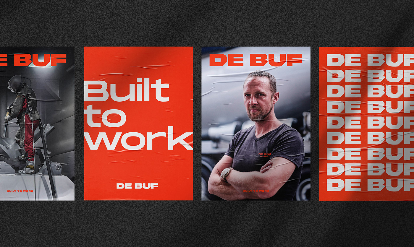
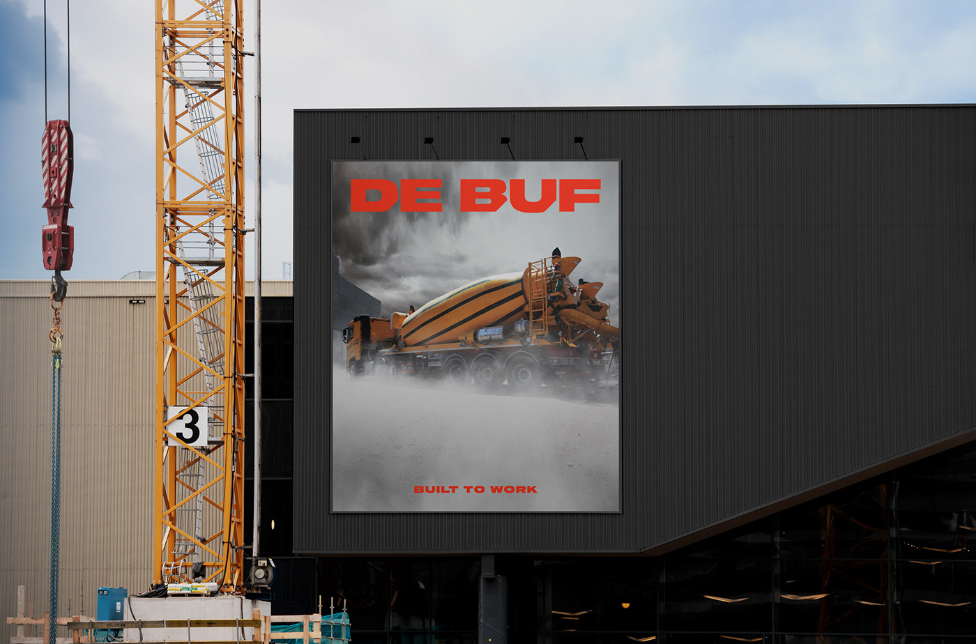
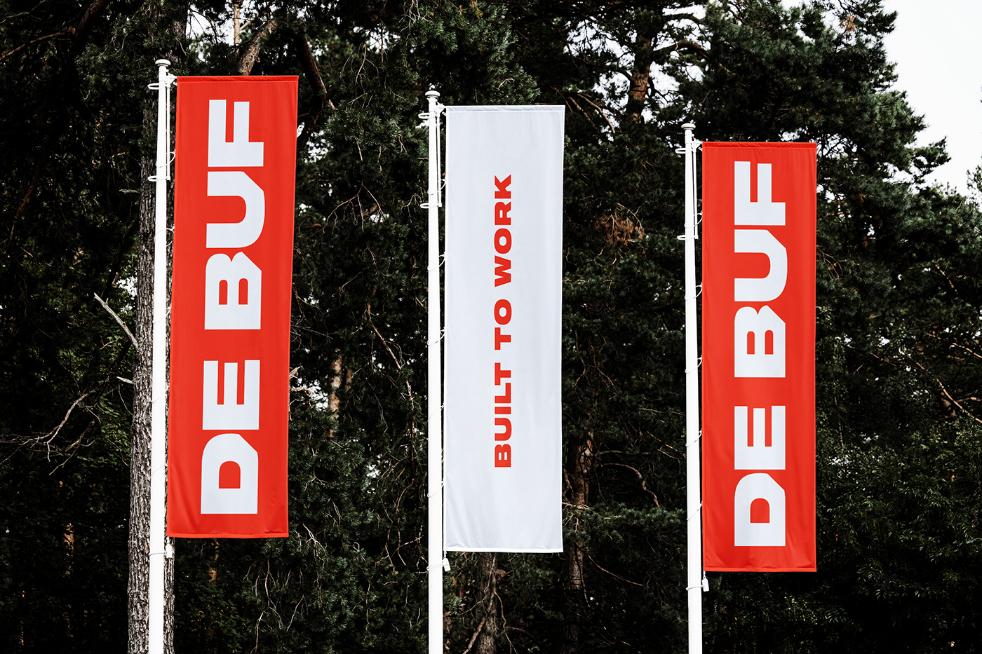
Bigger is more. De Buf really stands out in terms of both product and service, and we highlighted this by adding the largest possible logo wherever we could.
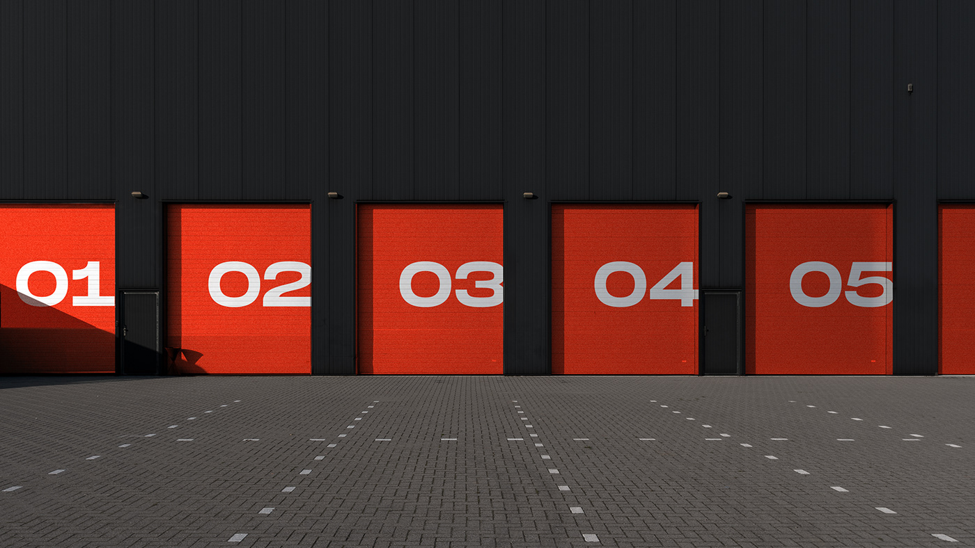
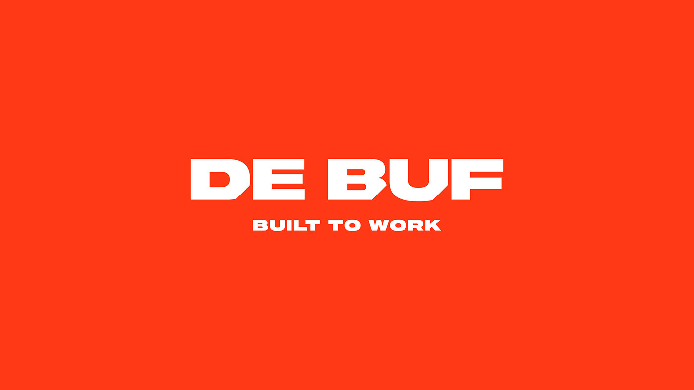
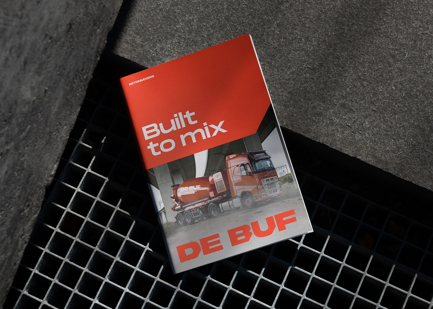
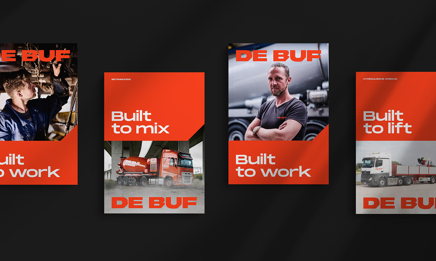
We made the existing orange house-style colour slightly redder, so that the target group would associate the brand with its passion and directness. The bevelled edges in the concept exude technical expertise and give the brand a recognisable character.
For the concrete mixers, which are produced entirely in house, De Buf is focused on a specific target group. Through taglines, we created the option to approach potential clients for concrete mixers separately.


The full brand experience
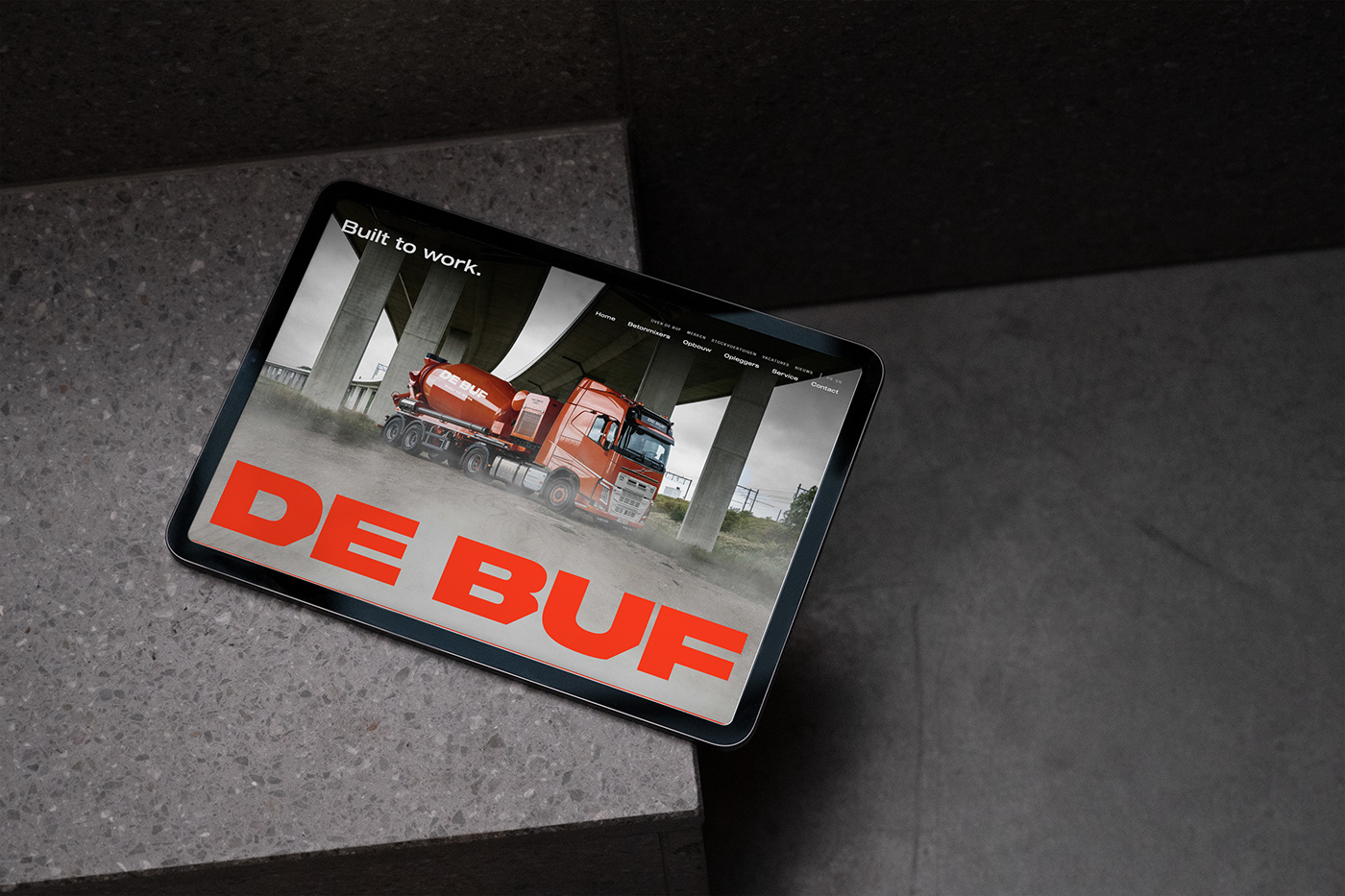
In addition to www.debuf.be the customer has access to all possible carriers, in order to increase familiarity with their products nationally and internationally, both online and offline. As a full-service partner, MOQO remains at De Buf’s service and we continue to monitor the brand’s line.

Spatial design
We carried the principle ‘bigger is more’ through to the spatial design too. Each physical touch point is branded with a large version of the logo and, where possible, the recognisable bevelled edge from the grid system.