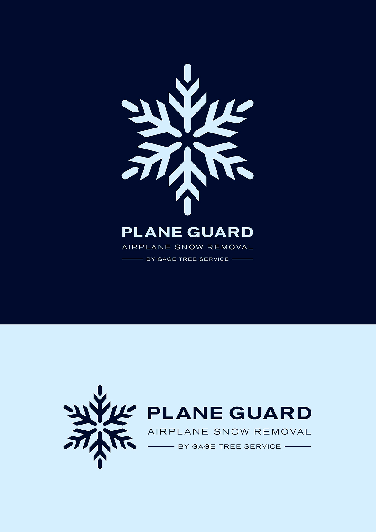
Plane Guard
Gage Tree Services are an Alaskan based company specialising in tree surgery,
snow removal and Christmas lighting in the winter.
In 2013 they decided to add airplane snow removal to their list of services and required
In 2013 they decided to add airplane snow removal to their list of services and required
a logo to promote Plane Guard. The target market was owners of airplanes at two
of Anchorage, Alaska’s airports.
A simple snowflake design was created and given an aeronautical twist. In doing so
A simple snowflake design was created and given an aeronautical twist. In doing so
the logo visually demonstrates a ‘two for the price of one’ solution – airplanes and snow.
The icon says something about the Plane Guard service in a modern,
clear and engaging, graphic way.

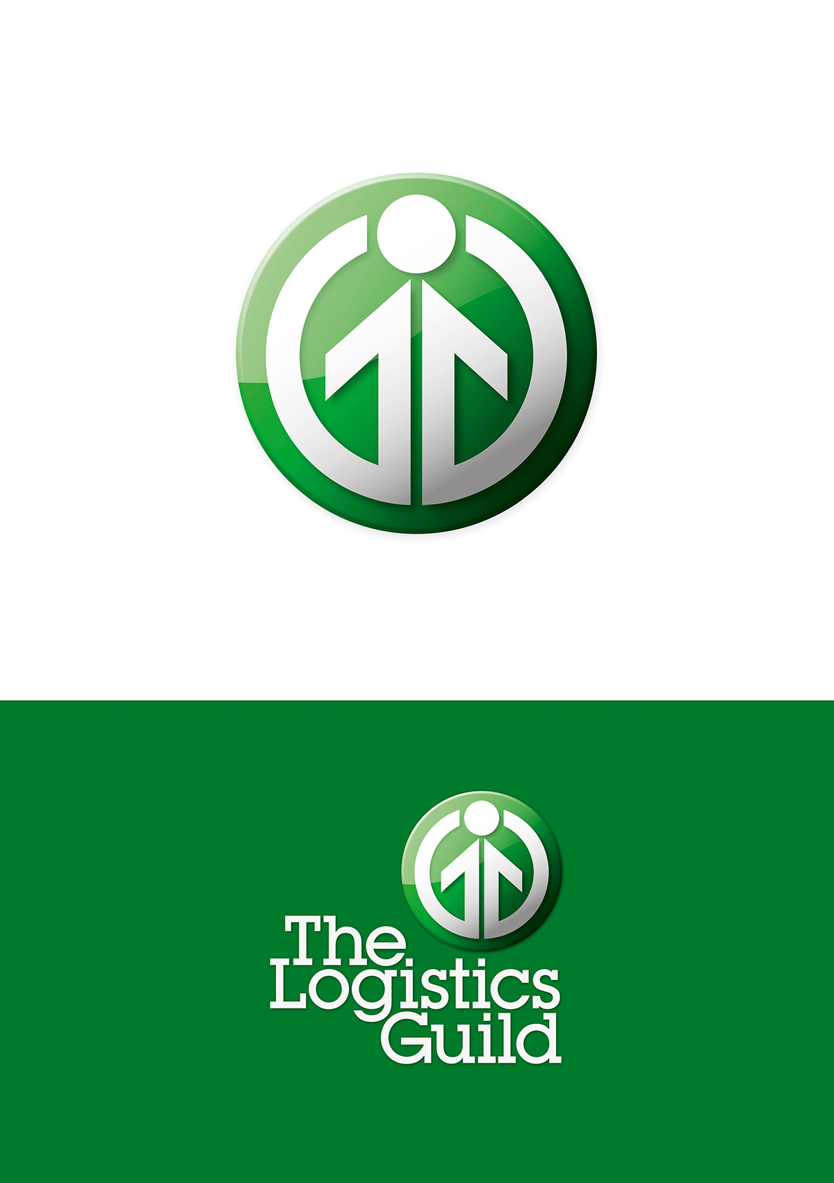
The Logistics Guild
The Logistics Guild is a membership network providing a shared support of resource,
information and opportunity, run for and by its members.
The Guild required a single identity/logo in the promotion of their members network.
The Guild required a single identity/logo in the promotion of their members network.
The Logistics Guild’s mission was ‘betterment of the individual’ within the
logistics and supply chain industry sectors.
Central to the logo was the visual expression of ‘individual betterment’ by way of the
Central to the logo was the visual expression of ‘individual betterment’ by way of the
dot (head) and arrows (arms) moving in an upward direction. The ‘Guild’ element was further
enhanced by the use of inter-locking the two ‘G’s’ to form the individual.

The Chartered Institute of Logistics and Transport
CILT is the professional body representing the transport and logistics industries across the world.
Founded in 1919, CILT was granted a Royal Charter in 1926.
The commission was to devise a new global logo and identity that best expressed the
The commission was to devise a new global logo and identity that best expressed the
original Institute’s Charter objectives: ‘To promote, encourage and co-ordinate the study of
the science and art of transport in all its branches.’
Uniting CILT under eight arrows, the logo’s shape expresses globalism through the central
Uniting CILT under eight arrows, the logo’s shape expresses globalism through the central
wheel (found in transport applications) and the compass point arrowheads which signify direction,
movement, energy and CILT’s eight core professional sectors.