
Rebranding For a Healthy Nut Butter Label
Valnuts is a Bulgarian nut-importing and processing company with a 30-year history. I was commissioned by their marketing director to redesign both the company logo and identity and their line of healthy nut butters. The company owners pride themselves on the unparalleled quality of their product, sourcing only the highest quality nut produce from all over the world. With over 30 years in business, the brand had outgrown its old visual identity and desperately needed a new look to elevate its upscale product to the high end of the market.
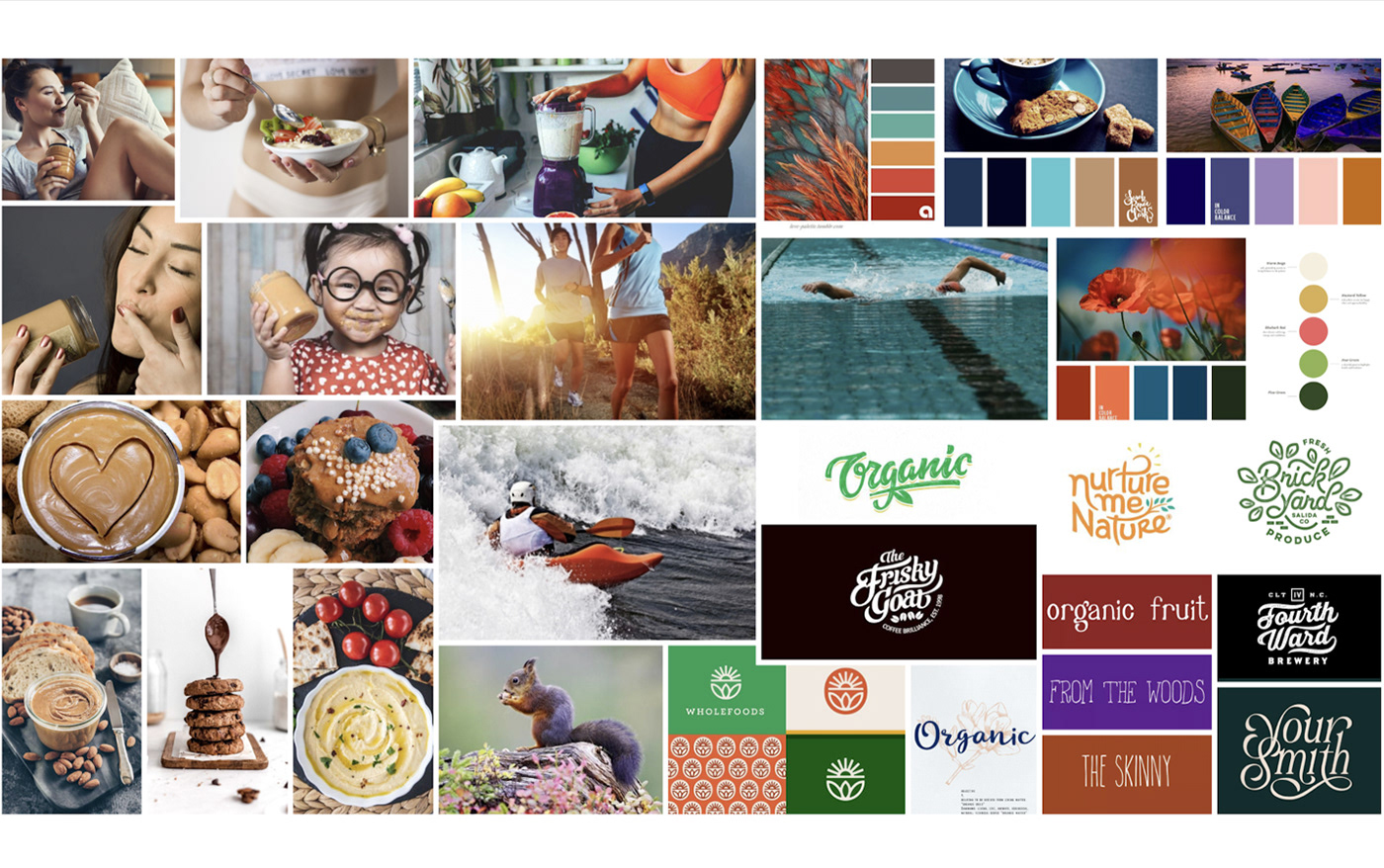
After a thorough discovery session with the Head of Marketing, a detailed mood board was put together as an early check-in point for initial feedback on the project’s general direction.
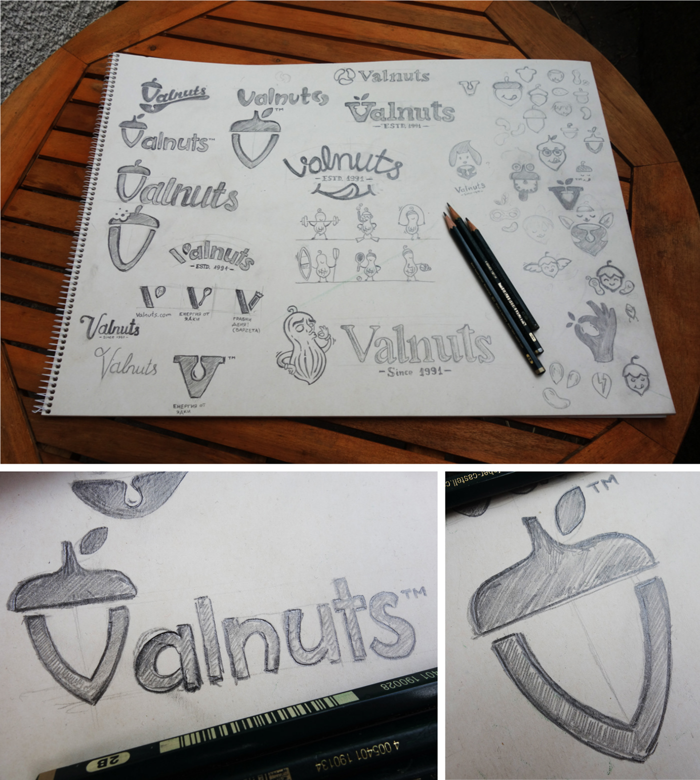
Once we agreed on the look & feel for the new identity, I set out to create a series of preliminary sketches to quickly come up with creative ideas for the company logo. Winning concept was digitized and refined.
The second part of the project involved creating the packaging for the whole product line of nearly 20 SKUs. The goal was to create an engaging series of labels that would stand out on the shelf and help establish the Valnuts Nut Butter line as an upscale product that appeals to health savvy consumers.
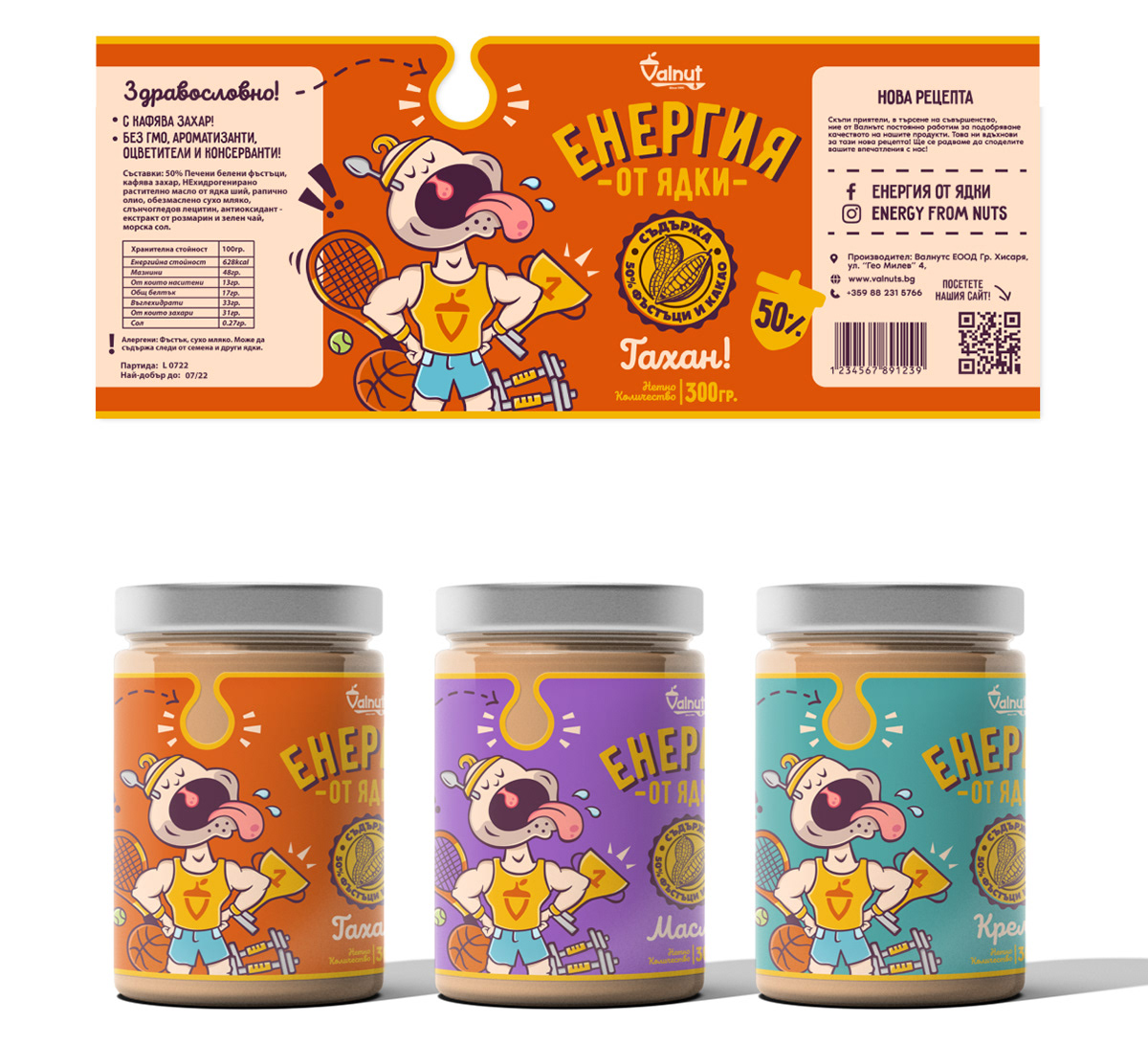
Two quick initial packaging directions were presented to the client, both building on the style already established with the logo. Although a solid chunk of the target audience were sports enthusiasts, the athlete character direction (concept #1) was regretfully rejected as being too whimsical and cartoony.
Packaging Direction #1
Packaging Direction #2
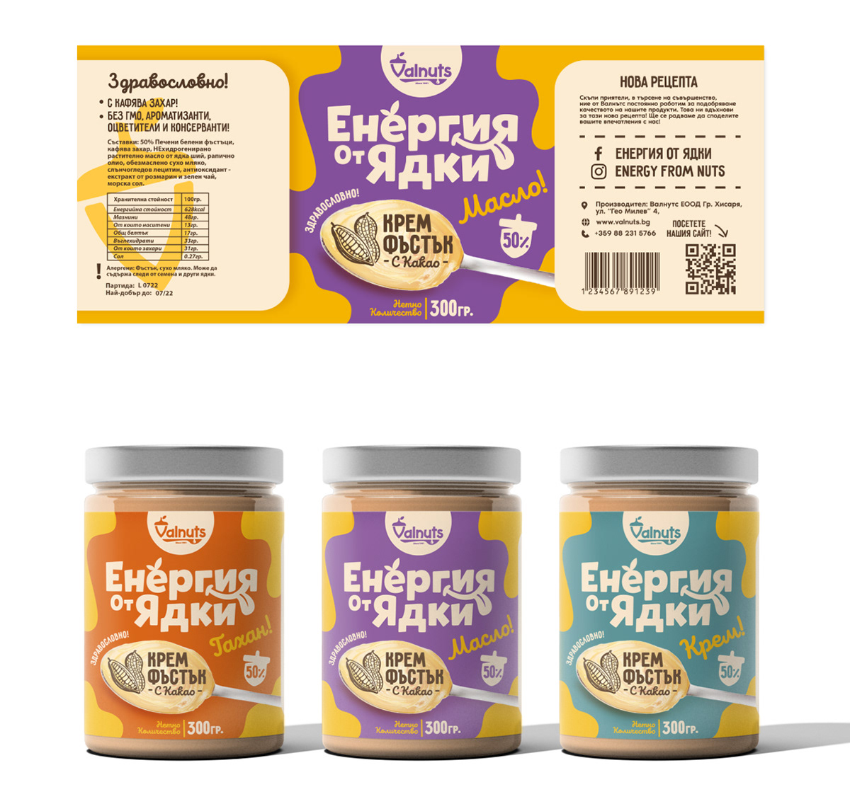
The second direction was singled out and refined further. The product blend needed to be more prominent on the front of the labels and also we needed to find a way to make part of the label transparent so that the content of the jars would show through. I decided to clean up the front and focus on typography combination to make the design both functional and impactful.
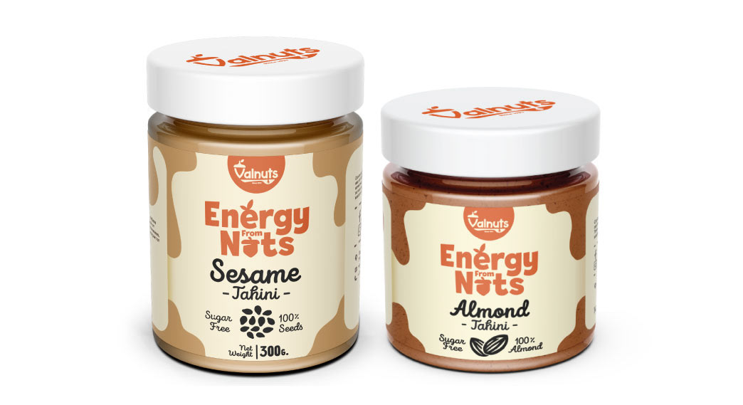
This is what the final packaging mockups looked like right before the first labels were printed:
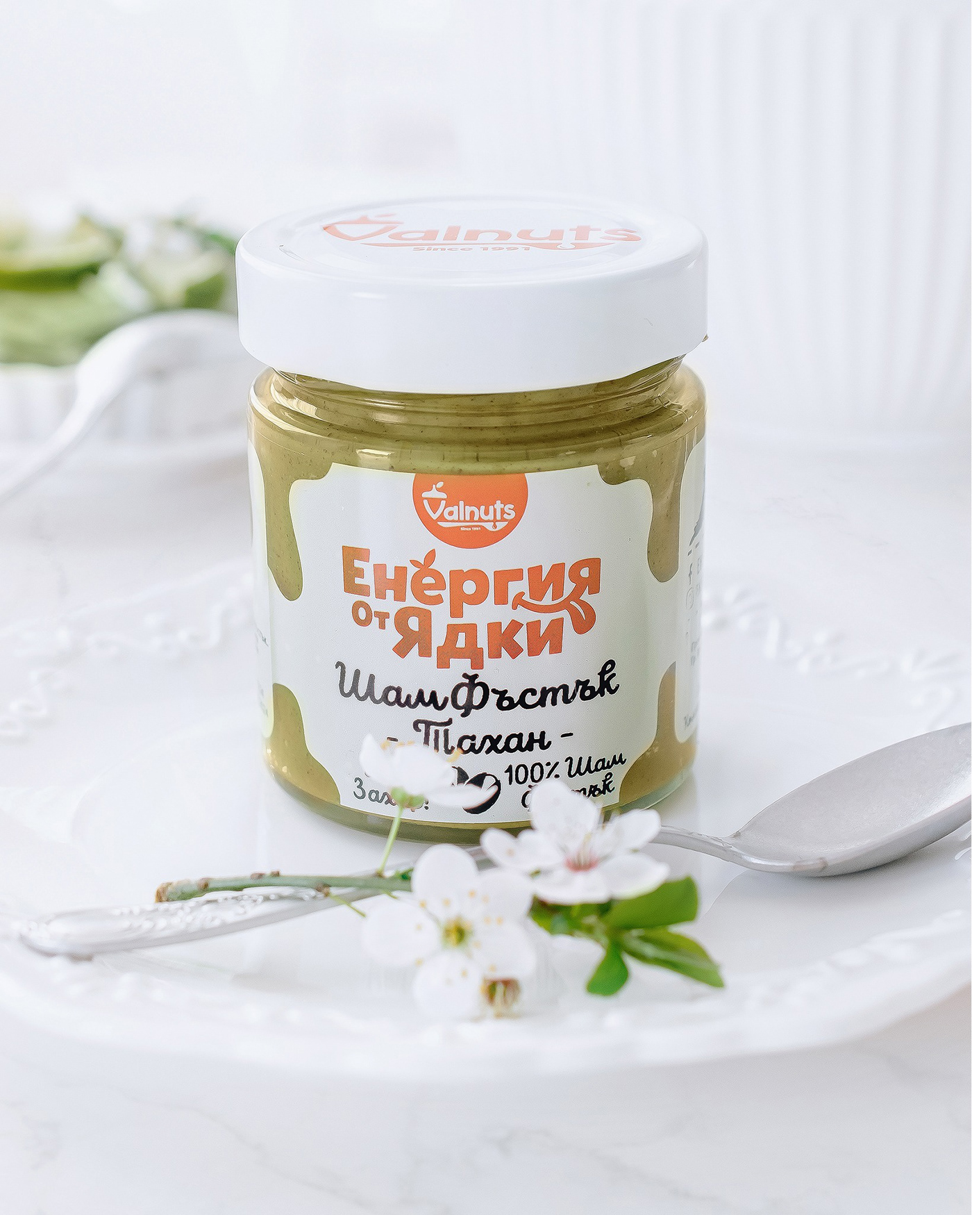
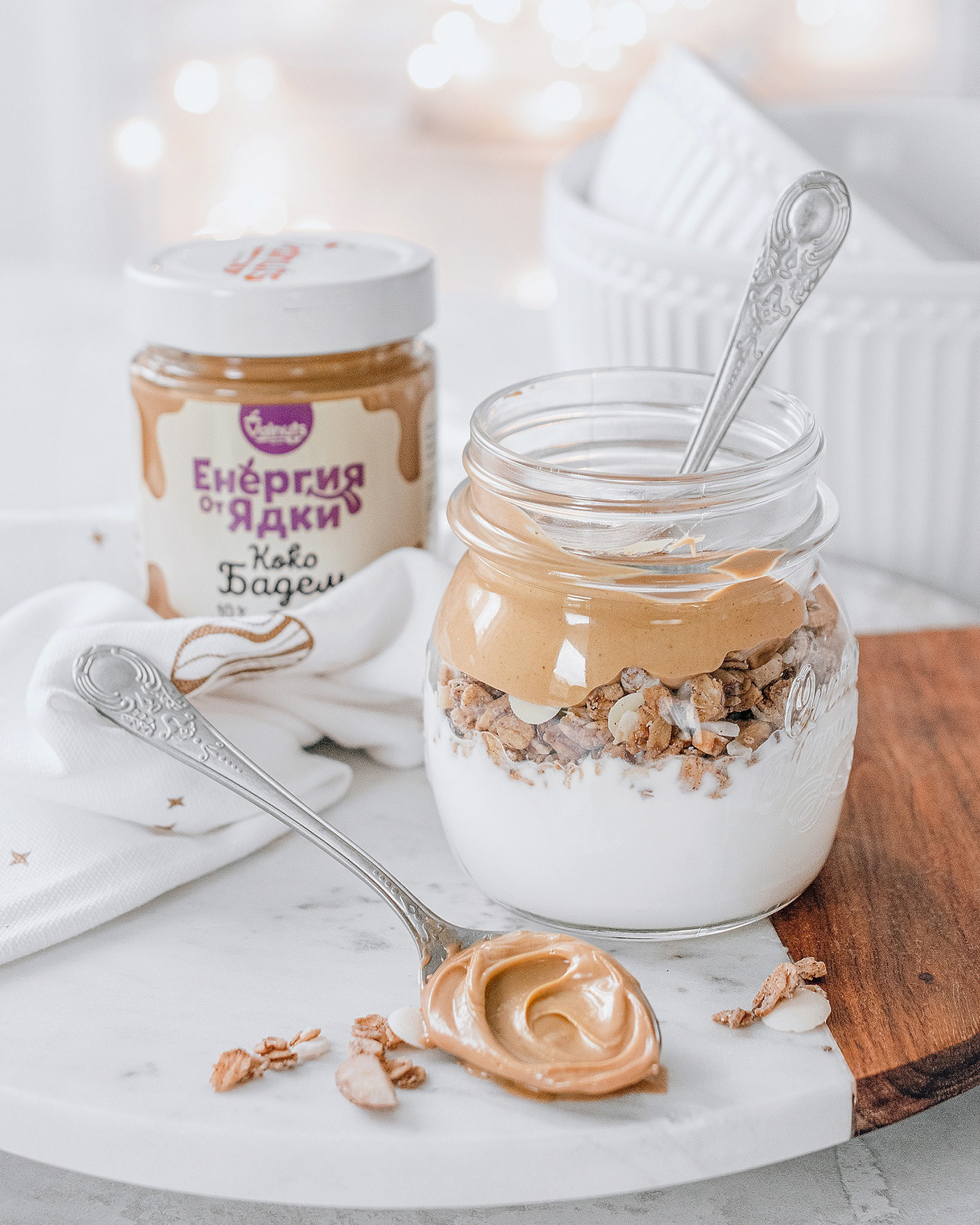
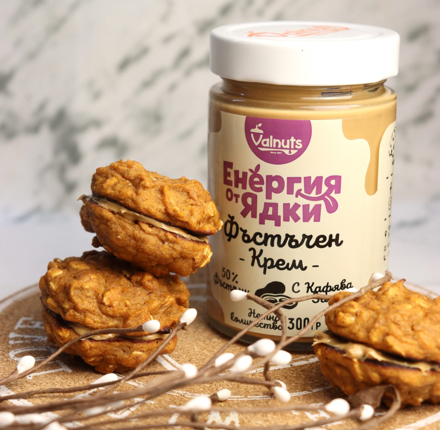
Some of the first shots of the actual product that were made, once the new labels had come out out of the printing press:
Testimonial from the client:
“Yavor did an excellent job with the rebrand of our company and the new packaging for our line of nut butters. He was very supportive, worked hard and truly exceeded
expectations to deliver high quality design. Highly recommended!“
- Rossen Nedev, Head of Sales & Marketing


