
Angler Immobilien is a real estate company that helps to rent and sell properties, as well as helping with property management, real estate-related bureaucratic issues, etc.
My task was to develop a logo and identity while respecting the following requirements: the design should be memorable and recognizable; reflect the activities of the company; inspire confidence and reliability; be strict and discreet.
The target audience was middle-aged people (30 to 55 years old) who would prefer to outsource their real estate related tasks to a company and thus free up their time. These people are quite busy, so the design had to be clear and accessible.
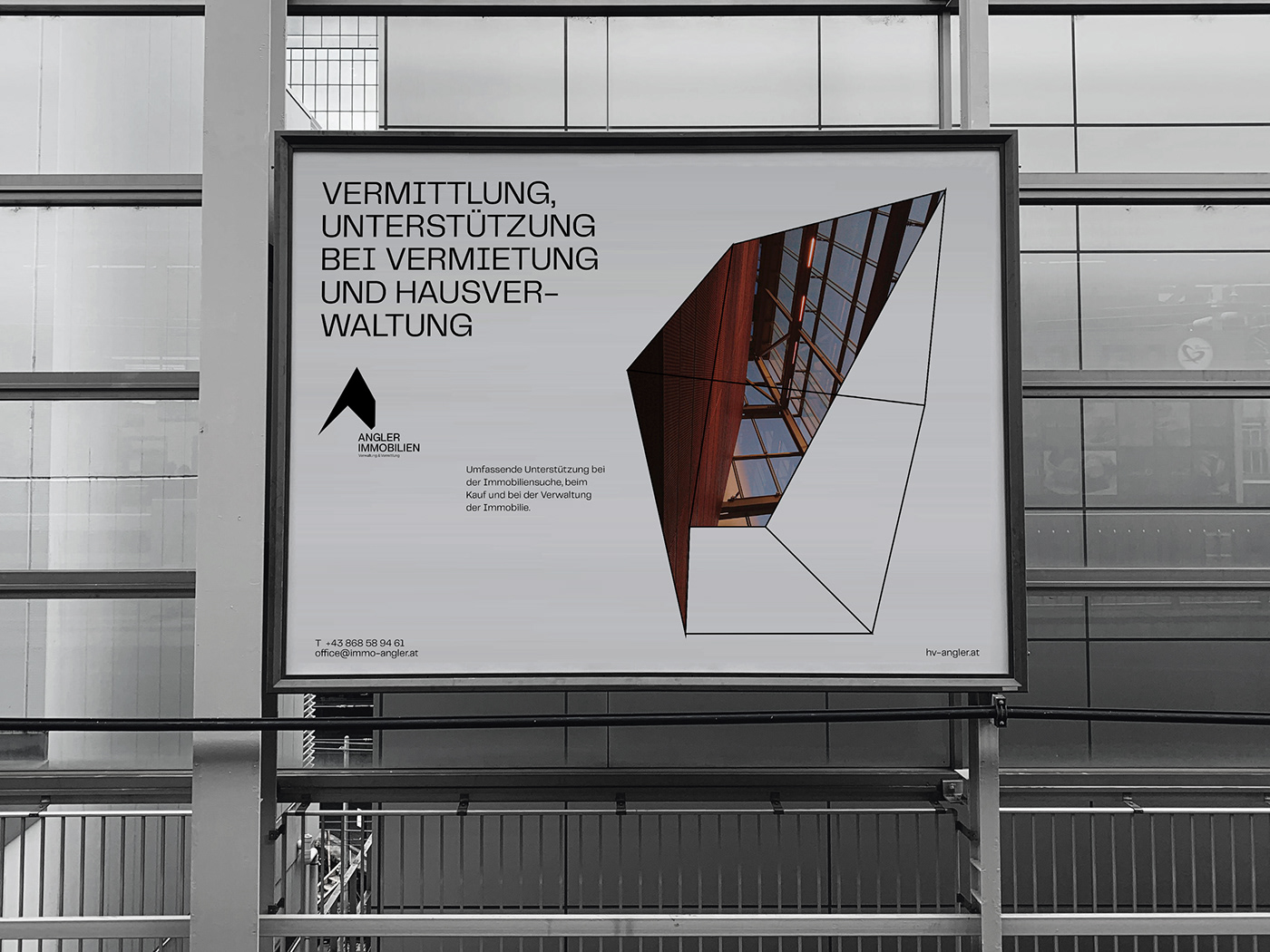
The identity and logo are based on the same metaphor - a simple and cozy house. The logo is a roof of a house, it symbolizes the reliability and responsibility of the company. The shape is triangular, as the psychology of this form creates a sense of stability.
The entire style is a variety of elastic and abstract shapes, which are very easy to adapt to different layouts, whether it is a presentation, a mug or an advertisement.
The entire style is a variety of elastic and abstract shapes, which are very easy to adapt to different layouts, whether it is a presentation, a mug or an advertisement.


Company Insight - "We will save your time by taking over some of your tasks".
To reflect this, I created a simple animation in the advertising layout, which motion indicates an elastic approach to the client. It is a metaphor for the fact that housing is easy and flexible if you ask for professional help.
To reflect this, I created a simple animation in the advertising layout, which motion indicates an elastic approach to the client. It is a metaphor for the fact that housing is easy and flexible if you ask for professional help.


