
Thessalonikios (Θεσσαλονικιός)
logo design
logo design
Thessalonikios (Θεσσαλονικιός) – meaning the man from Thessaloniki, is one of those traditional Greek soulvlaki places that have managed to become a landmark in their town.
The shop is well known in Corfu Town (Greece), especially in the suburb where is located (Garitsa – an old factory suburb). It is a traditional place, with traditional recipes for souvlaki and gyros that doesn’t experiment or strays away from the classics – which are well respected. It is also well known for its signature sauce (a local specialty for souvlaki) and has a large customer base.
In 2022 the owner decided to sell the shop. The new owner – already owning another grill/souvlaki restaurant – decided to keep the traditional feel of the shop. The shop itself was renovated but kept its identity as an old-school souvlaki/grill house. They even kept the same sauce recipe.
We were tasked with designing the new identity of the shop. The old establishment had no actual logo or identity (as it’s usual with the old shops of this kind), so we had the freedom to design something completely new.
The shop kept the same name, but the name itself came with restrictions. It was a homage to a different city and place. It could not be used literally for the new identity. The new logo should also show the shop’s traditional style and history.


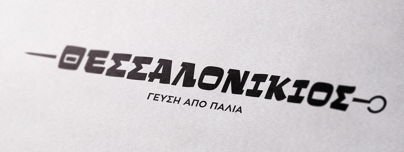
We decided to keep it simple. No fancy symbol, just text. We selected and old school blocky typeface, CF Klak which is an uppercase display font inspired by the lettering used for the advertisements of Greek movies of the ’50s, ’60s and ’70s – a direct reference to the history and age of the original establishment. The familiar look of the typeface (old Greek films of the time are really popular) also reinforced the feeling of familiarity, of “an already established shop” that we wanted, as well as the feeling of nostalgia of a bygone era.

The logo itself takes advantage of the font’s shape to create the most recognized dish – the souvlaki – the letters acting as pieces of meat on the souvlaki. Due to space limitations, the logo was designed as “responsive” and is able to adjust so it can fit in any place. It also transforms into the second most recognized dish – the Gyros. An additional icon was designed for small spaces or online use.


Along with the logo a tagline was introduced. Γεύση από παλιά – meaning Flavour from the past. A direct connection to the roots of the business and a discreet reminder that this is basically a continuation of an old business and not something completely new.


