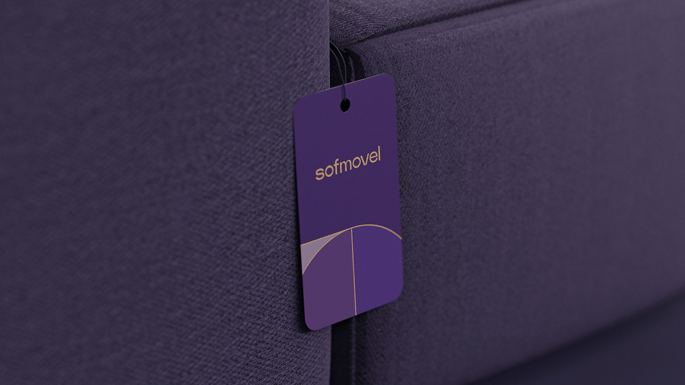
Sofmovel attends to the main goal of interior design, to ally the design with the quality of materials used by manufacturing furniture and upholstery.
With that concept we created the icon, where the simple geometry shapes represent the different materials used and their junction results in what Sofmovel representes. An icon that represents not only the experience of the brand, but also the know-how and skill required to create truly differential design pieces.
We used all of this communication concepts with a strong but simple lettering the reflects the experience, the classic context and the quality of the brand, without making it look old or heavy. We also used gold finishes that complement well with the purple for which the brand is already known for.