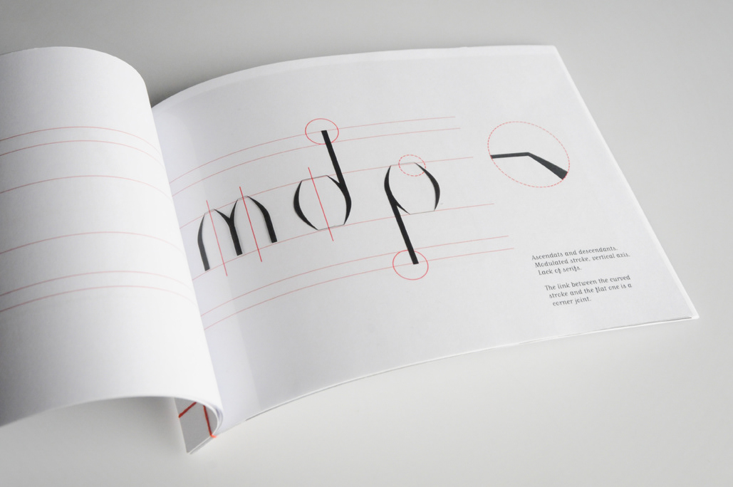
“A flatten vault, an arch cut just when the hand cannot follow it’s round trace anymore.”
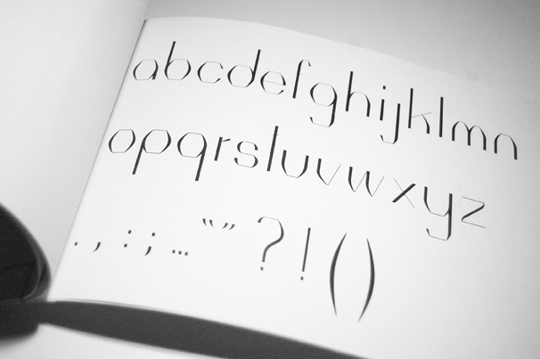
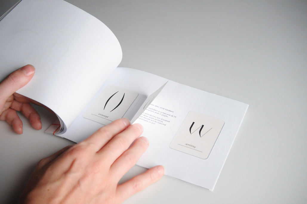
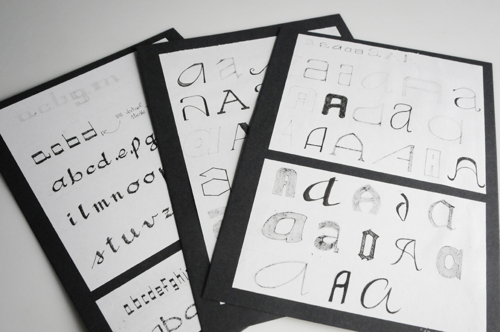
Roman sans serif typeface. The alphabet is composed of 26 characters and 11 glyphs.
Geometrical proportions, repetition of modules and curvatures are the main characteristics of archiSans. Strokes and sizes make it suitable for magazine covers or large print formats. The design is not right for light displays or web publishing. Small scale application would suffer too the slimness of the horizontal strokes and lack of legibility in smaller sizes.