


Celebrating its 110th anniversary, LPO (Ligue de Protection des Oiseaux, Bird Protection League) unveils a new logo, a new visual territory, and a new exclusive typeface.
The puffin couple has been redrawn and the whole logo rebalanced to maximize its readability. The new color palette brings natural, yet vivid colors, inspired by birds and their environment.
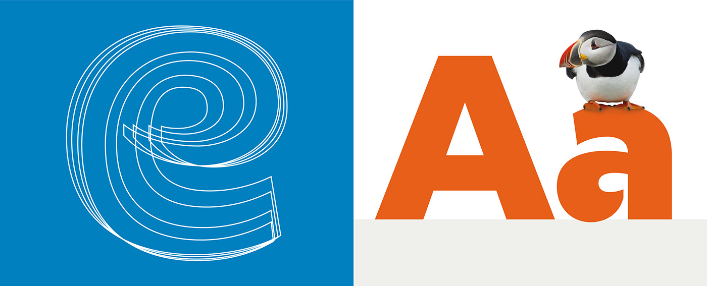
The typeface was tailor-designed by Éric de Berranger. It incorporates cuts in its classic letters, for an organic, clear and legible alphabet, fitting for both title and paragraph.


Direction de Création : Éric Colin
Direction Artistique : Rémi Perrollaz
Typographie : Éric de Berranger
Production : Florine Guillot


