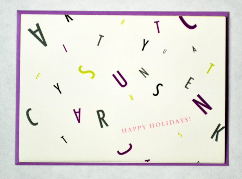
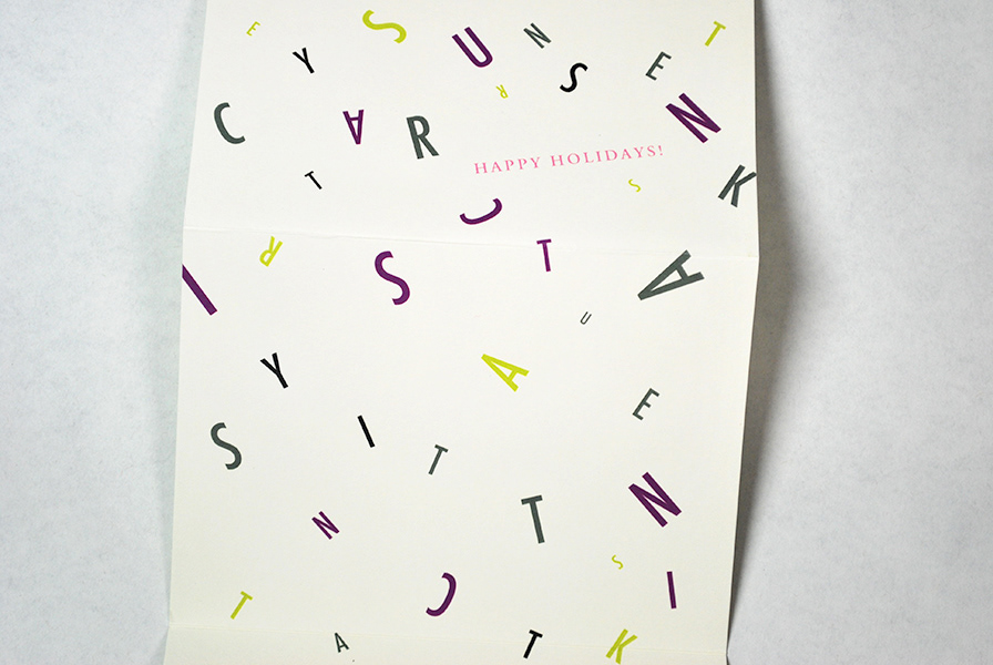
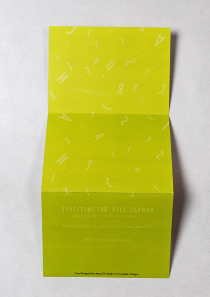
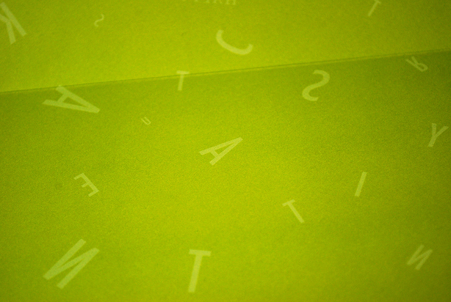
The idea was to put design and creativity back into holiday cards + have that letters that spell "Kansas City Art Institute" to be falling and blowing just like snow. A trifold was used to further enhance the experience of letters falling. The back of the card is a verse of the text from the main side but in white on KCAI's bright green.