For a University project we were set the brief to design a magazine called 'Creative Arts' to be aimed towards the various mediums of Art. We were set to design our own Masthead as well as creating four covers for the magazine.
The only restraint that we had on the brief was that we had to create two double page spreads and two of the covers had to be themed; One for the Launch issue and another as a Typography issue.
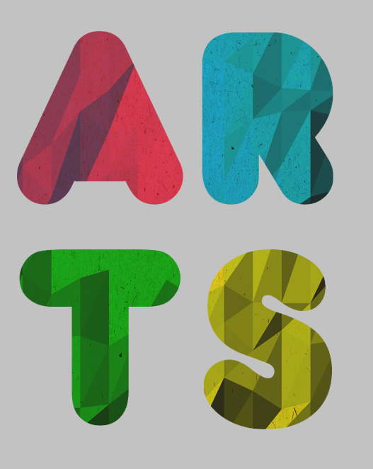
For my Masthead I decided to change the name of my Magazine from 'Creative Arts' to just 'Arts'. To not only make it shorter and a lot easier to design with but also to experiment with die cut.
I played around with the letters and decided a more laid-back take on the letters would make it appealing to the audience I was aiming for, and not making it look too formal.
I also decided that by laying them in a square structure it would make na interesting die-cut cover to make my magazine stand out on the shelf and also appeal to an audience by giving them a sneak preview of what was underneath.
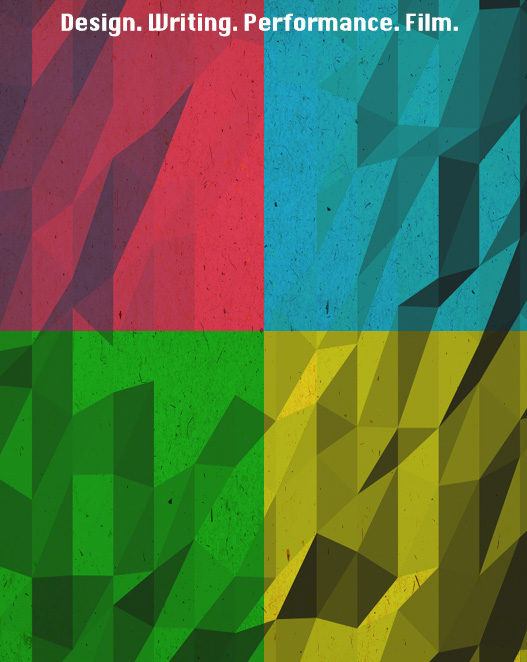
For my first cover I wanted to incorporate the design of the masthead with the Cover design. For this I decided to split the Cover into four colours that would help distinguish each of the letters through the die-cut cover. To make this more interesting I also added a texture and a pattern, as well as deciding to put the magazines Tagline across the top where it would not show up through the 'Arts' and become a distraction.
Here I experimented with my launch issue cover by placing the Masthead over the top as a mock-up die-cut cover. I liked how this worked so went on to experiment similarly with the other Covers.
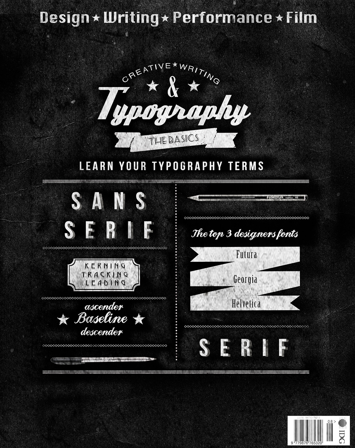
I decided that my second cover would be the Typography issue and experimented with various typefaces. I decided that I would use various Typography terms to entice people who already knew them, but also intrigue people into wanting to read the issue and learn them.
For this I also decided to use it as a blackboard inspired design making the issue feel like it is there to teach and inform its readers.
For my third issue I decided to combine hand-drawn elements and digital elements by bringing in patterns and creating a retro-like design.

Finally for my fourth Cover I decided to try something completely different and tried a Photography cover to work with the 'Film' aspect of the audience and Tagline, and also to make it unique amongst the more design based covers.

Here I saved a version of the images with the planned die-cut covers so I could see what they looked like before they were made.

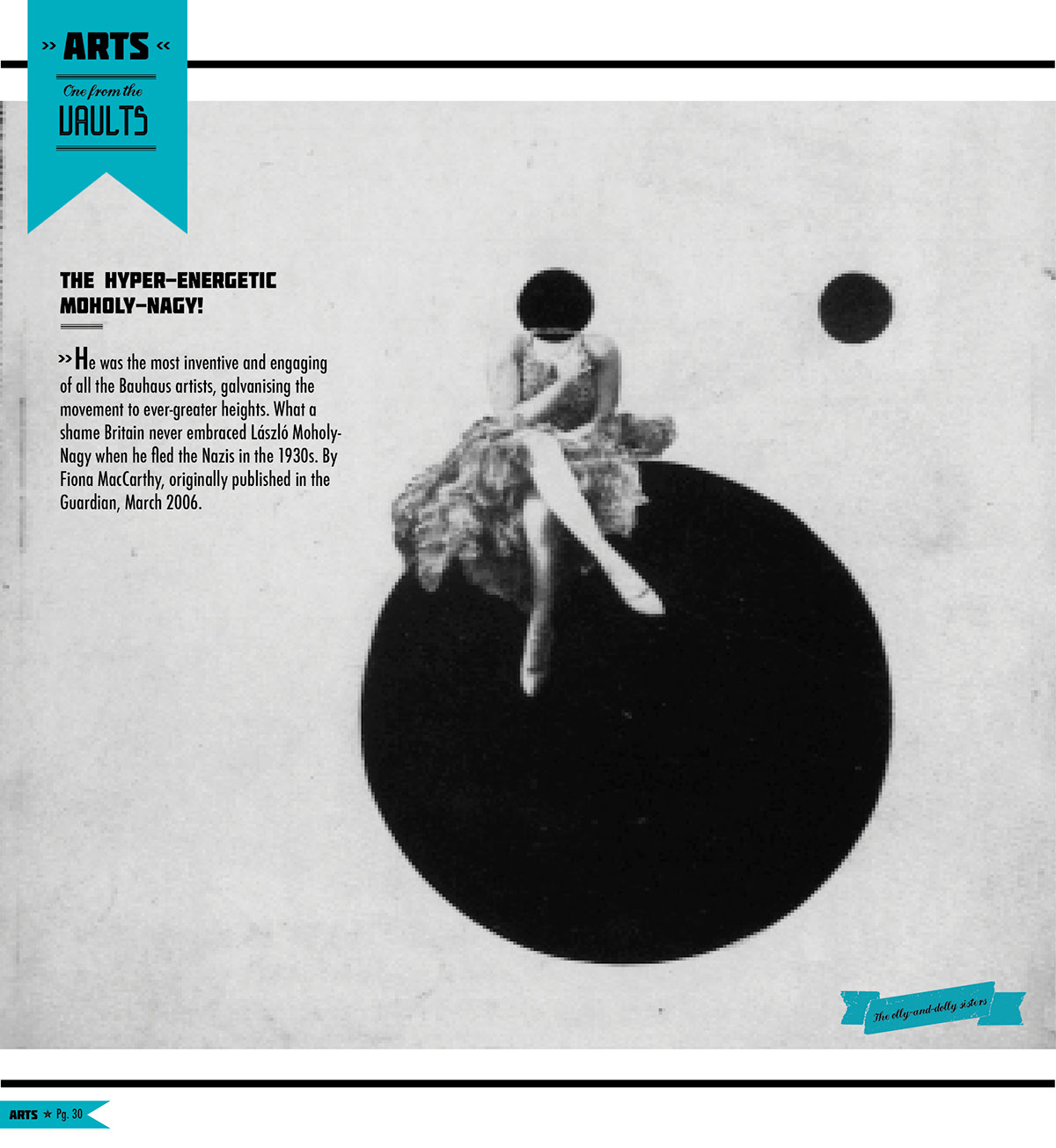
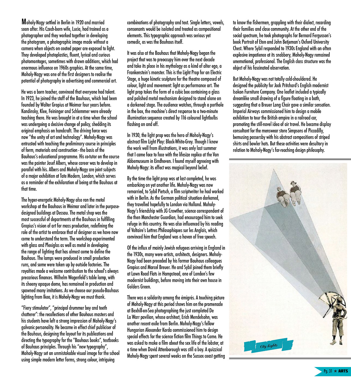
We also had to design a few of the inside pages with some pre-set text and specification on the subject. Having to find images of the Photographers work and incorporate them into the article.