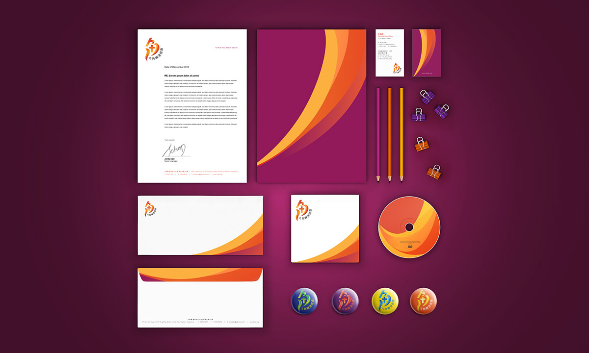
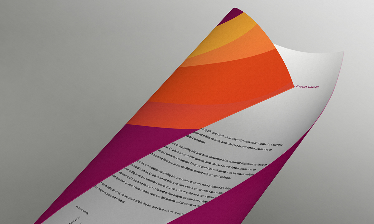
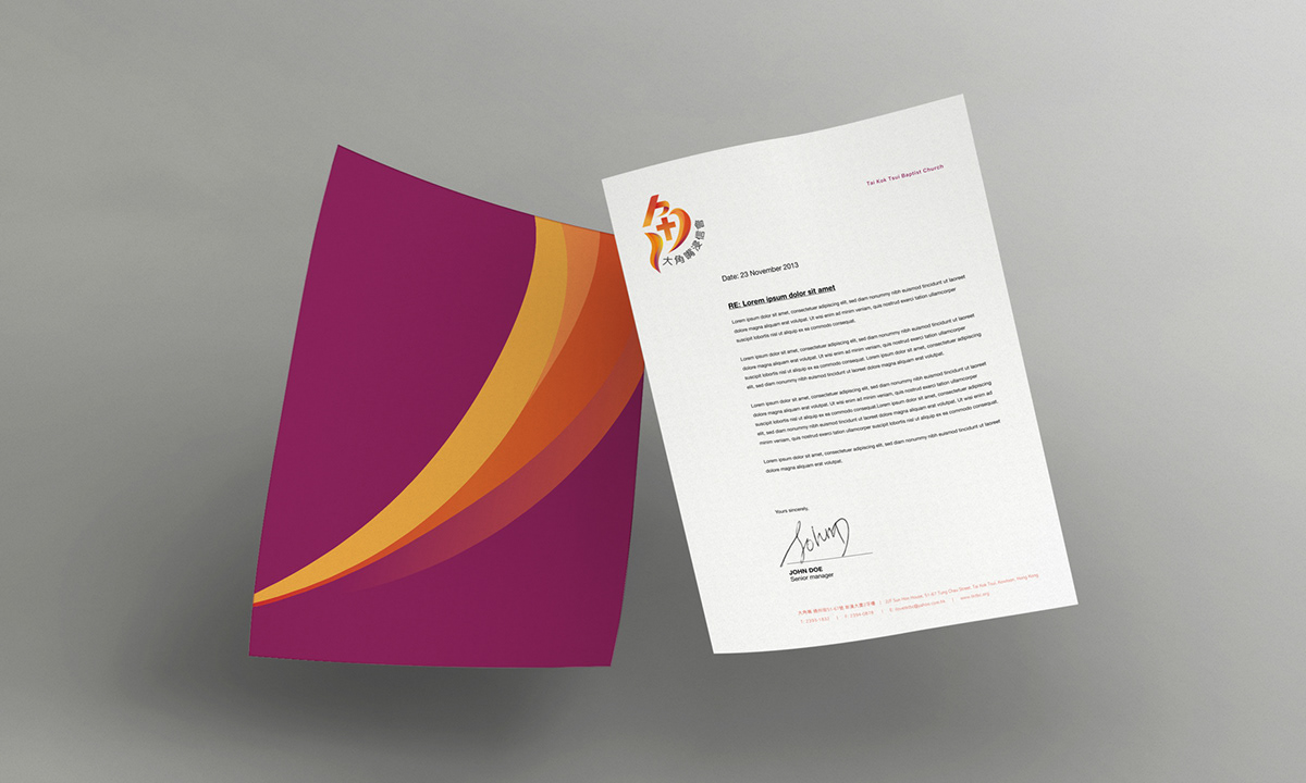
Tktbc is a Chinese Christian church and has a history of 50 years at the service to believers residing in Tai Kok Tsui, an old community that once hosted the oil tanks, now has been revitalized with substantial land reclamations and enormous private housing estates in Hong Kong. On a mission for the growth of spiritual life in every Christ follower and reinforce the cohesion among generations, its logo needs a major overhaul. The solution needs to be vivid, vibrant and able to instil a sense of Christ-centre life.
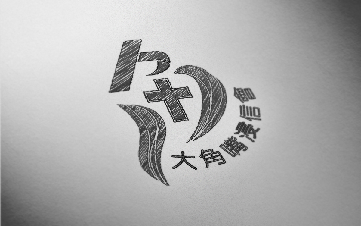
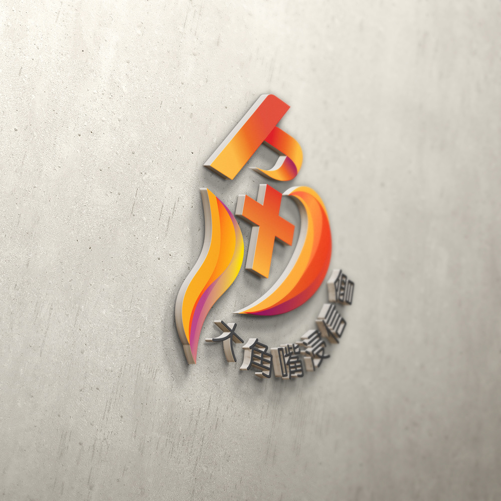
The design is based on the traditional acronym of church’s Chinese name “角” because it directly points out where the church is located and it serves. The strokes that compose the character are simplified so as to incorporate the following qualities of becoming a disciple:
- (Center) The Cross refers to the Christ-centre life;
- (Top) The appearance of a man carrying the Cross and stepping up
- (Right) The shape of an arm reaching out with one’s heart
- (Left) Representing the ascension of disciple’s enriched spiritual life.


Thanks for watching!


