


TOKIO Perfume
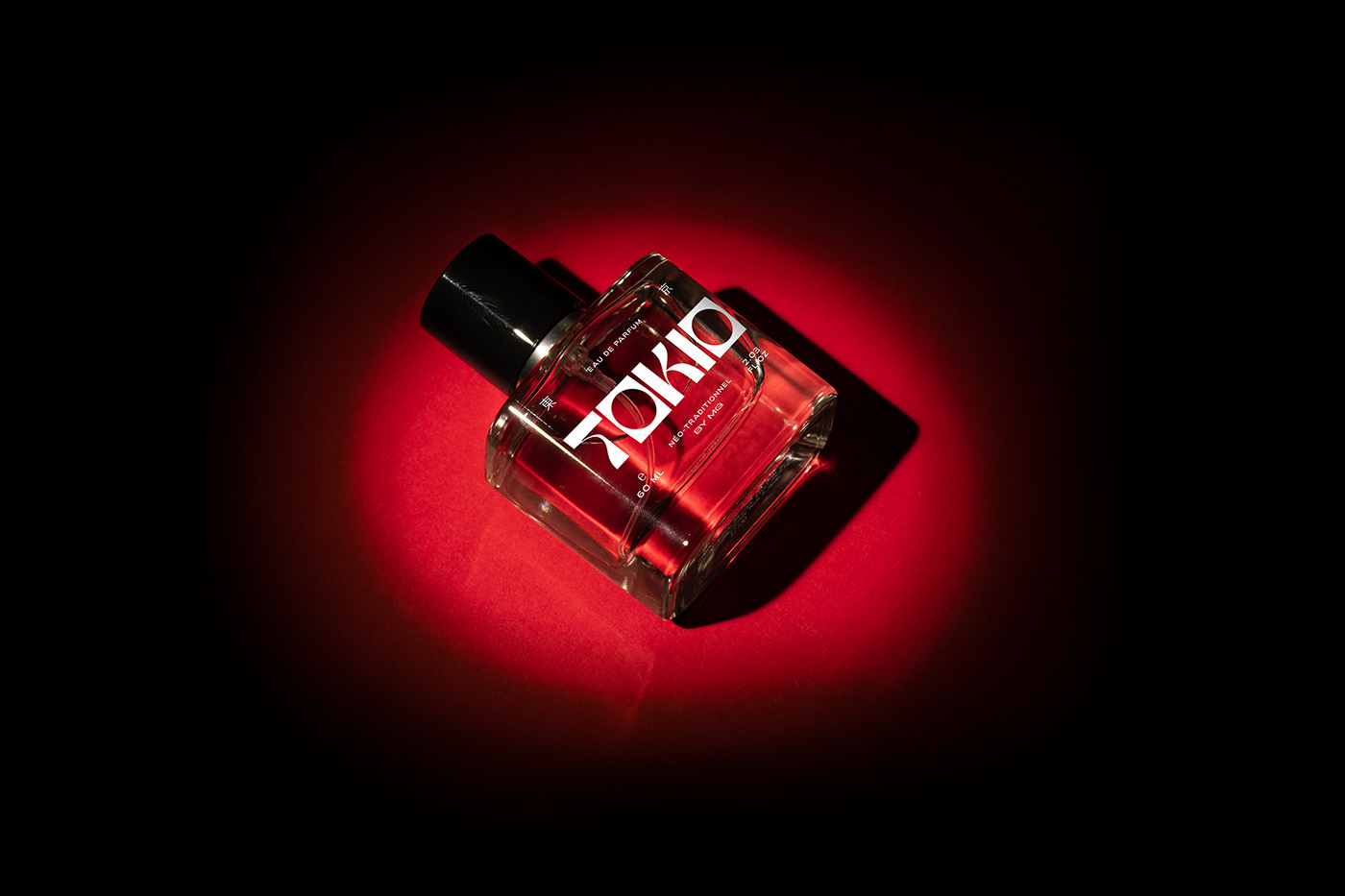
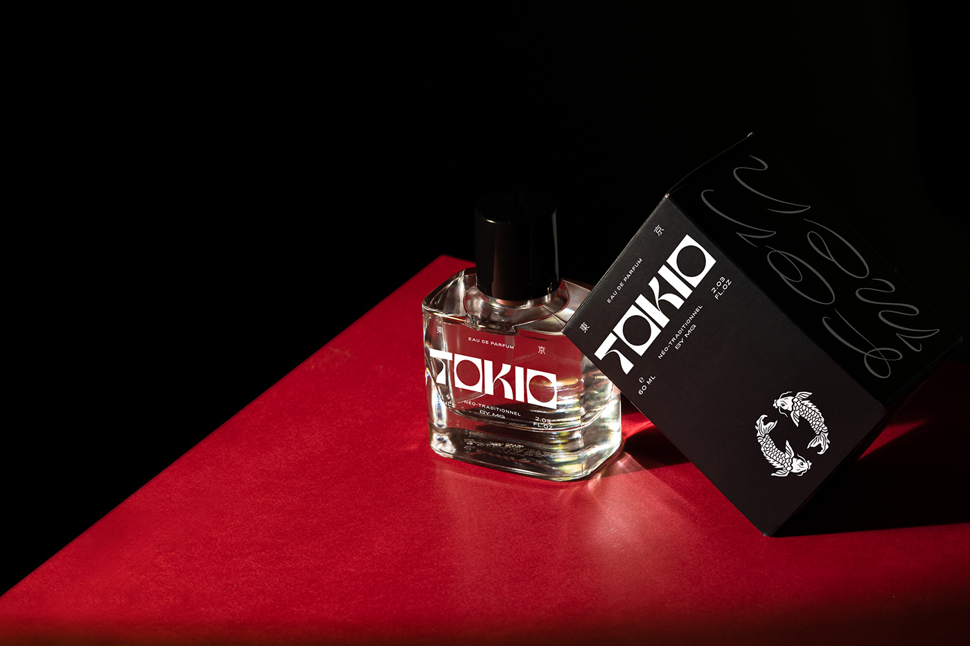
Probamos este increíble perfume, olía muy a blanco y negro para nosotros. Nos dió la sensación de que algo estuviera a punto de suceder. Olía a noir con una vibra asiática contemporánea. Así que diseñamos este wordmark y símbolo que se explican por sí solos.
We tried this incredible perfume, which smelled very black and white for us. Like something was about to happen. It smelled noir with a contemporary eastern vibe. So we designed a custom wordmark and symbol that explain themselves.
Location: Dubai


CRÉDITS
Graphic Identity & Packaging: Estudio Cariño
Photography & Art direction: Axel Troncoso
Copywriting: Iván Soto Camba
Animation: Max Vargas


