
Premessa
Ci è stato richiesto il restyling di un logo per un’agenzia di affitti e vendite di case per vacanze, Agenzia Pineta, che opera in due diverse località marittime immerse nel verde. Nella prima località, Rosolina Mare, l’agenzia si rivolge ad una clientela in grado di affrontare spese medio-basse; nella seconda località, Albarella, l’agenzia si rivolge ad una clientela in grado di affrontare spese molto più alte.
Per questo logo dovevamo rispettare la condizione, imposta dal nome stesso dell’agenzia, di rappresentare la natura, che è una caratteristica fondamentale dei due luoghi di villeggiatura, in particolare la pineta: il pino marittimo infatti era già presente nel logo precedente.
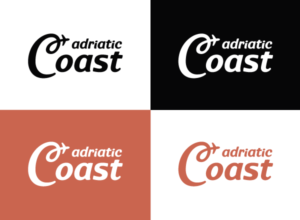
Ci è stato chiesto, inoltre, di fare il restyling di un secondo logo per un’agenzia di viaggi, Adriatic Coast, che si rivolge ad una clientela in grado di affrontare spese medie. Per questo logo non c’erano particolari condizioni o simboli da rispettare o mantenere. L’importante era che risultasse ben coordinato con il precedente.
Per questo logo dovevamo rispettare la condizione, imposta dal nome stesso dell’agenzia, di rappresentare la natura, che è una caratteristica fondamentale dei due luoghi di villeggiatura, in particolare la pineta: il pino marittimo infatti era già presente nel logo precedente.
Ci è stato chiesto, inoltre, di fare il restyling di un secondo logo per un’agenzia di viaggi, Adriatic Coast, che si rivolge ad una clientela in grado di affrontare spese medie. Per questo logo non c’erano particolari condizioni o simboli da rispettare o mantenere. L’importante era che risultasse ben coordinato con il precedente.
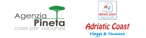
Old Logos
Introduction
A real estate agency asked us to project the restyling of its logo.
Agenzia Pineta, literally “Pinewood Agency”, rents and sells holiday apartments and villas in two different holiday resorts, both surrounded by vegetation.
In the first resort, Rosolina Mare, the agency addresses a clientele who can incur low or intermediate costs; in the second one, Albarella, the agency addresses a clientele who can incur much higher costs.
For the project of this logo we had to respect the condition, fixed by the name of the agency itself, of representing the nature, which is a fundamental characteristic of both resorts, particularly the pinewood: in fact the maritime pine was already present in the previous logo.
They also asked us to project the restyling of a second logo for a travel agency, Adriatic Coast, which addresses aclientele who can incur intermediate costs. For this logo there weren’t any particular condition or symbol to respect or to maintain. The important thing was that it had to result well-coordinated with the previous one.
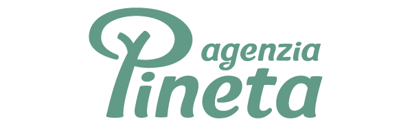
New Logos

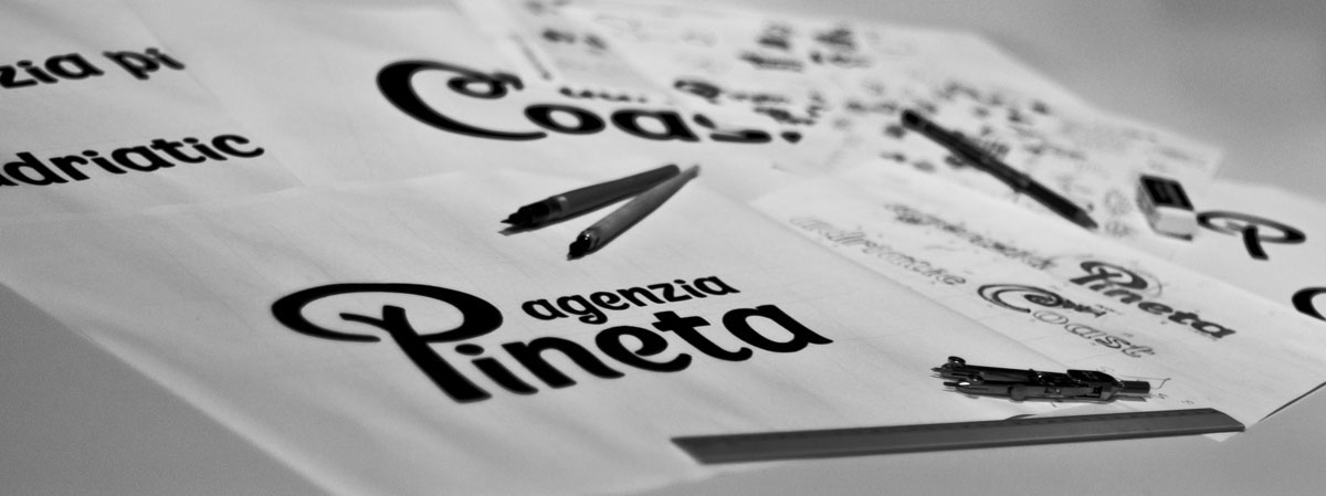
Sketches
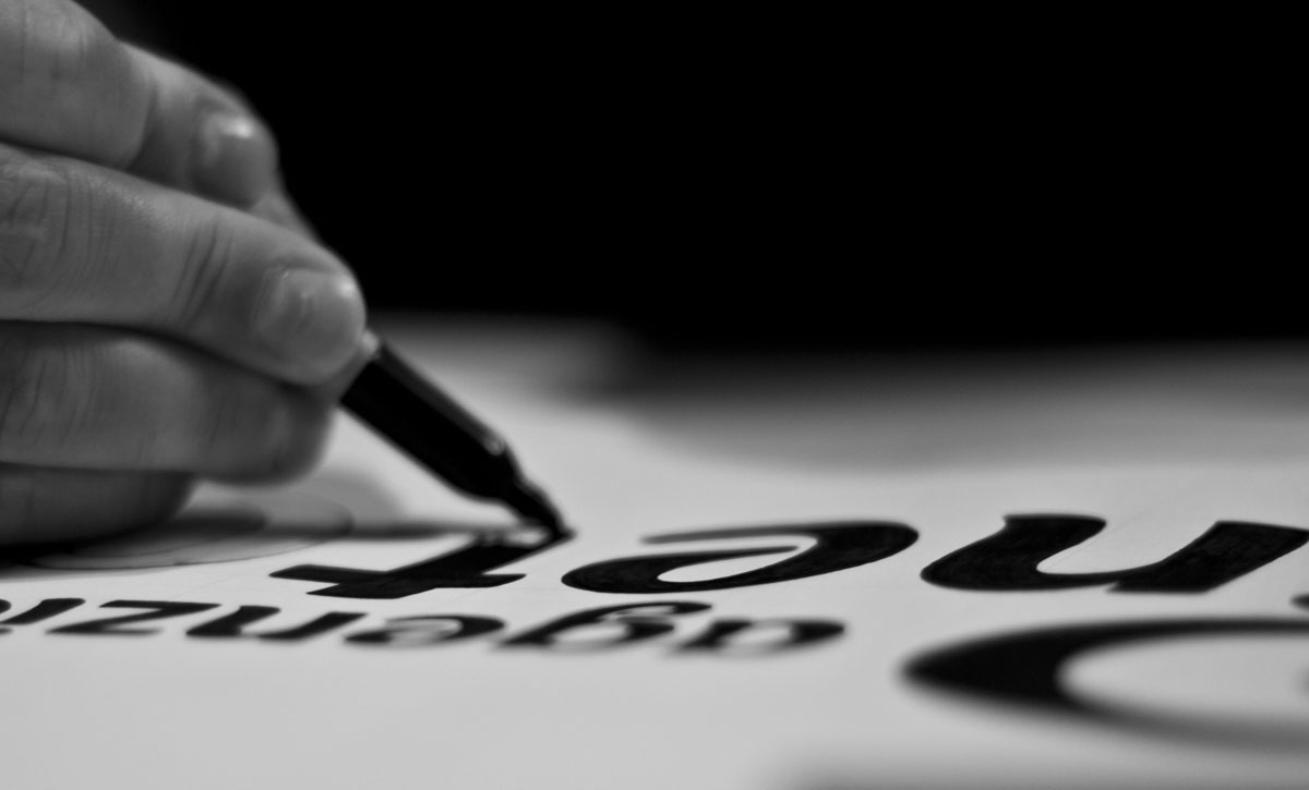
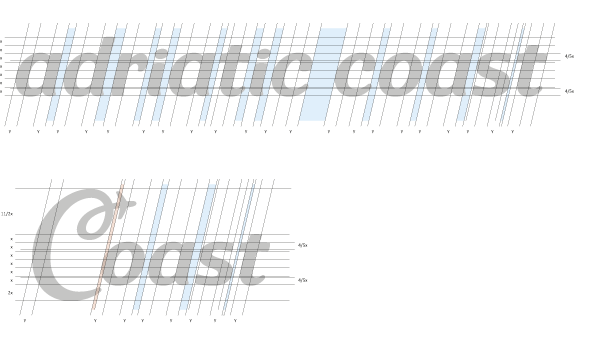
Typeface design

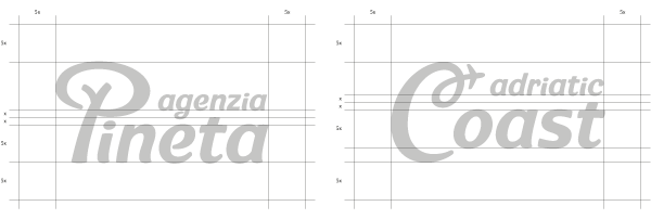
Logos design
Symbols design

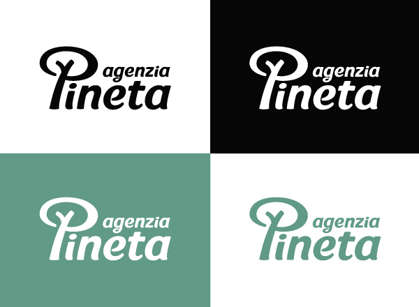
Colours

Colour combinations (Agenzia Pineta)
Colour combinations (Adriatic Coast)
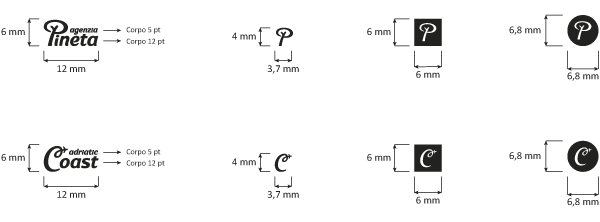
Minimal dimension
Font to be used

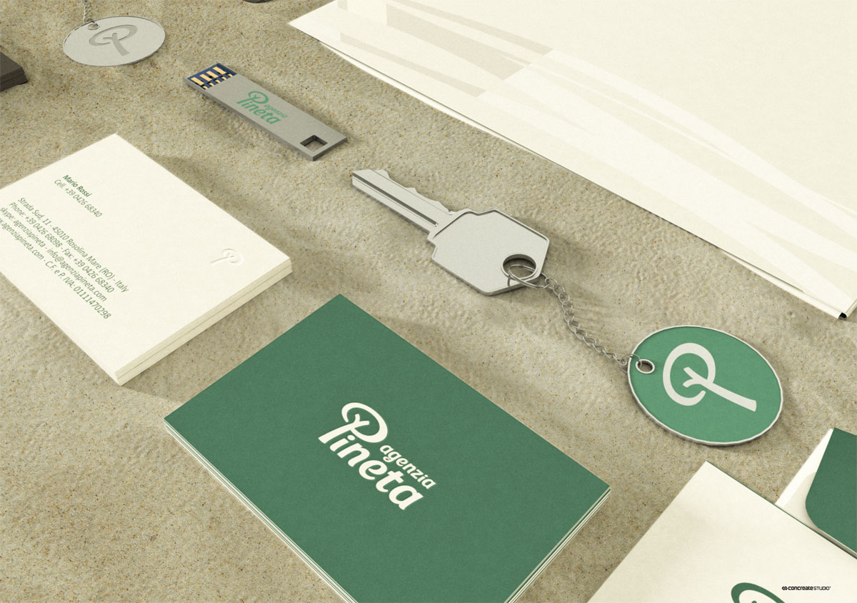
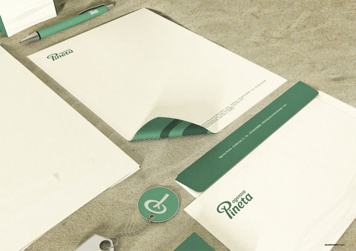
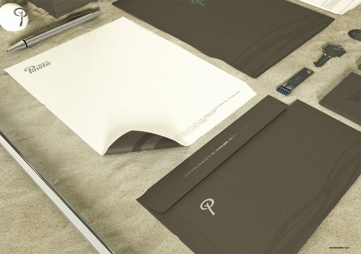
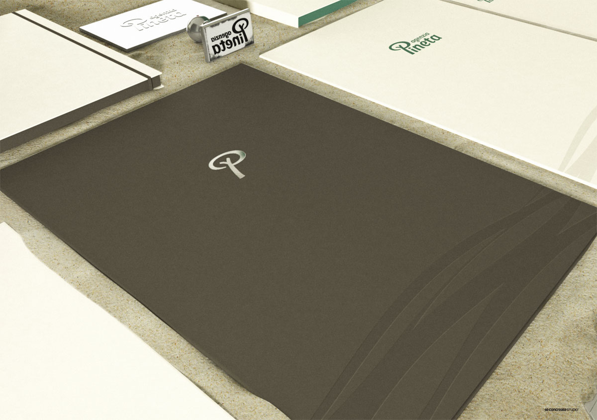
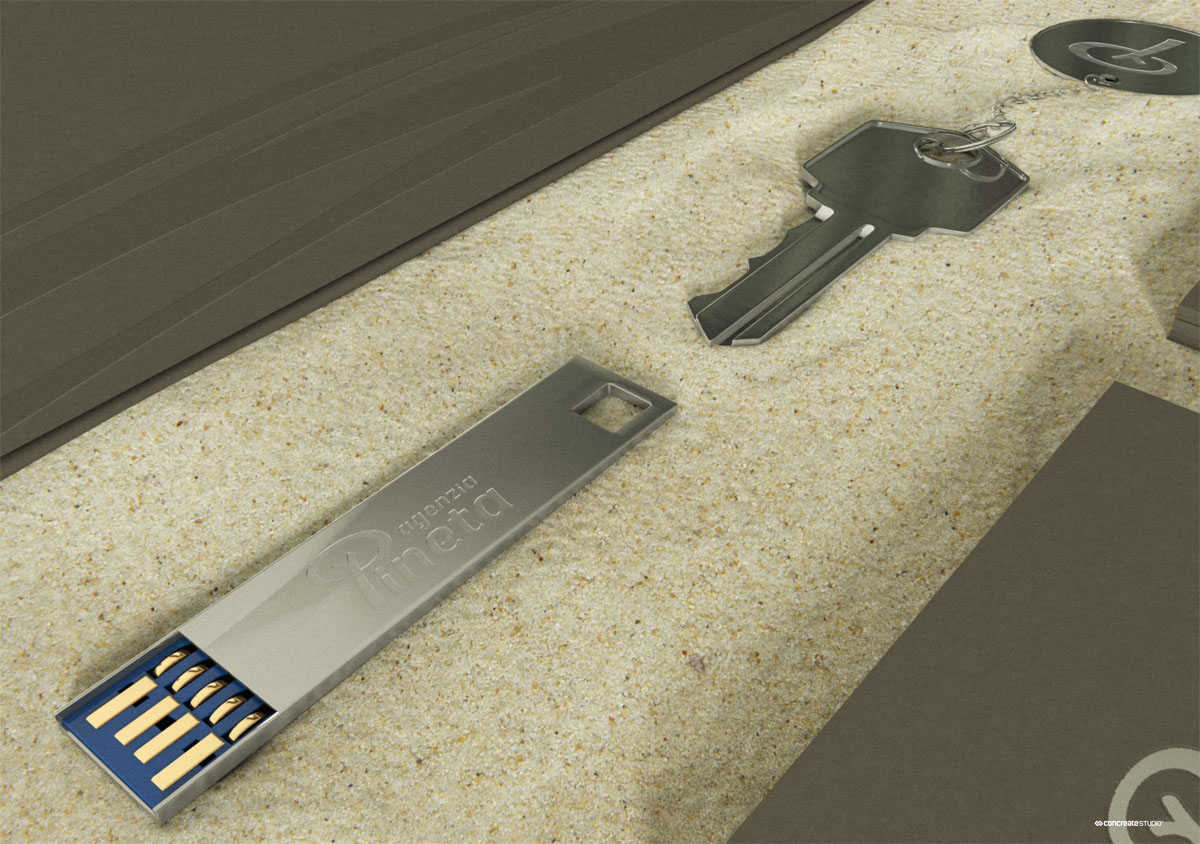
Agenzia Pineta Branding.
We designed two different identities for the two different targets.

Rosolina Mare

Albarella

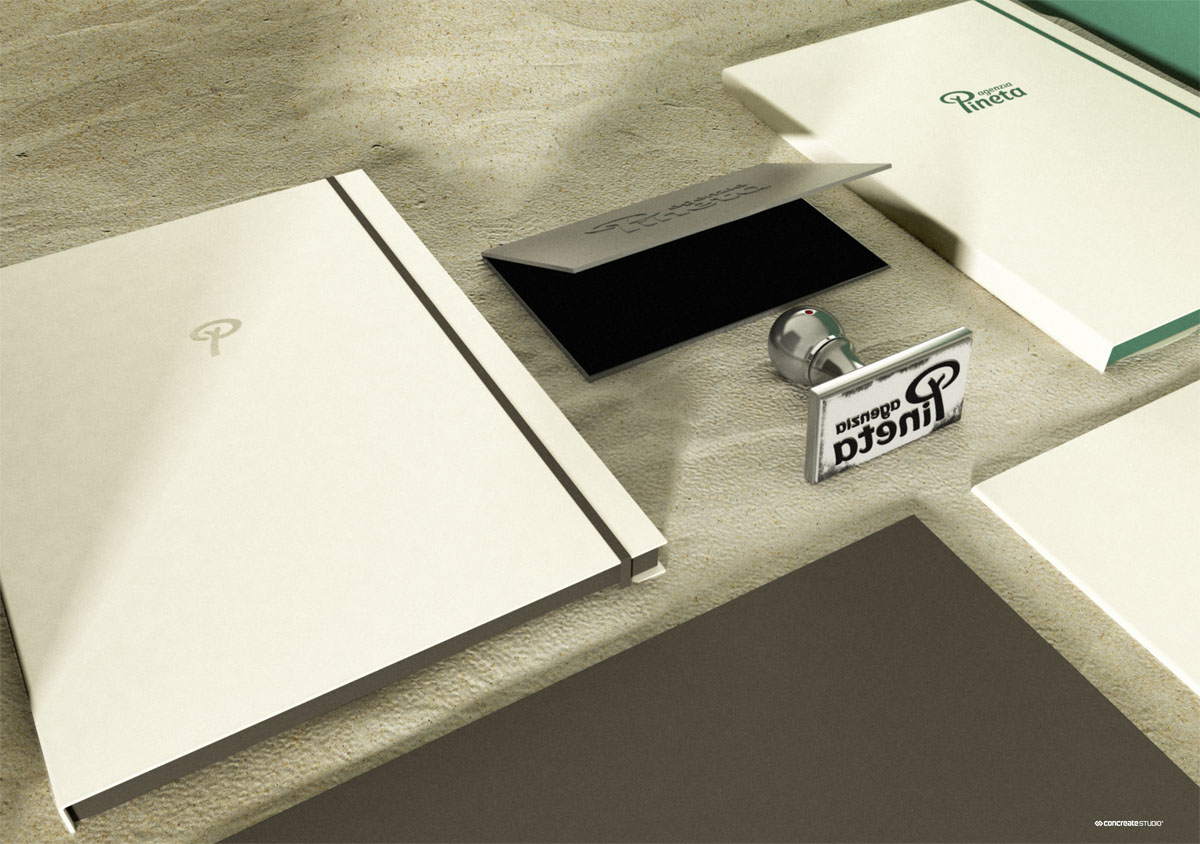
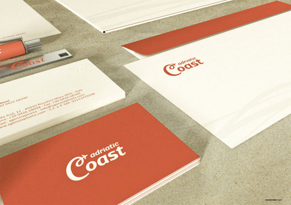
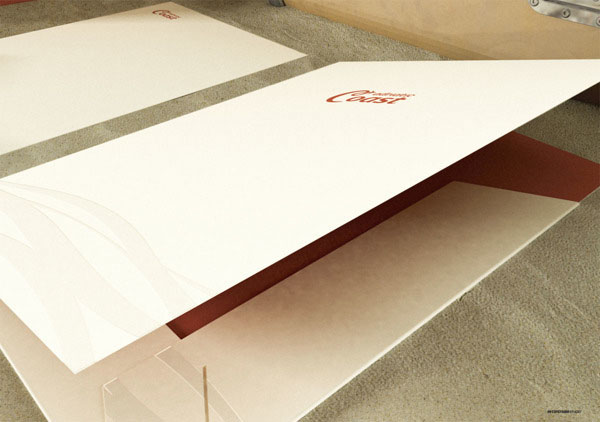
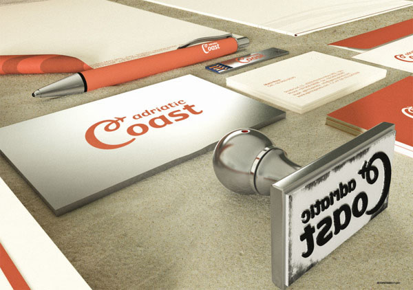
Adriatic Coast Branding.

Thank you for watching our work.


