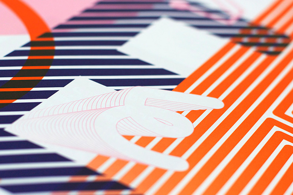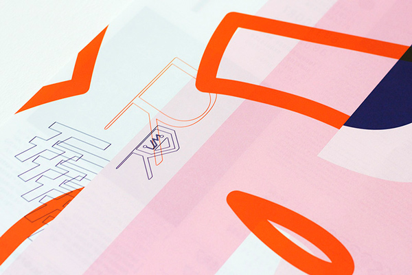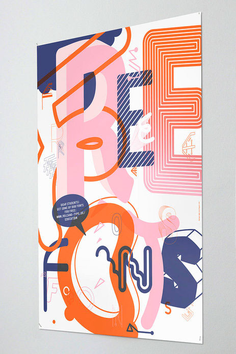
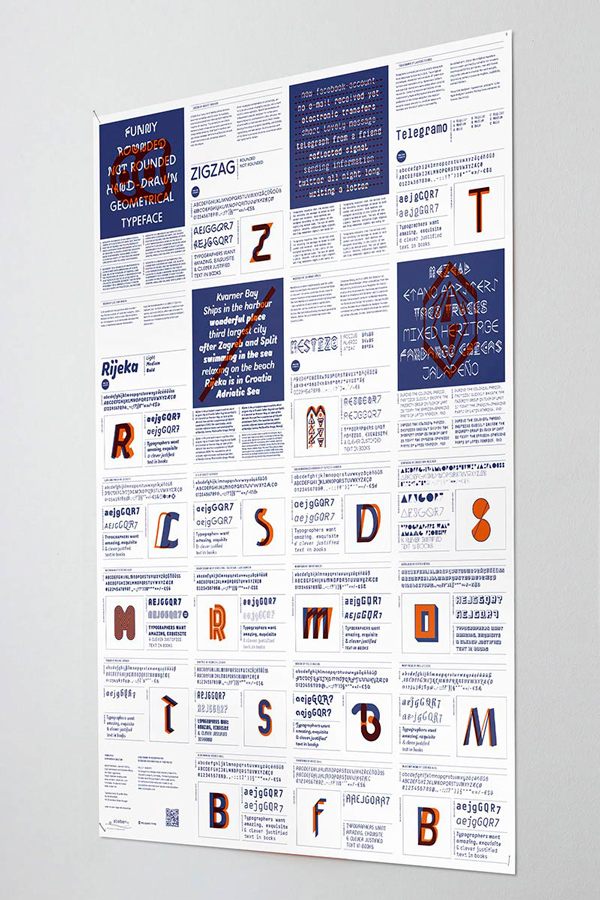
VolcanoType – Poster #1 Free fonts for students
To antagonize the daily type-routine in schools, the type foundry VolcanoType now offers 4 full type families to students for free in a six-months-cycle. Students can download the typefaces and work with them within their study projects and privately without any costs. Therefore a nice poster was designed by Visiotypen (Stuttgart, DE) and Peter Brugger (Istanbul, TR) which has been printed completely with special colors and which introduces the current available typefaces with a short profile. How does it work?
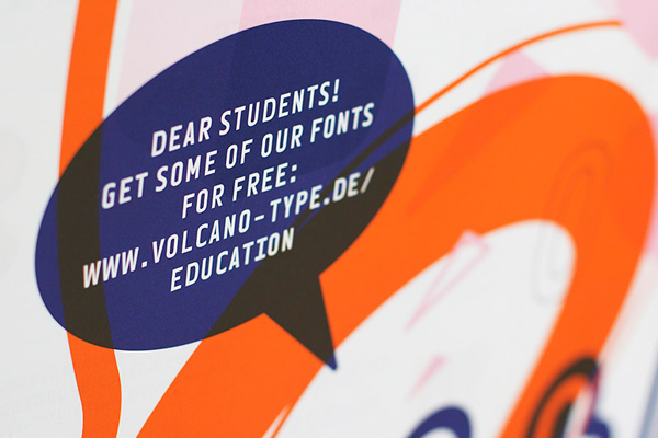
Just visit www.volcano-type.de/education or scan the QR-code from the poster. Insert your name and your school-email address to send a request for the typefaces. You will then receive the typefaces immediately. On this way you can built up your own little VolcanoType fonts library!
Just visit www.volcano-type.de/education or scan the QR-code from the poster. Insert your name and your school-email address to send a request for the typefaces. You will then receive the typefaces immediately. On this way you can built up your own little VolcanoType fonts library!
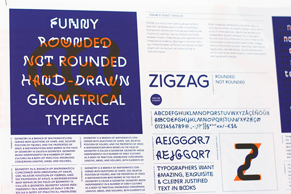
ZigZag is a funny font family whose letters have four varieties each in order to multiply
expressions and attract the eye by breaking the rhythm of reading. The variations oscillate
between a hand-drawn design and a geometric or imaginative drawing. OpenType’s function
lets you choose between different variations of each glyph and contextual variables allow
to mix the styles.
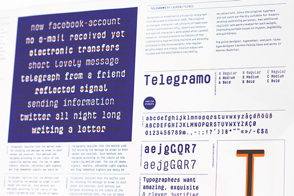
Telegramo is modelled on a historic telegraph from Belgrade to Vienna in 1914. The original archetypal character set consists of lowercase letters and numerals only. Uppercase letters
and special characters were added after careful research. Contact pressure variations of the rudimentary type writing machine are directly imitated in the three weights: the regular
weights edges are sharp, medium edges are rounded and the bold letters can nearly be called soft. Since the original typeface did not seem perfectly suitable for modern desktop publishing
purposes, two additional stylistic sets were created for each weight, improving certain issues
in rhythm, legibility and quirkiness.
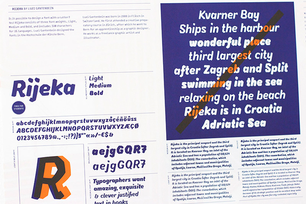
Is it possible to design a font with a cutter? Yes! Rijeka consists of three
font weights, Light, Medium and Bold, and includes 310 characters for 16 languages.
Luzi Gantenbein designed the fonts in the Hochschule der Künste Bern.
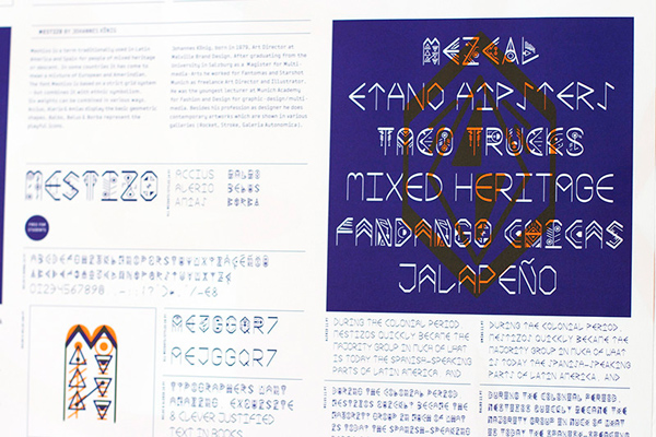
Mestizo is a term traditionally used in Latin America and Spain for people of mixed heritage or descent. In some countries it has come to mean a mixture of European and Amerindian. The font Mestizo is based on a strict grid system – but combines it with ethnic symbolism. Six weights can be combined in various ways. Accius, Alerio & Amias display the basic geometric shapes, Balbo, Belus & Borba represent the playful icons.