


Premise.
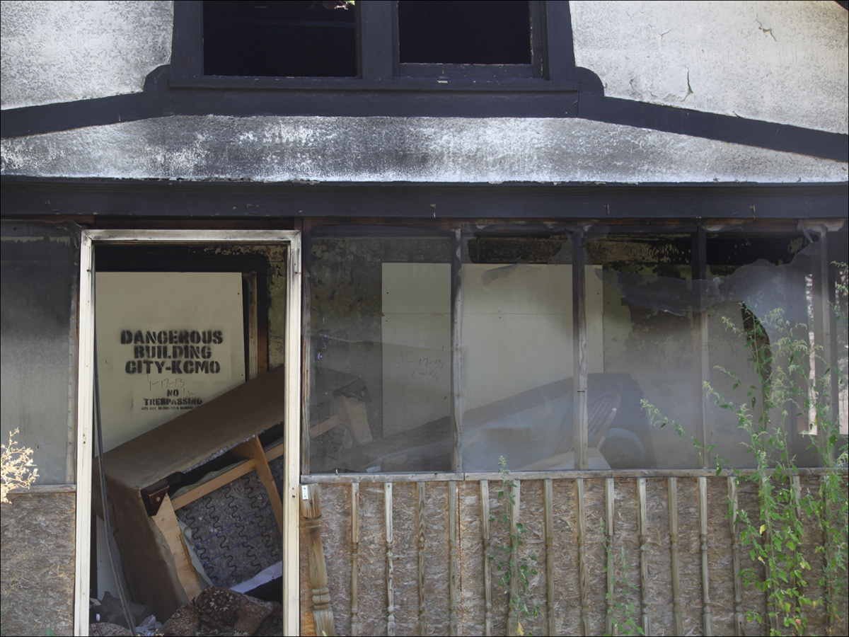
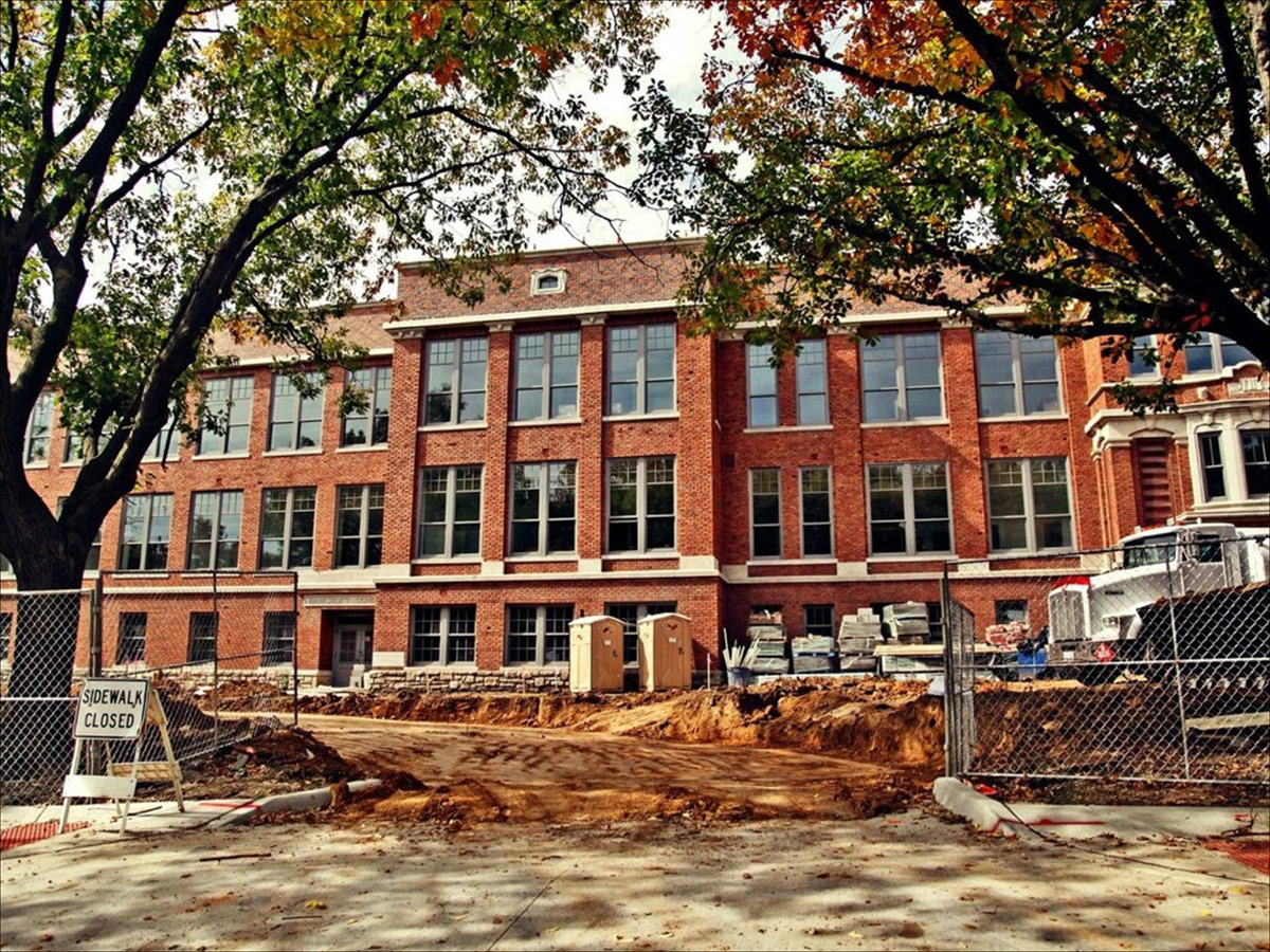
We were asked to help rebrand Manheim Park in Kansas City, Missouri. The overall current visual aesthetic of the neighborhood is half boarded up or broken down houses and businesses. Due to their recent partnership with the Make It Right Foundation and a few other organizations and companies, the neighborhood is slowly getting the renovations that it needs and thus, was in the need for a new visual identity to help further transform the area. Other nearby neighborhood's have their own visual aesthetic where you know where you are and Manheim Park wanted that same feel for their own new home.
We were asked to help rebrand Manheim Park in Kansas City, Missouri. The overall current visual aesthetic of the neighborhood is half boarded up or broken down houses and businesses. Due to their recent partnership with the Make It Right Foundation and a few other organizations and companies, the neighborhood is slowly getting the renovations that it needs and thus, was in the need for a new visual identity to help further transform the area. Other nearby neighborhood's have their own visual aesthetic where you know where you are and Manheim Park wanted that same feel for their own new home.

Challenges.
Plagued with poor circumstances Manheim Park had developed bad connotations in the minds of Kansas City Citizens. Our goal was to change the poor opinions by instigating, inspiring, and providing positive change by creating a unified brand system. A visual system that positively effects inward and outward views of Manheim.
Plagued with poor circumstances Manheim Park had developed bad connotations in the minds of Kansas City Citizens. Our goal was to change the poor opinions by instigating, inspiring, and providing positive change by creating a unified brand system. A visual system that positively effects inward and outward views of Manheim.


Solution.
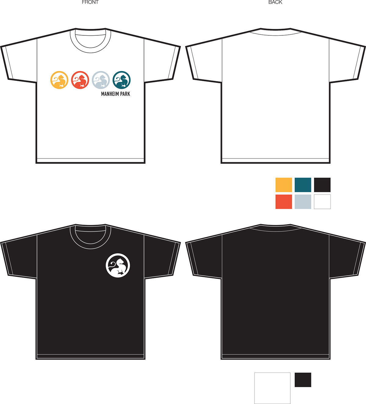
Our solution was to create a new logo and set of brand standards to be used when representing the neighborhood. It also included ways to keep that visualization throughout the neighborhood such as proposing they paint poles the primary color of their branding as well as sign toppers with their new brand mark.
Our solution was to create a new logo and set of brand standards to be used when representing the neighborhood. It also included ways to keep that visualization throughout the neighborhood such as proposing they paint poles the primary color of their branding as well as sign toppers with their new brand mark.

we went to town meetings to hear what the neighborhood wanted.
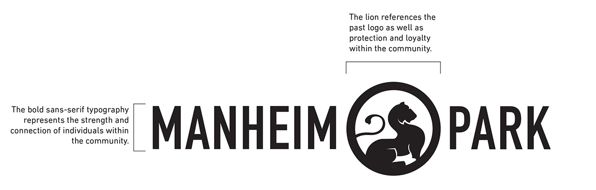
The logo is the unifying element for Manheim Park. The bold sans-serif represents the strength and stable connection of individuals within the community. There is a reference to the old logo with the continued use of the lion to represent protection and loyalty within the community.
The images below dictates the smallest the logo should ever be presented, as well as the typographic and iconographic reasoning.
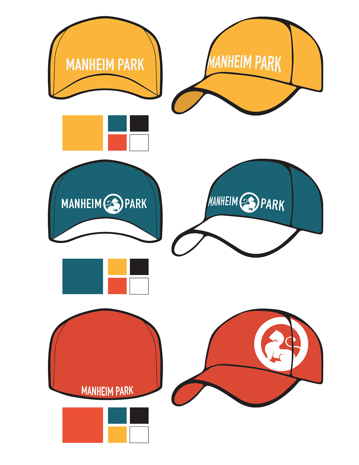
The collection of colors were chosen to represent Manheim Park and the Historic Manheim Park Association based on the connotations associated with each of the colors.
Yellow represents a mixture of happy, warmth and character. It was chosen as the main color to represent the friendly and energetic community.
Yellow represents a mixture of happy, warmth and character. It was chosen as the main color to represent the friendly and energetic community.
Gray-blue represents calm and security.
Red-orange stands for a mixture of passion, attention, creativity and culture.
Red-orange stands for a mixture of passion, attention, creativity and culture.
Turquoise represents trust, sustainability and balance.

We proposed that Manheim Park used the new colors and logo mark throughout the area to visually bring together the neighborhood through more street signage and slight modifications of current street signs.


proposed metal street sign topper for key entry points into neighborhood.


see the website live at http://discovermp.com/


front of business card option 01.

front of business card option 02.

back of business card.


the original logo.


