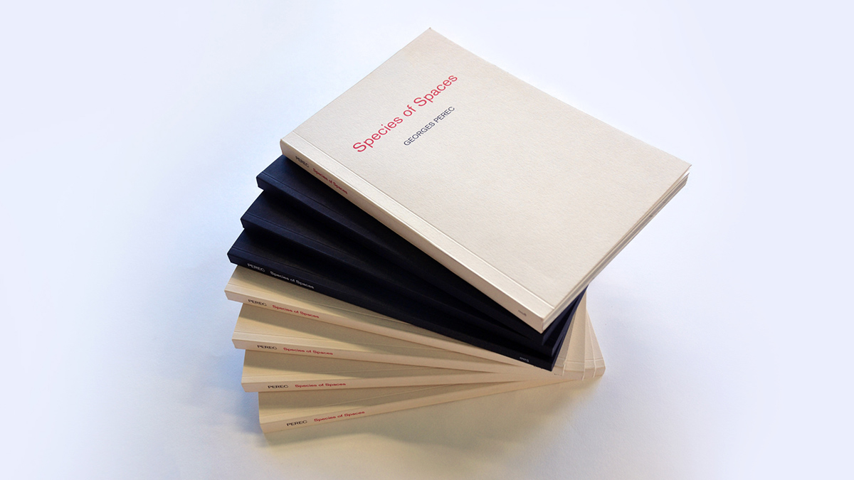
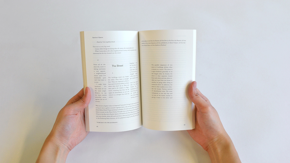
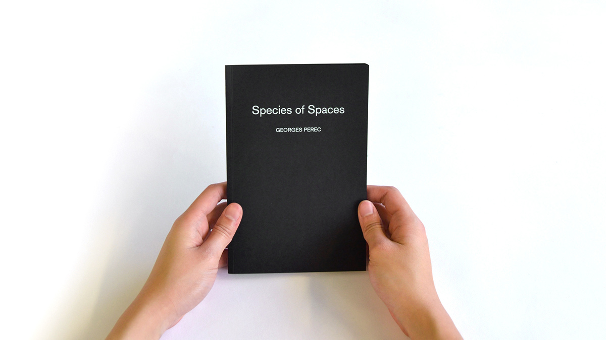
Having chosen Georges Perec’s Species of Spaces as my source of practical work, I looked for ways of how graphic design and the use of different print formats can be applied and contribute to a content. I focused on typographic and graphical experiments and aimed for ways in which I could use them effectively to remediate the book.
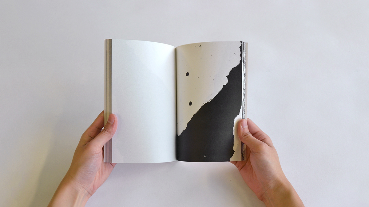
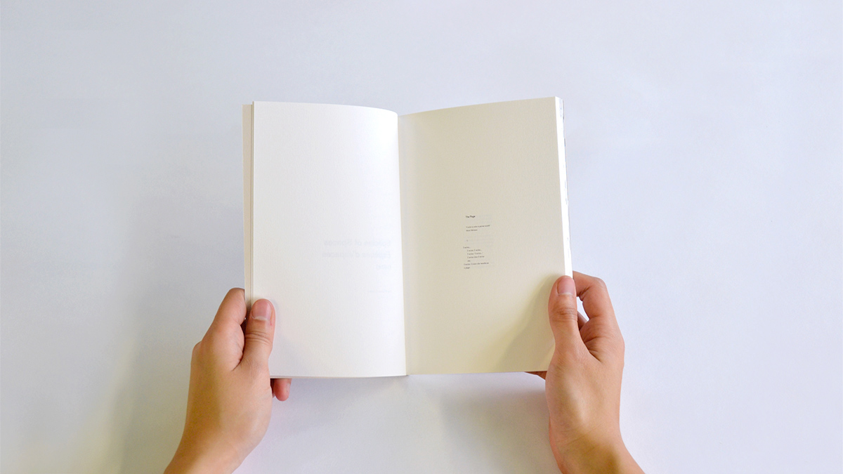
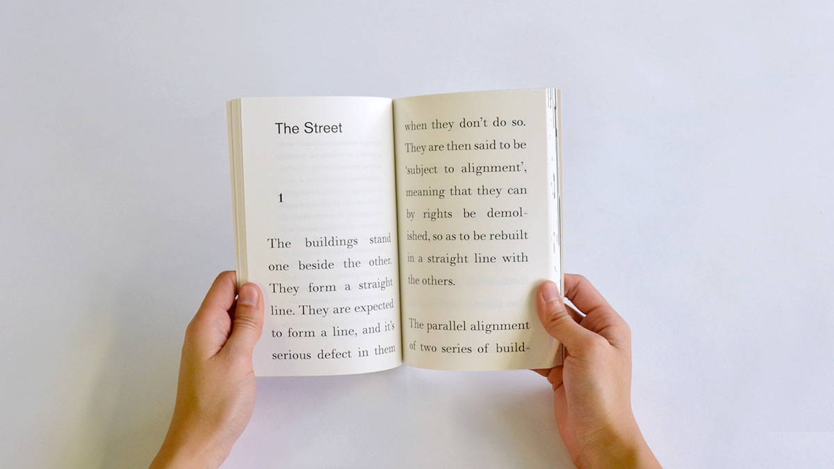
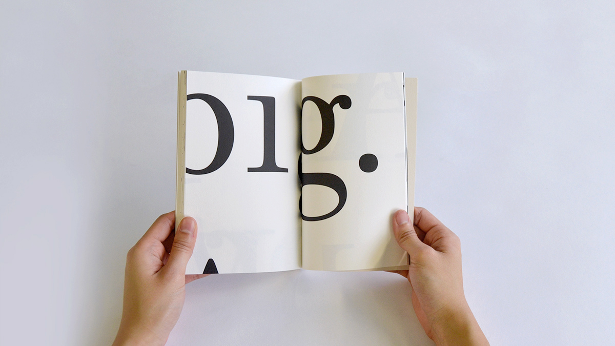
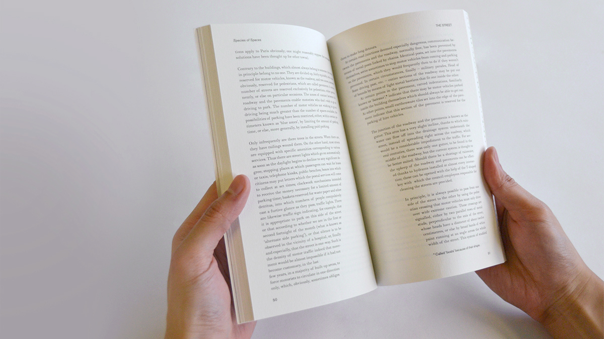
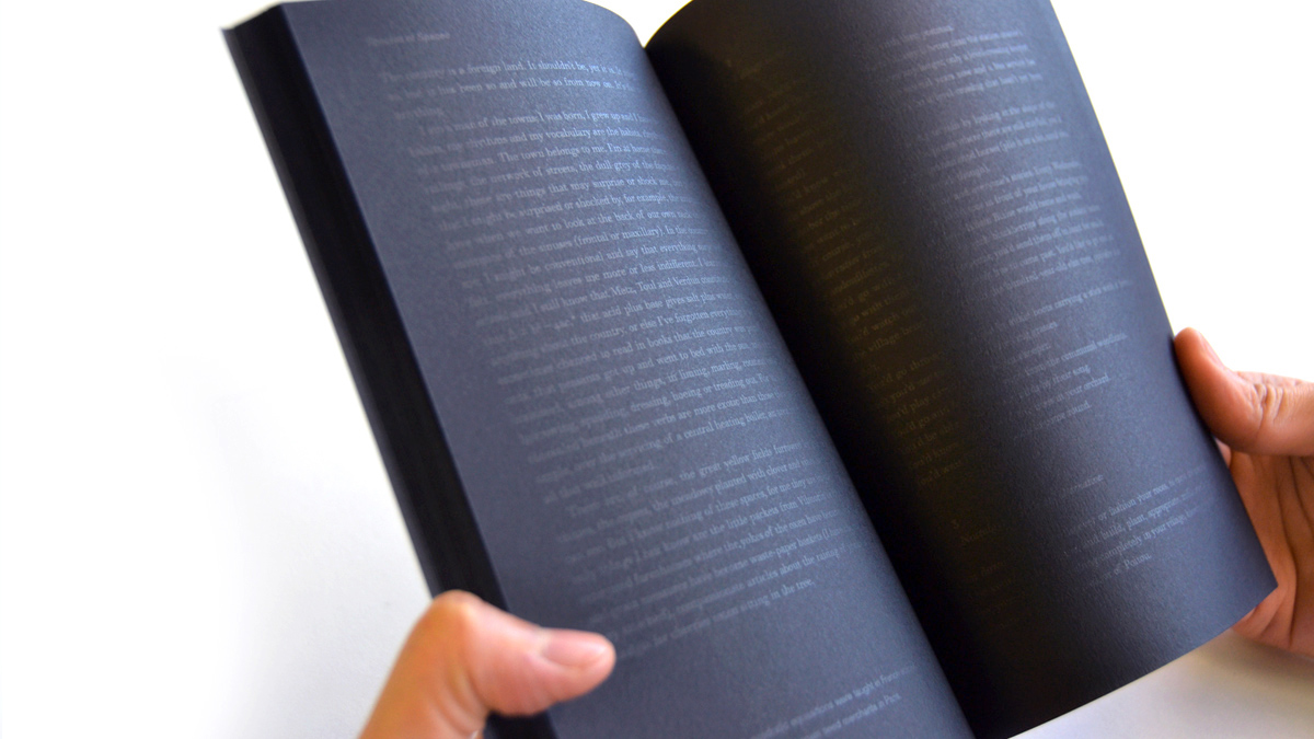
Book 1
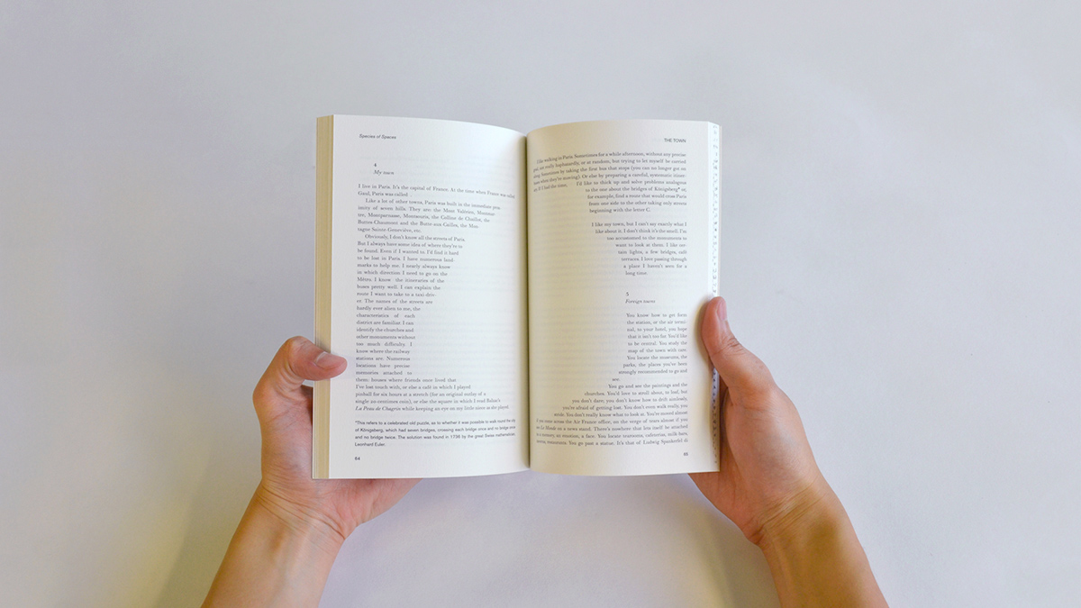
My first experiments explored the gradual growth of the spaces that Perec described, with their physical aspects and his emotional bonds to them. In that sense Book 1 explores the relation of the growth throughout the chapters. Though it hasn’t got a steady enlargement ratio from one chapter to another, I tried to adjust the type size and the expansion of the black space in a visually reasonable way. As the pages unfold, the reader experiences how each space is represented in the space of the page. Towards the final chapters the letters become gigantic and words overflow from the page. The spaces that are written in the book exceed the space of the book.


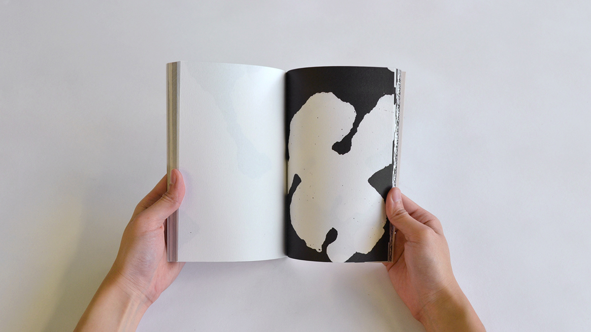
Book 2
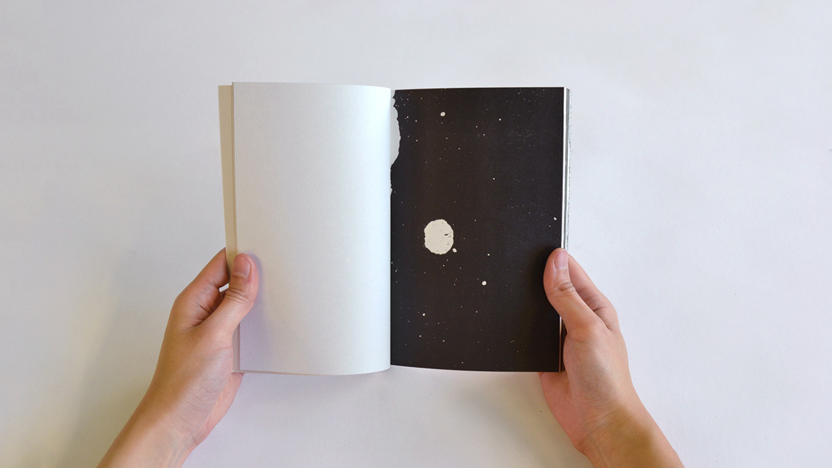
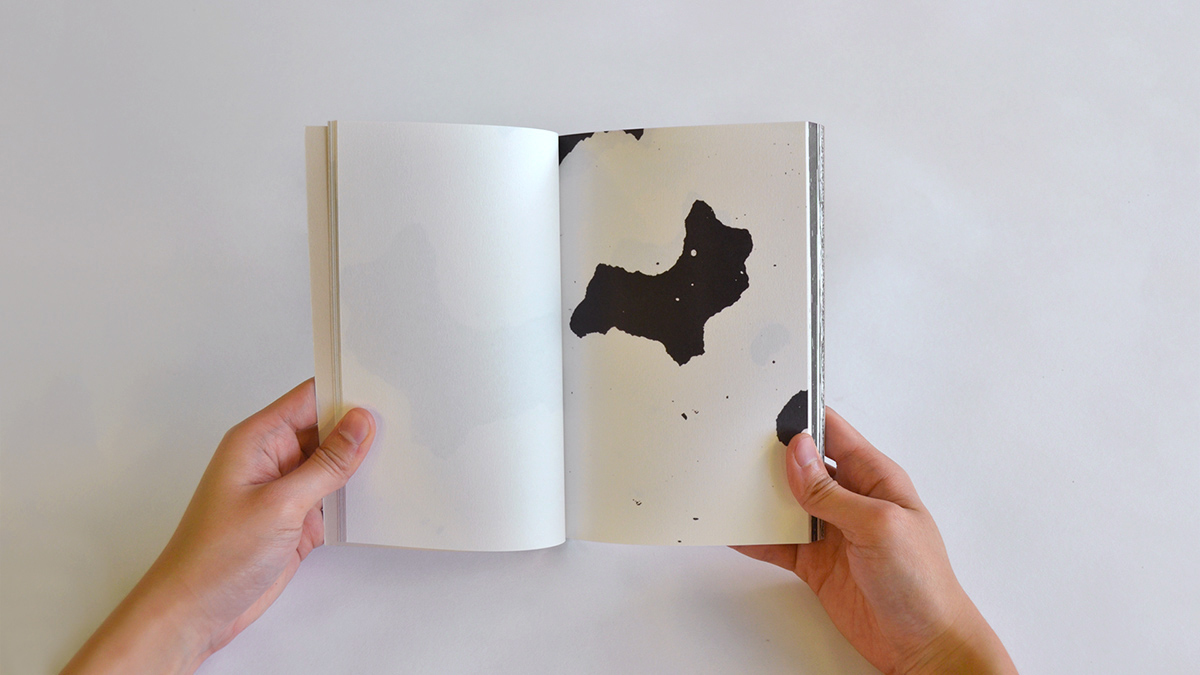
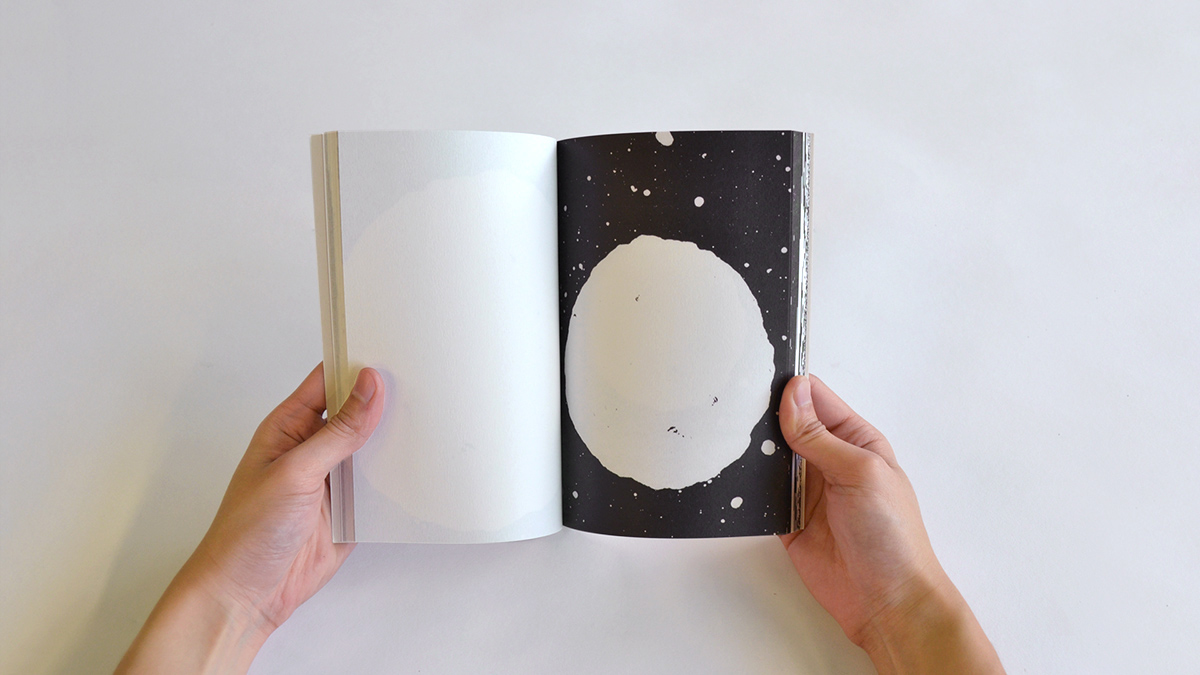
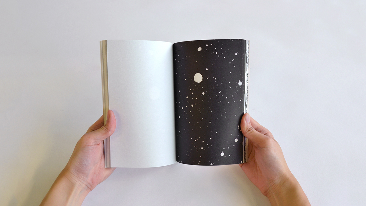
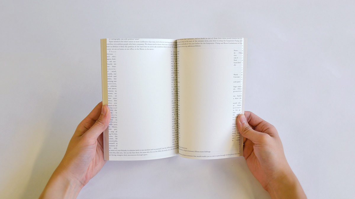
Book 2 is rather an illustrative output for a typographic approach. Every chapter depicts its relevant shape with the use of white space. The book starts with rectangular spaces which are then transformed into more organic shapes of towns, countries, up to the roundness of the world and lastly to the unknown reaches of space.


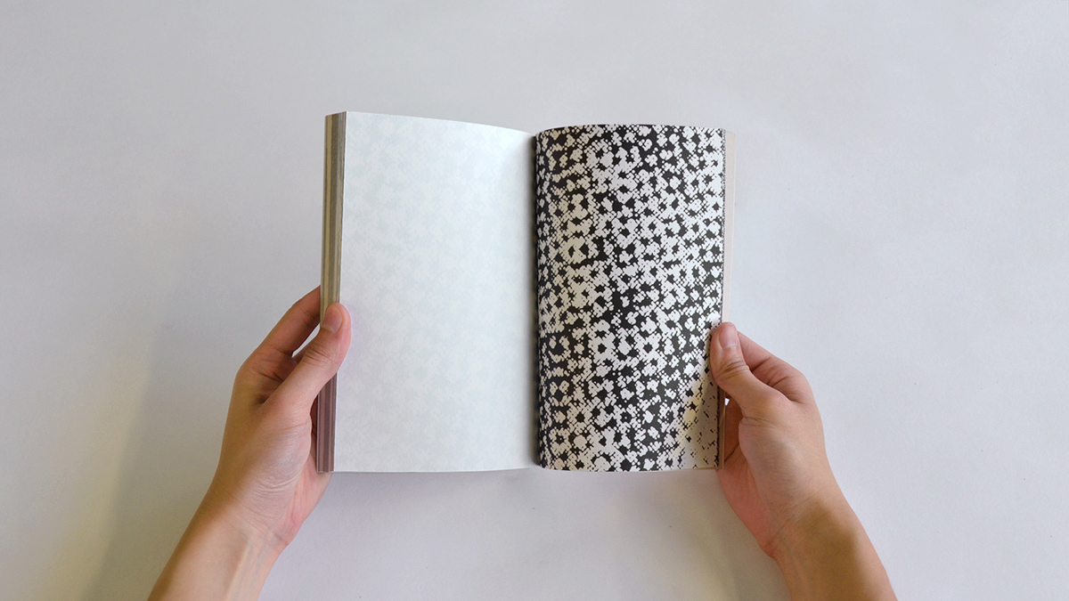
Book 3
Book 3 consists of a little game which was done with the figure of OuLiPo in mind. Since Perec was using different methods and constrictions in his various novels, engaging the index with the rest of the chapters is also an approach that would change the flow of the book. The index pages are more likely random words picked by Perec, words where some letters of the alphabet are whether or not purposefully left out. These words, instead of being duplicated, are taken from their places to form the index pages and at their places in the text is written address-like information that refers to the index. Consequently the index pages also become a space in use while intervening in the linearity of the book.


Book 4
The nested structure of the essays are typographically underlined in Book 4. Starting each chapter in a small text area on the last page of the preceding chapter is a way of stressing this structure.
Book 5
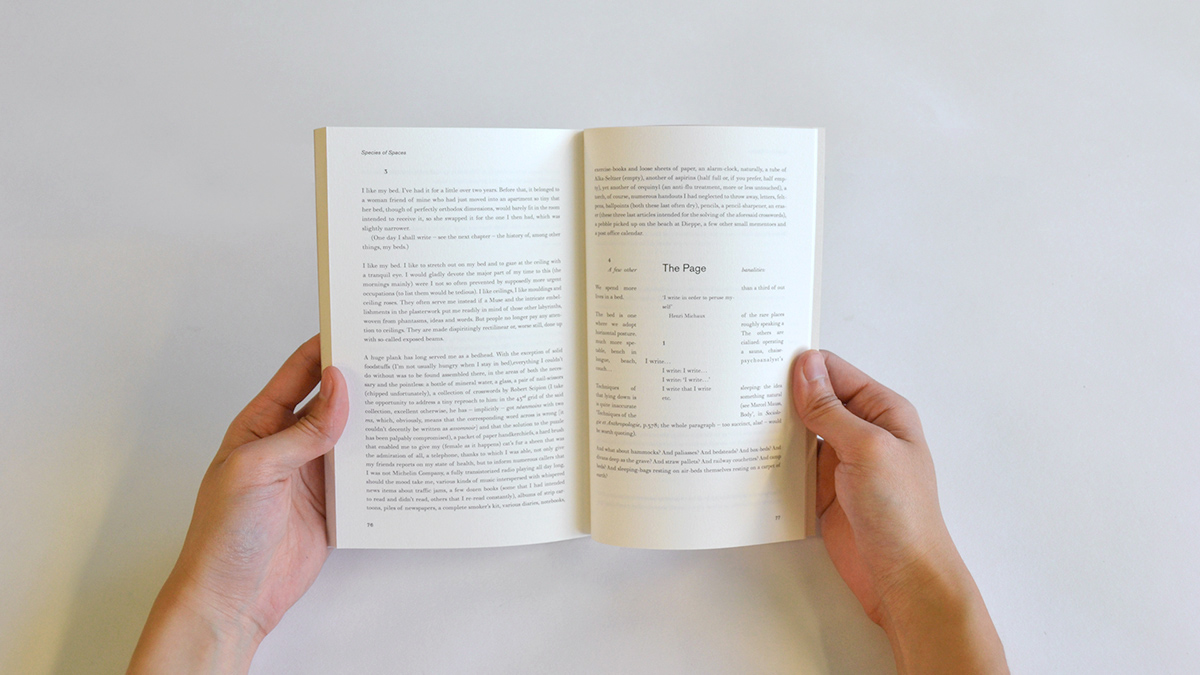
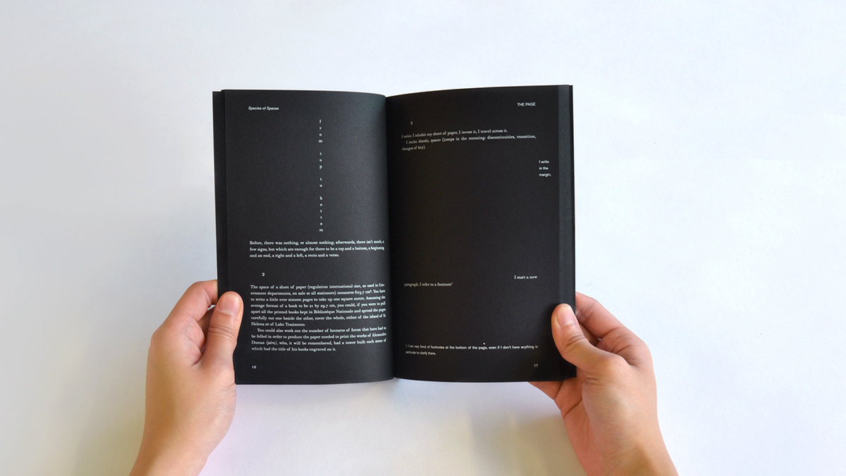
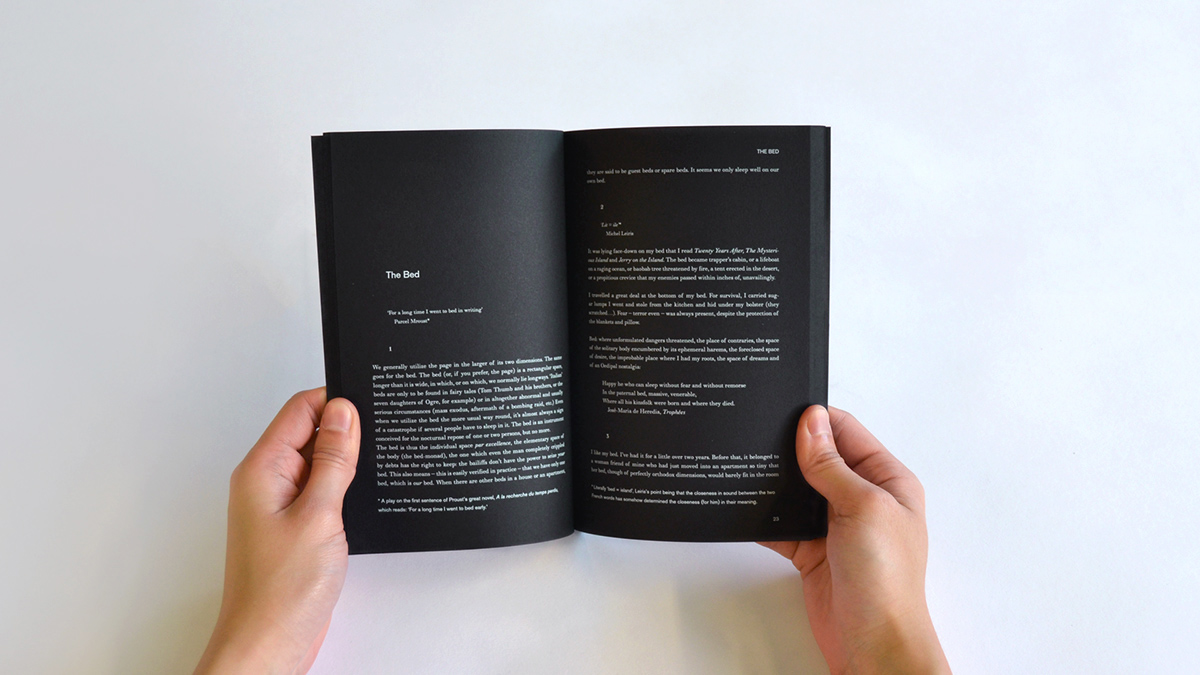
Book 5 and 6 examine the space of the book. It is not only the textual space but the book’s physical space that the reader would try to grasp. Regarding this, Perec starts his first chapter, The Page, and informs us with the size and dimension of a page and how it would cover a 1m2 area. Thus he reminds us of the space that we hold in our hands, the book that consists of pages is a space itself, consisting of the textual space of Perec’s essays. Both versions are a contrast to the conventional way of book design. Since they aren’t regular reading experiences they compel the reader to question the book space. They become objects rather than being conveyors of the content.

Book 6


Book 7
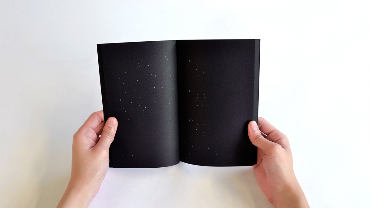
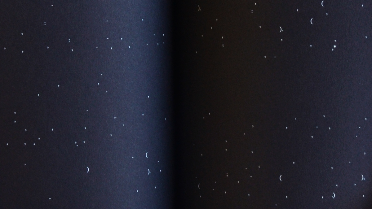
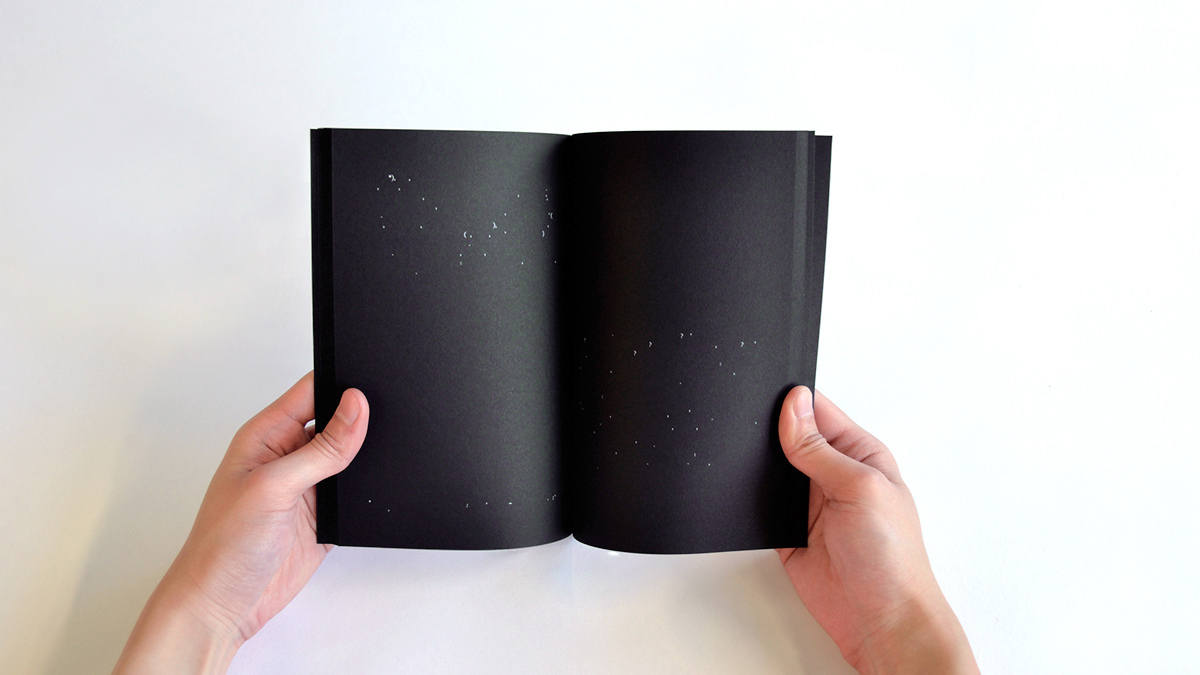
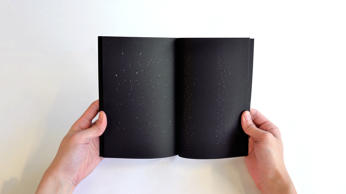
In Book 7 the punctuation marks of the entire text were examined. It is even possible to perceive the story in a different way just by altering these marks. We see the traces of Perec throughout these marks: i.e. where he makes lists of things, a lot of commas appear one after another. It is a typographic experimentation which turns into imagery and becomes interpretable.


Book 8
Exploring the places that Perec mentions on Google Maps was an interesting approach to involve in the story. It was possible to track down his house at Rue de l’Assomption where he was raised by his aunt and uncle. Instead of taking screen shots starting from space, France, Paris —visually those would be too generic— down to his rooftop, I started from a point where I felt that it would be more personal for Perec. It is the point where almost one third of the street is seen and his rooftop is recognisable. After converting that specific screenshot into halftone, the image was enlarged over and over to get closer to his apartment. As the enlargements proceeded, these images brought another wonder since they got more and more abstract. As they got closer to the house the images got more abstract, - creating new spaces. In Book 8 these images were collected and sequenced in a reverse order which begins from an abstract point and gets closer to Perec’s street, Rue de l’Assomption. This experiment speaks for both the geographical space referred to in the book and also the print space where it can actually be perceived that what we see on a page actually consists of dots.